Visual Design Foundations: Typography and Visual Hierarchy

Welcome back, design aficionados! As our design voyage unfolds, we’ve ventured through various design realms, from the magnetic pull of contrast to the breathing space of white, and the delicate dance of colors. Last week, we unraveled the secrets of scale and alignment. Today, our spotlight illuminates typography and visual hierarchy.
Join us as we delve into the art of typography techniques and explore the principles of visual hierarchy, building upon our design journey’s foundation.
For a quick refresher, feel free to explore our previous discussions on contrast, whitespace and colors too!
Typography
Typography is a fundamental aspect of visual design that focuses on the arrangement and style of text. It involves four key areas: tracking, leading, font styles, and font weight.
Considering these typography principles helps designers create visually appealing and effective designs by ensuring readability, hierarchy, and consistency in the presentation of text.
To understand it we have to focus on 4 different areas:
- Tracking: space between letters;
- Leading (read “leding” and not “liding”): space between line of text;
- Font styles: serif, sans-serif;
- Font weight;
Tracking
It’s how we adjust letter-spacing uniformly, between characters. We use wider tracking on titles, labels and watermarks. Usually the default value is good.

Leading
As mentioned before, leading is the space between each line of text. We have to uniformly distribute leading through the design. Not more in one and less in another. Here’s a correct example:

Font Styles
What kind of font will you use? Serif? Sans-serif?
Serif are complex fonts known for their decorative and distinctive strokes, which feature small lines or flourishes at the ends of characters. These extra details give serif fonts a more traditional and formal appearance.
They are often considered more readable in print and are commonly used for body text in books, newspapers, and magazines.

Sans-serif fonts are characterized by their clean and simple design, without the decorative strokes found in serif fonts. They are often chosen for their modern and minimalist appearance, making them highly versatile for various design contexts.
Due to their simplicity, sans-serif fonts are commonly used for digital interfaces, websites, and presentations. They offer excellent readability, especially at smaller sizes and on screens, making them a popular choice for body text in digital media.

Mixing together is allowed, but not more than 2, it erases consistency.
Font weight
It’s the actual weight of a font, means how to choose bold text and not-bold. Don’t bold too many words:
It’s good practice to bold titles and button links (cta). Always keep an eye on what is readable and what is not, so care for font sizes, because if we’re using smaller texts, make them bolder can be a good choice.
Visual Hierarchy
As anticipated: it is the principle of rearranging elements to show their order of importance. To reach this one we have to use all design fundamentals to give priority to elements in the UI. In a sense, it tells a story because it directs user’s eye where to look first, so what things consider primary or secondary. I will take as an example the same image as before. This is the image with a lack of visual hierarchy:
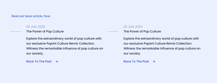
Whereas here we do have Visual Hierarchy:
As you can see, we have given much more importance to the title through font size and color, that is the first thing to read, and a secondary importance to the subtitles through the contrast and to the link, but through font weight we decided to make “Race to the post” more visible, to let understand users that it can be clicked. Notice that the dates are less visible since it is an information that demands less importance.
And with that, we conclude our exploration of typography and visual hierarchy. Armed with this knowledge, may you continue on your design journey, creating visually stunning and effective designs that captivate and communicate with clarity! Stay tuned for our upcoming discussions on other essential design principles and techniques.
Until then, keep honing your design skills and embracing the artistry of the visual world!

