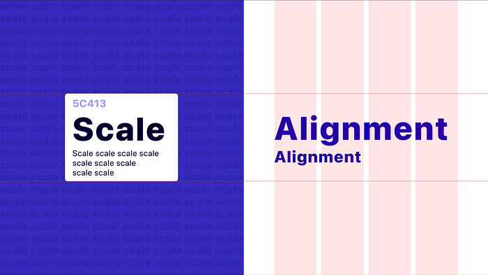
Visual Design Foundations: Scale and Alignment

Welcome back, fellow design enthusiasts! Our design expedition continues, and oh, what a ride it’s been! Last week, we danced in the delicate embrace of white space and reveled in the duo of contrast. Today, our spotlight shines on two more design pillars: scale and alignment.
Get ready to witness the magic unfold as we explore the power of size and the artful dance of perfect alignment. So, buckle up for another week of design delights, because the journey never stops, and the canvas of creativity keeps expanding!
Scale
Scale is a fundamental principle in visual design that refers to the size and proportion of elements in relation to one another. It allows designers to create visual hierarchy, emphasize important elements, and establish a sense of balance and harmony, helping you in generating creative layouts.
We have to make some considerations while applying scale:
- Should it be readable?
- How much space is available?
Should it be readable?
Paragraph texts should never be smaller than 16px (desktop size). The overall typescale should be adjusted to reinforce visual hierarchy which is the principle of rearranging elements to show their order of importance (we will cover it in the next article). Also headlines should be greater, and, for instance: dates can be smaller.

How much space is available?
It involves assessing the available space within a design layout and determining how the elements should be proportioned and sized accordingly.
Designers need to take into account the dimensions and constraints of the medium or platform they are designing for, as well as the overall composition and desired visual impact. By understanding the available space, designers can make informed decisions on how to effectively utilize and distribute elements to create a visually balanced and harmonious design.
Alignment
Alignment is that component that provides structure and flow to a layout. It creates a sense of order and cohesion in a design, ensuring that elements are visually connected and arranged in a deliberate manner. It helps guide the viewer’s eye and create a sense of visual flow. Whether using a grid system or aligning elements based on their edges or centers, alignment plays a crucial role in creating a polished and professional design. We “find” it in invisible vertical/horizontal lines that aligns elements.


And that concludes our deep dive into the fascinating world of scale and alignment in visual design! If you missed our previous discussions on whitespace and contrast, make sure to check out this article for a captivating exploration. Next week, we’ll unravel the final two elements of visual foundations: typography and visual hierarchy.
Stay tuned for more design insights and inspiration!


