Decoding colors: understanding hue, shades, tint, and tone
If you want to delve deeper into the design world, then you should definitely learn more about Colors and color theory. So let’s jump right into it!

Colors
First things first, what is a “color” in your design? Well, it is probably the most important element, it’s the skin of UI, with which you can make or break your interface.
In picking colors from our color wheel we should consider color schemes, which are recurring colors throughout the User Interface.
In general, it is important to select no more than 3 hues: Primary Color, Secondary Color & Accent (or tertiary color).
I know, I know, I’m using too much technicalities here, so let’s unravel the vocabulary of a designer!
Hue
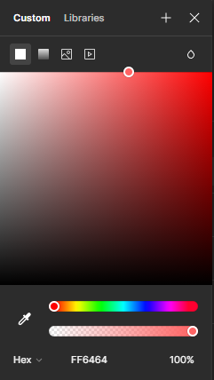
It is full color saturation. If you are picking colors on the color palette it corresponds to the picker all up-right

Tint
Starting from where we left, if we add more light to the color, then we are tinting it (or adding tint, as you like), by enhancing its brightness:

Shade
On the other hand, if we make it darker, then we are shading it (or adding a shade):

Tone
There’s one more change we can bring to our color schemes. If we are making the color more gray, then we are adding tone to it

And these are the main terms that you need to know about colors and color picking. After understanding these concepts, it is useful to know that there are several ways to create various color schemes. In fact they can be:
- Monochromatic: One hue with various tints, shades and tones. If you want to learn more about Monochromatic Design, then check this article by Abenezer Daniel;
- Analogous: Multiple hues located next to each other in the color spectrum. Curious about how to use Analogous color scheme in your design? I got you covered! Here’s an article by Vikalp Kaushik;
- Complementary: Hues located in an opposite position to each other on the color wheel;
- Experimental: Open to free changes but that respect the visual perception of color, resulting extravagant but still pleasant.
All these choices must be taken by considering the fact that each color has its own meaning, and it changes according to culture, religion. All of this lies in the realm of Color Theory, and now we’re going to get right in there.
Join me in the next article as we delve into the intricate interplay of hues, contrasts, and harmonies, unlocking the secrets to creating truly captivating visual experiences!

