Annotations: Google UX design professional certificate course (3/7)
Notes for the ‘Build Wireframes and Low-Fidelity Prototypes’ course, under the Google UX design professional certificate.
Wireframes and prototypes are the backbones of every tremendous digital product, laying the foundation for a seamless user experience that can make or break a product’s success. As the third course out of seven in the UX design professional certificate program, this course will equip you with the skills to turn your ideas into actionable wireframes and prototypes, allowing you to iterate and refine your designs easily.
In this article, I will dive into the key concepts and learnings from each week of the course, including developing low-fidelity prototypes, creating storyboards and identifying implicit biases and deceptive patterns in design. By the end of this article, you’ll have a comprehensive understanding of the wireframing and prototyping process, enabling you to create user experiences that are intuitive, streamlined, and effective.
Explore more from the Google UX Design Professional Certificate courses
- Foundations of User Experience (UX) Design: Notes | Course
- Start the UX Design Process: Empathize, Define, and Ideate: Notes | Course
- Build Wireframes and Low-Fidelity Prototypes: Notes | Course
- Conduct UX Research and Test Early Concepts: Notes | Course
- Create High-Fidelity Designs and Prototypes in Figma: Notes | Course
- Responsive Web Design in Adobe XD: Notes | Course
- Design a User Experience for Social Good & Prepare for Jobs: Notes | Course
Week 1: Storyboarding and wireframing
Use research to inform ideation.
- Ideation is the third stage in the design process where designers generate ideas to solve identified user problems.
- It follows the stages of empathizing with users and defining the problems they face.
- The goal of ideation is to generate a wide range of ideas for potential solutions.
- User research findings play a crucial role in informing the ideation process. Research provides insights into user behavior, experiences, and perspectives on the product.
- Formative or strategic research is conducted initially to build initial design concepts.
- Ongoing research with users and prototypes informs the actual design of the product.
- Tools such as empathy maps, personas, user stories, and user journey maps can help create a problem statement that describes the user’s needs to be addressed by the design.
Create goal statements
- Goal statements define the desired outcome and purpose of a product or design in a concise and specific manner.
- They specify what the product will enable users to do and how it will positively impact them.
- They guide the design process, ensuring alignment with user needs and serving as a guiding principle throughout product development.
- Goal statements establish a clear focus for design and provide a basis for evaluation and iteration.
![Template to create a goal statement: “Our [product] will let users [perform specific actions] which will affect [describe who the action will affect] by [describe how the action will positively affect them]. We will measure effectiveness by [describe how you will measure the impact].”](https://miro.medium.com/v2/resize:fit:1400/1*D3L5p0gzqUlvtt87bCLvlA.png)
By bridging the gap between user problems and design solutions, goal statements outline the transition from problem to solution.
- Reviewing the problem statement (to determine the who, what, why, and how) aids in understanding user needs and challenges, informing the crafting of the goal statement.
- Measurable success metrics should be incorporated into the goal statement.
- Goal statements address the target audience, product functionality, and the problem it solves.
Outline user flows
- User flow is the path a typical user takes on an app or website to complete a task.
- They help map how users achieve a specific goal in a product before the design process begins.
- User flows help visualize the user journey and inform design decisions.
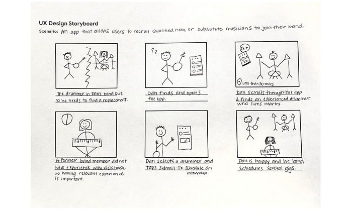
Create storyboards
- Storyboarding is a valuable tool for ideation in UX design that helps outline an ideal flow for the design.
- Storyboards visually describe and explore a user’s experience with a product.
- Storyboards help visualize potential solutions to user problems and can be used to communicate ideas to stakeholders.
- Critical elements of a storyboard include character, scene, plot, and narrative.
- The character represents the user, the scene sets the user’s environment, the plot showcases the design’s benefit or solution, and the narrative explains the user’s need or problem and how the design addresses it.
Big Picture Storyboards:
- Big-picture storyboards focus on the user experience, challenges, pain points, and interactions.
- They focus on the most essential parts of the user’s experience.
- Emphasize what the user needs, their context, and how the product will be useful. Emotion should be the key deliverable.
- Steps: problem statement, goal statement, setup storyboard, add scenario, draw one idea per panel, highlight user pain points.
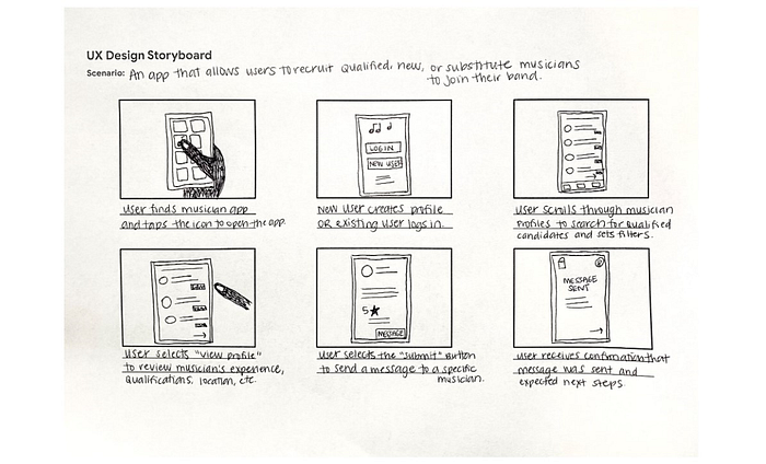
Close-up storyboard:
- Close-up storyboards focus on the product itself, including what happens on each screen, how the user transitions from one screen to another, and potential problems with the flow.
- By creating a close-up storyboard, designers can demonstrate the user flow within a product and how each action within the product will lead to the next screen.
- Only a few key screens need to be sketched in a close-up storyboard, and it’s unnecessary to include every part of the product in detail.
- Close-up storyboards are less focused on emotion and more focused on the practicalities of the product.
- For creating a close-up storyboard, follow the same initial steps as big picture storyboards: problem statement, goal statement, setup storyboard, and add scenario. Follow by focusing on the product itself, showcasing how it works.
- Decide which product details to highlight in each panel and show the user’s actions leading to the next screen.
Working with wireframes
- Fidelity in UX refers to how closely a design resembles the final product in terms of look and feel.
- Low-fidelity designs are rough and unfinished, allowing for quick ideation and exploration.
- High-fidelity designs closely resemble the final product and are used for testing and obtaining specific user feedback.
- Wireframes are basic outlines of digital experiences (e.g., apps, websites) that establish the basic structure of a page before visual elements are added.
- When creating wireframes, consider how to organize information in a way that makes sense for users and highlights the intended function of the product.
- Wireframes aid in organizing and communicating information to colleagues for implementation.
- Skipping wireframing can lead to problems and revisions later in the design process.
Benefits of creating wireframes:
- Wireframes are simple, making it easier to make decisions about the structure of the design early on.
- Stakeholders can focus on structure rather than details.
- Wireframes serve as a guide, saving time and effort.
- They facilitate quick iteration and exploration of design ideas
Week 2: Creating and organising wireframes
The basics of information architecture
- Information architecture (IA) organizes content to help users understand where they are in a product and where the information they want is.
- Effective IA is informed by many sources, such as user research and the ways that existing products in the market are structured.
- IA helps stakeholders review your designs and helps engineers understand how to organize the data.
- IA should be flexible and should allow for the addition of additional categories in the future.
- Sitemaps visually represent information architecture.
- Creating a clear IA helps UX designers understand how the different screens in the app will fit together and how the user will navigate between those screens.
The information architecture of apps
- Information architecture comprises of three parts:
- Organization: This refers to how different pieces of information connect within a product. It’s important to create clear connections and relationships between information so that users can easily navigate.
- Hierarchy: This helps to create a clear structure and categorization of information.
- Sequence: The sequence enables users to move through an app via certain orders or steps. This is particularly important for apps that have a specific flow or process, such as a shopping app or a task management app.
The eight basic principles of information architecture:
- Object principle: Content should be viewed as “living” and should change and grow over time.
- Choice principle: People think they want to have many choices, but they actually need fewer choices that are well-organized.
- Disclosure principle: Information should not be unexpected or unnecessary.
- Exemplar principle: Humans put things into categories and group different concepts together.
- Front door principle: People will usually arrive at a homepage from another website.
- Multiple classification principle: People have different ways of searching for information.
- Focused navigation principle: There must be a strategy and logic behind the way navigation menus are designed.
- Growth principle: The amount of content in a design will grow over time.
Create paper wireframes
- The goals of creating wireframes are to establish the basic structure of a page and to highlight the intended function of each element.
- Paper wireframes are the fastest way to get your idea out and are inexpensive because no fancy tools or software are required.
- Before drawing, it’s helpful to write a quick list of the information that needs to go on the page you’re drawing wireframes for.
- It’s a good rule of thumb to try to create at least 5 different versions of how you want to structure information on a page.
- Be creative and try new ideas, even if they feel like a ridiculous layout, because that’s how innovative ideas are born.
Transition from paper to digital wireframes
- Paper wireframes are a great starting point for UX designs, but digital wireframes allow for more attention to detail.
- Before moving on to digital wireframes, ensure your paper wireframes are complete, have received feedback, and are ready to consider basic visual cues.
- Use actual content for important pieces of text, but for large chunks of body copy, use placeholder text like Lorem ipsum.
- Hold back on adding expressive content like colour or images to your wireframes until working on prototypes.
Gestalt’s 7 Principles:
- Gestalt Principles describe how humans group similar elements, recognize patterns, and simplify complex images when we perceive objects.
- Gestalt principles can be applied to organize content on apps and websites so it’s visually pleasing and easier to understand.
- Figure-Ground: the brain automatically separates objects into a foreground and a background and focuses on the object in the foreground.
- Similarity: elements that look similar are perceived to have the same function.
- Proximity: elements that are close together appear to be more related than things that are spaced farther apart.
- Common region: means that elements located within the same area are perceived to be grouped together.
- Continuity: elements that are arranged in a straight line or curve are perceived to be more related than those that are not.
- Closure: when an object is incomplete or partially obscured, the brain fills in the missing information to create a whole object.
- Focal point: whatever stands out visually will capture and hold the viewer’s attention first.
Other principles:
- Symmetry: symmetrical objects are perceived to be more organized and pleasing than asymmetrical ones.
- Common fate: elements that move or change in the same direction or at the same time are perceived to be grouped together.
The design of an app or website may be subjective to the user’s interpretation, but the design itself is not subjective.
Week 3: Ethical design
Learn about low-fidelity prototypes.
- A prototype is an early model of a product that demonstrates its functionality without building the entire product.
- A low-fidelity prototype is a simple interactive model that provides a basic idea of what the product would look like.
- The goal of a low-fidelity prototype is to make your designs testable so that you can collect and analyze feedback early on.
- A low-fidelity prototype can be on paper or digital.
- The biggest difference between a wireframe and a low-fidelity prototype is the interactivity or the ability to click from one screen to another.
Recognize implicit bias in design
- UX designers can be affected by implicit bias, which is attitudes and stereotypes we associate with people without our conscious knowledge.
- Implicit bias can have detrimental effects on those who are the subject of the bias, such as qualified people not being hired or even being terminated unfairly.
- UX designers need to be as inclusive as possible when creating personas and understanding user needs.
- Personalizing onboarding messages by addressing users directly can exclude important users and reinforce stereotypes.
Being aware of implicit biases and combating stereotypes is important to work for UX designers to build more equitable user experiences.
Identify deceptive patterns in UX design
- Deceptive patterns are UX methods that trick users into doing or buying something they wouldn’t have done otherwise.
- The use of deceptive patterns has only increased since it was first called out. They exclude, belittle or mislead users.
- Deceptive patterns are ethically wrong and not a good business practice
Once users notice they’re being purposely deceived, they can lose respect and trust for a company’s brand
- Forced continuity involves charging a user for a membership without a warning or a reminder; as a UX designer, be upfront and transparent with users, notify them before their free trial ends, and make it easy for them to cancel their membership.
- Sneak into basket occurs when an extra item is added to a user’s shopping cart while checking out; make sure no boxes are pre-selected that add items to a user’s cart, and avoid surprises.
- Hidden costs involve hidden or unexpected charges in the user’s cart that are not revealed until the end of the checkout process; provide users with all pricing-related information upfront, and make a calculator available during shopping to help them calculate extra costs before checking out.
- Confirmshaming occurs when users are made to feel guilty when they opt out of something; be careful about the words you are using on buttons and confirmation screens to avoid manipulating the emotions of your users.
- Urgency involves attempting to convince users to purchase an item before they run out of time and miss today’s “amazing” price; be careful about how you are utilizing urgency and ensure you aren’t using this deceptive pattern to manipulate your users into making sales quickly.
- Scarcity occurs when a website makes users very aware of the limited number of items in stock; be honest about the stock availability, and avoid misleading users.
Understand the attention economy
- Information is readily available, but attention remains a limited resource.
- Attention refers to selectively focusing on certain stimuli while disregarding others.
- UX designers must consider the impact of their designs on users’ behavior in the attention economy, which involves competing for users’ attention.
Humans have limitations in their ability to think and perform multiple tasks simultaneously; multitasking is a myth.
- Technology should assist users rather than distract them, as distractions hinder task completion.
- Designers should avoid encouraging addictive behaviors that could negatively impact users’ lives.
- Respecting users’ time, attention, and experiences is crucial for keeping the focus of design on people and their needs.
- Several design trends in the attention economy can degrade the user experience, including attention-grabbing animations, cluttered designs, and intrusive ads.
Understand your impact as a UX designer
- Ethical design requires considering the societal impact of your design work.
- Consider the differences between yourself and the users of your product, and strive to make people from non-dominant cultures feel included.
- Pay attention to the challenges faced by specific groups or backgrounds and design products that are inclusive and accessible to all users.
- Marginalized populations, including people with disabilities and limited technology access, should be considered in design.
- Underrepresented populations, such as people of certain genders, sexualities, and ethnic backgrounds, should also be included in the design process.
- Good UX design anticipates edge cases, which are unforeseen situations that may arise.
Inclusive design is about designing for all users, not just a “normal” or “average” person.
- The products you design will be a part of the users’ lives, but they should not:
- Consume or control the user.
- Promote addictive behaviours.
- Promote unhealthy relationships between the user and a device or an app.
- Take advantage of the user.
Conclusion
The ‘Build Wireframes and Low-Fidelity Prototypes’ course by Google on Coursera is designed to equip designers with essential skills that enable them to create impactful user experiences while emphasizing the significance of design ethics. Through comprehensive modules on goal statements, storyboarding, and low-fidelity prototyping, this course provides a deep dive into the tools and knowledge necessary to transform creative ideas into intuitive and inclusive digital products. By placing a strong emphasis on prioritizing user needs and ethical considerations, designers are empowered to contribute to the development of user-centric designs that make a positive and meaningful impact on society.

