Zephyr- Auction house UX Case Study
I designed this conceptual application and website as a personal project, with the structure of a Google UX Design course.
The Product: Discovering extraordinary art and rare objects is easy with Zephyr. We empower our international community of collectors and connoisseurs to discover, acquire, finance, and consign fine art and rare objects. Browse a custom feed curated to your tastes of art categories, artists, and makers- and get notified about lots you are bidding on or interested in so you don’t miss an opportunity.
Project Duration: November- December 2021.
Role: UI/UX Designer, and Researcher.
The Challenge: The art world, particularly the auction world, is a very exclusive industry. Comprehensive art knowledge isn’t readily available alongside the capacity to purchase art from smaller artists and vendors.
The Goal: Creating an inclusive app that connects collectors to art from leading auction houses, nonprofit organizations, and sellers across the globe, so they can find works by their favorite artists — and discover new ones — all in one place, as well as provide a means for users to invest in that art.
Responsibilities: Conducting interviews, paper, and digital wireframing, low and high-fidelity prototyping, conducting usability studies, accounting for accessibility, iterating on designs, and responsive design.
Stage I — Preliminary Research
The first step in the process was to identify and research the direct competitors that existed in the market and had a diverse user base. Some of the art brokers and auction houses that I identified were companies that I had heard of in the past, namely Artsy, Google Arts and Culture, and the auction houses Sotheby’s and Christie’s.
The direct competitors being Sotheby’s, Christie’s, and Artsy- all auction houses that incorporate user experience, ecommerce and digital product design into the heart of their art market operations.
Google Arts and Culture is the only indirect competitor. It gives users the art knowledge but has no e-commerce capabilities. It has a very modern and new-age feeling to it. The app is visually appealing with great use of colors, well-structured and familiar layouts. App and website reviews state that users felt overwhelmed at times with the number of options that they were presented with.
Artsy has a design that is easy to use and highly informative. The main feature that the product focuses on is that the users can buy or sell artworks through the app. Also the only art broker or auction house with a wide range of prices- not just luxury art. However, Artsy does not have a clear feature by which the user can search for an artwork depending upon various factors like the era of the work or the region it originates in.
Both Sotheby’s and Christie’s have a real editorial, almost magazine feel to them. Reading up on their UX strategies, their buyers and bidders are upwards of 33% more likely to transact with them if they consume some of their editorial content. So their app design and site design is increasingly a marriage between curated editorial and traditional commerce and auction methods.
Stage II — Primary Research
For primary research, I conducted 1:1 zoom interviews with 5 people between the ages of 18 to 65 years, from various educational backgrounds as well as people with varying degrees of interest in art.
The interview questions aimed to understand their overall tone while using the application. The participants were then asked to enlist their pain points and also general challenges that they might have faced during the process. Suggestions as to how these challenges could be overcome were also enlisted by the users.
Finally, all the users were asked whether they would use similar applications in their regular life.
For secondary research, I read articles and user reviews on the apps and websites.
A few of the interview questions asked:
- Can you describe the importance of art in your life and how it’s defined your way of thinking?
- How often do you spend your time understanding or creating art and what is the motivation behind it?
- Who are some of your favorite artists and how does their work connect with you?
- What type of information would you like to know about art objects/pieces?
- How often do you visit/follow live auctions?
- Have you ever tried any mobile action app for online bidding?
- Do you feel secure when paying online?
- Do you trust the authenticity of the art pieces you see online?
- What were some of the positive takeaways from using the applications?
- What were some of the challenges you faced while using these applications and how did that make you feel?
- Is there a way in which you feel these challenges could be resolved?
- Would you use such applications in the future and why?

User Pain Points:
Collating the insights from the participants, it was evident that most users faced problems with either navigational issues, a lack of art knowledge, or a want to be as well informed on a piece as possible to prove the authenticity of it.
Users want to be engaged, to interact with art. In most cases, to feel more emotionally connected to it or the artist, in others, to gain insight on a piece they’re vying to collect.
Personas
Based on the findings, certain types of users were identified.
A. Users who want to use the app to diversify their understanding and collecting knowledge.
B. Users who are avid art collectors and want to have access to high-level auctions/events/exhibitions details, and register for them without having to switch between various applications.

Journey Mapping for user personas

I created three user journeys/experience maps on different scenarios to visualize the process that users would go through in order to accomplish their goals.
Sitemap
My goal here was to make strategic information architecture decisions that would improve overall website navigation. The structure I chose was designed to organize all the incorporated possibilities of an auction house.

Ideation
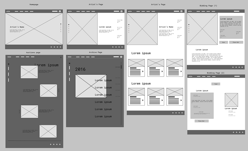
Once the initial framework of the application was ideated, I sketched out paper wireframes for each screen in the app (and because Zephyr’s users access the site on a variety of different devices, I started to work on designs for additional screen sizes to make sure the site would be fully responsive) keeping the user pain points about navigation, browsing, and checkout flow in mind.

Digital wireframes


User Testing
To further understand how the app impacts the user’s minds, I created a prototype with the existing wireframes to test with potential users in a Semi-moderated Usability Study with 5 Participants.
The term semi-moderated was used because the process of understanding the user’s feedback on the prototype was through an interview in which I was there to help the participant in case they needed the guidance. This not only helped the user to efficiently participate in the interview but also helped me understand and recognize similar patterns of difficulty among various participants.
The key performance indicators for the usability study were:
- Time on Task
- Completion Rate
- User Error Rates
Through testing, I discovered the following:
My initial plan of action for the wireframes was to modernize the approach to the auction house. I wanted to instill the foundation and information architecture of other auctions houses while maintaining the design as minimal and contemporary as possible. These features were shown to have significant room for improvement.
- Most users had an issue with the navigation of the (Web) Prototype archive and auctions pages. Users were confused and didn’t think the information was being positioned in a practical way. Too scattered.
- Users found the lack of filters on the search page to be unserviceable. Specificity in a medium that offers so many options simplifies the process significantly.
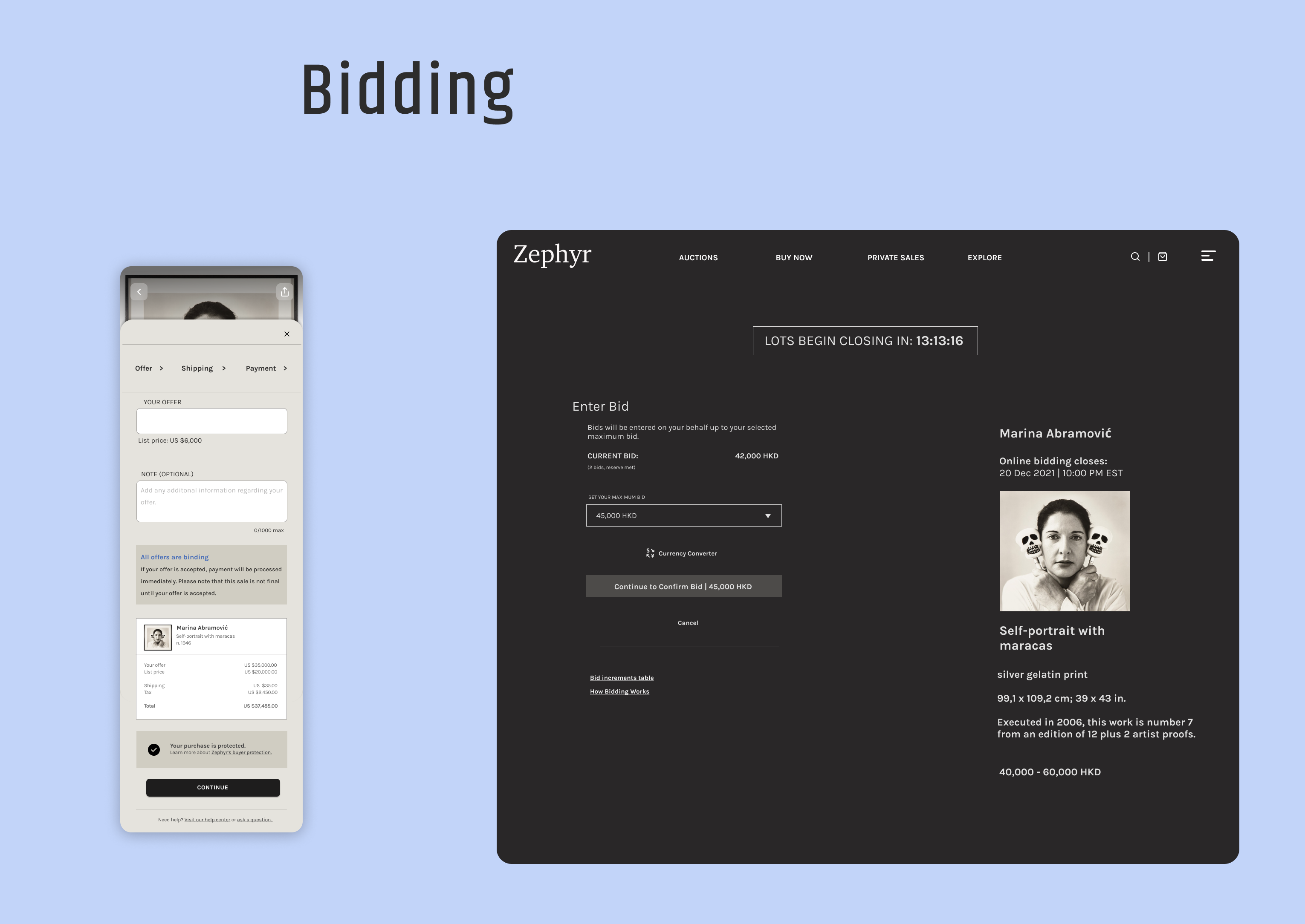
- Users were concerned with the possibility of there not being a (Mobile) function to track your bids and watch lists, no news content, and no currency conversion rates.
The discrepancies led to an obvious increase in the time on task and a decrease in the completion rate.
Due to the shortcomings in the navigation, the user engagement would be significantly affected hence making the app less immersive.
The focus of the rebuild would be utilizing the feedback to simplify the features and maintain a familiar yet new approach to the design.
Final Iterations
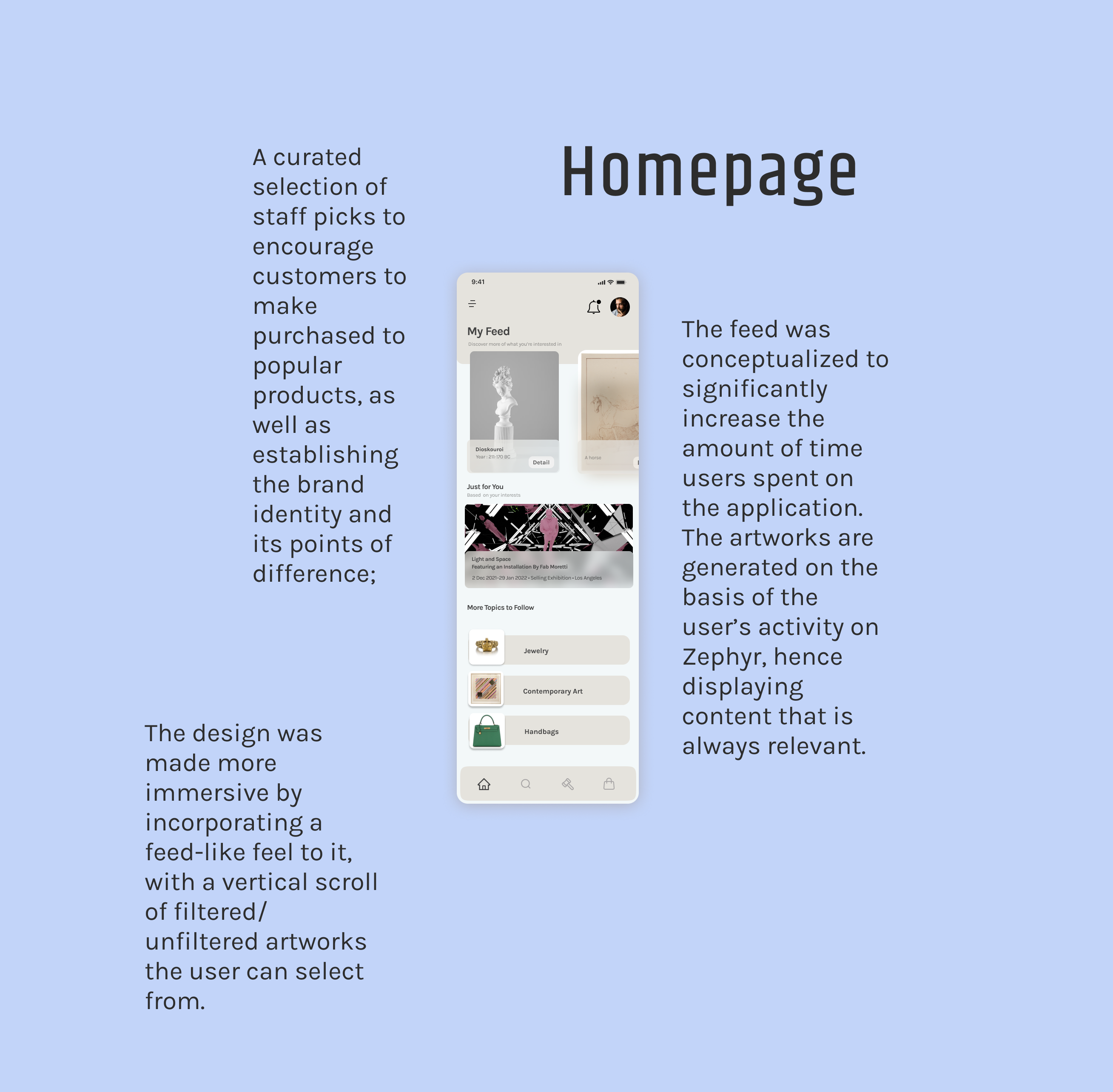
My goal while designing the higher fidelity final iterations was to make sure every decision I made was intentional and addressed the purpose of solving the pain points and potential worries of the users.


The Search screens were given a lot of importance in the designing process as the feature creates the maximum amount of engagement in the user base for those who are looking to view and read about artworks or artists.


Next Steps
Conduct another round of usability studies to validate whether the pain points users experienced have been effectively addressed. Conduct more user research to determine any new areas that need to be updated.
Conclusion
Through this, I came to understand that, while most auction houses want investment at the forefront of users’ minds, newer users were looking for something else. They wanted art to be financially and intellectually accessible. This project was a reminder that the best laid plans in design boil down to the needs and wants of the users we design for.
In future iterations, I’d like to continue exploring and developing the following:
- Augmented Reality viewing features
- Virtual Reality Gallery Tours
- Live auctions from within the app
- Payment plan options
- Gallery and Artist Collaboration
- Fractional Ownership of Art
Thank you for reading! if you have any questions or you’d like to reach out, don’t hesitate to contact me on Linkedin, Behance, Instagram, or email- (ElleDiazMorales@Gmail.com)

