Zap — Crypto bridging made seamless: a UI/UX case study
Buckle up! This case study takes you through the design processes and decisions that went into the design of Zap, crafted to provide a seamless, relaxed crypto-bridging experience for users.

As part of the 10k Designers UI/UX Design Cohort, I worked on the capstone project for Spacekayak to design a delightful bridging interface and crypto bridging flow. I chose to design for the mobile experience. The duration of this project was 3 weeks.
Psst! Catch a Glimpse of this app here 🫣
Setting Context 🔦
Web3 is an interesting technology that will open doors to various new possibilities. Since its existence, various cryptocurrencies have been created and used to invest, buy things, and even play games. However, these digital assets were locked up in different blockchain networks. So, if you wanted to use your ETH tokens on the Ethereum blockchain to play a game on the Solana blockchain, you couldn’t do so.

This is where Crypto Bridges come in. Crypto bridging allows the transfer of digital assets between different blockchain networks. This means that you can now bridge your ETH tokens on Ethereum to Solana to play that game on Solana. Currently, this crypto bridge has some problems that make it difficult for users to wrap their heads around it. However, this is pivotal in leveraging the full potential of decentralized applications.
The reason why I chose this is that I had very little knowledge about web3 myself and when I tried using a bridge, it was confusing and intimidating. That personal(painful) experience is exactly why I wanted to work on this project.
The Problem Soup 🍜

To begin with, I had no idea what crypto bridging meant xD. I surfed through the internet and thanks to Spacekayak’s solid resources, I got a hold of the concept.
I went ahead and tried bridging some tokens myself. Boy, I barely escaped a panic attack! I had this constant fear of losing my money. Among those, I gotta give a shoutout to Obvious, who has a relatively smooth experience.
Furthermore, I searched through Twitter and subreddits to gather some insights about bridging experiences from people who have used it. Every subreddit on crypto bridging has nothing but problems. People were ranting about
- how their money got stuck
- how hard it is not knowing the status of their assets while bridging
- how misleading some information was which resulted in transaction failure
- not knowing why is it taking forever to bridge their assets
After gaining these insights, I understood what the problem was with these bridges and felt the solid need for a solution.
Personal Goals 🎯
After understanding the problem, I set some goals for myself, because I believe that having clear goals gives directions to move into the project.
- Make crypto bridging seamless, like ordering food.
- Make people less anxious by making an enjoyable experience.
- Learn how design works in web3 and keep improving.
There were some of the deliverables for this capstone project by spacekayak
- Bridge interface visual design.
- Prototype of user flows.
- Error states and success states while designing.
- Process overview of research, finding problems, & designing solutions.
Secondary Research🕵️♂️
I prominently did secondary research, surfing through Reddit, Twitter, and crypto discussion forums like Polygon, polkadot. Also, I tried out other bridging apps to get first-hand experience.
The dilemma
- Crypto bridges play a vital role in DeFi and Web3 gaming by helping users bridge their assets to avail benefits on multiple chains. The whole concept of multichain stems from this, and some people think that “Multichain Sucks!” To some extent, this is true; however, if we consider the reasons behind this, we can see that poor user experience is prevalent almost everywhere.
- Every digital product deserves a good user experience, crypto bridging is no exception. Although design can’t solve many things like hacks, network traffic, etc. the user can be informed about this to reduce panic.
- I found out that basically, users are kind of in a dilemma while choosing between bridges because there are two types of bridges
➢ Trust-based: Users have to trust the reputation or identity of a centralized bridge and deposit their funds on the bridge.
➢ Trustless — leverages algorithms and smart contracts over a blockchain network, eliminating the need for central custodians. - While the trustless bridge comes with the risks of higher gas costs and longer wait times, the trust-based bridges bear the concerns of censorship due to centralized control.
- However, there are some bridging authorities like Obvious which are completely transparent on the bridging route (they use decentralized bridges), helping the user to take a decision.
Source — 101Blockchains, Coinpedia
Frustrations
I explored various other bridging apps and have gained an idea of the users’ frustration part from the reviews in the play store and app store.
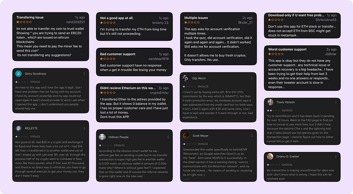
ISTG if you go through any subreddits or Twitter threads mentioning crypto bridging, you will find a hell load of problems and frustrations. The main reason is that users come with expectations from web2 UX standards, they have been using it all their life, so it’s only fair for them to have expectations.
Source — Biconomy, uxcontent, Tim Daub blog,
Key Insights 🗒️
As I mentioned earlier, I went through a lot of forums and Subreddits where I could gather a lot of problems pointed out by users and consolidate them. Based on my research, here are some key insights:

After all, it is our duty to make the users feel at ease and guide them through the experience.

Source — Subreddit 1, Subreddit 2, Polygon forum, UX in Web3 — Reddit
Competitor Analysis 👀
I was blown away, going through all these, and was also curious about the common patterns that other bridging apps/websites follow, so I went through similar bridging dapps(competitors) to get an idea of how things work by actually bridging a few tokens, thanks to Spacekayak!

Here are some of the common patterns that I observed from various bridges,
- Wallet info should be there to keep the user aware of the scenario.
- The tokens and the chain info should be prominent.
- Once the user chooses the amount and chain, they will have to sign the transaction (This might happen twice in some cases)
- Transaction progress — giving real-time updates on limited info about the transaction. Most of the bridges didn’t have this, kudos to Obvious, they did a nice job on this one.
- Transaction success — Some bridges show details of the transaction, how much time it took, transaction hash, etc.
Ideation 💡
After getting an idea of these patterns, I came down to a few basic things that the app should be able to do such that it makes the whole bridging experience seamless and relaxing.

- The app should be able to convey technical glitches like long transaction times, and gas fee hikes transparently to the user, through jargon-free copy and intuitive UI.
- It should show only those details which are simple and easily understandable upfront like gas fee, time, and network fee.
- In case of a failure or error, communicate the proper reason in simple terms and make sure to carry the user onward.
- The app should provide clear information to users regarding the type of token they will receive upon completing the bridge.
- Furthermore, there should be an engagement factor in place to keep users occupied and at ease during the transaction process. Because…

I followed a dynamic design process where at any point if anything doesn’t seem to go well with the flow, I could always come back and iterate on any step.
Mapping the experience! 🧭
After getting a hold of what are the main features of this experience, I went straight to Figjam and started mapping out the sitemap. (obviously iterated after a while)
The sitemap gives an overview of the steps from connecting the wallet to bridging tokens successfully.

Going further, I then made a detailed Information Architecture for the app, which involves all the detail that goes inside every single page of the flow.

It’s Skeleton time! 🩻
After getting clarity on the app’s flow and Information Architecture, I started sketching some wireframes which helped me outline the solutions.

The Visual Harmony 🎨
I created a style guide, which helped me achieve consistency and create intuitive interfaces throughout the app.
- I chose two typefaces: Technor and SF Compact Display. Technor gives off a techie, futuristic vibe which did well for crypto and SF Compact has a more legible and simple typographic voice.
- I chose purple as the primary color because it gave a bit of a cyberpunkish techno vibe, which I thought could suit well for a futuristic tech like crypto.

Time for some Visual jutsu! 🌸
Alright, let’s talk visuals now!

1) Home Screen
Once you Open the app, you will be asked to enter your name and that’s it you will then be taken to the home screen straight, where you could see only a few things, the important ones that have a use case there
- A CTA to connect the wallet
- Another CTA to bridge tokens
- Trending tokens, as per the market cap
Edge case: If a user clicks ‘Bridge’ when wallet isn’t connected, the user will be asked to connect it first via a popup message.

2) Connecting Wallet
I adapted the most followed way of importing wallets, by entering a seed phrase or private key. User can choose their wallet provider, enter their seed phrase, and then whoosh, they got their wallet in!

3) Bridge: Selecting Wallets

This is the part where the user will spend most of their time, So I revisited the goals that I have set before designing this app.
The wallet selecting flow involves two separate steps
Step 1: The user has to select the origin wallet (from which they are going to bridge their tokens).

Step 2: The user then proceeds to select the destination wallet (to which they want to bridge their tokens).

Also, when the user wants to bridge to a different wallet, they can do that from the secondary CTA below the wallet list, which will help them enter the wallet address to which the tokens will be sent after bridging.

Info Card — Custom Destination wallet
The wallet info card in the custom destination wallet flow took a lot of iterations and thoughts to finalize.
- The wallet name should be easily recognizable to the user and it should not embark on misbelief.
- Also visually, I was stuck at a point that How could I represent a custom wallet using wallet logos? Unlike the usual case, this one can’t be associated with any wallet logo because here we don’t know the wallet provider from the wallet address.

I brainstormed with ChatGPT and came to the conclusion that a simple wallet icon would be the perfect choice to represent this case visually.
4) Bridge: Select token and chain
Now then, once the user settles in fixing the wallets, they can proceed to choose tokens. This page shows them the list of tokens the user holds in their origin wallet.

Once the user selects the token, a list of chains that support this token are shown from which the user can choose one.

5) Bridge: Entering Amount
After successfully selecting the token and chain, the user can proceed to enter the amount of tokens they want to bridge. This page features a bill/receipt kinda design, I thought it could embark some sort of familiarity with the real world.

6) Bridge Details
Below the amount card, a details menu displays the important details about the transaction. I used the MoSCoW framework to determine which details should be presented upfront.
- Gas fee: shows the gas value and the specific token used for covering the fee which helps user to check whether they have enough.
- Estimated time: shows the approximate time it might take to complete bridging.
- Other fees: shows the value and specific token associated just like gas fee and the copy avoids creating confusion.

Wait, there’s more! This decentralized technology works on a trustless basis, the least we can do is be transparent and show all the info. But what if the user feels overwhelmed?

After a lot of experimentation, I found the golden egg: a folded menu that is collapsed by default. When clicked, it expands and shows all the advanced details that anyone might need to view.


Sometimes, the user might want to bridge all of their tokens, which is completely okay. However, the origin chain uses its native tokens as gas fees. The user might not be aware of what the native token is.
For example, if the user bridges DAI from Optimism to Polygon, where the gas fee is calculated on ETH, which is the native token of Optimism. The user might think they have enough DAI to cover the fees. However, gas fees use ETH, which they may not have enough of to carry out the transaction successfully.
How can we educate the user?
- The details menu already shows the token used to calculate the gas fee.
- When the low balance message pops up, the user can tap the details button to open the menu which shows what they are lacking and how much more they might need to cover the fees.

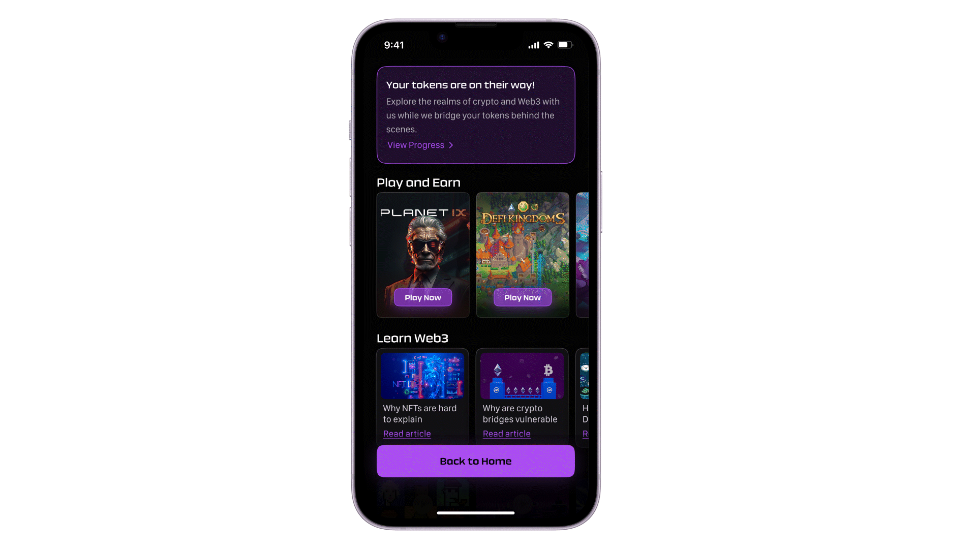
7) Bridging Begins! 🚀
Once the user enters the right amount and signs the transaction, the bridging will begin. They will then be taken to a page where they can explore the world of crypto while their tokens are being bridged. This reduces the anxiety that users may feel while waiting on the progress page.
At the same time, the users can seamlessly switch between the Explore and Progress pages with just a tap on the progress widget. It is at the top making it easy for the user to keep an eye on the progress.

So what exactly do the users get to explore?
Basically, there are 4 different sections here
- Play and Earn: features various popular web3 games to play
- Learn web3: provides articles on confusing web3 topics
- Binge Time: tutorials and podcasts to help users leverage web3
- Quests: features interesting quests that with cool rewards
The reason why each section contains only a limited amount of content is that the app is designed for bridging tokens, and I don’t want to pivot users away from that purpose.
8) Transaction Progress
The Progress page features an informative asset flow, showcasing the step-by-step process of token bridging.


Once the bridging is all done and dusted, a notification pops up, and guess what? Even after that, the user can still check out the asset flow and the nifty details menu if they need to.


9) What If? 🤔
Although decentralized transactions use cutting-edge technology, there’s still a chance of encountering failure due to various reasons.
But worry not, I’ve designed a solution that will not only explain why the transaction failed but also provide the user with the current status of their tokens and will guide them on what they can do next.

10) Support 🫂
Web3 might be a bit like exploring a whole new galaxy for some users. And transitioning from Web2, users might have some expectations in Web3 too. That’s totally normal!
If the user ever feels a bit lost or needs a guiding hand, it is super easy to access help from anywhere in the bridging process. Just a tap away, and boom! They are right in the middle of all the support they need — forums, FAQs, communities, you name it!

Notification System 🔔
Notifications keep the user updated on the progress of the bridge, even if they are away intentionally or unintentionally. Here’s how it works:
- When the user exits the app and returns later, they will see the progress of the bridge displayed at the top of the home screen ensuring they won’t miss it.

- In today’s fast-paced world, nobody likes to be idle, constantly checking the progress of the bridge. Once the bridging process is initiated, the user can return to their normal activities and will receive a push notification when the bridge is complete or has failed.

- Additionally, live activities on the iOS lock screen provide users with live updates on the progress of the bridge without them having to open the app.


What did this project teach me? 🙇♂️
Throughout the course of my case study, I have gained many valuable insights and learned some really important lessons.
- Understanding the world you are designing for: is crucial to understand the intricacies of the world, to be aware of limitations, and possibilities, and to have a clear idea of what to expect.
- There is no fixed framework in the design process: I realized that following a template is like putting oneself inside a box. This realization allowed me to embrace creativity and think outside the box.
- Iterations unlock perspectives: it becomes a crucial aspect of your design journey, ensuring that the final product meets the highest standard possible.
- Setting goals helps you from being lost: By defining goals at the beginning, you never lose sight of the ultimate objective and stay on track throughout the design process.
- Master the tool to Master the craft: leveraging the tool to its fullest potential is like a superpower. I used components and variants in Figma extensively to maintain consistency within my designs, which helped me create a cohesive visual language.
- Finally, I learned that designing for Web3 is a whole different ballgame. The users in this realm are akin to babies, requiring a deep understanding of their expectations and needs in order to create a seamless experience.
Prototype📱
Try out the bridging experience for yourself here
And that’s a wrap! 🥳
Thank you for sticking around till the end. If you are reading this, I am grateful for your time and attention 💟
Working on this project was a complete roller coaster ride for me. I hope you enjoyed the case study 😋
Let’s Catch Up! 🤝
Got any feedback or just want to chat? Book a call with me or just drop a DM on Twitter or LinkedIn. I’d be super glad to have a chat!
Also, I’m actively looking for full-time Product Design roles. If you have any cool opportunities, Do reach out to me via vignesux@gmail.com


