Here Are 10 Wireframing Tips Every UX Designer Must Master! 🔥🔥🔥

Perhaps your new to UX and you want to learn about wireframes, or maybe you’re currently enrolled in a UX bootcamp and those pesky graders keep on telling you your wireframes just aren’t quite good enough. Regardless of your background this article will provide you with best practices when it comes to wireframing.
Make Sure You Have a Userflow
Before you begin wireframing make sure you have created a userflow that depicts how your applications navigation will work. This functions as a blueprint for your wireframes and save you a lot of time thinking “What screen should come next?”
Start Out On Paper
I know you’re probably wondering “Why should I start out on paper when it will eventually be digitized?”. The reason being is that there are a lot of different ways you can imagine laying out your application and this is the fastest way to go about creating them. In fact this method is extremely popular among larger design centric companies such as Intuit — the Turbo Tax people — and is used in the popular Crazy 8s design exercise.
Time Isn’t a Constraint
Perhaps you aren’t worried about time and you just want to get this right on the first try; is there still a benefit to paper? Well yes, there is. When designers create artifacts digitally they tend to put a lot more focus on the alignment, spacing, etc. This will take your focus away from the primary goal of wireframing–Information Architecture–but if you must create wireframes digitally I would recommend using Balsamiq. They’re one of the few design applications that is designed specifically for wireframing.
With this being said, if you do decide to go with paper wireframes, make sure they are clean and easy to read. You don’t need to be an artist to create them, but make sure your stakeholders can tell the difference between a square button, an image, and your app bar.
No Color
Keep your design greyscale. This will ensure that your stakeholders focus on the layout and not whether or not they like the fact you decided to use twitter’s blue for the navigation bar.
Keep It Simple
Wireframes are tools to communicate with stakeholders more than anything else. This is a common theme among many UX artifacts created during the early stages of the design process. Because of this you want to keep them as simple as possible
- Make sure they’re grey scale
- Have minimal content
- Put an extreme emphasis on information architecture
The whole purpose of wireframes is to create different layouts and test Information Architecture in an efficient manner. For this reason you want to stick to the three points mentioned above.
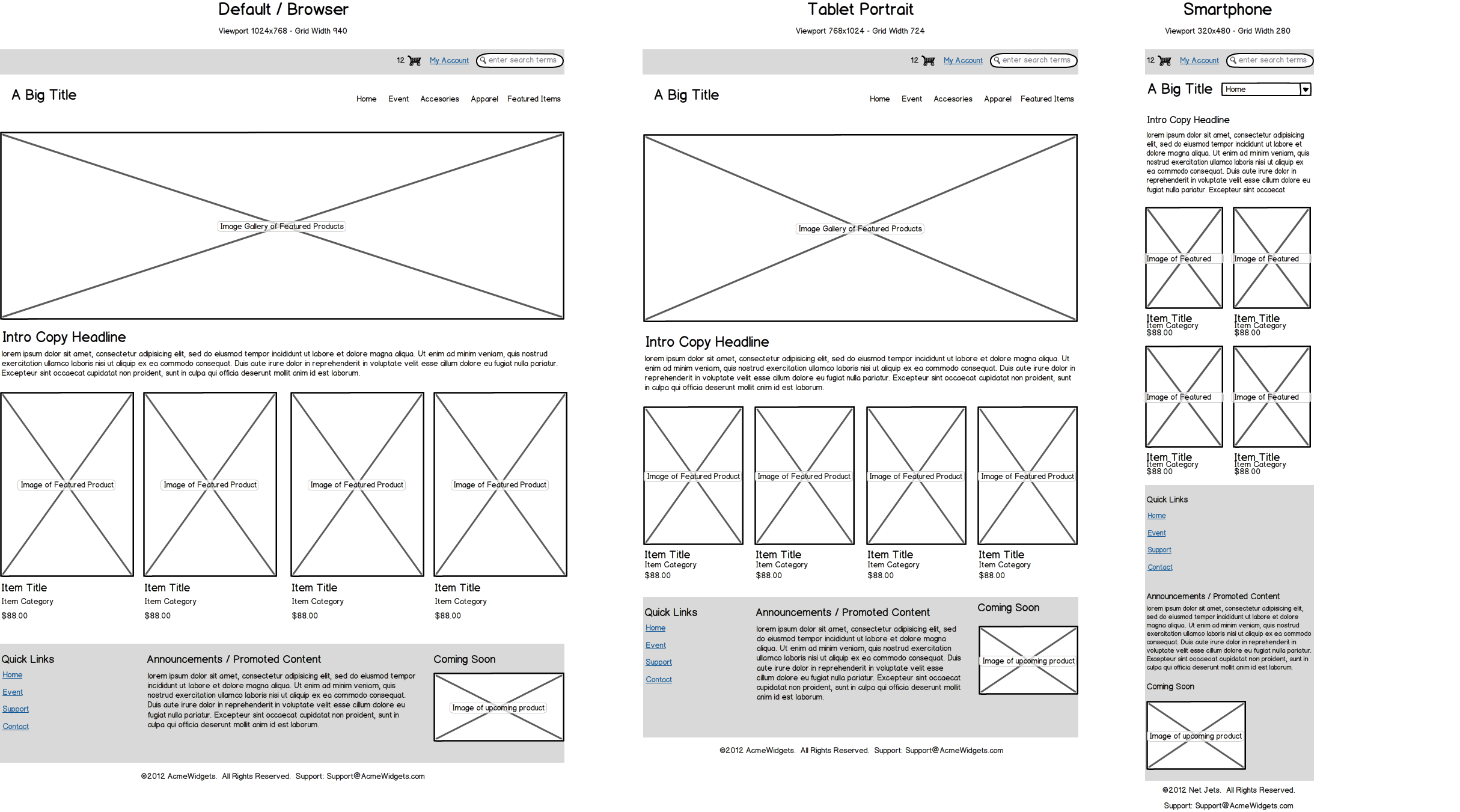
Include Content
This is a heavily debated topic among UXers. Some UXers will say to include as much content you have available to you, and they have a valid point. Content can impact an entire design and skew the effectiveness of a layout. On the other hand your wireframe should be a communication tool that puts a strong emphasis on your designs information architecture. Because of this you want to always include content that is necessary for the user to understand the navigation strategy of the design. This consists of titles for list items, app bar titles, and hard data such as dates and times, etc. This will allow the user to understand where they are in your wireframe.
An example of this would be if you’re making a hotel booking application. In the wireframes, instead of naming every list item “Hotel Name” provide actual names. This will give the user a sense of navigation when they click on it since the app bar title will have a real name and varying hard data (price, rating, etc) from the other hotels.
In short always include hard data and if your application is going to be content heavy include images as well, if you have access to them. This will provide the stakeholder with a better understanding of how intuitive the layout will be.
Keep Your Screens Orderly
Since your wireframe will not be a clickable prototype, you want to make sure your screens are laid out in sequential order. The best way to do this is to create a user flow beforehand so you don’t have to spend time figuring out what order is most intuitive. When laying your screens out you have to take your stakeholders’ culture into consideration. If they’re from a western country, where it is standard to read left-to-right, you will want to layout your screens from left-to-right and vice versa. This will make it much easier for your stakeholders to follow along without your assistance.
Include Icons
A common mistake I have seen a lot of people make when creating wireframes is that they consider icons images, and therefore use the image placeholder in place of them. Do not do this. This is not only confusing to users, but shows your stakeholders you have not fully thought out what type of icons would best communicate what page they’ll be navigating to. Notice I said type. These icons do not need to be your final choice, but they should convey the general idea of what type of icons you’re considering.
Including the icons also allows you to get pertinent feedback as to whether or not the stakeholders like them and/or if they’re intuitive. This communication will save you a ton of time creating or searching for icons, just to find out the stakeholder doesn’t approve or already had an icon in mind.
Alignment
More often than not, new designers don’t consider alignment and spacing when creating wireframes. Part of the reason is too many people scream Keep Them Low Fidelity without actually defining what that is. When designers mention low fidelity, what they’re saying is keep color out of it and focus on the layout. Since many of the Gestalt Principles focus on visual alignment this is something you want to make sure you get right in your wireframe. Taking the time to group elements will help communicate to the stakeholder their relationship to one another and how a user should navigate the app.
Arrows Can be Cool
As mentioned above, you want to make sure your screens are displayed in sequential order, but some people go the extra mile and include arrows between their screens to describe what action is taking place. These types of wireframes are often referred to as wireflows. Wireflows can be extremely beneficial communications tools, but in most cases are not necessary when dealing with stakeholders. Although they can supplement clickable prototypes to an extent and can be an early handoff to developers if development needs to start sooner.
If you follow the tips mentioned above, and any other tips you find on other articles, I promise you it will save you a vast amount of time converting your low fidelity digital wireframes to a high fidelity clickable prototype. Hope this helps and happy wireframing!
