
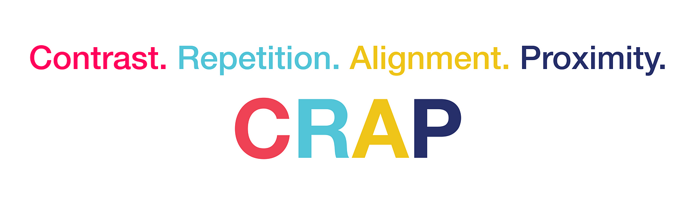
Why your designs should be CRAP
Yes, you read that right. No, it’s probably not what you think.
If I could go back in time and place one book into the hands of my newbie designer self, it would be Robin Williams’s The Non-Designer’s Design Book.
Before any formal design education, I always considered myself to have an eye for visual design– I could look at things and tell when they looked “right” and when they looked “wrong”. However, I didn’t know why.
It took me months to learn the principles and develop a vocabulary to describe what drew me to certain designs and drove me away from others. However, The Non-Designer’s Design Book lays solid foundations for understanding a few key principles that allow you to immediately begin identifying good design practices, and implementing them into your work. These four principles are: contrast, repetition, alignment, and proximity.
Although marketed towards non-designers, I argue this is a book for every designer, beginners and experts alike. For beginners it serves as a not-too-overwhelming introduction to the underlying principles that govern great visual design. For more advanced designers, it is a refresher on the overall importance of these principles and their utility.
The CRAP acronym serves as an important point of guidance because these principles don’t go away. While they might be basic, they are foundational to great design, and appear in the work of designers at all levels of expertise. Being able to understand, recognize, and wield these tools will make you a powerful designer.
Contrast
In the image below there are three variations of the same text. Which one draws your attention the most?

Likely, you said the far right. But why? These paragraphs all contain the same words, in the same font, in the same size. The sole difference is that the headers all possess different levels of contrast. The far right header holds no contrast– it is exactly the same as the body. The middle header is medium weighted, providing a slight contrast to the regular weighted body. And… the far right header’s condensed black weight provides a striking contrast to the body’s regular weight.
Simply put: different draws attention. And this is the purpose of contrast.
Whether you are looking to emphasize important information, create a sense of organization on the page, or enhance legibility, contrast serves as a crucial tool to grab the viewer’s attention.
To effectively wield contrast in your design, you need to lean into the power of dissimilarity. There needs to be a noticeable difference between the elements you are contrasting. Designers most commonly achieve this using size, shape, color, or weight. As shown in the example above, slight differences like using a regular vs. medium font weight don’t do an efficient enough job of generating interest.
As Williams advises in her book:
“Don’t be a wimp. If you’re going to contrast, do it with strength.”
Repetition
You’ve created visual repetition before– whether you know it or not. Think back to your high school years, all those essays you wrote. Indenting every new paragraph, assigning numbers to the top left corner of each page, citing each quote using parentheses that contain the author’s last name– all these repetitions contributed to creating a visual consistency that persisted throughout your entire paper.
Good start! However, for repetition to become a powerful tool in your design, it needs to surpass subtleness.
“Repetition goes beyond just being naturally consistent– it is a conscious effort to unify all parts of a design.”
By intentionally using certain elements again and again you create consistency. This is important because it drives unity and cohesion within your design. A great example of intentional repetition is the Google app logos.
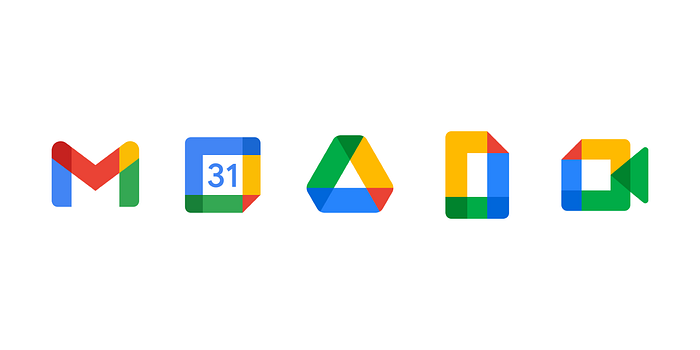
If you’re staring at a crowded homepage, it is easy to identify which apps are Google ones. Why? The deliberate use of the same colors, shapes, patterns, and size generate a resounding sense of harmony and understanding.
This is repetition wielded effectively: never making viewers question what’s connected and what’s not. Consciously repeat certain elements throughout your design to create meaningful associations.
Alignment
The mere act of where you place elements on the page is something that heavily impacts a design’s coherence. Therefore, it should not be an arbitrary act.
“Every element should have some visual connection with another element on the page.”
When you align elements on a page it brings an immediate sense of order to your work by creating connections. Alignment can become a nuanced topic when you introduce things like grids, but at its base is the principle of the invisible line.
Remember back in calculus when you used the vertical line test to determine whether or not a graph was a function? Here’s what I call the invisible line test: do all related elements align on an invisible vertical line?
If the answer is yes, you’ve passed! If it’s no, you might have some work to do.
Below is an example of the same content, aligned in two different ways. One version passes the invisible line test, the other does not.
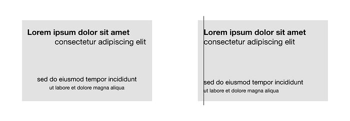
Notice how the design that passes the invisible line test–which is represented with an actual line here to prove my point–looks much more organized? The invisible line test is a rule that can be broken, but generally speaking, if your design passes, you have succeeded in creating some level of unity and balance in your work.
Proximity
When staring at a blank page with no idea how to start designing, proximity is the easiest place to start (in my opinion). Let one simple question guide your initial layout: What are the different relationships between all this content? If elements are related, group them together. If they’re not, use space to separate them. This is the essence of proximity.
Look at the image below. How many different groups of related elements do you count in each frame?

Even though each frame is filled only with identical black dots that possess no inherent meaning, it is clear that there are two groups in the left image, one in the middle, three on the left, and that the grouped together dots are somehow related to each other. This is the work of proximity.
Proximity is perhaps the easiest way to create organization within your design because it requires no editing of the content itself, but instead uses whitespace to create both visual connections and separations. Yet, it is important not to overlook this simple principle, because it is powerful.
“If the information is organized, it is more likely to be read and more likely to be remembered.”
Use proximity in your designs to make sure viewers never have to guess what content belongs together, and what doesn’t.
Conclusion
Yes, you’re design should be CRAP, but not that kind! We’re talking about the acronym for the powerful principles of contrast, repetition, alignment, and proximity.
While it is true that these rules can be successfully broken, I guarantee you that by abiding to the CRAP acronym, you will design more professional-looking, eye-catching work.
All quotes are from Robin Williams’s The Non-Designer’s Design Book. Find it on Amazon here!
👋 Hi, I’m Kathleen, a current student at Cornell studying Information Science with a passion for product design and writing.
Find me on LinkedIn here!

