Why slowing users down can help them make meaningful choices
The research in this article was conducted by Richard Mathera.

The moment I stepped into the world of user experience design, it was drilled into my head that our goal was to design experiences that were “seamless” and “frictionless.” These words are often used to refer to what the Nielsen Norman Group defines as “Interaction Cost”: “the sum of efforts — mental and physical — that the users must deploy in interacting with a site in order to reach their goals.” How can we enable our customers to complete the individual tasks needed to achieve their goal while exerting minimal effort? As a UX designer, my job was to uncover these pain points, then remove or solve for as many as possible.
Some of the best design systems even include pattern usage guidelines specifically designed to minimize interaction cost. For example, Google’s Material Design puts forward these guidelines about button hierarchy:
“A layout should contain a single prominent button that makes it clear that other buttons have less importance in the hierarchy. This high-emphasis button commands the most attention. An app can show more than one button in a layout at a time, so a high-emphasis button can be accompanied by medium- and low-emphasis buttons that perform less important actions.”
The point being, a user shouldn’t have to think about which call to action to pursue — the path of least resistance should be crystal clear.
When I stepped into the world of behavioral science, I realized it was no longer a tightly held assumption that we should strive to minimize interaction cost above all else. Friction is a lever to be pulled in either direction depending on what we want users to achieve. What if the goal is not just for our customers to get to the end of the journey with as little thought and effort as possible, but to have made meaningful choices along the way?
“Meaningful choices include which goals to pursue and, broadly, which methods to use to pursue them,” writes Amy Bucher in Engaged: Designing for Behavior Change. While having users slow down to actively consider a choice opens up the possibility that they won’t make the choice you as the designer want, or need them to, helping users feel autonomous and in control can also increase their motivation, effort, and task performance. Provide choice, but help users understand how a certain choice can support their goals.
What does it look like to provide this kind of choice? The Common Cents Lab designed and ran an experiment with Steady, an app that helps gig workers maximize their earnings. Steady wanted to increase the number of users who were linking their bank accounts so that they could better serve their users through the following features:
- Income Tracker: Steady’s free income tracker allows users to easily view their earnings from disparate sources together in one place.
- Job Recommendations: Steady can make algorithmic improvements to job recommendations based on the jobs that users actually take and the earnings they make.
- Bonus Payments: Steady can pay their bonuses for taking certain jobs directly into their bank account, rather than through prepaid cards.
Steady’s existing screen to prompt users to link their bank account probably looks much like something you’ve designed before: primary button style for the action we desire the user to take, secondary button style for opting out. In fact, this aligns with Google’s recommended button hierarchy. Looks pretty par for the course, right? How could this be potentially problematic?

This design does do a nice job of framing the choice around the benefit to the user, rather than the means to that end. Rather than being asked whether they want to link their bank account, users are asked whether they’d like to access Steady’s free income tracker. However, in spite of it being framed as the primary call to action, only about 35% of users were clicking the primary button, “Let’s do it,” with the rest of users choosing “Maybe Later.” The Common Cents Lab identified a few reasons why this might have been the case:
- Status Quo Bias: When a user is asked to link a bank account, the status quo is to do nothing. Skipping this step is the easiest option, and the cost of not having access to the above features is invisible.
- Choice Avoidance: Humans tend to avoid difficult choices, and users may defer this choice to later due to either time constraints, or uncertainty about the benefits.
- Procrastination: Humans often put off decisions. Even if they intend to come back to the decision eventually, for many users, choosing “Maybe Later” is equivalent to choosing “No.”
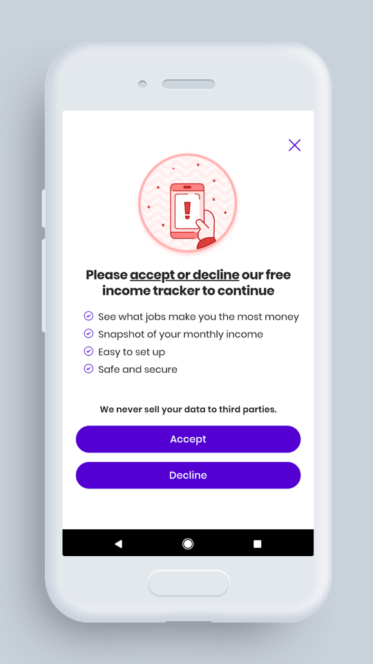
Are we really creating a seamless user experience by helping users put off an important decision until later? The Common Cents Lab tested a design intended to encourage users to slow down and actively consider this decision now. We used what’s called active choice: framing a decision such that there is no default, and users are required to make a choice. You can see that in the below design, “Accept” and “Decline” are both in the primary button style — removing the “Maybe Later” option that provided a clearer opportunity to stick with the status quo, avoid the choice, or procrastinate. Prompting an active choice has been shown to tap into something called regret aversion, which occurs when we make a decision simply to regret having made the alternative decision. Users may be more likely to accept the income tracker simply because they do not want to later regret having declined it.
Over 15,000 unique Steady users who had created an account within the past 7 days, and who had not already linked their account during onboarding, were randomized to see one of the two full-screen, in-app pop-ups. The control group (the original screen design, with one primary and one secondary button) and the active choice group showed no differences in the amount of time they had spent on the app, or in app usage, before their exposure to the experiment.
Forcing users to make a choice increased initial acceptance of the call to action by 71% — from 35% to 60% (p < 0.01). It also increased the percentage of those who successfully linked their bank account by 63% — from 7.1% to 11.6% (p < 0.001).
Regardless, the combination of the two changes worked together to frame the decision as an active choice. Providing no primary call to action, and instead framing the decision as an active choice, slowed users down in a way that was helpful to them — it enabled Steady to provide valuable features to better meet their users’ needs.
So what does this teach us? Interaction cost doesn’t always have to be bad. Prompting users to make meaningful choices at key points in a journey, even when it increases interaction cost, has the potential to increase their motivation, effort, and task performance.