Case study: Redesigning the Tesla Model 3 Display interface
A user-experience design case study on Tesla’s -infotainment system
The Problem
If the perspective is from safety aspects, Infotainment systems are the delicate digital solution that is been crafted to ease the use of comprehensive technologies. Tesla Model 3 display is one of the exclusively designed and prudent digital experiences.
As having majorly successful systems in the industry, conclusively there could be pros and cons to arise. Based on such a principle I sought to understand the business aspects of the Tesla Model 3 which can be expanded through the display design. According to the survey, Forbes analytics and after reviewing the 140-tesla owner’s concerns, the research found significant areas for improvisations according to their age group.
1. Issues that limit market capture of the 60+ age group.
2. Individuals faced disengagement with dominating space of the Navigation Map.
3. High-priority functionalities that are on multistep.
4. The user interface can be customisable along with visual design majors.
The Goal
Design suggestions that are Innovative and intuitive to the user. As Tesla called to the Display — PMCU (Prime media control unit) must have gone through many iterations, from reaching its implementation phase to the precision that consumers thoroughly appreciate. Investigate a user's nuances that function to the intuition and accordingly craft the improvisations.
- To Make a difference in productivity & its business.
- To Optimise user flow according to the priority of functionalities.
- To help them enhance user engagement.
- To multiply interactivity loop with functionalities for versatile users.
Pre-proposal
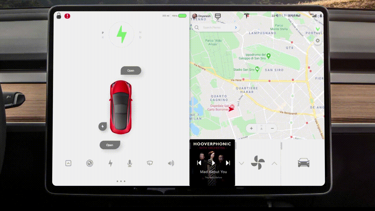
Rather than post-futurizing the existing Display interface, I will add lenient treatment and rearrange features of the home screen. Inlined with existing user experience.
That will enable the user to perceive it holistically and treat it based on human instincts. Realign high priority functionalities that are multistep for the tasking and optimise for the subtle experience.
These modifications would help versatile users to enhance personification as per their desires, based on emotional intelligence and safety majors.
Design Process

Research objectives
Fundamentally, how does the user balance the performance with the existing design?
Determine the behavioural patterns of the users when the user is driving an automotive vehicle.
Define, and categories what visually appeals and the experience satisfy the users.
Determine the most common to the most intensive areas of irritation, frustration, confusion, and anxiety when the user drive vehicle and has to interact with the infotainment system.
Understand how users interact with technology and define motivational aspects.
Define the standards to operate the infotainment system.
Identify specifications and areas for improvements. Learn about the user’s priority based upon specifications and usability aspects.
Interaction Priorities

I conducted an interaction function priority analysis to emphasise user comfortability to access the features.
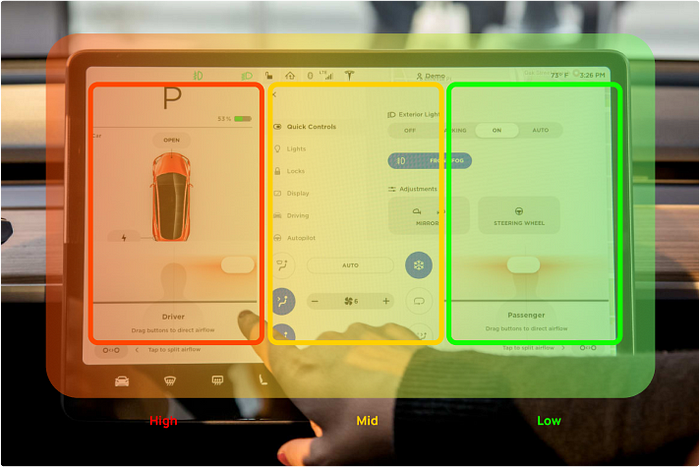
keeping the user(Prominently Driver) in mind, I could conclude that essential features and the most required functionalities should be in the high priority section.
Define user flow
After investigating certain user flaw issues, I dominantly refined flaws to process holistic thinking over the system interactivity.

The psychology of user interface
The established brand guidelines are crucial to provide convenient usability aspects. Initially, the mood board helped me to stick with the brand’s visual appearance. To blend in the all-new functionalities with existing aesthetics, I followed the branding guidelines.
User interface Design inhalation
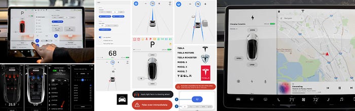
Alongside this, I modified the UI kit based on the brand's ideal aesthetics. I created new artifacts and icons for some features. An extensive compilation of all the components and UI patterns used in the system.
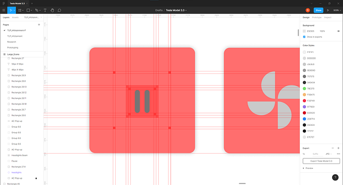
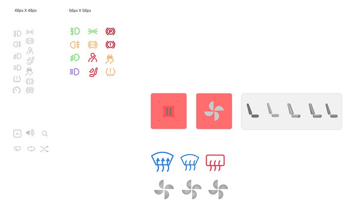
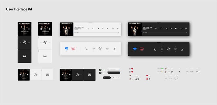
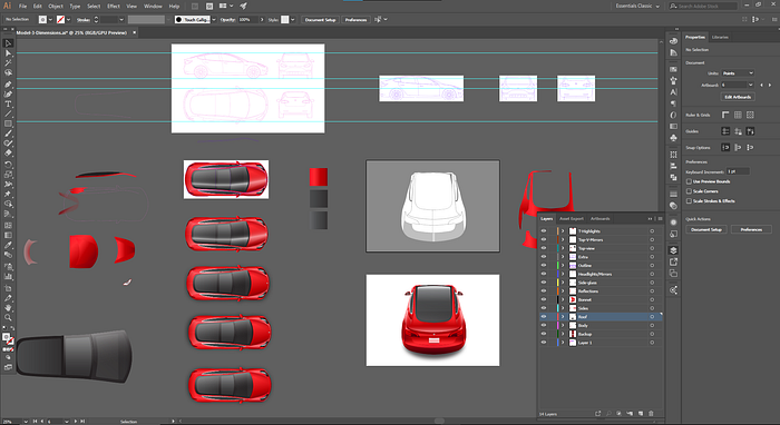
The artifacts
To coordinate the interaction parameters, I customized and crafted some of the artifacts that would specifically afford the values of interactive functionalities.
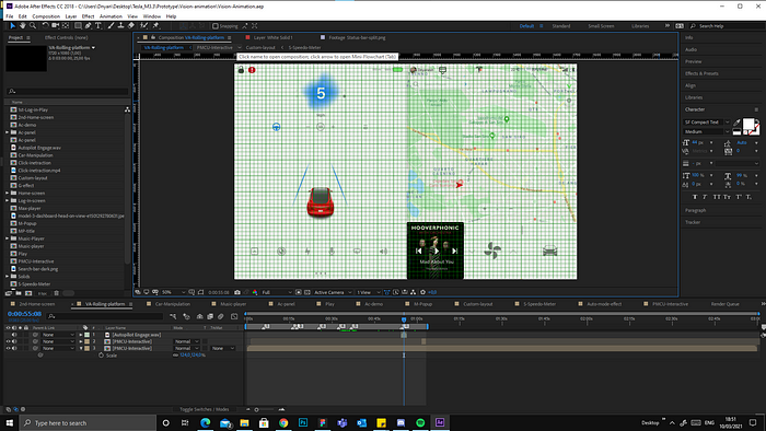
Interactive Animations
The enhancement of micro and macro animations was crucially aligned to Tesla’s infotainment system. I crafted animations according to the affordance of signifiers. As per the target research, some primary functionalities were not intuitive where the user has multitasking responsibilities.

Follow the link for the detailed case study;
Before you go
👏 Clap if you enjoyed this article, this will tell me to write more of it!
🤔 Comment if you have something to say
Portfolio: www.dnyaneshmaid.com

