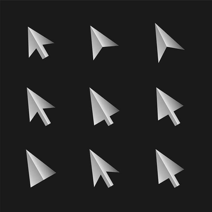
Why HUGE cursors are not a trend of the future.

This article is an investigation into the space of web ux and the cursor trend that have swept the community with awe as well as scepticism.
I stand with the latter.
This provocation to some, may seem a bit off to the common notion of the trend being an absolute innovative winner. Innovative in its way of adding playfulness and surprise for their users, but set apart from the visual dynamics, what else lies behind the intention of this innovation? Let’s find out!
Summoning my design rookie spirits, I started off with an analysis sprint with Jakob Nielson’s 10 Heuristics of Usability as my bible. Given the context, assuming one of a first time user landing on a website with a HUGE-cursor to greet them, I started my way to analyse the why and why-nots.
A Case Study on Wildcatterla.com

Given that Wildcatterla.com is an Independent Creative studio and Production Company, the freedom to build their identity and using the cursor as a symbol of their identity is an undeniable bold move in the act for self-expression. Going by Henri Tajfel’s theory of Group Identity, the symbolism of this manner can can be thought of as an attempt to establish the core divisions of ‘us’ and ‘them’. But in the ever changing industry of design, do decisions like these stand relevant when it comes to building trust and credibility among the users?
Maybe, maybe not. The advocates of Universal principles are at fail here. What matters is the context in which the scenarios occur.
- As a creative individual, the edge this symbol creates is inspiring. In the industry, the creative freedom of the self is often overshadowed by the time, effort and the revenue numbers. Innovative and creative risks are rare occurrences unless they are the only way out to a problem of stubborn manner. The nature of work that the studio delivers, from the look of it, requires them to establish a strong identity so as to set themselves apart from the other competitors. The bold colour and typeface stands for the narrative.
- The case for a client here may differ. The legibility of the cursor here creates a distraction, so as to creating major usability issues. Following the usability testing guidelines of the UX honeycomb, the accessibility on the navigation bit was impaired by the size of the cursor, bringing down the factors of its value-addition and desirability. Multi-media websites often require larger loading time because of the content, and the same is usually countered by adding particle animations as loaders on the loading screen. A behaviour of this kind builds upto to create credibility as it not only reflects the possible content the brand deals with but also making the mundane wait-time less painful. A behaviour of such kind was absent here.
Before running down to conclusions, let’s perform the 10 Usability Heuristics test on the landing page!
Given the contexts and post evaluating the user experience of the website, we come back to the question — But in the ever changing industry of design, do decisions like these stand relevant when it comes to building trust and credibility among the users?
…
The answer would be Nein. Thats german for ‘no’. How the translation of ‘nien’ required a delay of response, a delay in the industry leads to loss of efficiency and effectivity of decision making and time. But what does that mean in relation to the topic of this article, ‘ Why HUGE cursors can not be a trend of the future’? Let’s find out!
After an extensive study of the role of cursors in the usability of the websites, the certainty of it being an innovative winner is in question. At the end of the day, the context at which it lies decides its success metrics.
In the year 2020 amidst the pandemic, Small File Media Film Festival sent out an invitation to drop submissions of small media films, which were videos of sizes less than 5 megabytes. The motive was of pinging a reminder on how streaming online and other internet heavy actions are responsible for climate change and deplete fossil fuels. While the pandemic was at play the servers were gauging immense amount of internet traffic since that seemed to be the only wander about. Here, drawing parallels to a similar motive as initiated by groups like Small File Media Film Festival, as designers, our design actions contribute to the well-being of the planet and it’s dwellers. Websites with high visual functionality requirements, such as a cursor with intricate visual details and interactivity results in higher loading time, hence higher energy requirements affects the experience of a user with poor to moderate network connectivity with delay and ineffectiveness, and most importantly heats up the planet.
A Preferable future starts today only when you act towards making one.
My scepticism still stands strong. Innovative solutions needs to pass the test where Critical thinking decides the success metrics and not just the revenue it chimes in.

