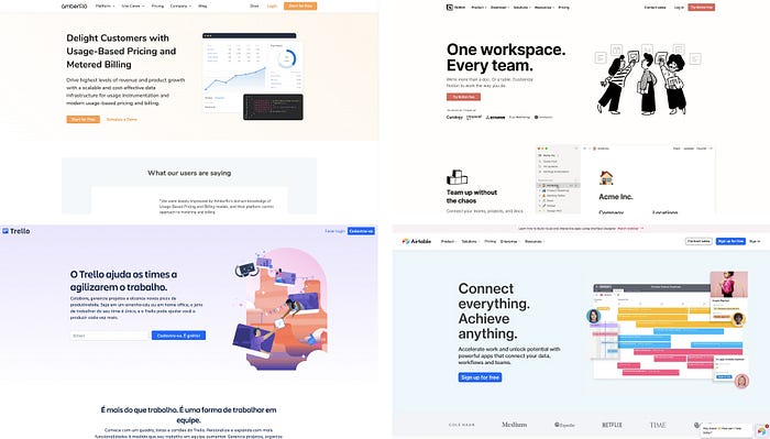
Why every interface looks the same
Why everything looks the same in the online world, and what can we do about it.

To better understand how did we get here, lets look at the story of the internet:
According to Khoi Vinh, graphic designer and Adobe's design director, The internet was a big white canvas in its dawn (90s). There were no guidelines or instructions regarding interfaces or information architecture. Designers at that time were parachuted in this exciting new world. For them, the experience of designing in a digital canvas was like experimenting true creative freedom. Especially with tools such as flash.

At that time, design was constantly reinvented. Almost like a natural task, pages were redesigned, and websites would become unrecognizable every 6 months or so. This generated a lot of opportunities for web designers and developers, to take role in the digital world.
The main task as a web designer, was to import all of his knowledge from the offline world (prints, books, paintings) and translate that into a computer grid (it makes sense how every website in the 90s was so full of color). As for today, we no longer emulate offline media to the digital world. Thats because we adapted to the way we look at interfaces and experience design.
Todays world is dynamic, intuitive and objective to the point we only need 7 seconds to understand what a business is about by looking at its website. This modern universe we interact with now, is based upon millions of usability tests, always behaving with the same objective: to convert, sell, engage and connect with you. It is no longer the white canvas, web designers used to create upon (by the way I found a hidden gem, preserved in digital amber).
Why Everything looks the same today

The best reason, personally is because we collectively evolved our perception of good design as being informative, friendly and hospitable. And it’s easier for people from different skillsets, to recognize good design because of the way we share our projects globally with social media. This constant creative feedback gives birth to global trends, highly replicable between digital interfaces. Basically what worked for a big company, has some chance of working for you too.*
I don’t condone using a big tech company interface as an inspiration for your designs, as long as you understand the principles behind what they are achieving, and make them resonate with what you are trying to accomplish.
Also, we are closer to information than we’ve never been before. Thats why companies that are looking for low cost, effective results will turn to real market examples in order to replicate what works, with their own content.
So… Is this bad?
Not necessarily. This generation of design trends, can also be explained as a positive indicator, that we as as a collective, are speaking the same design language, looking forward to create visual solutions that work, in a more product oriented way. Making the whole digital background, more objective and professional-looking.
This changes do not impair a designers creativity. They are only shared guidelines that help organizations test new concepts with safety. Avoiding the pressure of having to create a totally original product within the time-schedule, and with minimum rework.
But I must state the obvious as a warning: All trends are frail. Thats why we need to be constantly reflecting upon our design decisions and how to achieve our own objectives. Understanding how to use today's trends, is a significant thing you need to do in order to optimize your time as a creative professional, so you can spend it developing new possibilities for the digital world.

