Why Did I Build My UX Portfolio on Notion?
Notion is not your typical place to host a UX portfolio…
Context
Notion is a content management system used mainly by folks who want to organize aspects of their lives. It’s great for things like note-taking, daily journaling, documentation, and even habit tracking! However, it’s not a typical place to host a UX portfolio.
I enjoyed using this tool for organizing personal information and, speaking as a values-driven designer, it represented a lot of my principles. Most notably, Notion includes tools great for accessibility and the CMS is available for anyone despite their income. It also helped that how extremely efficient I was on this program thanks to its low processing times and simple UX. This is why I hosted my UX portfolio on Notion at https://adrianye.com/ux!
I see Notion as a website template similar to what you might find on Squarespace or Wix. As with every website template, there are pros and cons due to features, layouts, and technical ability. I won’t just tell you the good stuff because there are understandably some things I wish Notion had. So without further adieu, here are reasons why I loved using Notion to build my UX portfolio and some obstacles I encountered that required workarounds.
The Pros
It’s FREE!
This, to me, was the best reason to build my portfolio on Notion. After my career change, personal struggles, and COVID-19, I found myself challenged financially. I could have invested the little savings I had in a standard website builder. But it felt demoralizing to spend money when I needed a job in a world that underestimates design and creativity. I had also paid for dedicated website builders before and was not satisfied with the templates I was offered. I couldn’t justify paying for these templates when they didn’t suit me. Which goes on to my next point…

Just Enough Customizations
Notion is great at displaying content in various ways. The user can choose how their information or notes are viewed. This makes it easier for users or teams to understand complex information by way of various data visualization. In my case, this makes it great for displaying case studies in gallery view for the preview but a text layout for the case study.
For those seeking more self-expression, you can install plug-ins from third parties to further customize your page. One example is super.so, which provides both free and paid features for visual design and SEO. Initially I was drawn to this tool but I was already given an adequate number of ways to customize my content without it being too flashy. According to product designer Lily Konings, your content doesn’t need to be visually beautiful, but it does need to be easily navigable. To me, Notion has enough options without plug-ins to express my individuality while not worrying if viewers are distracted from the content.
Live Updates
With these customization abilities, it can be a drag to constantly save your work. No worries here! Notion updates content LIVE. And when I say live, I really mean live. There’s no need for loading wheels or a progress bar because as soon as you add that forgotten comma, your updates show up in the webpage. I know I’ve left pages unedited in the past because I didn’t press save before accidentally exiting the page. It’s a hassle to open and close modals to indicate you want to save your work, or even “Yes, I DO want to discard these changes!” Design should be simple, and that’s what Notion is. Live updates make for a happy UX designer!
Also, don’t worry if you made edits that you now regret. There’s the trusted cmd+Z and your work goes back to its previous state… (wait for it) immediately!
Great UX
Notion’s UX is superbly designed for quick documentation and viewing of data. As a UX designer building their website, I took advantage of this to reduce the time needed. It was minimal compared to the time I had previously spent on standard website-building platforms. I even had extra time to write a blog post about building it!
Its UX is intuitive, interactive, and has no delays. Changes happened so fast that I felt like I was working with something physical. I can drag and drop “blocks” of text or media within milliseconds. I can easily convert data into a visual gallery. I can convert multiple blocks into a different view for easier comprehension. All of this is possible without waiting for things to load or lag when dragging chunks of information.

Don’t believe me? See what features you’re missing out on!
- Photos are automatically clickable to see full size. No HTML or altered settings are needed!
- Both keyboard- and mouse-friendly users can switch between text formats easily.
- Groups of information can be displayed as a gallery, table, Kanban table, calendar, or timeline. In my case, a gallery view is great for giving folks a preview of my work.
- Photos can be resized to snapped sizes so that your photos align to a grid or layout.
- Their layouts are completely responsive. No more worrying if the pictures will be cut off on mobile. Plus Notion has a webpage and app easily accessible on a smartphone!
- BREADCRUMBS! Need I say more?
- It’s possible to link visitors to blocks of text or images (aka anchor links).
- Its UI is predictable and reliable. There are no animations, no flashy cursors, or cumbersome parallax that may not load successfully.
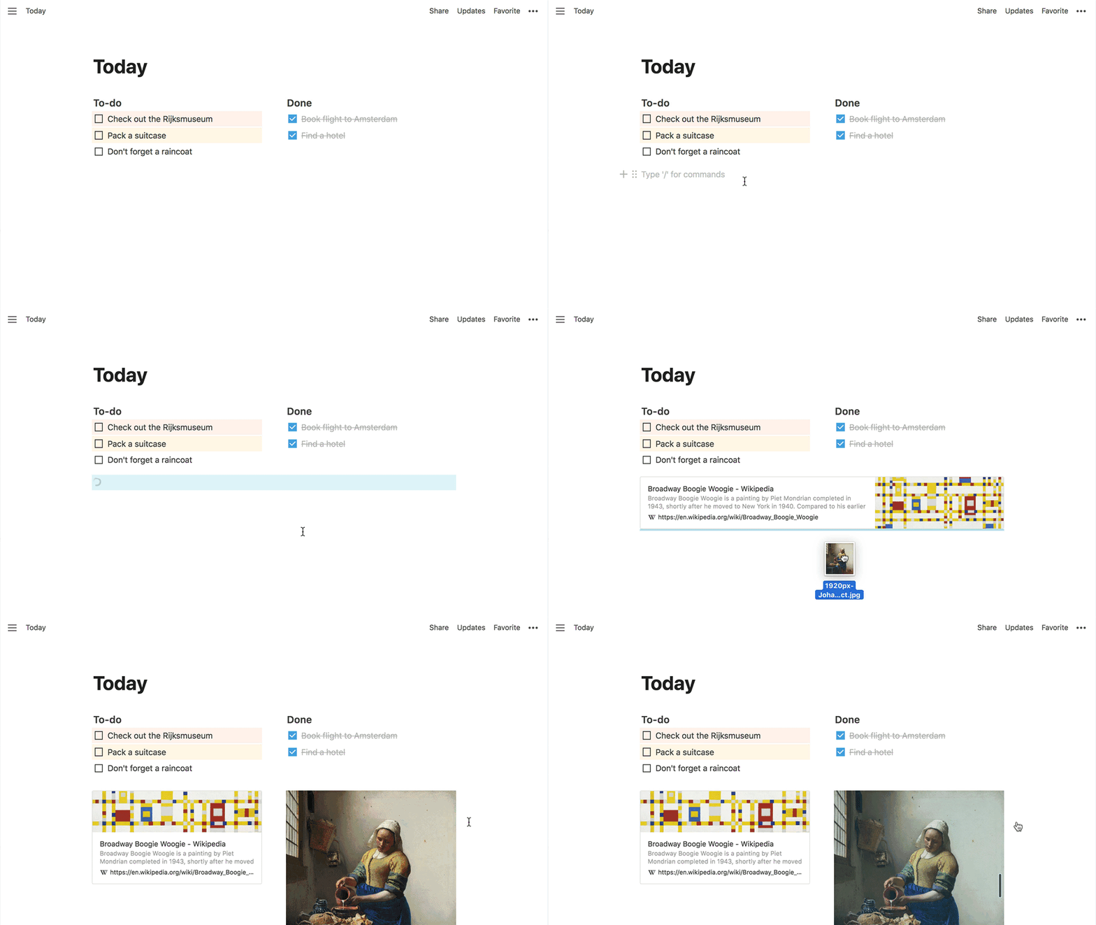
- The feedback is just a joy to see. I am shown if my actions were successfully noticed. For example, dragging content across a page would show the blue bar, as seen in this gif.
Accessible and Reader-friendly
Not only is the UI/UX great for documenters but it is a pleasure for all kinds of viewers as well. Many users have a visual impairment of some sort, myself included. With Notion I don’t worry if these users struggle to comprehend my work. Images can be clicked for a full-size view and text can be enlarged and not pixelated. Text can be highlighted in case a user needs to look up a word or if it needs to be copied. Notion also has features like a table of contents, breadcrumbs, call-outs, and colored text so that users can easily navigate content and not get lost.
Some may complain that Notion has limited options for UI customization. However, I believe a UX portfolio should showcase its content as much as its visual design, if not more. Let’s be real — we’ve all spent hours choosing the “right” font for our page. Notion has already narrowed down the options to extremely legible typefaces. As for accessibility for visual content, Notion has the power to create predictable layouts, snaps media when resizing, and offers a full- or narrow-width layout.

Embedded Links!
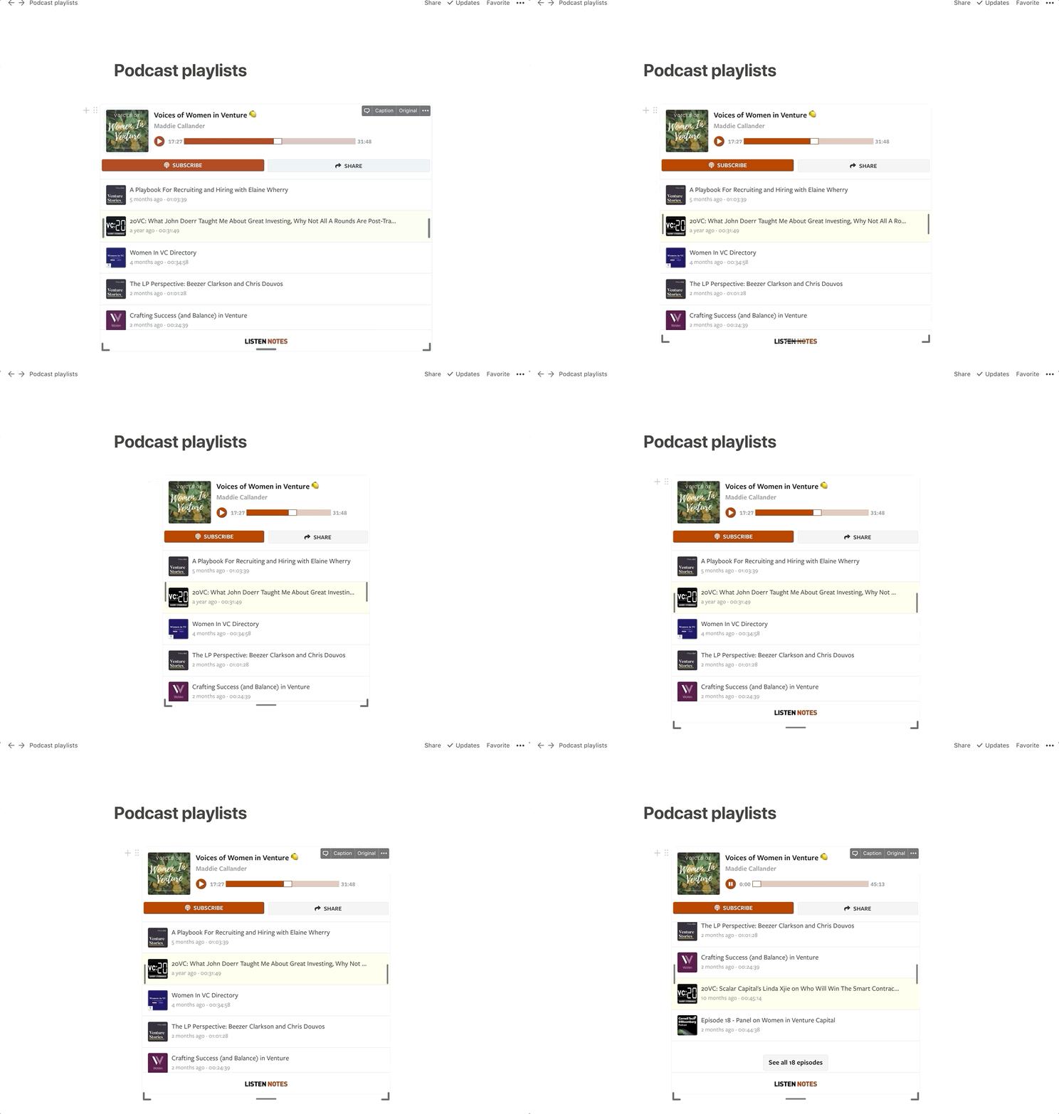
This is essential for a UX designer portfolio because there are so many designs on various programs that we have to showcase! All you have to do is paste the link to your media or program page and voila! You’re asked if you want to embed this link! This works for many UX professional-friendly resources, like Figma, Google Docs, Miro, and more! You can even embed information from other Notion pages.
This feature has been integrated so well that embedded links are updated as soon as the content is changed. Once you make edits to your Figma artboard or Miro brainstorming space, this content will show on your Notion’s embedded block. What a relief for designers and their teams!


Lastly… Why Not?
There are so many ways to generate websites these days, but they all look similar to each other. I’ve heard of hiring managers advising job seekers to not use generic templates. But how can folks do this on designated website-building platforms with limited funds or the ability to customize without code? More importantly, it’s rare to find a template that is unique, suits their personality, and is viewer-friendly.
At first, I thought it was ridiculous to build my UX portfolio on Notion. Would it be crazy to do it on a note-taking tool? Would I look silly building on a free platform with a “.notion.site” in the URL? But I saw the eye-catching ability of Notion and wanted to use a platform representing my values. When I was done building my website, I was so glad I did it that I wrote about it.
Beware — it’s not perfect
Despite the ease of building a portfolio on this CMS, Notion wasn’t perfect. It was never meant to be used for this purpose, despite my being a huge fan of this journey. Here are some limitations that can help you decide if you want to commit to this process. These didn’t deter me, but some might be a turn-off for you!
No Custom Domain
As far as I know, there is no free, simple option for using your custom domain to forward to your Notion page. This is unfortunate because a site with a trailing “.notion.site” is not as sophisticated as “adrianye.com” or “adrianye.design.” Even more unfortunate is that I actually do own a domain name but the process to link it to Notion is complicated and can be costly. My workaround is using a shortened URL (https://adrianye.com/ux) to link to my portfolio so that it is more memorable for hiring managers.
It May Be Too Minimal…
Notion has some color customizations but they’re purely for text. Besides the images folks include in their portfolio, it’s not possible to add color to your pages without a plug-in. This limited feature might seem too bland for some UX designers who want to treat their portfolio as a case study or add lots of personality* to their page.
*Don’t get me wrong — I have a personality, but I also believe content is important. This is especially true for a UX portfolio, and its content should not be forgotten under a flashy design.
SEO Image
When your portfolio is shared on social media, this first image found on the page becomes the SEO image representing your site. In my case, when I first shared my portfolio on social media, my boss’s photo was prominently displayed. I was shocked. Ultimately I moved her photo to a subpage to solve for this and LinkedIn eventually caught on to this.
Getting Creative with Formatting
In this corresponding image, case studies are displayed prominently, which is great. However, I had trouble adding other important content to my home page without clashing with each other due to limited formatting. In this case, I had to make sure the viewer saw my pitch, case studies, and contact info or risk not getting hired.
My workaround was to use elements for functions they weren’t intended for. I used Notion’s “callout” display for testimonies rather than the “quote” format. I used the “comment” feature to share my pitch in smaller text. I inserted text inside brackets to highlight links because I couldn’t put a link on an icon. This all took a lot of creativity, but I was able to distinguish different types of content and utilize a visual hierarchy.
Resources
Here are some great resources if you’d like to learn more about the process of building a portfolio on Notion. I didn’t refer to these during my portfolio-building process, but seeing these makes me happy to know that hiring managers aren’t turned off by portfolios built on Notion!
- Building your portfolio in Notion by Rama Krushna Behera, UX Planet
- How I shipped my new design portfolio in under 5 hours by Lennon Cheng, UX Collective
- Setting Up Your UI/UX or Product Design Portfolio in Notion by DesignerUp, Youtube
- Notion Portfolio Kit for UI/UX designers by Aparajith Aradhya, Figma community file

