Why Design System Designers need to be great auditors

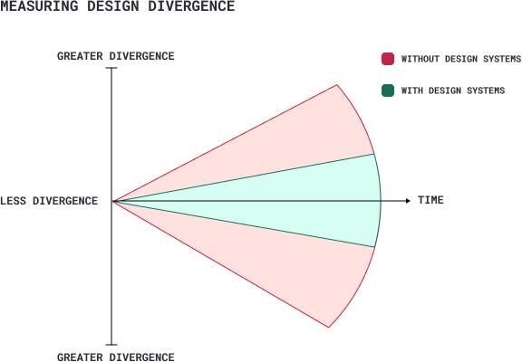
The upfront work put into a design system is crucial to its success. A designer can’t simply jump into building components. Before getting started, they need to become an expert in the full systems status, not only focusing on what exists in Figma, but also taking into account what exists in Storybook and the current live product as well. This means that the Design System Designer is first and foremost an auditor. As a great auditor, the designer will not only be able to make clear, informed decisions, but they can also use the discovered information to sell the entire company on the value and mission of design systems.
Audit: a methodical examination and review
Background
In February 2022 I was brought on as the lead and sole Design Systems Designer at Stellar Health, a rapidly growing health-tech startup. Stellar’s mission is to incentivize payors, health systems, provider networks and practicing physicians to improve the quality of care and performance, through their value-based actions platform and by providing real-time payments.

During this period the team was embarking on a major overhaul effort to take the product to a 2.0 and design leadership worried about a few common issues that many companies face:
- How might we manage the consistency of design across our product/s
- How might we improve the efficiency of our design and front-end engineering teams?
- How might we improve the quality of our product/s?
The answer? A design system!

Originally, the company had no intention of hiring a design system designer. They assumed that the small, but mighty team of 4 designers could handle the maintenance and upkeep of the system. However, from my POV, the company made the right decision to bring me in at this point. The design team was shouldering a massive amount of user research, design and iteration, and QA and release. There was no way the designers would be able to bear the additional responsibility of maintaining the organization and adherence of a design system. Additionally, as the company grew in size, so did the accrual of design debt. Without a system in place, the designers would continue to veer off in various directions, bringing chaos and inconsistency to the product.
Que entry of design system designer (me).

Building the system
So for the uninitiated, Design systems empower *Makers* (designers & engineers) to fully design, develop and realize digital products. This is done by creating a single source of truth for how products are built. It includes styles, components, documentation, code, language and governance. All in all, design systems are a product with its primary users being designers, engineers, and product people. A design system needs to be built and iterated on the same way product teams build and iterate on products: by taking into account user needs and aligning them with business goals.

Now before I jump into the juicy, exhaustive deets about how to complete a comprehensive design system audit, let me start off by providing you with a helpful organizational tool showcasing the high level steps in developing and maturing a design system. As an aside, I’m a big believer in creating helpful infographics and digital artifacts, so buckle up.

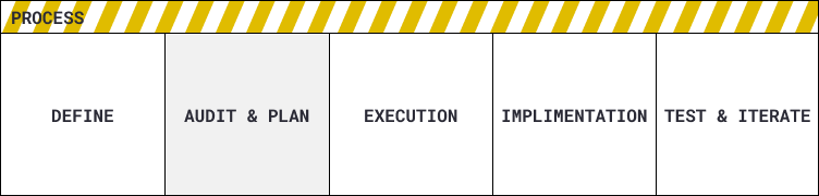
- Define This step is all about establishing the mission, purpose, and presence of the design system as well as of the design system designer. As a climber would set up base camp at Everest before starting the climb, the design system designer would too set up basecamp within Figma as a way to guide the work going forward. Once you’re onboarded you shouldn’t spend more than a week or two in this phase.
- Audit & Planning The purpose of this phase is to understand the needs of our users, the goals of the company and the lay of the land with regard to design assets, tools, user needs and limitations. The work done here will guide the execution of the design system build out. This can take anywhere between one to two months depending on the size of the company and status of the system.
- Execution (build out) This is a flexible, multi-pronged, multi-dimensional phase that can be approached in many different ways depending on the system’s unique status and situation. Generally, this phase is about following the roadmap defined in the previous phase, creating styles, expanding on governance processes, building components, building out the Storybook library, QA’ing etc.
- Implementing (release) This phase is about how design system releases are pushed within the product. It’s a crucial stage where the greatest risk of something going wrong can occur.
- Test and iterate This includes regularly testing the design system with users and gathering feedback to make improvements and updates as needed.
Now that that’s out of the way, let’s get into it.
Audit & Planning
As mentioned previously, an audit is arguably the most crucial stage in the design system creation process.
Benefits of performing an audit are:
- Improved consistency: This process can identify areas where the design system needs improvement and ensure that all components, processes, and documentation are aligned and consistent.
- Better usability: An audit can uncover areas where the design system may not be meeting the needs of users or designers, and identify opportunities to improve usability.
- Increased efficiency: By identifying areas where the design system can be streamlined or automated, an audit can help increase efficiency and reduce the time and resources required to maintain the system.
- Better alignment with business goals: By informing the design system roadmap, performing an audit will ensure that the design system aligns with the organization’s business goals and objectives.
- Improved stakeholder confidence: An independent assessment of the design system can provide stakeholders with greater confidence in the accuracy and reliability of the system.
- Better decision-making: The results of a design systems audit can provide valuable insights and information that can be used to inform decision-making and guide future development.
We can break our audit down into three distinctive areas:

Audit Areas
- Figma audit
- Storybook audit
- Product audit
In order to perform each audit, I leveraged the following tools:
Audit Tools
Interface inventory audit: The process of identifying, cataloging, and analyzing all of the user interface components used across an organization. The goal of this audit is to understand the current state of the organization’s design system, including the number and types of components, the consistency of their usage, and the overall quality of the components.
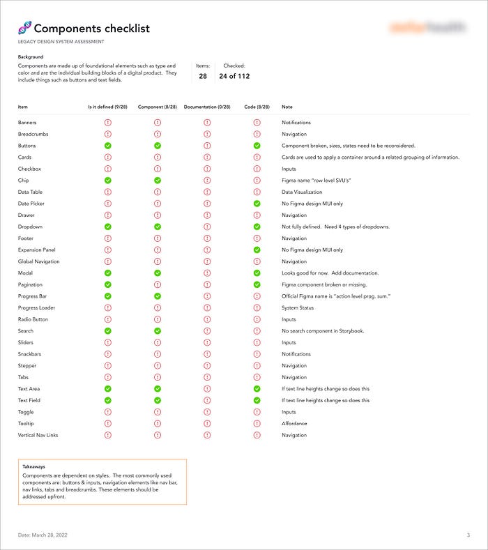
Legacy design system assessment: An evaluation of the current footprint of design system and the creation of a design checklist accompanied by each items status. The list compares the footprint against that of the industry standard design system catalogues.
Teammate interviews: These interviews provide crucial insights of the pain points, current workflows and expectations of our users. Interviews help influence feature prioritization later on.
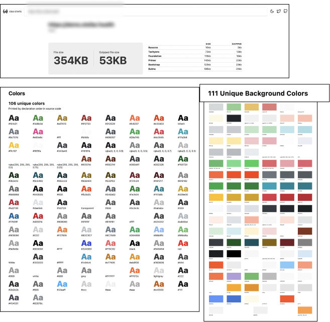
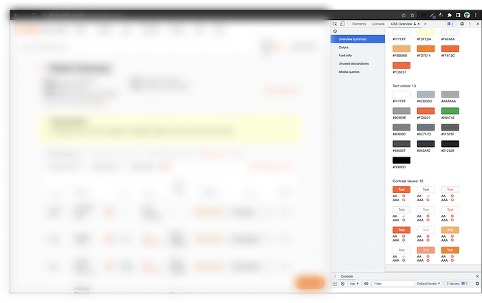
Accessibility review: Utilizing CSS Stats & CSS Overview to identify total font and color declarations as well as inaccessible colors.
Within each of the audit areas lies an array of sub-sections with questions that need to be explored and answered. For this purpose I created a series of checklists based on my prior knowledge of design systems that would guide each audit.

The Figma audit
I began with an audit of the company’s presence in Figma. From a high level, my goal was to understand the size of the style & component library, the Figma organizational structure, and how the library was being utilized by the team.
Style & Component library question checklist:
- Are the libraries centralized or scattered?
- What does the size of the footprint look like? What’s included and what’s missing?
- What does the structure of the color system look like? Are there tokens, what do they look like?
- What does the build quality of the components look like?
- What does the build quality of the styles look like?
Tool used: Legacy design system assessment
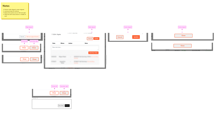
Take away: The audit revealed that Stellar had a fledgling library comprised of a handful of styles and components, no governance documents or workflow tools. Many of the current styles and components were not following latest Figma best practices, had too many variations or were many missing states, most notable was we were not adhering to an 8px grid.
Figma organization structure question checklist:
- Do we have an organization tier Figma account?
- What is the overarching Figma file structure?
- Are Figma teams categorized by squad / zone or by app experience?
- Does the design team use cover sheets?
- Does the design team make use of an archive?
Tool used: Legacy design system assessment
Take away: Like a lot of fast paced, heads-down startups we had a fledging system of organization. Our Figma file was setup as a single organization with no formal team structure, which made it difficult to locate work. The longer we remained like this, the more design debt the design team would be accruing. Notably they had a Professional account and not an Organizational one, this meant no access to crucial statistics about component usage.

Teammate work files question checklist:
- What are the designers pain points?
- What are the designers expectations?
- How are new styles and components getting added to the system?
- How are designers organizing their work? Is it easy to follow, what about handoffs? Page structure, file count?
- What does style and component usage look like? Is there adherence or unique one-offs?
- Does usage of styles, components and patterns appear to follow the same direction?
Tool used: Teammate interviews
Take away: With no formal set of guidelines set in place and with a MVP style and component library, designers were slowly going off-course from one another, leading to a product with diverging user experiences

The Storybook audit
Style & component library footprint question checklist:
- What is the total style & component count, what was missing?
- Is there visual misalignment between Figma and Storybook?
- Are there any naming convention mismatches?
- Does Storybook have components that Figma does not and vise-versa?
Tool used: Legacy design system assessment
Take away: Among the few Storybook styles and components we had, many were misnamed or mismatched to how the styles and components were created in Figma.

Library structure question checklist:
- How are elements named?
- How are elements grouped?
- Are there any interaction tools (ability to view states)?
Tool used: Legacy Design system assessment
Take away: On the positive, the library provided an alphabetized list of categorized styles and components and showed their interactivity. However, many naming conventions were misaligned with how they appeared in Figma.
Teammate conversations question checklist:
- What are developers pain points?
- What are developers expectations?
- Are developers utilizing this library?
- Do all devs know about this library?
- What does the intake process look like?
- How are old assets deprecated?
- Who manages and maintains this library?
Tool used: Teammate interviews
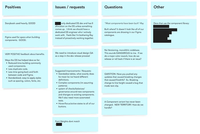
Take away: Another positive, the front-end team knew about and actively used the existing library and they communicated daily using a dedicated #front-end Slack channel. However, there was no formal intake process and no dedicated design system engineer. Our incredible dev lead was doing this off the side of his desk in addition to all the other work.

The product audit
Product scope and Interface inventory question checklist:
- How many unique pages including modals are there across the product?
- How many unique products are there?
- How many different versions of the same components exist?
- How many different color and type styles exist?
- How many inaccessible colors exist?
Tool used: Interface inventory, accessibility audit
Take away: The product was comprised of roughly 25 pages, not including modals or internal tools. After conducting an interface inventory and color accessibility audit, I found an abundance of unique variations of components and patterns across the entire product. This including core components like buttons and an array of unique modal approaches. There were 111 unique colors found using CSS Stats and major accessibility violations in regard to color across all pages. Fundamentally our color system was inaccessible.
Planning
Once the audits were complete, it was time to synthesize and prioritize! I first listed out each design system style, component and process I had uncovered during the audit, and performed a card sort exercise centered around understanding where that element fit into the system and its dependencies.

From there, I took each category and ran them through a feature prioritization matrix in order to discover which elements would provide the most value to the team while taking the lowest amount of effort to implement. This exercise was completed by taking into account the dependencies of the element, status of the item discovered during the audit, and the needs of the team and business.

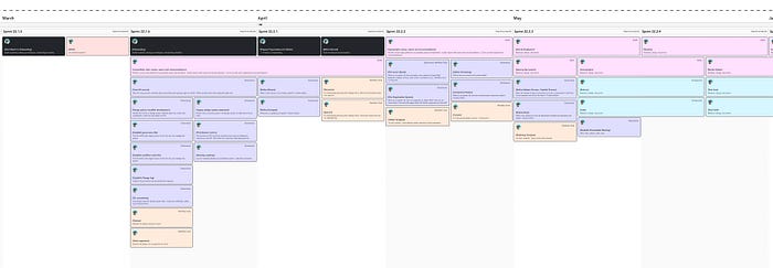
After presenting my findings to the team and aligning everyone on the path forward, I created a comprehensive design system roadmap to provide the team with transparency and a shared understanding into my key goals, milestones and deliverables.
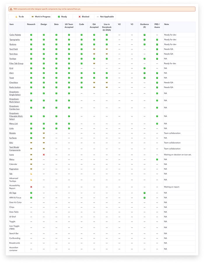
I also created a component checklist to track the work in more minute detail. For those that don’t know, a component checklist is an exhaustive, categorized list of each individual element within a design system library accompanied by its status of development.
Conclusion
Beyond the roadmap and the checklist, I now had a clear understanding of the needs of the current product, a clear plan to execute on those needs, and an exhaustive amount of artifacts that could be used to socialize the system and get buy-in from design leadership and the rest of the company. For example, the storybook and color styles audit uncovered many glaring issues with the company’s accessibility compliance. As a healthcare company, this compliance issue could have stood in the way of generating future contracts and business for the company. With this in mind, I prioritized work on Stellar’s color palette first and used my findings from the audit to reassure leadership on the path forward.
This audit proved that Stellar did indeed need not only a design system, but a design system designer.
For more exhaustive design systems content, make sure to give me a follow and like and keep an eye out for my next article.


