Why Covid safety signs are bad UX?
Designing a better experience for Covid shopping.
When London was in Tier 2 restrictions, pubs were open, and time to time we were going to our favourite pubs with my wife (good old days). One day we were sitting in the garden of a pub. And I used the closest door to go to the loo. Suddenly a waitress warned me and showed the sign on the door “No entrance. Please use the main door”. Honestly, I was a bit embarrassed because it was a pretty big sign at my eye level.
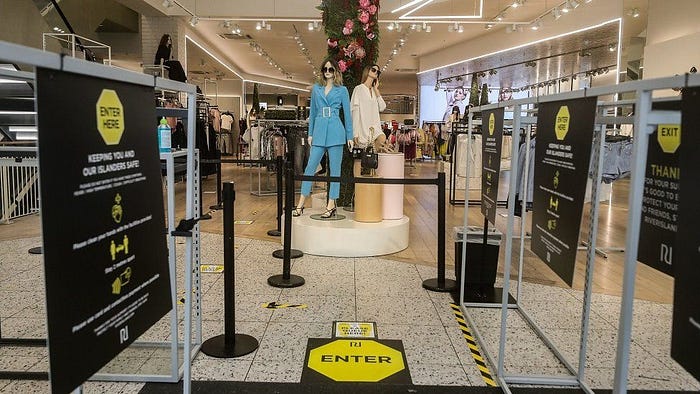
A week later, I had the same situation in the market. I didn’t notice the sign on the floor which has a neon, eye-catching colour. And probably, later on, I failed to notice safety signs in some other shops too.

I brought up this subject to a friend who has a cafe, and he immediately started to fuss about customers like me. He said he never figured out how the customers fail to see the safety signs in the cafe. They were very obvious to him. (Well, happy to hear that I wasn’t the only careless shopper.)
And my last Covid shopping experience was at the Apple Store. There were some instructions at the door (probably they were mandatory), and inside the store, there were no safety signs. Instead of the signs, one of the staff guided me from the beginning to the end of my shopping. All the Apple Store staff were organised to maintain social distancing and make the shopping experience as smooth as possible. As a result of this effort, I never used the wrong door or failed to keep social distancing.

Don Norman explains that a signifier refers to any mark or sound, any perceivable indicator that communicates appropriate behaviour to a person. So, signifiers like safety signs are tools to simplify and provide clarity on user experiences. In most cases, they are very useful for experience designers. However, signifiers are not the most efficient way of designing an experience in an extreme situation, like a pandemic.

There are many procedures in place for Covid shopping. Maintaining social distance in the queue, putting a mask on, hand sanitising before entering the shop, following the paths, keeping social distancing during the shopping so on and so forth. This is utterly an information overload, and it’s not possible to design this kind of user experience by only signifiers. When customers step into a shop, their attention is mostly focused on buying something, not applying Covid procedures. No matter how visible the Covid safety signs are, customers may ignore them. So designing Covid shopping needs a more hands-on approach.
For sure, it’s not possible to apply this approach to all shops. However, since Covid shopping seems to be with us for a while, it’s still worth thinking about designing better and safer shopping experiences, instead of applying the most common approach.

