Case study: Redesign mobile experience and interface for a spend management software

About me
¡Hola amigos! I am Aditi Saini, working as a Product designer at Fyle for the past ~3 years. I am an Engineer turned Developer turned Designer (I know, like they say, change is the only constant!)
I joined Fyle with a little knowledge of design and explored my potential as a designer while working on very sophisticated and exciting problems
About Fyle
Fyle is an intelligent spend management software. Our vision is to create a world where not a single second is spent on expense management. Fyle mobile app is very helpful for users to claim reimbursements in just a click by uploading or clicking the image of the receipt.
For traveling salespeople, the Fyle mobile application can be used to create expenses offline even if they don’t have access to the internet. The app allows users to create a report and submit it to claim reimbursement.

How did we know we needed a redesign?
The Fyle app offers many useful features to its users, however, the user experience was subpar. Along with the UX of the app, UI is also very critical. UI refresh was also long due.
Customer Problems
Through user interviews and feedback we found out that there were a bunch of problems around the user flow and UI.
- The app was not intuitive. This was quite evident from our NPS Score.
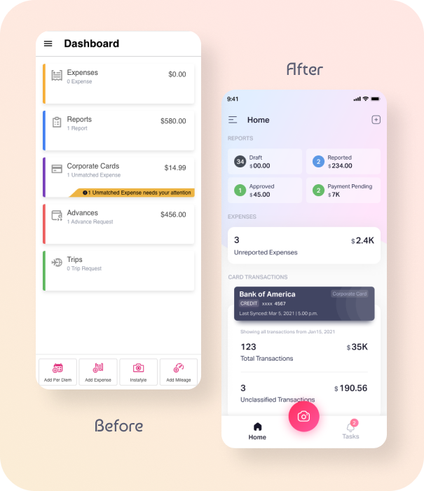
- On the mobile home screen, users get to see a bunch of redundant data when they specifically want to see only the critical information.
- Many interactions across the app were not standardized. Users were finding it difficult to understand and interact with. To state a few —
- Search interaction does not match with the user’s expectations with respect to other apps which they were habitual to use.
- The amounts were displayed in a different manner in different places. - The app does not provide a native app experience. Android and iOS users expect the experience to be platform-specific as this reduces the cognitive load to learn something completely different
- The app does not follow a coherent color palette. Rhythmic typography fails to utilize whitespace in general.
- Data and actions were presented in a cluttered manner, making it difficult to understand.
Goals and motivation for the redesign
- Make Fyle mobile app users super happy with the revamped design.
- Deliver a super-intuitive user interface that will make expense management very easy and simple.
- Less time spent on creating expenses.
- Users should be able to see what needs their attention the most.
Mobile app before the redesign

Design Process
1. Heuristic Evaluation
Heuristic Evaluation is a method where an expert audits a Website/App for Usability Problems using the Principles of Heuristic.
We did a detailed heuristic evaluation on the mobile app and got to know that there were a lot of Usability Issues in our mobile app.
- Consistency — Fyle mobile app was not consistent with respect to the confirmation modals, Call to action buttons, etc.

- Unfamiliar language and metaphor — There were a lot of terms used in the app which our users found difficult to understand. Instafyle is a feature that allows users to create expenses in one click. Due to the name
Instafyle, a lot of users found it difficult to understand its functionality. Another such example is the termFyleDraftthese were the terms used to denote the state of expenses. - Feedback missing for actions that users have performed — Feedback was missing after creating or deleting an expense or places where users would like to know if their task was a success or failure.
2. Usage metrics and Hypotheses
We started collecting data and forming hypotheses. A lot of interesting results came from data.
- We collected data for the past 3 months on how users are creating a new expense from the mobile app. Data analysis showed us that only 40.2% of users are using Instafyle. This indicates that Instafyle which has been a core feature of the mobile platform is losing out the importance in the existing design in terms of discoverability because of which most users preferred to fill out the expense form manually.

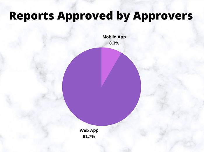
- When a user submits an expense, It has to be approved by an Approver. Improving the approver’s flow was also one of the priorities in this redesign. So we collected data on how many reports are approved by approver in both the platforms. Data says only 8.3% of reports are getting approved using the mobile app. This implies low discoverability of this option on mobile app or approver finds it easy to do it on the web than the mobile app.
Similarly, we also collected data around — how many reports are being submitted in a month per user, what is the most claimed currency, Usage of a particular feature, etc. As a result, we realized that the usage patterns were very different from what we had anticipated.
We were able to apply the learnings from the data to develop a more user-centric flow instead of creating what we envisioned would be useful for our users.
3. Thorough Research
Competitive research and other research helped us to understand that instead of reinventing some new way to perform a task it is always better to follow the existing user behavior which is familiar to the users.
4. Wireframe and Idea Exploration
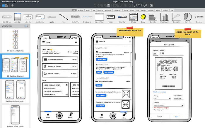
We had a lot of research, data, and hypotheses up to this point and we were somewhat clear on the flow. The next step will be to start creating wireframes and design suggestions. Explored a number of ideas and iterated on a few before moving on to the High Fidelity Design phase.
5. High Fidelity Designs
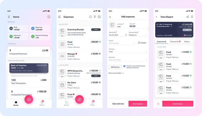
Wireframe to high fidelity design transition was straightforward because the flow had already been decided. The emphasis shifted more to interaction and creating visually pleasing designs for this phase.
6. Testing prototype with users
Designs and flows were tested by a lot of users, and we observed how users interacted with the app. It helped us validate our hypotheses. We improved the designs based on the feedback we received during user acceptance testing.
The Result
- Redesign helped us to increase the usage of mobile app
- Redesign helped us to increase the usage of the camera(Instafyle) from 40.2% to 72.7% (~81% increase in usage)
- We successfully implemented our awesome design language in the Mobile app
- Consistency in actions reduced cognitive load for the users
- Made Data-informed decisions — We collected data and carried out extensive research for this project which helped us to make Data-informed decisions

One last thing
My mentors in this initiative were Swapna Ranjita Nayak and Yashwanth Madhusudan. Through their guidance, I learned how to approach a project of this magnitude. Swapna assisted me in creating quality designs and design documentation. I was able to reach her for assistance whenever I encountered problems. Throughout this initiative, she extended her helping hand with her knowledge and resources.
Irfan Alam helped me a lot by quickly providing the data whenever required. Last but not least thanks to my fellow designers and users who helped us by giving their valuable feedback.

