
Case study: Redesigning the most widely used chatting app
Remember the days when QWERTY keyboards were all the rage? When everyone wanted to own a blackberry and texting meant sending SMSes? Remember how carefully you hd 2 choose evry wrd so that you do not exceed the character limit? Even after all that effort, one painful rupee got deducted for every text message. But then WhatsApp swooped in and saved the day! (along with a lot of relationships 😉)
WhatsApp was just what messaging needed to be. Quick, easy, painless and endless. It is so effective it has become synonymous with texting.
So I set out to re-design Whatsapp, the world’s most popular messaging app, to make it easier to use and more engaging during a 24-hour design sprint.
The challenge was identifying problems in a system that already worked well. Everyone knows how to fix a bad experience. I believe the real test lies in making good things work even better!
Timeline: 24 hrs
Methods: In-Person UX research, Wireframing, UI design, Prototyping (made after the initial timeline)
Tools: Sketch, Figma, Illustrator
Results: ⬆ Ease of use, ⬆ Aesthetic appeal, ⬆ Engagement
Where did I begin? 🕵🏻♀️
I only focused on some qualitative research to find a few problems given the time crunch. Finding users was effortless (all of the research was conducted with android users). I spoke to a couple of friends and family and noticed their actions while using the app. I also observed my behaviour on WhatsApp.
Process Outline
- Qualitative User Research
- Problem Identification and Insight Gathering
- Ideating ( Paper + Wireframe tools)
- UI Design
- UI Updates (done post the initial 24 hr sprint)
A glimpse into my 🧠
What is the foremost goal of WhatsApp?
Chatting on WhatsApp is the primary mode of communication for billions of people.
How well does the app help users achieve this goal?
Very efficiently, which is why WhatsApp is so widely accepted.
Observe the actions taken by the user to send a chat.
- Open Whatsapp
- Tap Search
- Types the name of the person they want to text
- Tap on the person in search results
- Start typing the message in the chatbox and press send
What do people do when they are not chatting on WhatsApp?
- Change Profile Picture
- Share Status
- Call friends (mentioned last since it is out of the scope of this project)
I identified 4 problem areas 🧐
Problem 1: Search is placed out of reach despite being the most frequently used action
- WhatsApp’s extensive usage and numerous groups have ensured that we never find the people we are looking for at the top of the list.
- New chat button can also help find conversations and is placed in a prime location. But the mental model of users doesn’t support the use of new chat to find existing conversations. Most people don't use the new chat button to message people they have already spoken to on WhatsApp.
- So they end up using search. But it is at the top of the screen while the keyboard appears at the bottom. An ergonomically average-sized user has to repeatedly change their phone grip each time they want to text someone (not visible in the first fold). Goodbye, single-handed use!

Problem 2: 5 steps are needed to update display pictures
- People love to habitually change their DPs on WhatsApp. But despite being such a popular use-case, it takes a minimum of 5 steps to update it (without counting the gallery surfing).
- While some users like to keep their pictures in sync with their social plans, others change it to resonate with their mood. Some may change it more frequently than others, and not everyone keeps a picture of themselves. Yet people take pleasure in using this feature because it is an extension of their presence online.

Problem 3: View status feature is not engaging and is underutilised
- People love posting statuses to socialise as well as advertise their latest ventures. And WhatsApp statuses are a very effective way to reach people organically.
- However, the feature itself is not engaging enough, which may be why it is substantially underutilised (its usage has further decreased since creating this project).

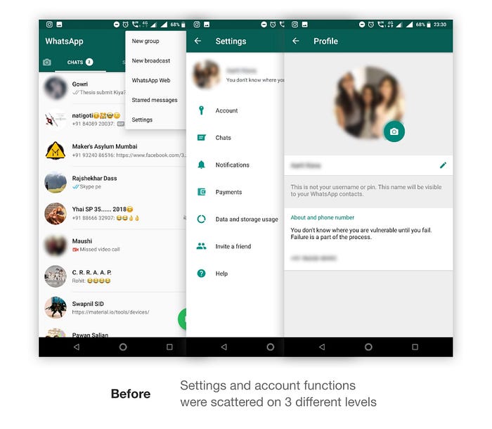
Problem 4: Duplicate and Redundant ways to perform tasks
There are at least 3 different ways to update statuses, 2 ways to create new groups, 2 ways to begin a conversation etc. causing a lot of repetition and unwanted clutter in the UI.

🧪 Time to find some solutions!
I quickly explored a few ideas on paper and then moved to digital wireframes. Here are some of the iterations I went through for the chat screen. The opportunity explored here is “pinning favourite people” as a quicker method to find friends and family you talk to often.
The Re-design! 🎩 🪄
UI Design Decisions
I have proposed a unified design language here for Android and iOS. It will maintain brand consistency and enable a smoother transition when a user shifts from an android device to iOS or vice versa.
Add status can be accessed by swiping right and Profile page by swiping left from the home and view status screens.


Navigation
Status, Call log and Chat screens (previously tabs) are accessible from the bottom navigation. This allowed me room to bring search into the bottom nav, making it much easier to use.

- Chat placed is in the extreme right corner since it is the default screen. Users can access the camera (to post a status) from here by swiping right and the profile page by swiping left.
- Search and call log are placed in the centre to allow quick access from both sides.
- The status page is on the left corner since browsing statuses is a tertiary task.
The Favourites Tray
The people we want to talk to most often are lost in the noise of group chats and spam forwards making it quite tedious to find them. The favourites tray solves this issue by helping users keep their most significant conversations first.

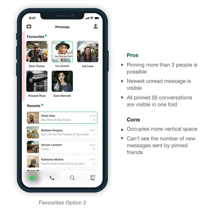
- The favourites tray is designed to be compact and occupy less vertical space.
- to make sure that day to day usability is not compromised,
- and favourite contacts are still easily findable.
- Users can add a person to favourites by swiping their chat card.
The Profile Page
Introducing the new profile page that is just a swipe away from the home and status screens. It is the one-stop-shop for all personal and account settings.
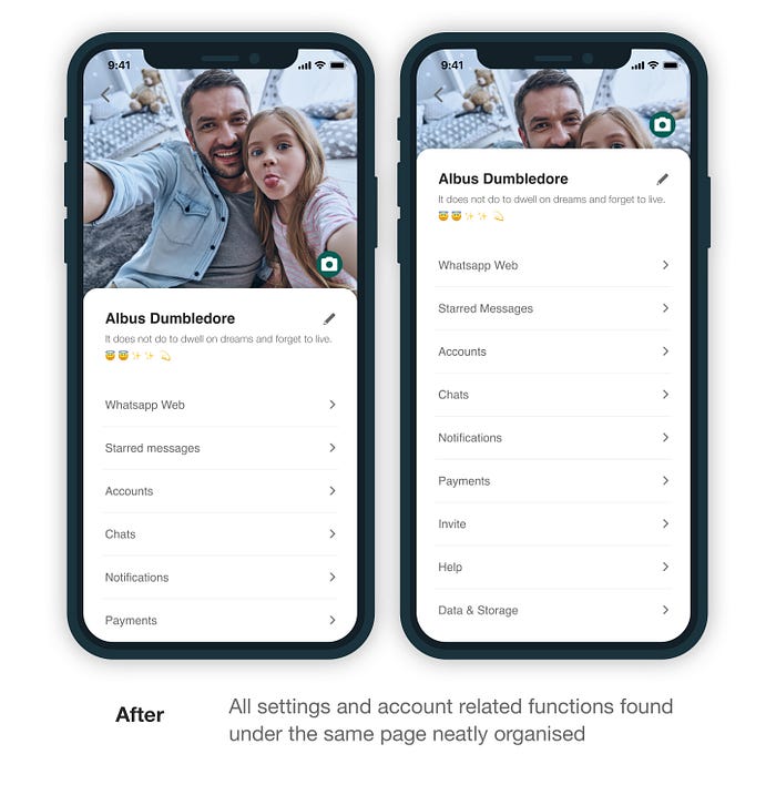
- User’s profile picture takes up almost half of the screen in the new design. While contributing to a “better feel”, this design choice also pushes tappable options closer to the bottom of the screen where they are easier to reach.
- Users can now change their profile picture with only two steps (swipe and tap) instead of 5 in the current app.
- Removing the overflow menu helped reduce a lot of steps and unnecessary segregations. All choices under more options and settings have a new home in the profile page, which is just a swipe away. This further simplified the app hierarchy while also allowing easy access to all the other significant tasks (like privacy control, WhatsApp web etc.).
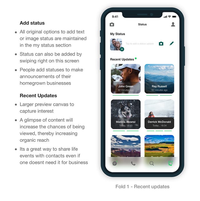
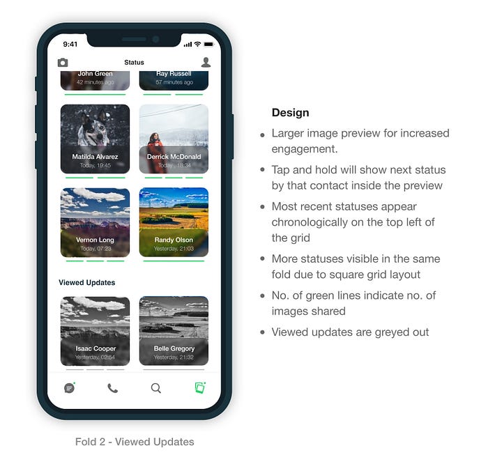
A brand new status view!
Statuses just got BIGGER while remaining space-efficient. A much more immersive way to keep up with the latest updates from friends and families.
The Prototype
🤔 Reflecting Back…
This was my first UI focussed project back in 2018. Probably that’s why it has been so close to my heart. However, I have never published the very first design before now. The final UI design has gone through 3 iterations. Each time I updated it, I corrected a few errors and made it contemporary. But I didn't rescope the UX part of the project because the problems are still relevant!

The first interface was quite horrible. I didn’t know the concept of background blur at the time, as I didn’t have Sketch. But I also didn’t want a solid navbar. There were other readability issues due to font sizes and lack of contrast too. Gradients were picking up pace, and so I was eager to incorporate them. But as I learnt more, I fixed my bad UI decisions and made the second version.
Even as I document this project now, tweaking and further simplifying it, I realize that there are many more things that could be done. One can never do justice to any design in such a short time, but it was an enjoyable journey to try!! 😊
About me
Hi! I am Aarti Kava. I design products that evoke emotions. Currently working on delivering an exceptional experience on TataCLiQ Luxury. I am a curious person who loves to contemplate the design of life and everyday things. And I am planning to keep sharing my experience and thoughts here on medium. I am always open to healthy feedback and discussions. You can also reach me on:
🐦 Twitter
👩🏻💻 Linked In
📸 Instagram
❤️ Thanks for reading!
If you liked reading this article, you may also like my other case study:

