What’s the difference between a website and a Star Destroyer? Greebles.
Outside of a few baroque design trends, “function defines the form” has generally been an unassailable axiom. When UX designers put cursor to canvas they typically make their design decisions based on a conceptual model of the objects and tasks involved. Those tasks form the constraints of what a product (say, a website) will look like.
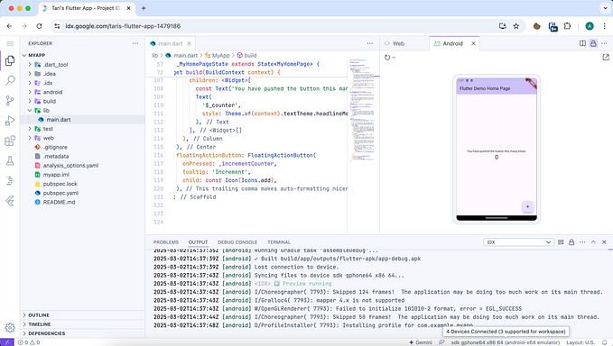
But none of us are making the first-ever website. We have a general idea of what a website looks like — there will be some nav links, a header, some body copy, and the Call to Action that you really want to make people click. Your team’s design system already contains the components necessary to implement this, alongside any caption, button, or switch you could want. And those components are itching to be used.
Understanding the general case of how a website works can trick us into thinking that we understand the specific task our users need to perform, and can start placing these elements in a layout editor. And that’s when designers fall victim to greebles.
Greeble ipsum dolor sit amet
Let’s back up a bit — instead of a UX designer making a website, you are a model designer at Industrial Light & Magic in the 70s. You are the first person ever to design a Star Destroyer, a 12 mile long space battleship, but you don’t have skillsets in either rocket science or naval gunnery. But rockets and battleships have been around for decades, so you have a general idea of what they look like: they are gray and have a bunch of bits and bobs hanging off the surface.
Your audience’s understanding of spaceships is going to be similar to yours. They’re not going to pilot the thing, they’re just going to look at it. So you stick a bunch of those bits and bobs on to the surface of a shape and it’s a job well done: what looked like just a big gray triangle now strikes terror into the systems of the Galactic Empire and into millions of movie watchers. That detail — greebles — gives the appearance of life to an invented object.
Effectively, today’s UX designer in the example above is doing the same thing: making something (a website) “look right” by adding a light sprinkling of detail to the surface. Except unlike the model designer’s output, a product mockup is not just meant to be looked at — it is meant to be used (by developer teams) to create a product that is also meant to be used (by the end-user).
Skipping the work of developing a valid conceptual model and skipping straight to solutioning has resulted in a greebled website, composed of cool but ultimately useless visuals. It creates the appearance of a carefully designed solution where there isn’t one, and leads stakeholders to believe that the team is ready to start building before the research has even gotten off the ground. Instead of getting critical early-stage 30-percent feedback, the design’s high fidelity is inviting superficial tweaks to fonts or colors.
But unlike the Star Destroyer, the website will eventually hit production. By the time the greebles are unmasked, it’s too late to make changes cheaply, and the problems are there to stay.
Catalyzing useful feedback
But greebles are not at all bad things, if you use them right. The Star Destroyer may have been designed on the principle of “what looks coolest” but in the 45+ years since it was created, it sparked the imaginations of countless people to come up with how it would work, if it did work.
That power to cheaply stimulate the imagination makes greebles a powerful technique for user research, as long as you are open to open-ended feedback and not just validation.
There are a variety of techniques that can take advantage of greebling, to make it easier for research participants to imagine the product within their lived context and think about what would meet their needs. Provotyping on the higher-fidelity end, speed dating for early stage concepts, even more cutting edge techniques like non-finito prototyping could benefit from using greebles to make the design feel like a real object that exists within a real space.
And when the participant asks, hey what’s this for? what does it do? what information does this show? the researcher can turn the question right back at them. What would you like it to do, or what information would you want to have? What would be helpful, in this context?
Once you have the answers (and the answers might be “I don’t need anything here”), use them as inputs for modeling how the system should behave, and replace the greeble with the real thing. Just keep them out of your demos and deliverables.


