What UI\UX designers can learn from mobile experiences

As our mobile phones get bigger and new technologies emerge, mobile companies AND mobile apps don’t have to compromise on usability or user-friendliness.
Inevitably, mobiles are setting their footprint in the big consoles’ court with unbeatable portability and effortless experiences.
What does that mean for designers in general?
In this article, that was originally published in Design.Minutemedia, we’re to discover:
- Why do users prefer mobile?
- How can we take inspiration from mobile user experiences?
- Top 4 desktop websites and apps that do it just right
People are willing to put minimal effort
Users don’t want to and shouldn’t have to work hard. Mobiles provide them with value for minimal effort compared to desktops.
Between mobile and desktop, mobile UX dominates websites’ traffic, purchases and conversion rates, search queries, social media browsing, and more.
Why? Because mobile is so much simpler!

Mobile experiences offer different ways to complete a single action: different touch gestures, voice inputs, user movements, GPS, camera, and more.
These habits set exceptionally high standards for user experiences across every platform.
If you can’t beat them, take inspiration from them
Mobile users are used to achieving tasks with almost no effort while receiving maximum value — at least that’s what good UX feels like.

How can we take inspiration from mobile experiences into our desktop designs?
1. Micro animations
One thing that makes mobile interactions awesome is those little smooth and ‘effortless’ animations. They can help users focus on what’s happening and add delight to the experience in a natural feeling way.

When it comes to desktop, however, we see less effort in that area, probably because it is a bit trickier for a few reasons:
- Designers have more freedom to use animations on mobile, whereas animations can quickly become overwhelming on desktop (especially with SAAS and Productivity apps).
- Animations on larger elements on desktop (bigger cards, tables, forms) can look rough when not done right.
With all that being said, I challenge you to explore and implement micro-animations in your desktop designs where you can — it could really make a huge difference!
2. Forms that make it a little easier
We all know that feeling when we open a thesis-long form.
You get the motivation to start filling it out when you’re thinking,
“Haven’t I already filled this info a hundred times already?”…
You finally finish, hit submit — and boom! You get three errors.
“NOW you tell me?!”
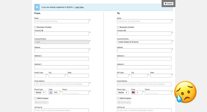
To spare your users, we can take a few examples from form experiences on mobile:
- Using autocomplete/autofill fields
- Using one column forms
- Dividing long forms into pages, or
- Using a Wizard, as we see on mobile onboarding’s
I love growth.design’s case studies on onboarding experiences — you can find great inspirations like the one on HEY Email.
3. Unique cursor interactions
One unique interaction we would never see in mobile is cursor interactions.
They add great delight and excitement to your product, and while they may not be suitable for heavy-duty platforms for work — they could really take your landing page, onboarding, and corporate website designs to a whole ‘nother level.
Top 4 desktop websites and apps that do it just right 👌
Some products have mastered their desktop experiences even more than their mobile’s. My personal favorites are:
4. Muzli
I usually think of Chrome extensions for productivity reasons, like ones that help me organize my tabs and bookmarks.
However, Muzli is no ordinary add-on.
Big visuals, dark mode, and smooth, minimalistic animations let me browse inspirations for long periods of time and not get overstimulated.
3. Whatsapp Web
Whatsapp has become one of the most used apps in the world, and my personal “most used״ on mobile.
But what about Whatsapp’s web version?
For people like me who use Whatsapp to communicate with friends and family as well for work, the desktop version is highly useful. You can write faster than on mobile, drag files directly to the conversation, easily copy links from other tabs, and more.
The only con is that the Voice Recording feature is easier on mobile, in my opinion.
2. Medium
Apart from the diverse content we can find on Medium, I personally find their desktop experience amazing for reading lots of content for long periods of time.
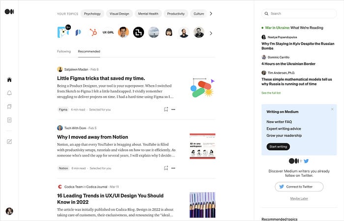
I usually prefer reading on mobile, however, Medium’s layout and design make searching for content, casually browsing, writing, and going through my Reading List so fluent on desktop.
1. Spotify
You’ll never catch me using Spotify on mobile when I’m near my computer.
Not that their mobile app isn’t great — it’s a crowd favorite, justifiably.
But as a music enthusiast, their desktop takes the cake by making a true pleasure out of exploring new tunes, managing playlists, and judging my friends’ life choices.
To summarize
Mobile designs have led some of the greatest UX trends and will continue to do so as new technologies introduce us to even more opportunities.
We designers have to be one step ahead by keeping up with trends and truly committing to creating effortless and pleasant experiences for our users.

