What to keep in mind for your next spacing system?
Upon researching guidelines and best practices for the very first spacing system I worked on, I came across some common points that each article would highlight. So, here are a few things you might want to keep in mind for your next spacing system:
Proximity is key!
That is the most important rule to keep in mind, and is best quoted in Robin Williams’ “The Non-Designer’s Design Book” :
Items relating to each other should be grouped close together. When several items are in close proximity to each other, they become one visual unit rather than several separate units. This helps organize information, reduces clutter, and gives the reader a clear structure.
Proximity is your eye’s first indicator of what belongs to what, and where a group begins and ends. So, in a technical matter, where are your tighter spacing values? and where are the larger spacing values within the elements of your UI design?
Squinting at a screen that you are designing, or simply looking at it from afar, is what we call the squint test. This way, you are able to tell which sections look too far off, and which ones look closer to each other. That will be able to tell you if you got them correctly sectioned.
Here with two examples to further discuss this:

Why do they seem different?
Looking at the example above, try to squint at it or look at it from afar. How do you interpret it?
Example 1 seems to have two sections, where each section has a title and three points.
Example 2 seems to have eight lines that are within the section, with two titles that are simply identified due to their text weight.
How does the spacing affect that?
Example 1 has two main sections separated by 16px; inside each one of these sections, there is the title and the content. The title and the related content are separated by 8px, and each line of the content’s body is separated by 4px.
Example 2 has one unified spacing value; I used 8px to separate every line from the other.
When building a content block, make sure to utilize the spacing to your advantage. You want to utilize it in a way that supports the text you have, where every title would have its related content nearby. However, sections unrelated to one another should be further away accordingly.
Following these steps would help you build a spacing pattern that supports these cases to make sure your content has a unified look overall.
You should note that this rule doesn’t apply to text only; it also applies to all of the UI elements. You should keep in mind what you want the user to see first, or what grouping you want them to pay attention to. In addition, what elements make sense if they were grouped together, and which should hold their own space further from one another?
With a bit of experimentation, you will be able to build a good spacing pattern for your elements!
What is your system’s base value?
Your system’s base value is the smallest spacing unit that you would use in your UI design system. It is also the value you would multiply and use to determine bigger spacing values.
Your base value can be 2, 4, 5, 8, or even 10. There is no consensus on the answer to this question. It depends on your product, where it will be used (what device/platform), and of course, the aesthetic of your product.
For example, when designing for mobile screens, you might pick (2, 4, or 5) because you would be designing for smaller screens.
However, designing for desktop screens or tablets, you might go for (8 or 10) because you would be designing for bigger screens.
When designing for responsive UI, I would recommend using an even-numbered spacing value. It would be easier to cut down spacing values from a bigger screen UI to a smaller screen UI. (Also, bonus easier math! No need for decimals in your UI design!)
Going back to the first example in this article, the smallest spacing value used in Example 1 was 4px. And the largest spacing value used in the example was 16px. The base spacing value used in that example was 4px, and the other spacing values (8px and 16px) were also multiples of the 4px base value.
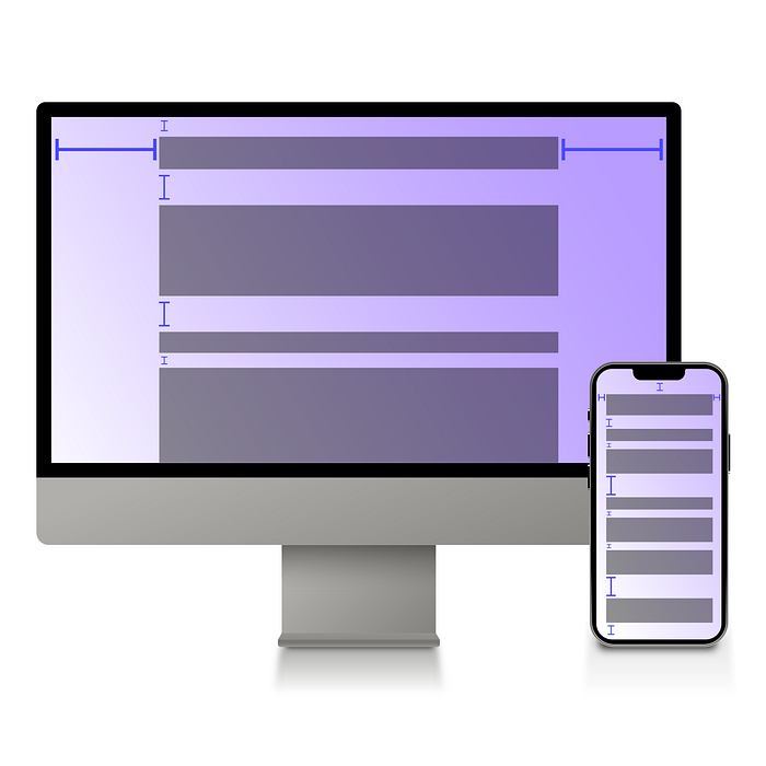
The images below explain the difference between a Spacing pattern for a Mobile screen vs a Desktop screen:


As seen in the examples above, the spacing pattern used for Mobile screens would include smaller values than the spacing pattern used for Desktop screens. Of course, you can adjust that pattern to the needs of your product and your UI design system.
Choose your base value, build your pattern, and do your experimentation! See what works best for you and your product!
Unify your page margins!
Just like our spacing patterns, unifying your page’s margins helps create a more unified and consistent layout on the overall look of your product.
Similarly, you can break down your margins to the spacing pattern you have for your product. The example below is given on a responsive UI, where the product is used on different platforms:
For Mobile screens, there are two breaking points:
1. Screen width 320px till 479px: page margin 16px.
2. Screen width 480px till 700px: page margin 24px.
For Tablet screens, there is one breaking point:
Screen width 701px till 1024px: page margin 32px.
For Desktop screens, there are two breaking points:
1. Screen width 1025px till 1439px: page margin 80px.
2. Screen width 1440px till 1920px: page margin 120px.
Again, this would take some experimenting to find a suitable margin while considering the overall structure of your design, and the usability of your product across different platforms.
In conclusion…
- Proximity is crucial for effective design: Use different spacing values to differentiate between sections and maintain a clear structure. Spacing is a powerful tool when utilized correctly., use it to your advantage in your design to guide the user’s eye to certain important elements, or to simply add more white space between elements when necessary!
- Determine your system’s base value: Choose the smallest spacing unit to be used in your UI design system, which will serve as your reference for calculating larger spacing values. That base value will depend on the platform and the device that your product will be on.
- Unify your page margins: Just like spacing patterns, unifying your margins will help you create and maintain a unified look to your UI. Customize margins based on different platforms and screen sizes to ensure a unified look and usability across devices.
Remember, experimentation is key when it comes to designing and building your patterns for spacing. See what suits your design and what works best for it. Remember, it doesn’t have to be perfect the first time!
Also, adding examples of the spacing elements into your design UI kit helps ensure that your team understands what values work best in certain scenarios. I find it helpful to add examples from the product inside our design UI kit about common patterns of spacing values, to ensure that the overall product has a consistent look to it!
What is next?
I will be releasing an article that showcases how I work with spacing units on Mobile vs Desktop next; can’t wait to share it with you all. Happy reading!

