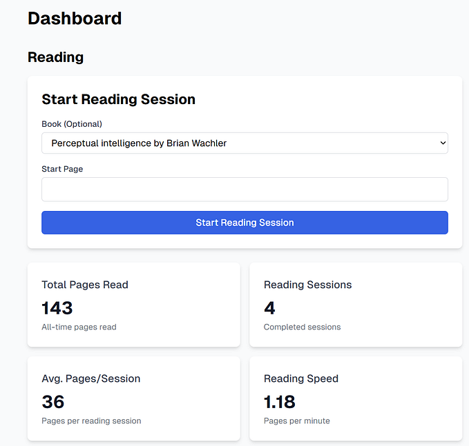

In the dynamic world of Android design, designer are confused with dp and px. A few terms hold the key to crafting pixel-perfect interfaces: Pixels, Density-Independent Pixels (dp), and Dots Per Inch (dpi). Let’s simplify these concepts to empower designers in creating visually seamless and responsive designs for Android devices.
Pixels (px):
Pixels are the smallest unit of display on a screen. Each pixel represents a single point of color.
Pixels are the building blocks. When you say something is `width=”100px”`, you’re telling the system exactly how big it should be.

Challenge of Using pixels for layout dimensions can lead to inconsistent visual sizes across devices with different screen densities.
Density-Independent Pixels (dp = dip):
Density-Independent Pixels (dp) are a virtual pixel unit that is not tied to the physical pixels on the screen.
They provide a way to express dimensions in a way that remains consistent across different screen densities.
Dp helps us make sure things look the same size on different Android devices.

Advantage: Using dp allows for responsive design, ensuring that UI elements appear roughly the same size regardless of the device’s screen density.
Dots Per Inch (dpi):
Dots Per Inch (dpi) is a measure of the pixel density on a screen. It indicates how many pixels are present per inch.
It helps us make sure pictures and graphics look sharp on all kinds of screens.

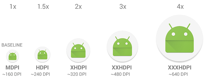
Screen Density Buckets
Android categories devices into several density buckets based on DPI. Common buckets include:
- (0.75x) for low density (ldpi) = ~120DPI
- (1.0x baseline) for medium density (mdpi) = ~160DPI
- (1.5x) for high density (hdpi) = ~240DPI
- (2.0x) for extra-high density (xhdpi) = ~320DPI
- (3.0x) for extra-extra-high density (xxhdpi) = ~480DPI
- (4.0x) for extra-extra-extra-high density (xxxhdpi) = ~640DPI
The conversion factor between dp and pixels is determined by the device’s dpi. For example, on an
mdpiscreen, 1 dp is equivalent to 1 pixel, while on anhdpiscreen, 1 dp might be equivalent to 1.5 pixels.
Android automatically scales resources when necessary to match the device’s DPI. For example, if an image is designed for
xhdpi, on a device withmdpiscreen, Android will automatically scale it up.
Different in px and dp in mobile devices

In mobile design, pixels (px) and density-independent pixels (dp) play different roles. Pixels are the basic units on a screen, but their size can vary on different devices. On the flip side, dp adjusts for these differences, providing a standard size.
For example, a 100px button might look bigger on one phone and smaller on another, but using dp ensures it stays consistent. This ensures a smooth experience, no matter the device size or type. It’s a key detail for making apps that look good on all kinds of phones and tablets.
Takeaways:
- As a designer, it’s crucial to comprehend the screen density buckets and their values.
- Designers typically work with pixels (px) in tools like Figma, while the development process involves units like dp and dpi.
- For Android mobile design targeting MDPI (Medium Density ~160 DPI), it’s recommended to start with a screen size of 360px by 640px in Figma. Keep in mind that DPI is determined by the screen size and its pixel density, making 160 DPI a baseline for MDPI.
- Designers can communicate the specifications for the MDPI screen and easily share assets in Figma. Developers can then use these assets to adapt designs to other densities, ensuring a consistent user experience across various devices.
Knowing about pixels, dp, and dpi is like having a handy toolkit for your Android designs. Whether you’re defining sizes precisely or making sure pictures look great, these measurements help you create interfaces that adapt smoothly to different devices. So, the next time you’re sketching your Android masterpiece, remember, it all starts with understanding pixels, dp, and dpi in a friendly way.


