What I Wish I Knew When I Started Using Figma
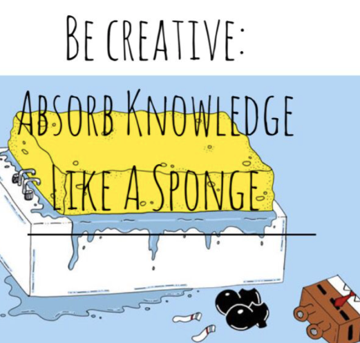
If you ask me what are the important traits of a product designer, from my list, there will be one trait about “willingness to learn”. Each year we talk about new trends in UI and so many design tools are launched, as a product designer I always feel I need to keep myself busy to absorb knowledge as much as possible.
Back to the topic about Figma in the article, since my first post of “From Zero to Something-My First Week with Figma”, it has been 6 months passed. I have used Figma quite often these days, recently I started to manage the UI library with my team and explore more features in Figma.
If you have no ideas what are variants, auto layout, swapping and states in Figma, this article is for you. 👈

Swapping and state
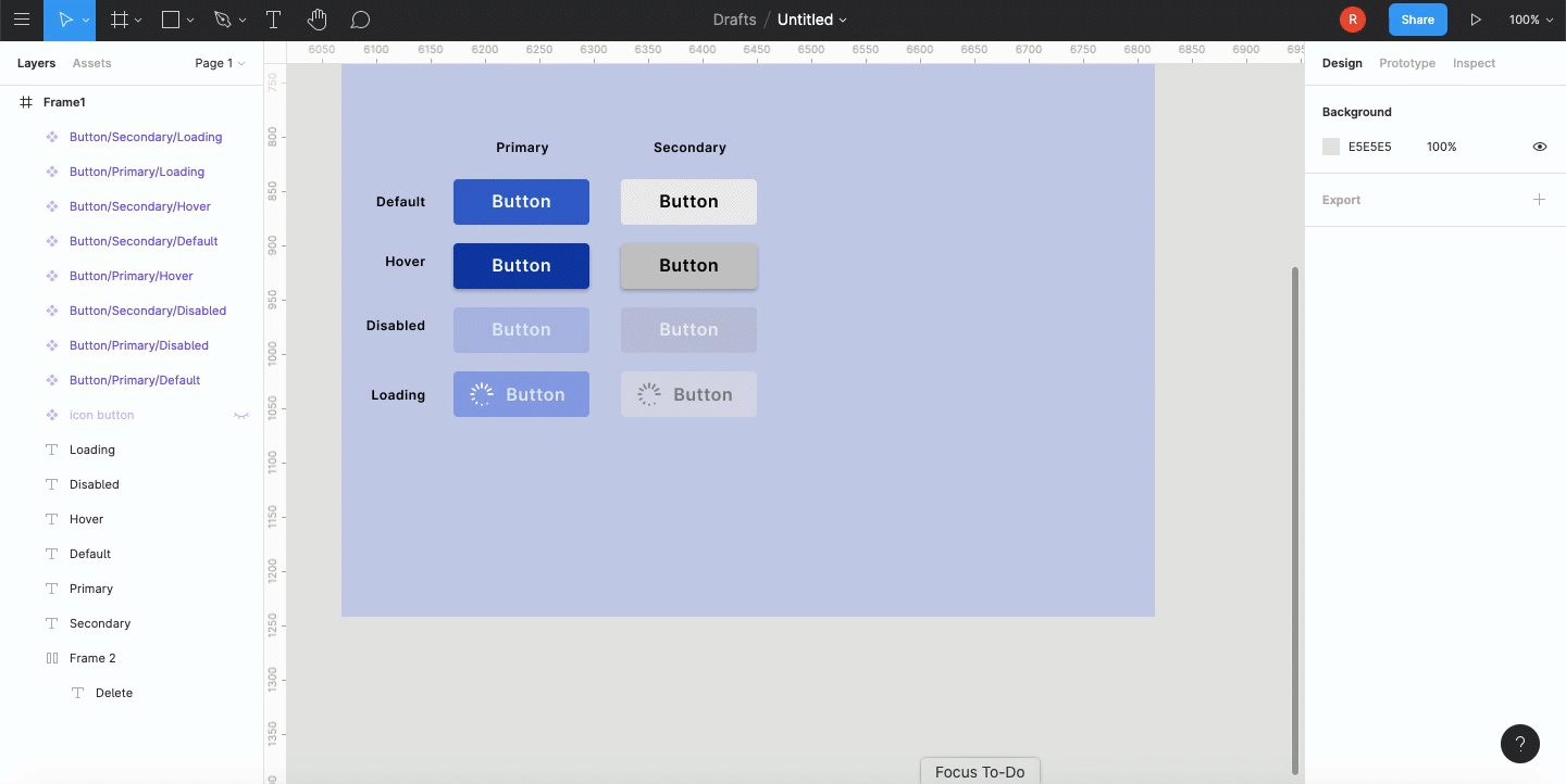
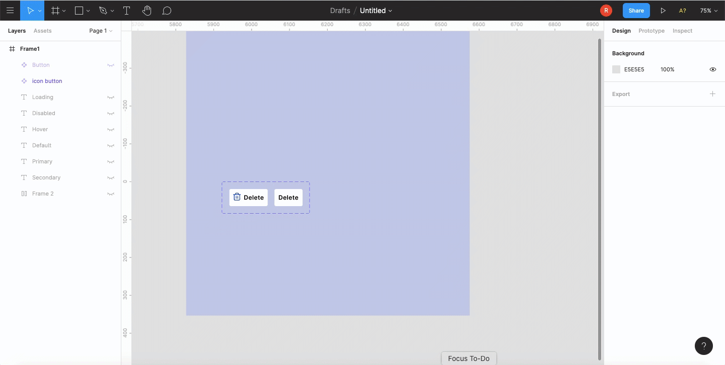
Firstly, if you’re not familiar with components, here is the definition from Figma: Components let you create and reuse elements of your designs to speed up the process and keep things consistent. The short cut in creating a component is Alt+Command+K. When creating the icons, buttons, and cards through the switch between instances of these components, could make our design more efficient. By creating the component with the slash to name it, then access the instance menu from the properties panel in the right sidebar to make the change.

The other way is to hold the Alt+Command when the component is nested within another Frame or component.

Auto layout
The process of auto-layout is simple and super easy to enable but it allows a ton of possibilities. To use the shortcut is Shift+A then the element will be converted into an auto-layout frame. Then everything will be updated dynamically within the frame.

Incorporate icons into the button and change the spacing or padding around the item.

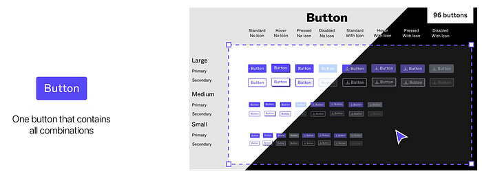
Variants
A collection of components, called variants, that all share their properties, but have different combinations of values for those properties.
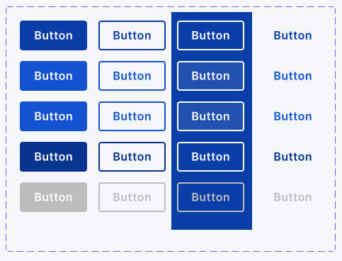
To understand the mechanics of creating and using variants, let’s start by creating a component set and name it with slashes.
Button/{Primary/Secondary}/{Default/Hover/Disabled}, such as Button/Primary/Disabled or Button/Secondary/Default.
Once select the components, there will be the button “Combine as Varians” in the right sidebar. After merging, Figma would use the value before the first slash as the component’s name and each of the subsequent attributes separated by slashes would convert to values. Figma will also create the properties.

Tips: Figma recognized Ture/False or On/Off as boolean values, instead of showing the value itself, it will show the toggle switch.
Let’s try to apply what introduced before of the auto-layout with this feature.
Closing
Building a high-quality component system takes time and patience and a well-organized system allows us to work more effectively and better collaborate with others in the team. What is more important, as a designer, the willingness to learn and explore the ways in designing the product, as mentioned at the beginning of this article.
Thank you for reading!
Give me a clap if this article gives you a “Sponge” moment. 😋
References:
Swap between component instances in a file; Figma Tutorial: Components — Swapping and States; Figma Tutorial: Variants

