What I wish I knew about Figma UX/UI Handoffs
A love letter to Figma’s auto layout feature, feel free to hop in.

As a UX/UI Designer I like to think that design is primarily, a form of communication: The user needs to reach the information in some way to begin to understand, after that they will take any action IF their expectation was communicated in the way their mental model understands it.
For a client, this is the same, the team receives a briefing/goal, and for a few sprints, the design team needs to communicate the plan/process, research, layouts, and yadda yadda…
We all are aware of this. However, there is a part of the “Design is communication” speech that is oftentimes overlooked. How to communicate with your team, and that’s what we will investigate in this text.
Organize and map your design
Locating other designers, PMs, or Devs where a flow starts and ends it’s your duty, not only its starts and ends but how they are connected. To do this you will need to do three things — to illustrate let’s use Instagram desktop as an example.
Use GIANT Headings
This is the simplest for everybody to understand what and where things happen. Usually, I like to use 3 types of headings
- OUTDOORSIZED: Those are for the parent flows. Those will be divided into different branches as the users use the app. e.g. Create an account.
- JUMBO: Jumbo headings are for those flows that still will be divided, but for edge cases or specific actions such as building your profile, or adding your first post
- meeh, just BIG: Those headings are for the edge cases or specific flows that came from the JUMBO headings like confirming your email or adding friends…
Sections
This is a feature very similar to the “frame”, but for organizing. Using sections you can keep every property of your design but still group them in a big container.
- Press Shift + S
- Select all the areas you want to group as a section
- Name as you want

You want to create a section for some of those headings, they will help you A LOT when creating links to share multiple screens.
Arrows everywhere
Figma lets up creating prototypes that can go from semi-navigable to The Wizard of Oz level. In the following chapters, there’s a 101 in delivering them to the team.
But you can start in a more straightforward way. Using figma’s autoflow plugin
This plugin lets you link that login button with the homepage, connect the main user flow with its edge cases, and show everybody your intentions without having to check (again and again) the prototype. I like to keep them 6px to 8px wide and 30% opacity, this way when they go over an element on the layout or over themselves no information is lost.
If you want to keep both updated you can use the ProtoToFlow plugin, it’s a little bit trickier and, if you aren’t that organized, can mess up your Figma file.

Instagram example
If you follow those steps correctly your Figma layouts will look more like this:

If you want to take a closer look, the creating post is a great example of all the heading and arrow structures:

This is just a silly example, it's very likely that your files will be more complex and have multiple flows, in those cases, the organization becomes even more important.
From Figma sections to Jira
Those sections can turn into even more handful features when you consider creating Jira cards.
I was used to creating Jira cards displaying print screens, but when we talk about design — on the consultant market — that also means, the clients can always demand changes out of nowhere, but what does this have to do with print screens and Figma sections?
The screenshots are a static frame of your design. But Figma sections can easily turn into dynamic views of your design in Jira — and for multiple screens. So, if you are creating a user story for an entire flow, instead of pasting an outdated print for each screen you can add the section for that flow, and later create a card for each of those layouts if you want to get into the details of each.
This demands you add the Figma plugin into Jira, but that’s super simple. Follow this link for the article or watch the video below
It’s super important for the product team — Product manager/Product Owner to be aligned with the design team so you can keep both user story cards and layouts on the same page.
A touch of front-end in your UI
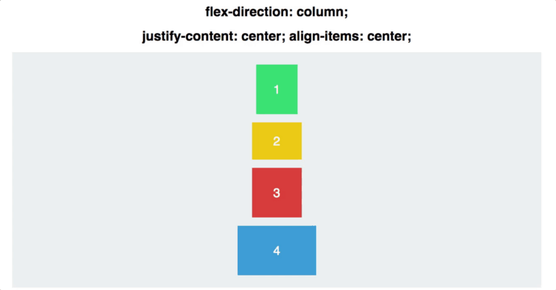
Introducing auto layout
This can be done in numerous ways, one that has become a super easy approach since I’ve learned auto layout is thinking as a developer — using flexbox.
Flexbox is a web layout model that is used to organize content in any direction, and also a way to fit the content inside the front-end containers.
I got this gif from the article How Flexbox works — explained with big, colorful, animated gifs.
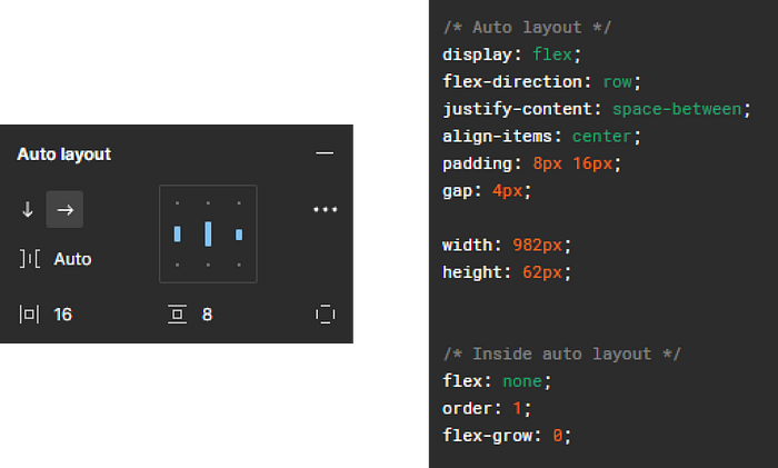
The cool part is: Figma’s auto layout is based on the mechanics from flexbox. That means you can use all of those things in your design. And Figma “does” all the code for you when you create an auto layout container, see the image below for an example — On the left, are the auto layout settings, and on the right the code provided by Figma.
If you still don’t know how to use the auto layout I strongly recommend checking it as soon as possible — it makes your designs way clearer and more intuitive to follow. Here is a helpful article Explore auto layout properties.
Getting precise
The last chapter was necessary even if you already were a master in auto layout to understand that not everybody knows this feature, if not every designer knows, imagine the developers.
There’s also an effort to introduce auto-layout precision to other teams, and their skill level can play a huge part in this. There can be multiple parts in a layout and just a small modal can have multiple auto layout containers inside of it, with different paddings, gaps, etc… It’s vital, for you, the designer owning the layout to show your expectations for the front-end.
This can be done by making the flexbox properties visible. Show what the spacing planned for each field with horizontal and vertical bars, like this:
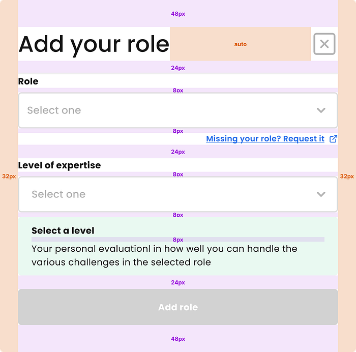
I love to add this to the cards followed by the disclaimer: This is the expectation in pixels for this viewport. Please, feel free to adapt to the desired unit rem, em, vw, vh,%…
To add those columns/rows you need to follow 2 steps
- Remove the spacing from auto-layout as you go. Use FIXED when you have set a number for the spacing. Use FILL when the input on the auto layout was “auto” and you want the spacing to answer the responsiveness of the page. In flexbox, respectively those cases would be treated with properties like gap, margin, padding; and justify-content: space between.
- Inside the columns you created position, using the auto layout, a font in the middle displays the expected dimension. I recommend using a 10px font, cause it can fit everywhere.
This idea was inspired by the design system Mondrian, there, they reduced a lot of the design/development effort by creating a robust DesignOps.
Responsive layouts
Designing responsive layouts can be a very tricky subject to talk about, it requires practice and experience. The best way to learn it is to design it and follow shadowing your developers. But for the handoff, here are some things you can do.
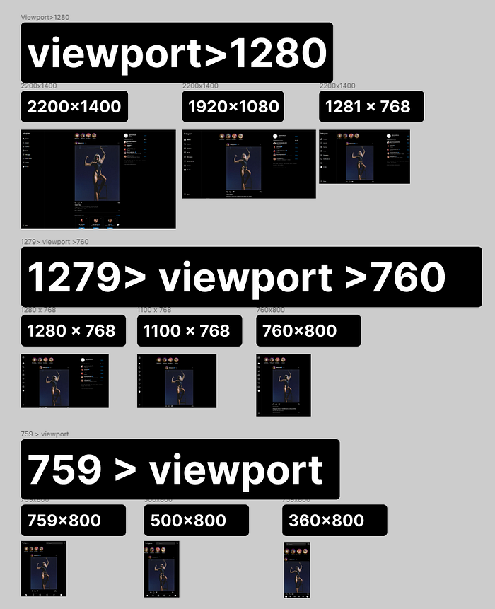
To develop logical responsive layouts on Figma, first, we gotta understand how the front-end developers read the layout. Most likely they will translate it using media query tags, they tell the style what is expected for each screen size

So, the media query can cover a range of screens like (1920 to 1366), but you need to show what are those ranges and what’s expected for the biggest and smallest resolution inside the range, to do that follow these steps:
- Select a range to start with, usually, you want to understand where your audience usually displays your system
- Find the breakpoints. Breakpoints are the sizes where your layout starts to collapse or objects get overwritten, if you use auto layout you can just shrink the page as you go and see where it breaks.
- Find the solutions for that breakpoint range and show how you expect it to be from the biggest to the lowest resolution from that media query.
It will look just like this:
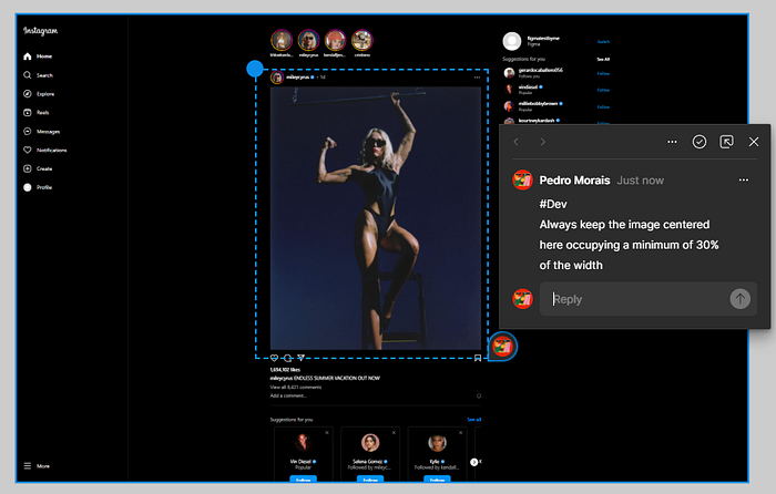
If you want to nail it, don’t forget to add comments and notes for the Developers and for the QA to understand what you are looking for just like this:
So far, That’s all
Yeah, I think that’s all I can cover and give some recommendations, as I mentioned we all learn things much better on the fly but I hope this article helped you a bit.
If you have any advice please comment down below I’m pleased to also learn with a much more expert community hahaha ❤ Thanks!
Hope you liked it! Follow me here or on Linkedin to know whenever I post anything. See ya!

