What are visual design principles?
These elements are inherently present in any good layout design.

Today I will talk about the design principles that are essential for a good ‘visual’ design on a digital or printed platform.
The principles of Visual design create a consistent user experience. To create the aesthetic of a product or experience, we use the elements of visual design, based on these principles. If we learn how to achieve unity, gestalt, hierarchy, balance, contrast, scale, and dominance, we will achieve consistent results time and repeatedly.
Principles of visual design
The elements of visual design- line, shape, Negative /white space, volume, value, Color, and texture — describe the foundation of product’s aesthetics. On the other hand, the principles of visual design tell us how these elements can and should go together for the best result.
The best designer sometimes disregards the principles of design. When they do so, however, there is usually some compensating merit attained at the cost of violation. Unless you are certain of doing as well, it is best to abide by the principles.
— William Lidwell

Let me start with the visual design principles:
Unity:
Unity creates a sense of harmony between all the elements in the page. A page with elements that are visually or conceptually arranged together will create a sense of unity.
Unity refers to how well the elements of a design work together. Visual elements should have clear relationships with each other in a design. Unity also helps ensure concepts are being communicated in a clear, cohesive fashion. Designs with good unity also appear to be more organized and of higher quality and authority than designs with poor unity.

We design websites that can make use of grid to achieve a sense of unity, since elements are organized in a grid will follow an orderly arrangement. We do need, however, to introduce some variety in our work to strike a balance between a dynamic and a chaotic design.
Gestalt
Gestalt refers to our tendency to perceive the sum of all parts as opposed to the individual elements. The human eye and brain perceive a unified shape in a unique way to the way they perceive the individual parts of such shapes. We tend to perceive the overall shape of the object first before we perceive the details of the object.
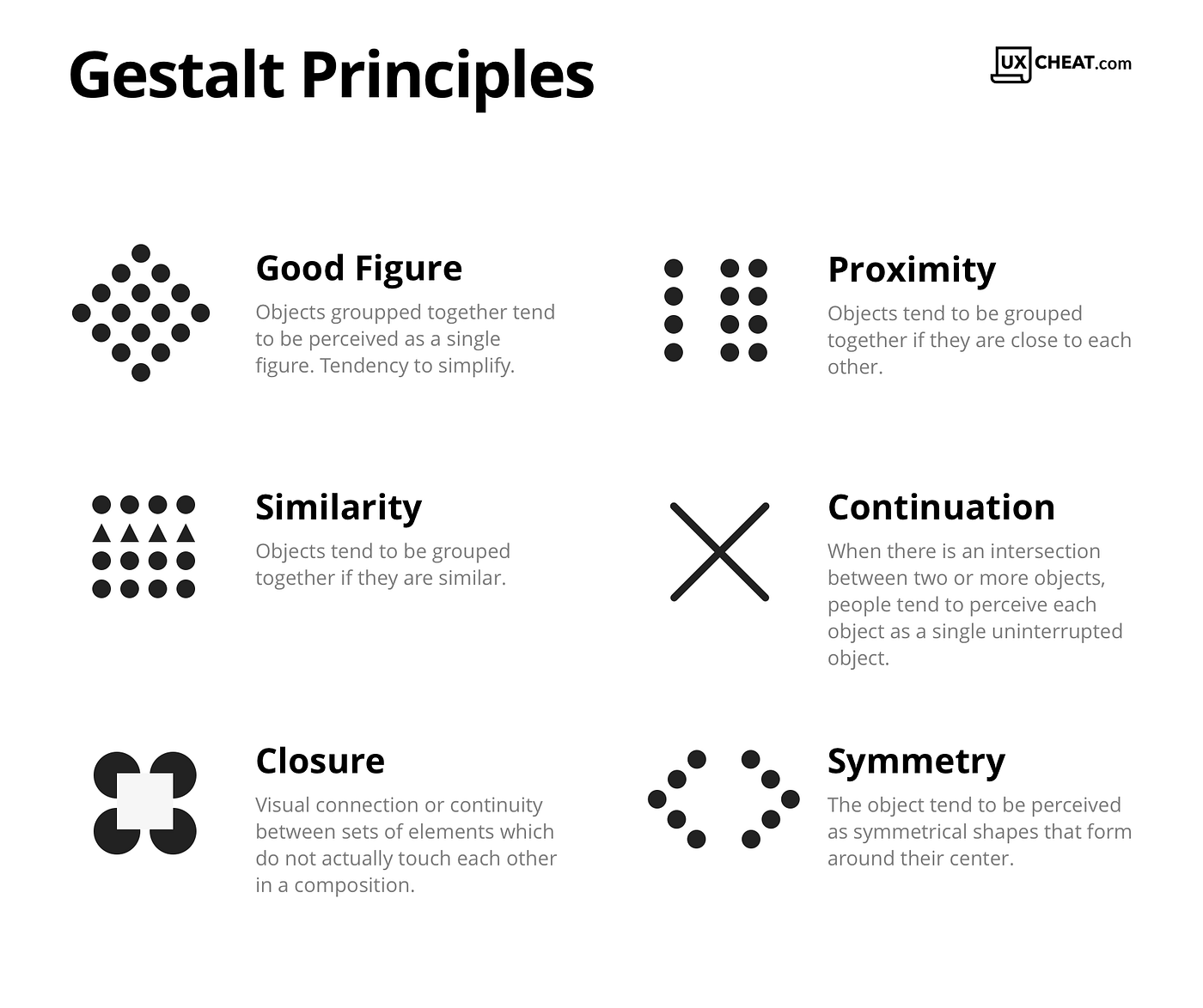
Gestalt is important, for instance, to make separate sections of a website distinct with whitespace between them. As a designer, we should make sure that the parts of the website we group together with gestalt principles — i.e. if they are close to one another, have the same shape and/or are similarly sized — are indeed conceptually grouped together. Otherwise — accidentally — if we grouped elements which are not conceptually similar, the result will confuse users.
Hierarchy
Hierarchy shows the difference in importance of the elements in a design. Color and size are the most common ways we can create hierarchy — for instance, to highlight the primary button, or use larger fonts for headings. Item that appears at the top of the page or app also tend to be viewed with a higher hierarchy than those that appear below.

Balance
Balance is the principle that governs how we distribute the elements of a design evenly. Balanced designs tend to appear calm, stable, and natural, while imbalanced designs make us feel uneasy.

There are two basic types of balance: symmetrical and asymmetrical. Symmetrical designs layout elements of equal weight on either side of an imaginary center line. Asymmetrical balance uses elements of differing weights, often laid out in relation to a line that is not centered within the overall design.
Contrast
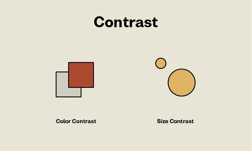
Contrast refers to the level of difference between design elements to create visual hierarchies. The variation makes certain elements stand out more than others. You can apply contrast by using colors, textures, sizes, and shapes.
In a layout, contrast is applied to create hierarchy between the font sizes. Larger text tends to be read before any smaller text. Contrast is important when it comes to pairing fonts.
Scale
Scale describes the relative sizes of the elements in the design. Use scale to make an element larger than others that appear with it, to emphasize that element. Not only can you make the element standout this way — you can also use scale to create a sense of depth.

Scale is a large part of design, sometimes literally. In a basic definition, scale is the deliberate sizing of individual elements.
Scales can help us make sense of designs and images. Think about if you were to draw a mouse next to an elephant, you’d draw the mouse much smaller than the elephant, which would help viewers instantly understand your drawing.
Dominance
Dominance creates a focus on a single element. We can use Color, scale, shape, contrast, and position to achieve dominance. For instance, most websites have a main hero image, which uses dominance, to appeal to users and naturally draw their attention to it.

Conclusion
Design is a complicated business full of principles, tricks, and techniques, some of which you can learn from others, and some of which you must learn on your own.
Take every ‘rule’ you read about with a grain of salt and apply it where it feels appropriate and abandon the rules whenever you feel they aren’t. Design is a constantly evolving and changing field and each situation is different, unique, and exciting.
Thank you! 🤗🤗
Thank You for reading this article. I hope you liked it and found it helpful. Support me by following me and showing some love by hitting that clap button.

