What are design tokens?
And how they can ensure a unified implementation of our design system

Design tokens are just one part of the design system. They help make building products easier by offering a solid foundation to build on. Tokens are essentially variables that are shared between developers and designers.

What are design tokens?
If you are a developer, you might have seen variables defined in your CSS files and used throughout your front-end applications. If you are a designer, you might see them in the form of Figma styles defined in your design libraries. Yes they are variables, but also so much more.
To quote my alma mater, Salesforce– the (cough) inventor of design system tokens:
Design tokens are the visual design atoms of the design system — specifically, they are named entities that store visual design attributes. We use them in place of hard-coded values (such as hex values for color or pixel values for spacing) in order to maintain a scalable and consistent visual system for UI development.
Design tokens are all the values needed to construct and maintain a design system — spacing, color, typography, object styles, animation, etc. — represented as variables. These can represent anything defined by design: a color as a RGB value, an opacity as a number, an animation ease as Bezier coordinates. They’re used in place of hard-coded values in order to ensure flexibility and unity across all product experiences.
If you’re curious, check out my work on Salesforce Experience’s design system hooks.
Tiers of design tokens
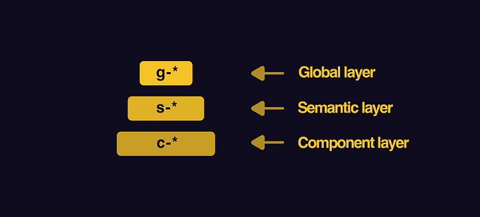
Tokens are generally split into three tiers, which represent the type of tokens making up a design language.

Global tokens
They can sometimes be called “tier 1” tokens, or core tokens. Global tokens are context-agnostic; they are not aware of the context in which they will be used. Basal spacing and font definitions belongs here because the tokens have no design system context.
Global design tokens have no awareness of intention, design or usage context.

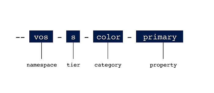
Let’s take for example, VOSS Water ( — arbitrary example — I was thirsty). VOSS has a design system with the prefix “vos.” To define the color blue, we use the token, ‘ — vos-g-color-blue.’ This defines what blue means to VOSS. VOSS blue should be the same across the organization.
An example of a global.css:
--vos-g-color-blue: navy;Semantic tokens
They can sometimes be called “tier 2” tokens, or alias tokens. Semantic tokens are design-system aware. They represent the intent of the design system. Some examples include, primary and secondary colors, focus colors, and border radius, which ultimately reflect the choices of the designer(s).
Semantic design tokens carry design intent and are design context aware.

In VOSS’s case, a designer might define all call-to-action Buttons within a light theme to use VOSS Blue as a background color. The intention is what defines a semantic token. The semantic token in this case would define the primary color (sometimes called brand color) to be VOSS Blue.
An example of a semantic.css:
--vos-s-color-primary: var(--vos-g-color-blue);Component tokens
They can sometimes be called “tier 3” tokens, or overwrite tokens. Component-specific tokens are an exhaustive representation of every value associated with a component. They often inherit from semantic tokens, but are named in a way that allows engineering teams to be as specific as possible in applying tokens in component development.
Component tokens are used when engineers need to override specific values in a pre-defined UI components. These types of tokens are to be used with caution, as they can break the unitary nature of a design language.

Say that a VOSS engineer has to implement a tabular component with a primary button inside, but it is not a call-to-action. There is a call-to-action outside that component. They need to overwrite the active-state background color of that button to be a different color, to prevent the appearance of having two CTAs on a page. The designer determines this to be a one-off case that does not call for a Semantic layer update. The engineer can use overwrite tokens to make changes directly to the component.
Component tokens are typically implemented as the need arises, often for a more mature design system, or for an organization for a complex portfolio.
Let’s talk a little more about component tokens.
Component token support need to be implemented by engineers. That means that an organization’s design system needs to be complex enough to warrant this. For that to happen, there needs to be an existing library of coded generic components (see: Storybook). Those components need to be coded with Component Tokens support.
button.html:
<button type="button" class="primary"></button>button.css:
button.primary {
background-color: --var(--vos-s-color-primary); /* Fallback */
background-color: --var(--vos-c-button-brand-color-background-active);}
tabularComponent.css:
--vos-c-button-brand-color-background-active: royalblue;For an example of just how extensively Component Tokens can be implemented: Lightning Design System Buttons.
Why we should tokenize our design system
Here are the goals our tokenized design system should strive to achieve:
- To create a robust, flexible, and scalable design system.
- To offer a source of truth for cross-functional teams
- Tokens should be flexibly defined to make room for organizational growth, yet be manageable
Designing for Scale
A tokenized design system allows our product portfolio to be scaled effectively, across design and engineering. It also allows for external-scaling, which could happen if our design system was made publicly available.
Designing for Clarity
The design tokens should be clear, informative, but not overly restricting. It should offer both designers and engineers good guidelines of what margins to use within layouts, sections, and components, yet not restrict them from designing for their specific need.
Designing for Consistency
The design tokens should offer a source of truth across functions, for engineering and design.
Designing for Maintainability
For a design system to be highly maintainable, the following conditions must be met
- Documentation must be available and maintained to reflect the current status of the design system. A poorly documented design system will render it useless across functions.
- Flexibility: The design tokens should be flexible enough to be used across different projects, each with their own design specifications.
- Governance: A system must exist where designers and engineers can propose new tokens and refactor the existing system based on new needs.
Was this article informative?
Leave a comment or share it with your team!

