Watercolor hack to paint different moods of the sky

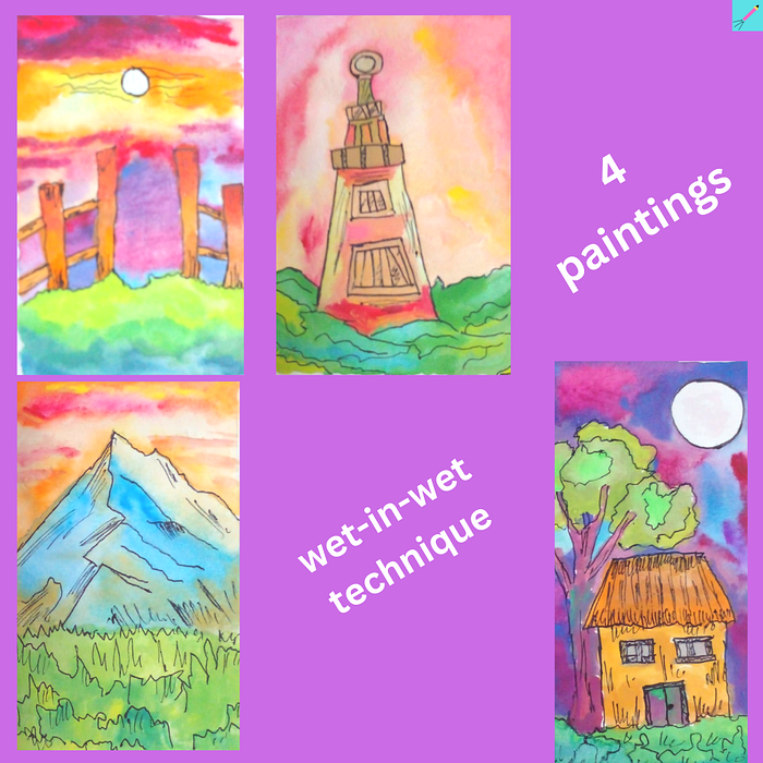
When you paint the sky then the wet-in-wet technique is the most suitable. You can make the colors blend into each other in an organic fashion. The only problem is it is difficult to handle the amount of water. But, some practice can make it simpler. The only question remains the choice of colors.

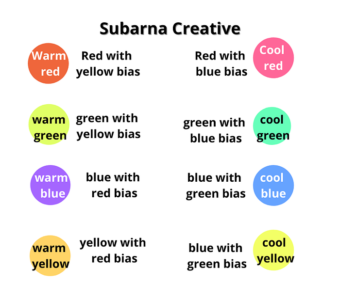
Remember that pure colors do not exist in most color palettes. So, you must take care never to let a warm color mix with a cool color. It is because the result will be a dull brown.
Difference between the two skies painted using warm colors

Notice that the sky looks warm in both paintings. However, the first painting has an angry and tiring feel about it. While the second painting has a calm and joyous feel about it. Let us analyze the skies of the two paintings in detail.
The color palettes of the sky
In the first painting, the sky uses three colors: Crimson, yellow, and Chinese white. In the second painting, the sky uses Crimson, yellow, and orange. The replacement of Chinese white with orange makes all the difference.
In the first painting, the white mixed into crimson only dull the anger of crimson. Yellow is a warm color but mixed with crimson, it becomes like a dull peach. There is the energy of crimson and no element of joy except the occasional usage of yellow. However, crimson dominates the first painting and it is looking like a tiring noon.
The building and the mountain
The building in the first painting is tall and majestic. It could be a mark of industrialization. It uses similar colors to the sky with black outlines separating it from the background. The angry and unforgiving mood of the sky matches well with the urban landscape.
In the second painting, orange dominates. It creates a happy and pleasing effect with yellow. The limited use of crimson adds energy but does not take away the happiness of orange and yellow.
The mountains in the second painting use two colors: Cobalt blue and brown mixed with orange. The blue chunk is huge and balances the energy of the warm sky with its serenity. It looks like the sunrise, the coming of energy and health, and happiness all in one painting.
The colors in the grass
Notice that the grass in both paintings uses the same color palette but has different color biases. The first painting is more biased toward blue color which gives it a gloomy depth. The second painting has grass more biased towards yellow color which feels like coming toward the viewer and is energetic.
The sunset

Notice how the sunset looks gorgeous. It is possible because it uses both warm, cool, and transition colors. But, here is the hack about how to use both warm and cool colors together and not get a dull brown.
How to color the sky
Close to the sun, there is yellow and beyond it is orange. Beyond orange is peach which you get by mixing orange and crimson. Then, keep mixing blue with crimson to get progressively cooler colors.
How to color the grass
The top part of the grass is a warm green. It means it is green with loads of yellow in it. We gradually keep mixing blue into this warm green to get progressively cooler shades of green. It is a great way to create artistic effects.
A mysterious night

I wet the entire background with water then let my blue, crimson, and purple flow freely and blend into each other. The wet-in-wet technique can create magic.
For a complete discussion on color theory, visit my blog.
Loved this blog? Follow me on medium for more discussions on art hacks and concepts and more.

