Case study: Filtering main feed content for VSCO
VSCO could be the new Instagram.
What a bold statement. It’s true — at least to me.
I have been using VSCO has an outlet and happy place for the past 5 years. I can find inspiring, aesthetic, relatable, and feel good content, and I can post whatever I want, all in an app that completely diminishes the notion that your number of friends or followers, number of likes, or number of retweets defines you.
I follow about 30 accounts — some are my friends and some are big accounts that post general types of content, such as favoritesfeed, satisfyingposts, and quotesforlife. As I scroll through my feed, I often find myself very confused and overwhelmed by the amount of content I see at once.
Sometimes posts are repeated, since it will show up every time it is republished by someone who I am following. And sometimes, I find myself scrolling through an overwhelming amount of posts from big accounts that spam a ton of content at once, when I just want to see new posts from people I personally know. I don’t want to unfollow these big accounts because I appreciate most of their content — it is just tedious to have to scroll through it all to find content I want to see at a specific moment in time.
VSCO does have a search feature where people can search for accounts and topics to browse through content. But to me, I look at my feed of people I follow as my main source of content and find that it would be convenient if my feed was easier to navigate. I wondered if others felt the same way.
Is the main feed an equally overwhelming experience for anyone else?
User Research

In my interviews, I wanted to discover what people struggle with overall when using VSCO. Here’s what I learned from their responses:
- People would rather see posts from their friends and accounts they follow because the discover page is not personalized.
- People get confused when republishes and original posts are seen together in one feed because content is repeated.
- People prioritize seeing specific content at certain moments in time when there is a lot of new posts to scroll through.
- People rarely find new accounts to follow nor share posts with friends because both the search and messaging features are obscure and not user-friendly.
I learned that the people I interviewed shared my struggle with the main feed but also have some troubles with other areas of the app. I decided to narrow my focus on the main feed itself to stick with my original problem space and the main source of content, leading me to develop the actual people problem.
The Problem Statement
Users want to navigate their main content feed in a smooth and efficient way but they can’t do this well because:
1. They prioritize seeing certain types of content or certain people’s content over other accounts who tend to spam the feed all at one time, but they don’t want to go through the trouble of unfollowing accounts.
2. Content is repeated on their feeds, making it hard to keep track of whether they are up to date on all of their new content.

My Journey to the Solution
The brainstorming session with my friends Carl and Jennifer took 5 hours and hundreds of sticky notes but we came up with 6 potential solutions.
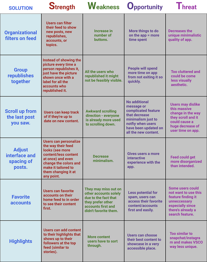
1. Organizational filters on feed: Users can filter by new posts, new republishes, accounts, and topics.
2. Group republishes together: Instead of showing the picture every time a person republishes it, just have the picture shown once with a label for all the accounts who republished it.
3. Scroll up from the last post you saw: Users can keep track of if they’re up to date on new content.
4. Adjust interface and the spacing of posts: Users can personalize the way their feed looks (see more content/less content at once) and even change the colors and make it tailored to them changing it at any point.
5. Favorite accounts: Ability to favorite accounts on their home feed to in order to see their content first and maybe even be a shortcut to their account.
6. Highlights: They can add content to their highlights that shows up to their followers at the top feed (similar to stories) so that people can see the best content of the accounts they follow.
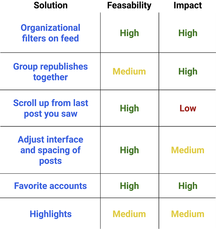
I analyzed each solution with the SWOT technique and also made a feasibility/impact matrix.


After a lot of thinking, I decided to proceed with the solution of organizational filters on the feed.
This feature has both high feasibility and high impact and it approaches both aspects of my people problem. Users who prioritize certain people’s content over others can directly toggle their feed using the filters to show them it. And the filters allow people to separate republishes from posts, helping with repeated content.
All six features would improve VSCO, but the organizational filters best targeted my people problem.
Flow Explorations

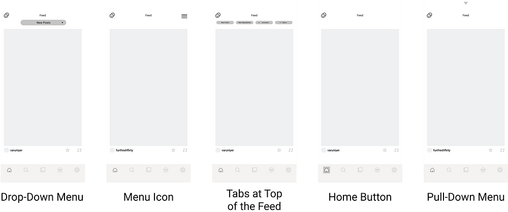
I first came up with 5 possible entry points for my feature:
- Drop-Down Menu: It’s user-friendly and an easily accessible drop-down menu at the top of the feed. It makes sense to be at the top of the page. It’s super prominent and not hidden at all.
- Menu Icon: It’s a small icon to the top right of the screen. This makes sense to be structured and positioned in this way because it’s a common indicator that their are more options available. I don’t think it’s very hidden but it’s definitely more subtle than the first entry point.
- Tabs at Top of the Feed: It’s an extremely easy and effortless way for the user to clearly see all their options right away without having to click a button.
- Home Button: It doesn’t add anything to the actual feed, just extra detailing to the home button to indicate to the user that this can be clicked. This a button that should be held down on, similar to Instagram’s way for users to change between their accounts by holding down on their profile picture at the bottom right of the screen.
- Pull-Down Menu: It’s a menu you can pull down from the top like what you can do on the actual iPhone. It is minimalist and doesn’t add too much to the main feed.
In my user testing, I decided to test the drop-down menu, the menu icon, and the tabs at the top of the feed, in terms of entry points. I felt that these three were the most prominent and made the most sense when filtering a feed.
I created several flows, exploring various shapes of buttons and icons, and the overall organization of the elements on the screen. I narrowed it down to 3 flows and prototyped each. I tested each prototype on 3 different users and received their feedback.

Flow 1
Flow 1 uses the menu icon at the top right of the screen as the entry point. When clicked on, a menu slides over with the different filters — new posts, new republishes, accounts, and topics. When the topic or account tabs is clicked, it leads the user to a list. They can click on specific topics or accounts to add those filters to the feed. A back button needs to be clicked to lead the user back to an adjusted feed.

Flow 2
Flow 2 uses the drop-down menu at the top of the feed as the entry point. When clicked on, a menu pulls down with only 3 filters — new posts, new republishes, and topics. In this flow, when new posts is clicked, it leads the user to a list of accounts that they can click on to show new posts from those specific accounts. Also, profile pictures are visible when scrolling through the list of accounts. Topics works the same as Flow 1.

Flow 3
Flow 3 uses the tabs spread out horizontally at the top of the feed as the entry point. Only three filters are available like in Flow 2 and works the same way except the user has to horizontally scroll through accounts and topics to select them. These filters are structured similar to a shopping website.
In my user testing, I wanted my interviewees to identify the pros and cons of each prototype and the best aspects of each. I wanted to know if the feature is overall easy to use and understand and if it serves its purpose in tackling the problem statement.
User Research Findings on Explorations

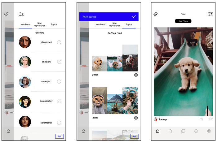
Based on these findings, I developed my final flow after dozens of iterations and little tweaks to different parts of the flows. I allowed the user to be able to toggle their feed to show both accounts and topics together. I implemented the use of the pictures in both the profile pictures of the accounts and as a preview of the topics because pictures are more appealing and stimulating for people.
I used the style of existing components and assets in the app as inspiration for the additional components and assets of my feature. I made sure to apply the existing hierarchy of the typography in both font size and weight. I also used the color palette and the existing spacing of the app.
All of these specific details are outlined in my UI Kit below.
UI Kit

The Finished Product


Conclusion
The main feed of a social media app is always one of the most important parts. If it is confusing, this can be very overwhelming for users. My idea of adding organizational filters on the user’s main feed in VSCO, tackles a core problem with the app. My final prototype could hopefully rid of the confusion that the current feed can cause. It allows users to choose what type of content they want to see at any point, without having to scroll through dozens of posts.
In the Future
Looking forward, I would like to ponder better ways for this feature to be able to be used by all types of users — those who follow a lot of accounts and those who don’t. I would also love to explore other areas of the app, maybe make sharing features more accessible and strengthen the connection between people on the app.
This was my first design case study and I loved every minute of it. I hope to improve and continue to grow as a designer. Thank you Cornell AppDev for the amazing Intro to Digital Product Design course and for introducing me to my new passion and future career aspiration. I am extremely thankful for this experience and all the amazing and talented people I met through this project.

