Case study: The Ola App, a heuristic read

Ola Cabs, is an Indian transportation network company offering services that include peer-to-peer ridesharing, ride service hailing, taxi, food delivery, and digital purse which can be used to make payments for various merchants.
The v 4.9.9 OlaCabs app, which runs on Andriod and iOS platform has options to book, schedule, and pay for your cab, order food online, pay your bills (electricity, water, etc.), and much more. So, commute, food delivery, and digital money under the same name, OlaCabs.
The heuristics evaluation performed on this application is to explore and understand the user interface, looking closely at user experience aspects also identify the kind of user experience problems and is conducted against a set of design principles.
Content Overview


Nielsen Norman Group Principal by Jakob Nielsen
The Nielsen Norman Group (NN/g) heuristics, these heuristics have been reflected in many of the products designed by some of the most successful companies in the world such as Apple, Google, Microsoft, Adobe, and more.
- Visibility of system status
- Match between system and the real world
- User control and freedom
- Consistency and standards
- Error prevention
- Recognition rather than recall
- Flexibility and efficiency of use
- Aesthetic and minimalist design
- Help users recognize, diagnose and recover from errors
- Help, and documentation
Shneiderman’s Eight Golden Rules
The characteristics derived from Shneiderman’s golden rules can be recognized in various user interface guidelines produced by companies like Apple, Google, Microsoft, Adobe, and more.
- Strive for consistency
- Enable frequent users to use shortcuts
- Offer informative feedback
- Design dialogue to yield closure
- Offer simple error handling
- Permit easy reversal of actions
- Support internal locus of control
- Reduce short-term memory load
Gerhardt-Powals’ Cognitive Engineering Principles
Jill Gerhardt-Powals developed a set of cognitive principles for enhancing computer performance. These heuristics, or principles, are similar to Nielsen’s heuristics but take a more holistic approach to evaluation.
- Automate unwanted workload
- Reduce uncertainty
- Fuse data
- Present new information with meaningful aids to interpretation
- Use names that are conceptually related to the function
- Limit data-driven tasks
- Include in the displays only that information needed by the user at a given time
- Provide multiple coding of data when appropriate
- Practice judicious redundancy

Home Screen


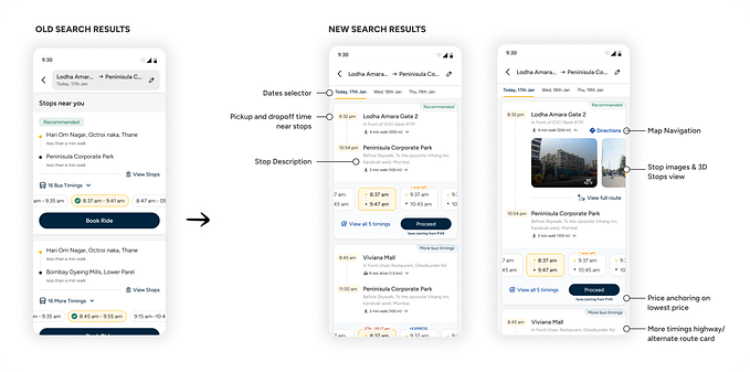
Booking a cab

Track your ride

Hamburger menu


Flow 1 — Booking a cab

- Food, Rides, and Money, the three primary services offered by Ola always visible on top of the screen for easy navigation and overview.
- The notification icon records the total number of unread notifications across all three primary services.
- The user is able to select or choose between ‘Daily, ‘ Rental’ and ‘Out-station’ at the bottom half of the screen, in a more meaningful way.
- The category of cabs under ‘Daily’ is grouped with regards to their pricing and type of comfort of transport, increasing user convenience.
- The user throughout his/her journey is given the controls to choose or change his/her mode of payment.
Flow 2 — Hamburger Menu

- The Hamburger menu is designed independently for every primary service and shows the necessary secondary services and information with respect to its primary business line.
- The options available on the Hamburger menu are reduced from 15 to 7.
- The user would still be able to act on the same information, now, in a sorted manner.
Flow 3 — Tracking your booked cab

- On re-visiting the home-screen after having booked a cab, information and tracking on current booking is available to view and action upfront on the home-screen
Flow 4 — Tracking your booked cab via Hamburger menu + Past rides and Invoice

- Another way where the user can track his current booking is by using the hamburger menu.
- The ‘My Rides’ section on the hamburger menu should be divided on basis of ‘Upcoming Rides’ and ‘Past Rides’, which helps the user navigate in a smoother manner.
Conclusions and Learnings
Although Ola cab should let you book choice of your cab primarily, the version v4.9.9 (version, evaluated) also lets you order food and pay bills and more. With this exercise, I felt the application’s primary goal had been diluted into multiple other use cases.
Please note that as I write this article today, the app version 5.2.8 and there has been considerate improvements in the app’s product strategy.
This exercise revised the design principles for me, and, certainly made me feel connected to UX learnings again. Whereas, as a professional, I spend most of my time designing and researching.
The heuristic evaluation performed above is with respect to the Design principle’s as mentioned, and, also after listening to real-time user experiences with the OlaCabs application.
The solutions recommended here are an attempt from my side as an understanding of the common user pain points. I would like to thank all the users who shared their experiences with OlaCabs.

Be there a chance to connect, I would be happy to get in touch! 🤝
Radhakrishna Aekbote, UX Design | UX Research | Product | Mentor