
Member-only story
UX word of the day: Proximity Compatability Principle (PCP)
Proximity Compatibility Principle | noun | Prau — xi — mi -ti • Com-pat-ibal-it-ee • Prin-sip-pal
- : A design principle that relates two concepts of task proximity and display proximity.
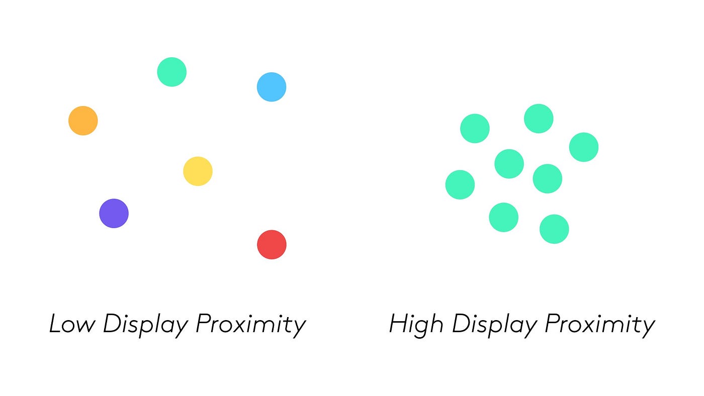
Display Proximity: refers to the level of visual similarity between two given pieces of information. For instance, if they are close together, share the same color, use the same physical dimensions (e.g. orientation or length), or use the same code (e.g. digital or analog), they are said to have more display proximity.

Task Proximity: defines the extent to which the two or more sources of information are used as part of the same task. Here, it’s easier to compare the sizes of Missouri and Nevada when they are placed next to each other, instead of on a map with numerous states between them.
Increasing the events’ proximal compatibility on my calendar by color-coding them by category on the calendar helps me keep track of my schedule at a glance. I can simply look at the week view and compare the kind of events I have scheduled and judge the nature of an event by looking at it.


