UX/UI Color Psychology

Introduction about color psychology:
Color psychology in design is the study of how different colors can influence human emotions, behaviors, and perceptions when applied to various design elements, whether in graphics, interior design, branding, marketing, or any other creative discipline. This field of study is rooted in the idea that colors have the power to evoke specific feelings and convey particular messages, impacting how people perceive and interact with design.
Colors and Emotions:-
Colors in UI design can evoke specific emotions and influence user perceptions and behaviors. Here are some common associations between colors and emotions in UI design:
Color psychology in UI design refers to the practice of using color to evoke specific emotional, psychological, and behavioral responses from users interacting with a digital interface. It involves the strategic selection of colors to create a visually appealing and effective user experience, considering how different colors can influence user perceptions and actions.
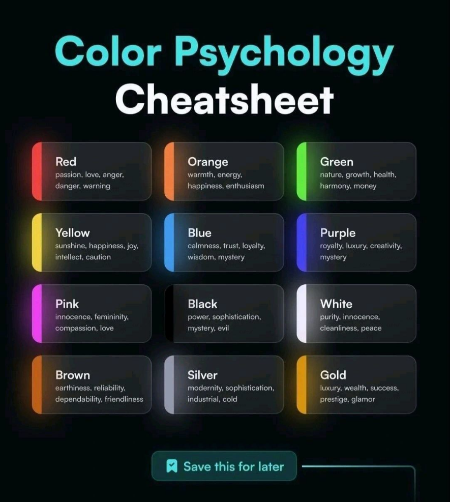
1. Red:
//Emotions: Passion, love, excitement, energy, urgency.
// Use in UI: Red is often used for call-to-action buttons to grab users’ attention and encourage action.
2. Orange:
//Emotions: Creativity, enthusiasm, excitement, warmth.
//Use in UI: Orange is often used to create a sense of energy or fun in UI elements.
3. Green:
//Emotions: Growth, health, nature, relaxation.
//Use in UI: Green is often used for eco-friendly or wellness-related designs.
4. Yellow:
//Emotions: Happiness, optimism, warmth, caution.
//Use in UI: Yellow can be used to draw attention or create a sense of happiness, but it should be used sparingly due to its potential for eye strain.
5. Blue:
//Emotions: Calm, trust, reliability, serenity.
//Use in UI: Blue is commonly used by tech companies and financial institutions to convey trust and professionalism.
6. Purple:
//Emotions: Royalty, luxury, spirituality, mystery.
//Use in UI: Purple is associated with luxury and can be used for premium or high-end products or services.
7. Pink:
//Emotions: Romance, sweetness, youthfulness.
//Use in UI: Pink is often used for designs targeting a younger or more feminine audience.
8. Black:
//Emotions: Elegance, sophistication, mystery.
//Use in UI: Black is often used for luxury brands and can add a touch of sophistication to a design.
9. White:
//Emotions: Cleanliness, purity, simplicity.
//Use in UI: White is often used for minimalist and modern designs, emphasizing cleanliness and simplicity.
10. Brown:
//Emotions: Earthiness, stability, warmth.
//Use in UI: Brown can be used in designs that want to convey a sense of tradition or naturalness.
11. Gray:
//Emotions: Neutrality, balance, practicality.
//Use in UI: Gray is often used for background colors and to create a neutral, balanced appearance.
12. Gold:
//Emotions: Luxury, wealth, success.
//Use in UI: Gold is usually used for glamor and power.
It’s important to note that the emotional associations with colors can vary based on cultural and personal differences. Additionally, context plays a significant role in how colors are perceived. Designers need to carefully consider their target audience, brand identity, and the intended message when selecting colors for UI elements.
Importance of color psychology:
This field of study is rooted in the idea that colors have the power to evoke specific feelings and convey particular messages, impacting how people perceive and interact with design.
Key aspects of color psychology in design include:
1. Emotional Associations: Different colors are often associated with particular emotions or moods. For example, red is often linked to passion and excitement, while blue is associated with calm and trust. Designers use these associations to create desired emotional responses in their audiences.
2. Branding and Identity: Colors play a crucial role in building and reinforcing brand identities. Companies select colors that align with their values and messaging, creating a consistent look and feel across their materials.
3. Visual Hierarchy: Designers use color to establish visual hierarchy, directing viewers’ attention to the most important elements. Vibrant colors or high-contrast combinations can make key information stand out.
4. Cultural and Regional Variations: Different cultures and regions may interpret colors differently. For example, white may symbolize purity in one culture and mourning in another. Designers must consider these variations in global or multicultural design.
5. Legibility and Accessibility: Proper color choices are essential for readability. Text must be easily legible against its background, and accessibility standards must be met to accommodate individuals with visual impairments.
6. Aesthetic Appeal: Colors are used to create a visually pleasing and harmonious design. Color harmony and balance are fundamental principles in creating attractive visuals.
7. User Engagement: In digital design, colors are employed to engage users effectively. This includes using eye-catching colors for call-to-action buttons or using color transitions to provide feedback for user interactions.
8. Psychological Impact: Colors can influence decision-making, such as buying choices. Marketers often utilize color psychology to encourage specific actions, such as making a purchase.
9. Mood and Atmosphere: Colors can set the mood or atmosphere for a design. Warm colors like red or orange may create a sense of urgency, while cooler colors like blue or green can evoke a sense of tranquility.
10. Testing and Iteration: Designers often use A/B testing and user feedback to evaluate the effectiveness of color choices and make iterative adjustments to optimize the design.
In summary, color psychology in design explores how color choices impact human perceptions and responses in the context of various design applications. Understanding the psychological and emotional aspects of color enables designers to create more engaging, effective, and visually appealing designs that align with their goals and target audience.
About Us
Hii there! I’m Ritik Kumar. I hope you will like this article. I want to share UI/UX design tips and knowledge with all of you guy’s. So stay tuned with me for more information like these. ❤️ Thank you for read this.

