UX/UI case study: Website landing page for a food blogger
Hello! Here is a walkthrough of my 2-week assignment for 10kdesigners, where I designed a web page for an internet creator.

Goal
Design a “start-here” page for Swayampurna Mishra, a banker-turned-food writer, blogger, photographer, and author.
The website aims to enable new audiences to discover her blog, buy her book, and subscribe to her socials. Being a self-proclaimed food nerd, I was super excited about this assignment!

Why lapetitchef?
“Lapetitchef”, as Swayampurna goes by on Instagram, has inspired me in many ways. Working on her terms, this food writer-photographer has carved a niche for herself while building her brand from scratch. Her recipes, little tips and tricks, and come-what-may attitude are no less than a masterclass on living life like a boss!
Problem identified
True to her aesthetic, Swayampurna has a very beautifully curated Instagram feed. However, her current website has many design and copy-related issues. My goal through this project is to revamp the landing page of her website while keeping its basic concept and essence intact.
Design Process

I realised that the design process is non-linear. Despite doing exhaustive research and exploration, I found myself coming back to doing research every time I felt stuck in the subsequent stages, especially during wireframing and visual design.
Explore
The goal of this step was to understand the creator, her style, aesthetic, and work. Here is what I did:
- Explored her existing website, categorised elements into necessary and unnecessary, and identified the underlying issues. (For this, I clicked a full-pager screenshot, pasted it on Figma and used sticky notes to document key points.)
- I went through the website’s “About” section and noted all details relevant to the start-here page.
- Scouted her other social media handles, especially Instagram, to gather updated information.

Research
Since I was designing a food-related webpage for the first time, I checked out 5 similar websites to identify their positive points and possible issues. I followed a similar approach as above for this:
- clipped full-pager screenshots of the websites
- pasted them on my Figma file
- used arrows and post-its to note down my observations.

This exercise helped me a lot while finalizing the IA and during wireframing.
After compiling the research, I sat down to answer these 4 questions:
- What information can be kept from the existing website?
- What is unnecessary and can be skipped?
- What needs to be changed?
- What elements can I take as inspiration from other websites and her Instagram profile?

Information Architecture
In my version of the website, I changed the header and footer contents and added sections about her and her book. I also worked on the overall structuring of the content.

Wireframing
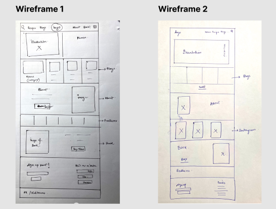
With all my information consolidated in one place, I picked up my pen and paper to jot down my vision of the website. I chose this method because wireframing on paper is quicker, takes less effort, and gives more creative freedom than any design tool.
I made 2 pen and paper wireframes, working around sections and their layouts before finalising the design.
Style Guide
When picking the visual details, keeping the essence of the original website intact was paramount. I used the existing website as the mood board and designed the elements around it.
Colour: Sticking to the overall theme of the existing website- a pink and pastel colour theme was a natural choice.

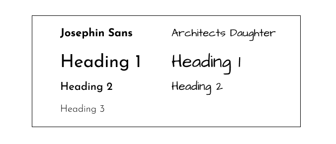
Font: The current font is tricky to read. Hence I decided to change it. The goal was to make the text more legible and clear but also very elegant and minimalistic.
CTA buttons: I did a couple of iterations on the CTA buttons- block and hyperlink. Finally, I decided to go with minimalistic, hyperlinked style buttons with a small arrow on the side indicating a new page.
Visual Design
Header

I wanted to add quick links and a search button on a fixed header so that the reader can easily switch between pages at any time.
- ‘Recipe’ button: drops down to a menu where recipes are classified into bakery, breakfast, dinner, snacks and thali
- ‘Blogs’ and ‘About me’ button: directs the viewer to the respective pages
- ‘Search’ icon: to search anything on the website using keywords
Hero Section
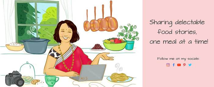
- Idea: Keep the hero section minimalistic- just like the creator!
- I used her illustration (which captures her essence to the T!), added her catchphrase, and quick button links to her socials.
Recipe carousel
- Goal: To direct the reader towards the highlight of the blog- the recipes.
- The carousel lists 9 of the top-performing recipes, their photos and category. Readers can click on them, and it will direct them to the recipe page.

- Current version: The recipes and blogs are listed haphazardly all at once, creating no distinction. Also, there is a lot of white space, making navigation difficult and distracting.
About
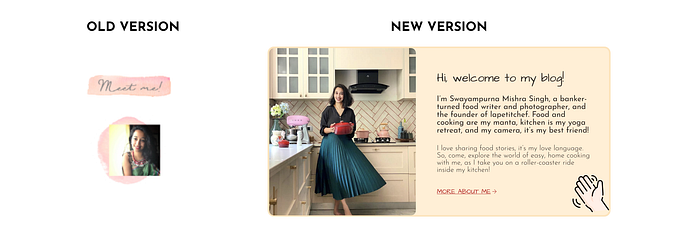
- The current website does not mention anything about the blogger besides a small, old picture.
- In my version, I updated the picture, added a brief description, and a quick link for her about me page.
Features
- Since she has been featured in several credible publications and has associations with great brands, adding them to the landing page was a must!
- Documenting all of them would have cluttered the space. Hence, I listed only the 10 most important features.

The current website has these features cluttered on one side. I resized the logos in the same size and placed them in a single line to make them easier to identify.
- Amongst all the social media channels, lapetitchef’s Instagram page is the most active. She posts recipes, photos, and other life updates there daily. It is also where she interacts and stays connected with her followers regularly.
- Why this section?
The goal of this section is to direct readers towards her Instagram page. This section will increase the visibility of her profile by introducing new people to her page- especially those who stumbled upon her website while doing a recipe search on Google.
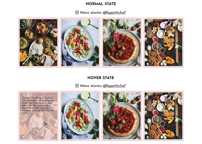
Readers can click on any element, which will direct them to the “lapetitchef” Instagram page. Also, if you hover over each picture, it will display the caption of the Instagram post.
Book

- Her book does not feature on the homepage currently. I believe that since it is one of the best exhibits of her work, it should be mentioned more prominently on the website’s homepage.
- Hence, I added this section. Since it retails on multiple websites, I included a CTA to buy the book, directing the reader to where they can purchase it.
Footer
- Current version: Currently, the website does not have a footer.
- I decided to declutter the header and move all the extra elements to the footer. I made 2 iterations for the same.
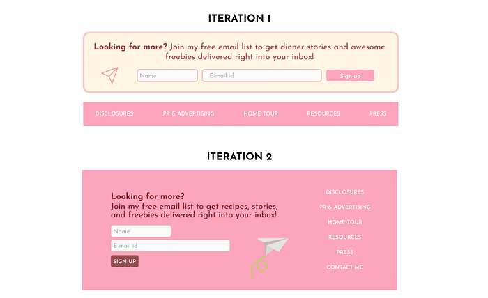
I decided to stick with a single broad footer. I added the sign-up prompt on the left so that the reader catches it first and listed the quick links on the right.
Check out the complete design here!
Key learnings and takeaway
- Working on a timeline: Since this was a 2-week project, I learnt how to divide tasks and work on them within the stipulated time so that I could complete the project timely.
- Design process: I learnt what is a design process, recognised its non-linearity, and understood how establishing a process from the outset can help improve efficiency and save time.
- Research documentation: Since this was my first project, I did a lot of competitor research. Consolidating all this data was vital, so I focussed on documenting it comprehensively.
- Feedback: I realised that timely and regular feedback could help save a lot of time and avoid personal biases that may affect the outcome.
- Iterate! Iterate! Iterate!: I learnt that multiple iterations are worth all the effort and can do wonders for any project.
- Case study: Most importantly, I learned how to write and present a UI case study.

