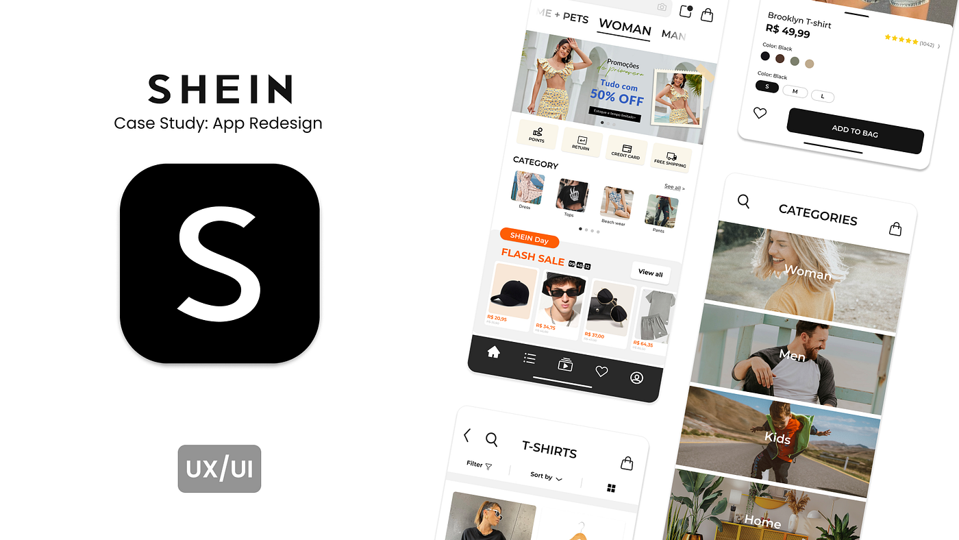
UX/UI Case study: Shein Redesign
Introduction
This case study was done after some UX/UI Bootcamp as a first portfolio project to start some applications. This project was conducted only by myself, therefore my role consisted from the beginning to the conclusion of all UX/UI steps. It was developed on August to September 2022.
Disclaimer: It is important to say that this case wasn’t affiliated with SHEIN. Also, it will be developed in English, however some of the pictures will be in Portuguese.
Project Overview
SHEIN is a Chinese digital company focused on exporting ultra-fast fashion worldwide. Its business strategy consists on offering a huge and rapidly changing selection of very low-priced fashion items focusing on exports, currently exporting to more than 150 countries.
The company was the world’s second most frequently downloaded shopping app in the world with 193 million downloads (Apptopia, 2022). Also, SHEIN got ranked second of the biggest global fashion stores, with total 2021 first-party fashion net sales of US$10.4 billion. (ecommerceDB, 2022)
The Chinese giant has achieved numerous active users and became fashion reference for the globally. In addition, several features has been added constantly to increase selling products. However, this fast growth isn´t keeping up with its user’s best experience in the app, since the platform gets confusing by the numerous secondary information and shown products followed by the others lack of design aspects.
Objectives/ Problem Statement
Fixing the usability issues of the app creating refined and simpler visual, as improving product search and selecting process and cart feature.
Design Process

1. Empathize
Understanding the user: Summary and pain points
Summary
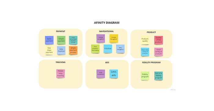
In this step, the goal was to understand the corporate goals, competitors, online shopping behavior and needs, and also, user research to discover user’s pain points. User research consisted on conducting surveys, app reviews and heuristic analysis.
Survey
This step consisted on 5 quantitative and 1 qualitative questions directed to 20 targeted users.
Main Findings:
- 100% of the participants has previously shopped online.
- 60% of the participants are aged between 18–24 y.o.
- 50% has purchased more than 3 time on SHEIN before.
- 66.7% thinks that the app is somehow visually polluted.
- 40% finds the checkout process somehow difficult.
- Important topics as a SHEIN consumer in priority order:
- Easy checkout process
- Easy and simple navigation
- Quality and variety of products
- Fidelity programs
- Few ads
- Easy status checking
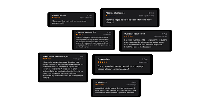
Online reviews
Reading the reviews, it is clear that people uses the comment feature to check the products details for purchasing and also there are fidelity program and payment issues.
2. Define
After empathize stage, I gathered the information from the research step and defined the core problems that the SHEIN users commonly experiences. While the easy navigation is a must, since the quality and variety of products is expected, the searching feature and review comment section needs to be improved. Also, a section dedicated to fidelity program should be implemented as the survey showed that it is an important feature.
Persona
This step helped building a starting point to understand users needs while redesigning the app. Therefore, I worked on an ideal profile for the project based on a user´s common characteristics.

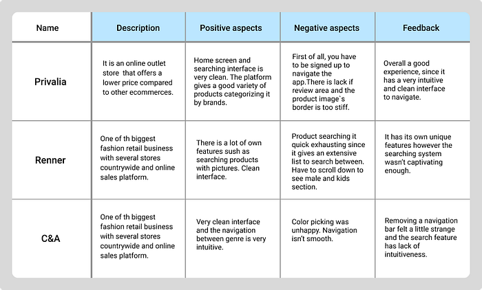
Competitive Audit
As a next step, I looked for some big national competitors in the fashion industry and understand their structure. As a result, I could find some opportunities and inspirations to work on, considering the pros and cons of the competitors.
Defining problems
Interface navigation
Following are some reasons why users experiences difficulties while navigating the interface.
- Excessive information
- Lack of blank spaces
- Size hierarchy is poor
Product search and review comment section
- Filter has too many options
- Poor interaction on “favorite” feature
- Missing filter in the comment section
- Searching bar could be placed by an icon
3. Ideate and Prototype
Sitemap
I created a flowchart/sitemap with some of the main features the app is going to have. The same scheme was utilized as a base for the wireframes creation.

Paper-wireframe
To start off the ideation phase, I choose wireframing on a paper since ideas was coming fast and also a quick iteration was required.
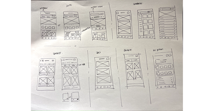
Wireframe
Prototype
4. Presentation
What has changed?
Homescreen
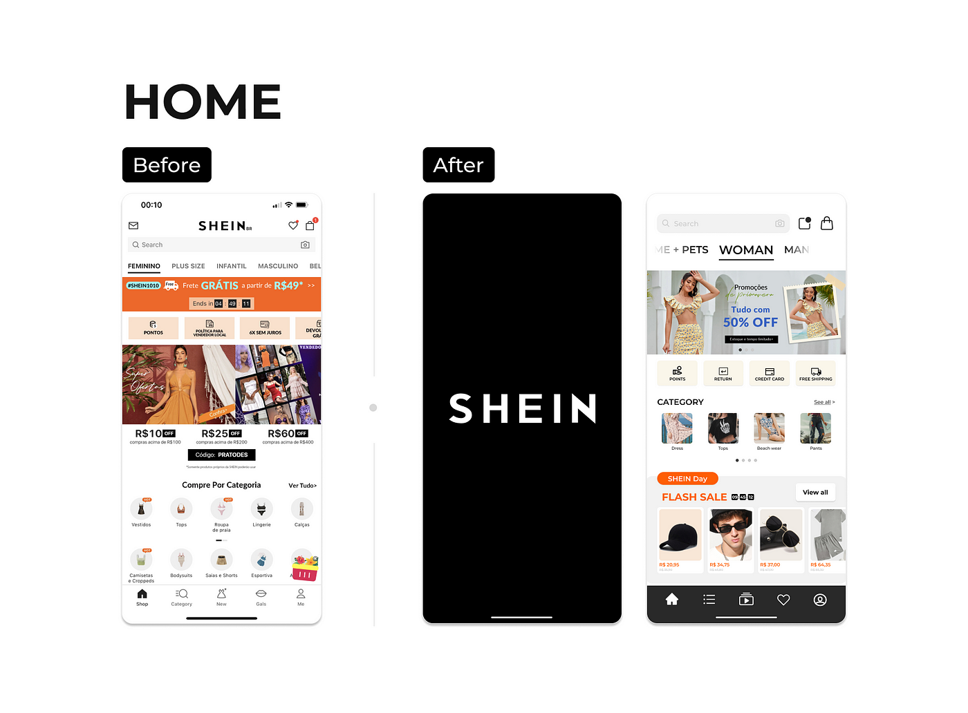
- Wiped up excessive ads.
- Since 66.7% thinks that the app is somehow visually polluted I created cover page before starting navigation allow removing logo on the top and making it cleaner.
- For the same reason mentioned, a grid system and margin to create more blank spaces and make navigation cleaner.
- Made title and icons in general bigger to create visual hierarchy.
- Put squared shape background behind images to create visual patters and separate each other.
Searching Products
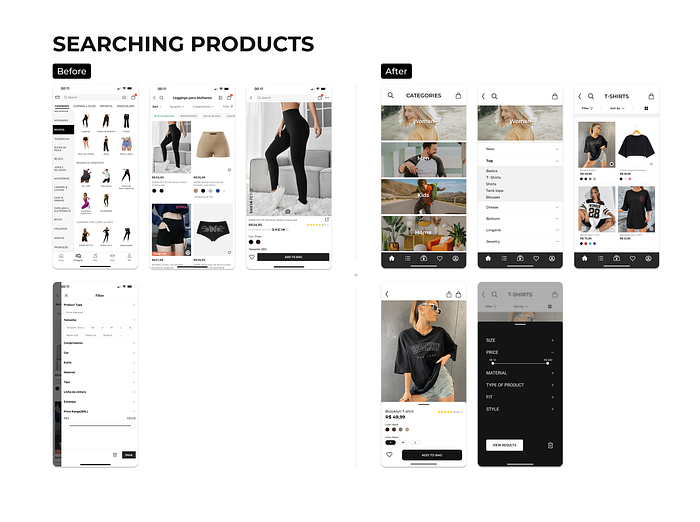
- As an easy and simple navigation is required for the users, to make the navigation and visually chear, I created a page that directs to the products by genre before.
- Removed the imagery from the categories, which most of the time wasn’t maching to the product described, and left only text.
- Made header with less information and placed an icon for a searching bar.
- Placed the listing icon on a place that can be visualized
- Made the filtering feature with less but usufull informations.
My Account
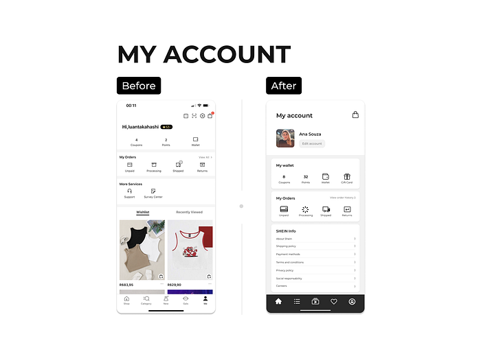
- Created a dedicated space for personal details.
- Followed a grid system and margin to create more blank spaces and make navigation cleaner.
- Made icon bigger.
- Add a section for more informations about the platform.
Favorites
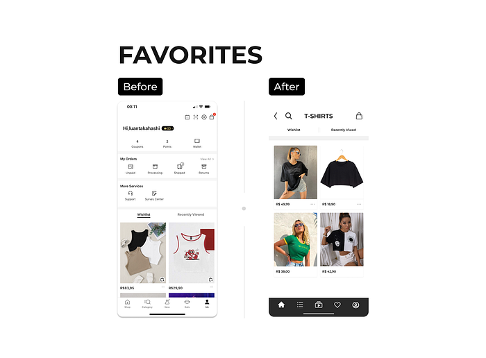
- Created a dedicated space for favorited items.
- Put squared shape background behind images to create visual patters and separate each other.
Shopping bag / Purchasing
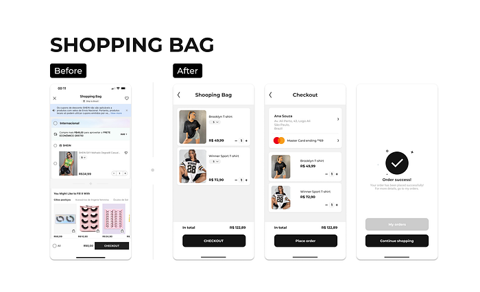
- 40% finds the checkout process somehow difficult, therefore I left only the essential informations to make it simpler.
- Followed a grid system and margin to create more blank spaces and make navigation cleaner.
- Add Order Success page that hasn’t before.
Design System

Navigable Prototype
After a few bootcamps and through this experience, it was so enriching. This isn’t by far a perfect presentation, so feel free to leave any constructive criticism or suggestions.
I’m sure this is only the beggining of lots of actual projects comming that I can put all my background knowledge and also grow with it.
There is my linkedin link below so feel free to reach me out:
