UX/UI Case Study: Redesigning LinkedIn for Enhanced User Experience
Is LinkedIn ready for a redesign that enhances the user experience? Join us on our captivating one-day journey in this UX/UI Case Study as we dive into redesigning LinkedIn for an enhanced user experience. Despite the time constraints, we embarked on the exciting challenge of making subtle yet impactful design changes that prioritize inclusivity, streamline navigation, and optimize job searches. Get ready to take your professional networking experience to the next level as we explore the transformation of LinkedIn!
Selecting LinkedIn for Redesign:
In this project, we had the liberty to choose the app for redesign. After a brief discussion on apps presenting unique challenges, LinkedIn emerged as a unanimous choice due to its frequent use by both of us. Thus, we made the decision to overhaul LinkedIn and make it better.
Understanding the User:
To guide our redesign, we defined our user type as Hannah, representing individuals who leverage the News Feed for industry education and utilize networking and job hunting features. This user persona helped us tailor our redesign efforts to suit the needs and preferences of our target audience.

Identifying Challenges:
Our heuristic analysis brought forth four primary challenges that hindered the user experience on LinkedIn:
- Feed Visibility Challenge: The home page’s display of posts based on network reactions can be counterproductive during job changes or when having a diverse network. The lack of customization options limited the user’s control over the content they see.
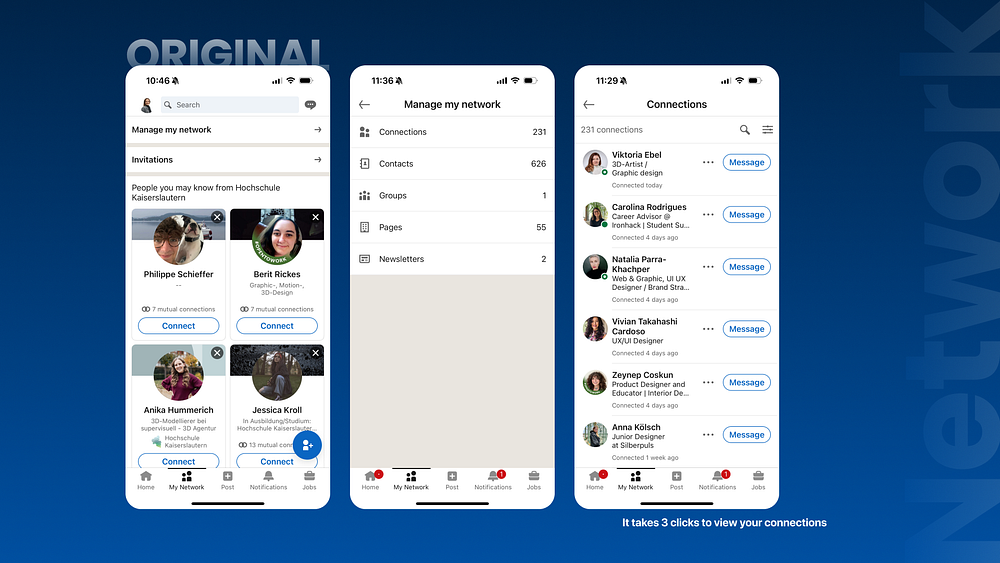
- Network Navigation Complexity: Navigating the network page involved three clicks, causing confusion and inefficiency for users trying to find and connect with new contacts.
- Misleading Icons on Jobs Page: Icons on the jobs page appeared as search filters but functioned as buttons, leading to other pages. This inconsistency caused confusion and disrupted the user flow.
- Design Issues: Our analysis uncovered concerns with icons, alignment, and limited visibility of the brand color, causing a visual inconsistency and impacting the overall design quality.
Subtle Design Changes:
To address these challenges, we implemented a set of subtle yet impactful design changes. We introduced lighter icons, removed descriptions from the Navbar to declutter the interface, integrated the brand color more consistently throughout the app, and implemented easily distinguishable filters. Additionally, we introduced a swipe function for improved user interactions.

Optimizing the News Feed:
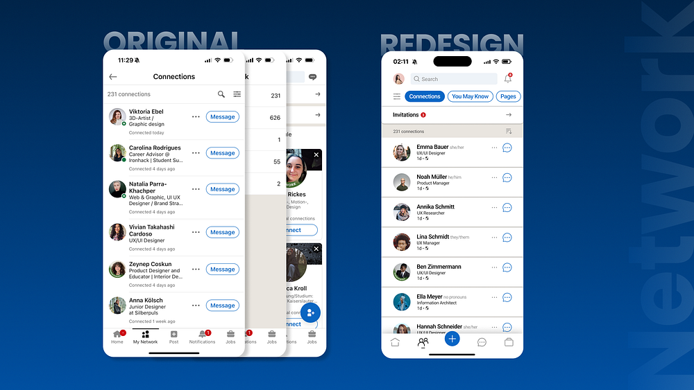
Navigating to the news feed, we observed challenges in post visibility and customization options. To enhance this aspect, we strategically swapped the position of notifications and message icons to prioritize communication, added filters to allow users to refine their feed based on specific interests, and included a save button for future reading. Understanding the importance of personalization, we introduced an optional pronoun feature that allows users to express their gender identity. This fosters a more inclusive and personalized networking experience, aligning with LinkedIn’s commitment to diversity and inclusion.

Streamlining Network Navigation:
Moving to the network page, we encountered the challenge of navigation complexity. To streamline this process, we restructured the network page into a single page, providing users with easy access to different types of networks with a simple scroll. This simplification reduces confusion and enhances the overall user flow.


Enhancing “You May Know” Section:
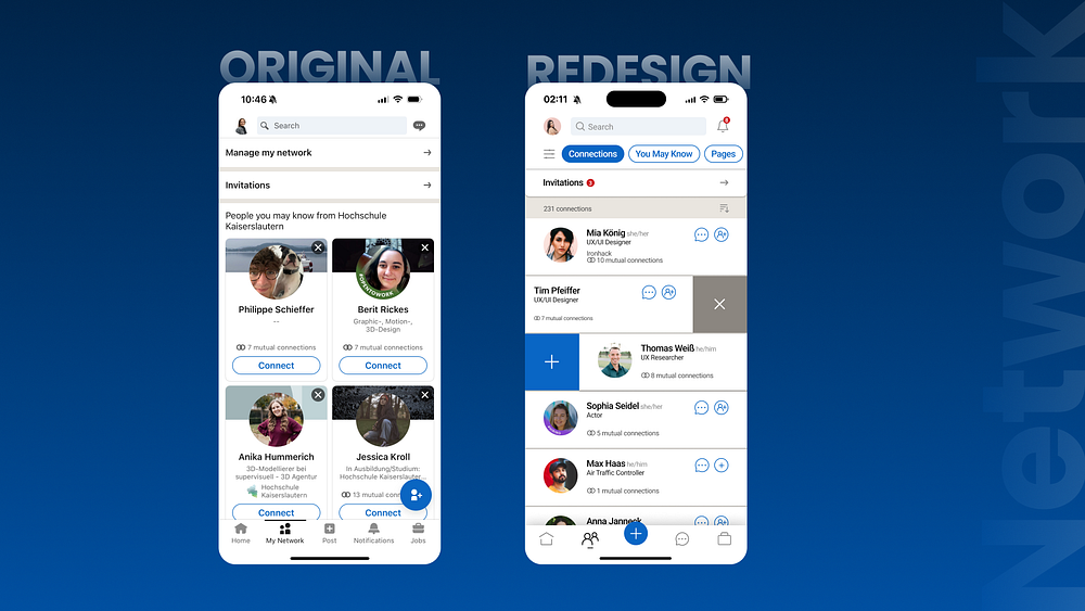
In the ‘You May Know’ section, we reorganized suggested contacts into a list format and introduced manual sorting options based on mutual connections, companies, and schools. This feature is automatically tailored to the information users provide in the app’s resume section, improving the accuracy and relevance of the suggestions. By optimizing this section, we aimed to make it easier for users to expand their network and make relevant connections.

Optimizing the Job Page:
On the job page, we addressed the issue of buttons at the top that were designed as filters but led to other pages. We reorganized the layout to consolidate all relevant information and actions onto one page. Additionally, we introduced filters for personalized job searches, including job title, experience level, work mode, location, and job type. These filters empower users to find job opportunities that align with their preferences more efficiently.

Notifications:
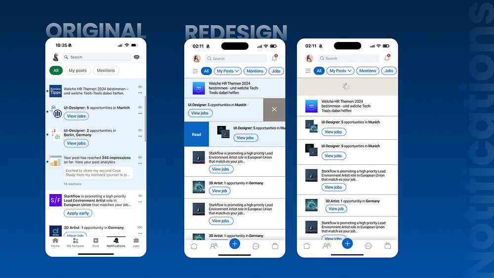
In our case study, we observed issues related to notifications. Even if users have read the notifications, they still had to click on each article to mark it as read. Even swiping down to refresh the feed did not alleviate the problem. To address this issue, we introduced a swipe function. Swiping right allows users to mark the notification as read, and manually refreshing the feed marks all notifications as read. Additionally, swiping left enables users to delete the notification, and the algorithm remembers which notifications they no longer wish to see. This implementation allows users to effortlessly manage their feed.

In Summary:
Through these subtle design adjustments, we were able to create a new and improved experience on LinkedIn. Each change was aimed at addressing key challenges and enhancing the user interaction. By prioritizing customization, streamlining navigation, and improving the overall visual consistency, our redesign provides a more user-friendly and intuitive experience.
Next Steps:
- Redesign additional pages
- Consider the redesign from a recruiter’s perspective.
- Refine the prototype for a more polished user experience.
Thank you, Natália Trailin, for inviting me to collaborate on this brief but impactful project. It was an honor.

