UX/UI case study: Project Kokoro
How to design an experience to use sport to help people with mental health problems.

Kokoro is a project created in the User Experience Immersive course at UXER SCHOOL by a team of design professionals. If you want to see the video presentation of the project, click here.
When we shared our concerns, we discovered that mental health was an issue of equal concern.
Access to professional help is often difficult, delayed or uneconomical. We were using sports as a remedy to complicated mental situations.
Most of the apps used for sports are focused only on the physical part, and the ones used for mental health are focused only on mindfulness. That’s when we came up with the idea: What if we put everything together in one place, and also make it easier for users to access professional help?

RESEARCH DESIGN
The first thing we had to consider was the challenge of how to design an experience to use sport to help people with mental health problems. To do so, we had to define the following objectives:
1. Understanding lifestyle as a daily routine
2. To understand the behavior of people with health problems
3. Understanding how people create interest in sport
4. Understanding why they lack motivation/lack of perseverance
PHASE ONE: EMPATHIZE
We began to investigate in order to know the situation of the users with respect to their state and experiences, in terms of the use of sport in a therapeutic way and the deficiencies and difficulties involved in receiving psychological help.
After interviewing a large number of people related to these profiles, we defined our potential user.
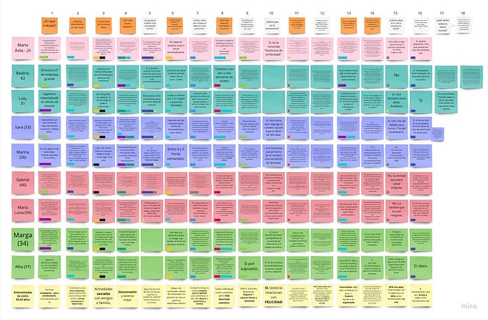
Through Sara, we were able to observe that her main motivations were that she used sports to disconnect from her problems, to meet people and to look better physically and thus obtain greater personal satisfaction.
These were frustrated by the lack of time, the economic impossibility and above all that sometimes she did not practice a specific sport because she had no one to do it with.

With Luis we saw that the problem of access to psychological help is so great that resorting to sport as a therapy is a common practice for people suffering from disorders such as depression, anxiety, stress, etc.
Time also remains a pending task to be solved, and finding people with the same concerns with whom to do sport, influences whether or not to do a physical activity.
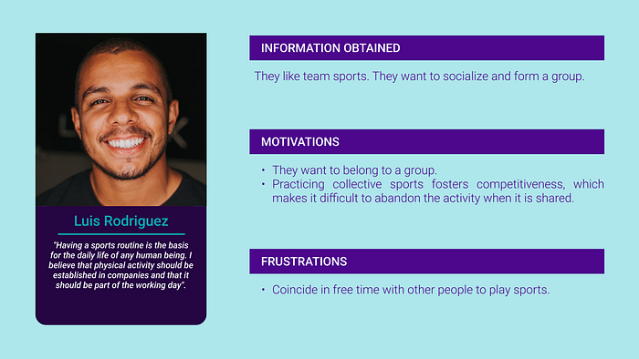
With this data we gathered enough information to pose the design challenge.
Who: People who are interested in their mental health.
What: Sport as a way to help them cope with mental health problems.


PHASE 2: IDEATE
We started to establish what will be the information architecture of the application and how the future screens of Kokoro will be designed.
To begin with, we use our imagination and the Brainstorm technique to devise how the screens of the application will be divided and what functionalities it will have.
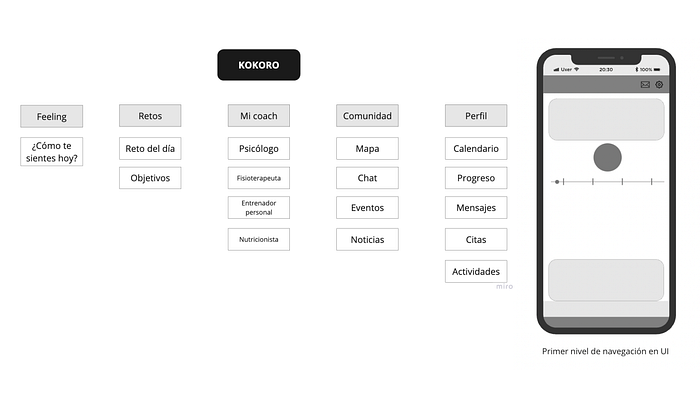
After defining which were going to be the main screens and functionalities, we established a MoSCoW to make clear which functions and screens we are going to have in the first instance and which are going to be in future instances of the development.

To continue, after having the ideas collected in the Brainstorm and the priority of the functionalities established in the MoSCoW, we could start drawing how the screens were going to be designed with very low fidelity using the Crazy8 method.

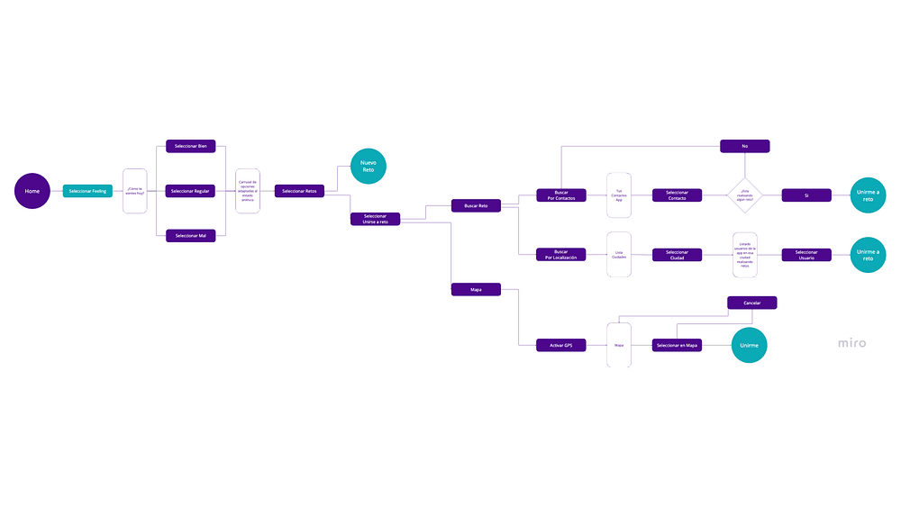
With all the IDEATE process done, we could start to create the User Flow of our user, for this we established the route that he would follow using most of the functionalities defined in MoSCoW. In this case, what flow should he follow to perform a sport challenge depending on his mood.
PHASE 3: PROTOTYPING
After having done all this, we can start designing the screens of the application in Figma.
To begin with, we made a low-fidelity prototype, which only has texts really necessary for testing. It also does not have any images or text styles.

After finishing the low fidelity prototype, we performed a series of 5 user tests to check the usability, check if there are any bugs in the flow and receive feedback.
FINAL PHASE
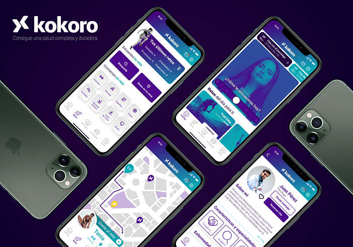
In this final phase of the project, we began to develop the prototype in High Fidelity and what would be the first release version. To do this we began by establishing a style guide that would compose the colors to be used, check the usability of these, and define the typography that best transmits legibility and purity. Also to establish what mood we want to convey, we created a Moodboard and an Inspiration Guide.

Now we just had to implement that style and information in our prototype. Using wireframes, applying typographies, colors and images. We created navigation flows, from the login screen, defining the journey that our user would make if he/she wanted to ask for help to a specialist, create a challenge, or join one.
Ultimately our purpose with Kokoro was to connect people and provide them with the tools to achieve complete and lasting health.
Click here, to access the interactive prototype.
Thanks for watching! :)

