Case study: UX research on Airbnb hosting
Two-part series of analysis and redesigning hosting on Airbnb.
I took a real-life situation to understand the process of UX design. With the changing times due to Covid-19, there is no dearth in the number of travelers working from home, more from scenic spots. With the surge in demand for spaces, I got curious to know how businesses like Airbnb coped better. Rather, how they enabled hosting experience.
This is a simple design exercise to get my hands dirty on the design process and has nothing to do with Airbnb.
Design Process
I’ve followed the double diamond model to redesign the app.

Problem
How do the hosts find the hosting experience on Airbnb, addressing the sudden surge in demand for homestays and getaways?
Discover
Secondary research
Data as per Airbnb survey and blog states:
- 54% of longer-term stays* on Airbnb were due to the Covid-19 factor
- 60% of these longer-term stays came for working or studying finding a new level of freedom
*longer-term stay >/= 28 nights
Playstore reviews
To ensure the research process stays unbiased and inclusive, I looked up reviews on the Play Store, picking those relevant to this context.

What did I conclude from these reviews?
- Even the most recent reviews were about the deceptive profiles published by the hosts, or blatantly lying and claiming what’s in it for guests in the property.
- I can do nothing about the legal policies followed and the business model. However, this shall be addressed as much as possible to reduce such friction in part 2 of the series.
I came up with a couple of questions from brainstorming as I diverged to learn the scope of the problem:
- Can a new host find an existing Airbnb property to take it on a lease?
- If a new host has taken space from an existing Airbnb host, what happens to the app profile? Should the old credits be retained or be left behind?
- Does Airbnb have a physical verification check on the property being hosted? What if the host is lying about the property?
- How to enhance the overall experience for a host on Airbnb?
Primary research
I had interviewed two users, one who hosted his space for the first time on Airbnb and another host who didn’t rely on online platforms yet has great traction.
User Persona
The host is 30 years old, an ardent traveler. His love for traveling and connecting with new people primed him to take up Airbnb space. He expects his guests to be those with wanderlust; visit his space to stay in close connection with nature, cut off from the societal hullabaloo.
Define
Considering the constraints in information and time, the problem statement was defined.
How to enhance the overall experience of hosting on Airbnb such that it is a win-win for hosts and guests?
This meant I start with where the host starts on the app, the onboarding journey.
Empathy mapping
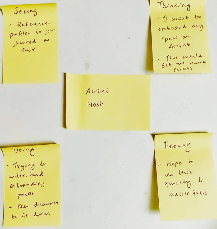
Onboarding flow for the hosts

The fifth step is where the user paused and faced multiple pain points and further discussed with his peer to understand and fill the form.
Pain points hosting on Airbnb
I’ve listed down the pain points suggesting probable redesign solutions.

I’ve tried to solve a couple of these pain points owing to the nature of the problem constraining me to ignore the rest for this limited research. I’ve used Figma to redesign the screens.
- Property type

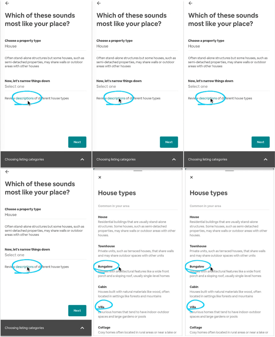
- Vague content: After picking the property type as ‘House’, the host had to narrow things down as given on the screen. He ended up with two options, bungalow, and villa, but couldn’t decide which one of the two would be more appropriate.
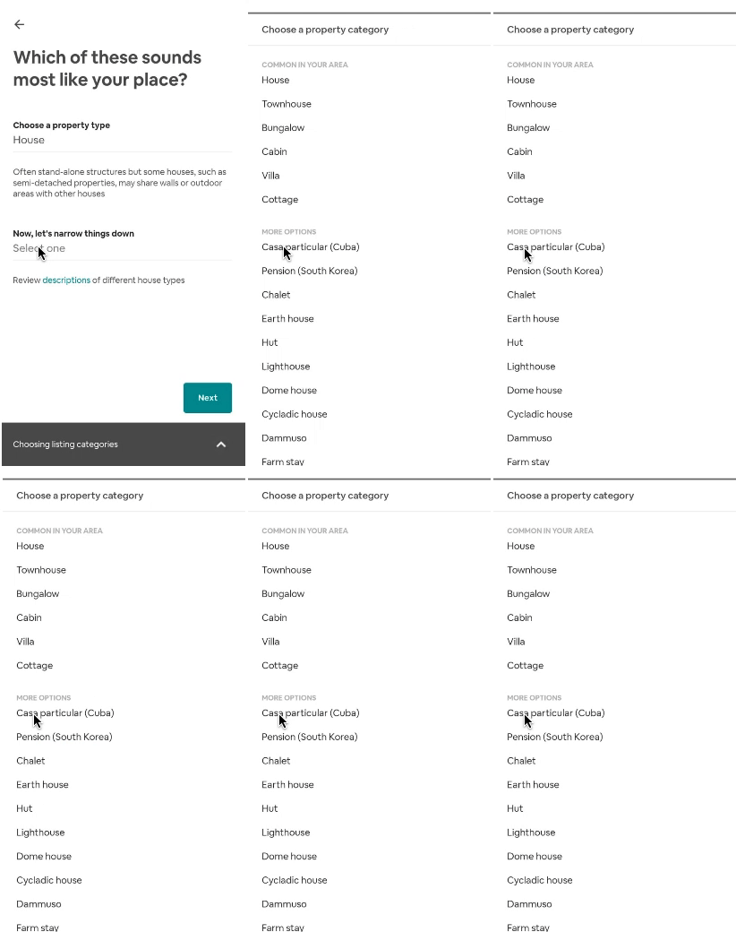
- The visibility to review different house types is so minimal that it went unnoticed by the host. This could be due to its poor positioning or mismatched content of house types with things. Anyhow, the host ended up making an intuitive choice.
- UI glitch: Next CTA button is functional irrespective of mandatory fields being filled; throws up an error field while trying to surpass with a null entry.


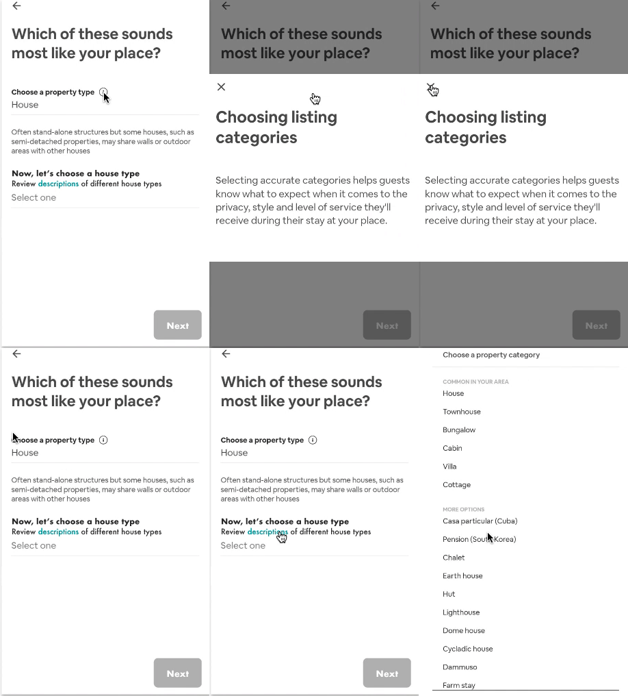
- Changed the filler heading to ‘Now, let’s choose a house type’
- Moved and highlighted review descriptions on top of the placeholder
- Made Next CTA button non-clickable and static till mandatory fields are filled
2. Pricing options

- Lack of dynamic pricing option — when the host has to quote different prices for more than one room type.
- UI glitches: Placement of CTA buttons

Having understood the problems in this screen, I brainstormed ideas on solving these issues and coming up with better space utilization.
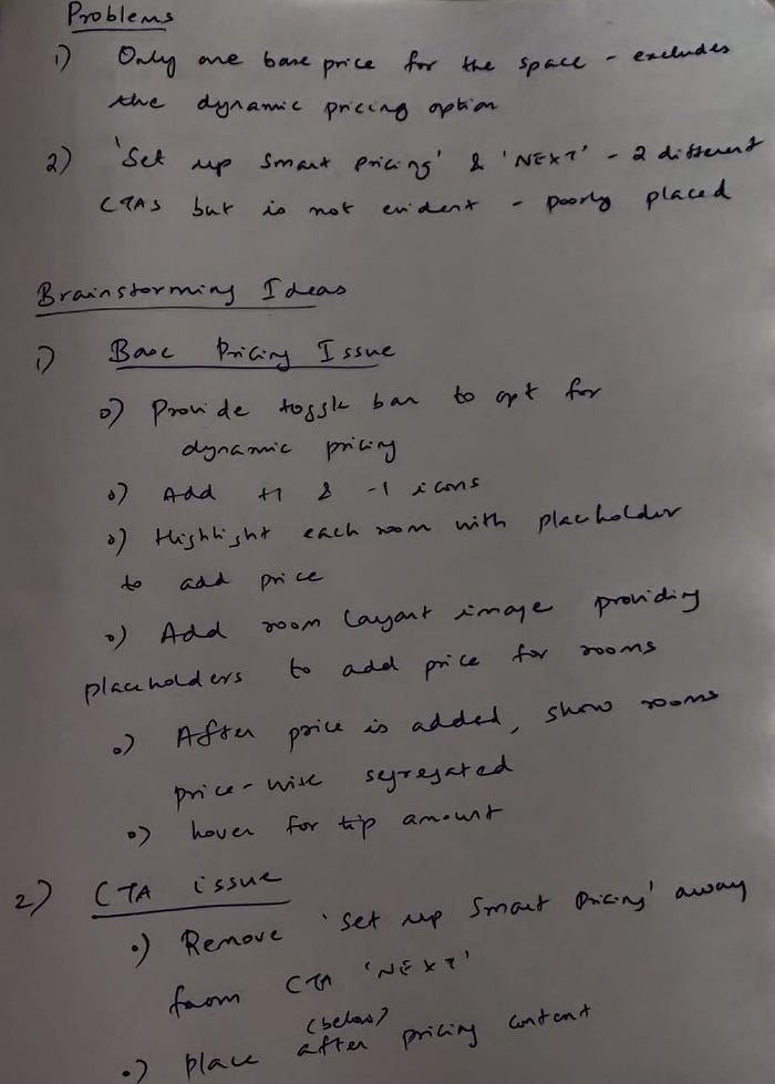
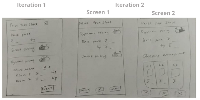


- Added toggle bar for dynamic pricing
- Added toggle bar for smart pricing with highlight text to know more
- Added -1 and +1 icons
- Moved Save and Exit CTA button to the bottom of the screen
While dynamic pricing is on:
- Sleeping arrangements card appears
- Rupee symbol gets populated when each room is clicked and placeholder appears to enter the amount
- Base price disappears
Key Takeaways
- The real scope of designing and solving problems varies from one product to another. This is highly subjective and can be understood only while being in the process.
- Even though the scope to redesign has been minimal, I have learned how the design process works, how real-time interactions with people can make so much difference to my learning curve. What matters is to keep going and getting your hands dirty.
- Figma is as seamless as it can get to redesign what one has on paper. I still have a lot more to explore.
Part 2 of the series shall address redesigning and enhancing the overall experience on Airbnb for hosts and guests. I’m still fiddling around with Figma and UI — have added different fonts in the redesigned screen. If there seemed to be any evident mistakes I’ve made or you’ve any suggestions, please comment or you can find me on Linkedin.

