UX Research Case Study: Lang

What is Lang?
Lang* is an educational startup based in India that strives to simplify their users’ studying process for the TOEFL/IELTS assessments by providing minimalist mock tests that closely model the true test experience.
*The company’s real name has been altered due to a non disclosure agreement. The logo has also been removed from all images.
Background
The TOEFL and IELTS tests are two of the most commonly administered assessments for English language proficiency, consisting of four sections that cover reading, listening, writing, and speaking skills.
These tests are widely used as a measure to prove one’s english proficiency for admittance into universities and/or international employment opportunities.
Problem
Lang provides mock tests that prioritize curating a true TOEFL/IELTS test taking experience for their users. However, the company was struggling to develop a testing interface that was both intuitive and minimalist.
After producing a version 1 of the product, Lang discovered that they needed to conduct more research to optimize the mock test experience and brainstorm additional features that would further improve the user experience.
Solution
- Analysis and testing of Lang’s v1 test solution to gauge potential usability issues
- Competitive and heuristic analysis of competitors’ testing interface for comparative insight
- Iterations onto pre-existing version 1 testing interface provided by Lang
Context
Role
UX Researcher on a team of four
Target Audience
- University students aged 17–25
- Working people aged 21–55
Duration
4 weeks
Research Plan
Before beginning discovery, our team devised a project plan with Lang’s stakeholders for initial projects that we knew needed to be accomplished. We continued to use this table to document any other deliverables that needed to be added along the way.

We also discussed communication expectations, worked through any time zone issues so that we could meet on a regular weekly basis, and established who specifically we would be reporting to for questions or concerns.
Discovery
After being presented with introductory information in my team’s initial call with stakeholders, it was decided that we first needed to understand the problem more specifically.
So far, we knew that the mock test needed to be “improved” — but we didn’t know where the actual issues existed yet. Two methodologies were utilized in this discovery process:
- Usability testing: Before anything else, it would be essential to not only take the mock test ourselves and discern our findings, but listen to the input of other users as they move through the test as well. This will uncover most of the major issues and guide the team in the right direction.
- Competitive heuristic analysis: Observing how other companies dealt with providing an online TOEFL mock would help us discover helpful features and solutions to current issues.
Usability Testing
Five potential users were prompted to take Lang’s 30 minute diagnostic test. They were asked to voice their concerns specifically regarding ease of use, areas of frustration, and features that they found helpful.
Participants were specifically asked to voice any thoughts they had as they moved through the mock test, especially regarding usability issues, interface concerns, and content problem areas. Additionally, they were encouraged to also voice any positive aspects of the test that they enjoyed.
As participants moved through the test, I documented their statements and created a diagram comprised of their key statements:
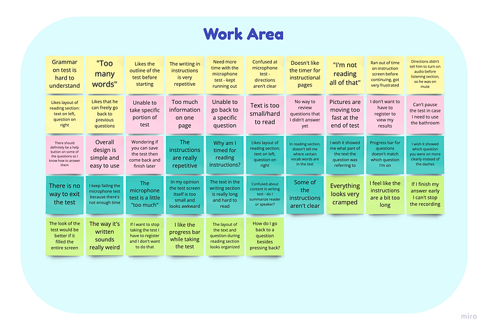
After writing down all key observations, I began to synthesize my findings. I did this by going through each statement and categorizing them based on their problem area. Eventually, I had 5 groups of validated issues, and one group that showed what participants enjoyed during the test:
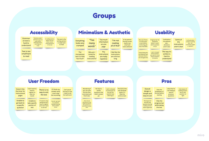
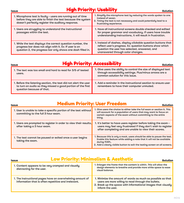
During testing, I found that Lang was mainly having issues with user freedom, minimalism & aesthetic, and usability. My team and I organized this research and ordered it by priority — for example, the user should at least be able to get through the test without any usability issues, therefore those issues should be resolved first.
These boards not only made it easier to communicate with our stakeholders about the specific issues at hand, but gave us clarity on what potential solutions we needed to look for as we ran through competitor tests.
Heuristic Analysis of Competitors
After immersing ourselves in the product, our team was ready to move on to more comparitive research. Instead of doing an overall analysis of each company’s product, we decided to focus our observations on five heuristics that were relevant to the issues uncovered during testing:
- User Control & Freedom
- Help & Documentation
- Aesthetic & Minimalist Design
- Recognition Rather than Recall
- Flexibility & Efficiency of Use
Each team member committed to taking a TOEFL mock test from a different competitor, and wrote their analysis on a shared document. We looked at 5 companies in total.
In order to more easily present our findings to our stakeholders, we created diagrams that communicated the research in a digestible manner.
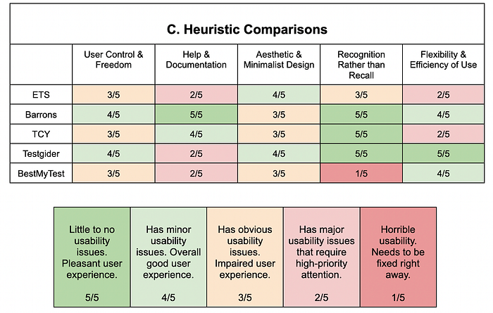
Because each heuristic had at least one company that was successful in that regard, our stakeholders would know where to focus their attention when searching for insight throughout our entire document. Using this diagram, we were also more able to collectively decide as a group where we should be gathering inspiration from for potential solutions in Lang’s mock test.
We also created a feature comparison diagram to quickly view which tests had specific features that improved the user’s experience. The features were additionally categorized in order of most important to least important in the user experience.
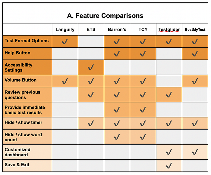

The highest priority features that we recommended for Lang to add in their tests were as follows:
- Help button: Providing a help button throughout the test that further explains how to properly answer specific questions should be available for the user in case they need technical assistance. This would also help in preparing and familiarizing the user for what they might see in the actual TOEFL.
- Accessibility settings: While adding a feature that allows the user to customize their testing experience as a whole would be best, consider at least providing a feature that allows the user to adjust font size for basic readability.
- Provide basic test results: Currently, Lang does not allow users to view test results until they register. In order to increase conversion rate and provide the user with a more satisfying experience, provide a basic test report upon completing the exam and reserve a more in depth analysis for registered members only.
Lower priority features that we recommended for Lang to add were providing the ability for users to review previous answers, a volume button on the listening section for the user to adjust at their comfort, and the ability to hide/show the timer throughout the entire test to conform to the user’s preference.
Presentation of Findings
After presenting our findings to the stakeholders, they were happily on board to apply most of our recommended features to their test. Lang’s main focus was providing a test that remained accurate to the authentic TOEFL testing experience — so when it came down to actually applying these features to the test’s design, we had to keep in mind that straying too far from the original format was not an option.
Design Iteration
With that being said, it was time for us to move on to the design aspect of this project!
We discussed our timeline with our stakeholders and decided that the best and most time sensitive way for us to show them our recommendations in action would be to adjust the pre-existing elements in their original v1 design.
While creating completely new sketches and wireframes would have been ideal, we found that after testing and analyzing our research, time was running short.
Style Guide
Before beginning, we noticed that there were a lot of inconsistencies within the design’s components. Clickable buttons were all different sizes, text across the project was inconsistent along with spacing. Therefore, we created a style guide to better direct our designs as we worked:

Question Screens
While my team and I rearranged the elements in Lang’s entire flow, the screens that I specifically was focusing on were the question screens.
As I was working, I kept in mind key findings from our research:
- Displayed text should be short, concise, and relevant to not overwhelm or distract the user.
- The user should have the freedom to easily switch which question they have selected, pause, or exit the exam at any time.
- Utilize white space to its full advantage to give the design breathing room.
- Maintain authenticity to the standardized TOEFL test.
Below are two example screens that I rearranged from version 1 into a version 2, along with explanations of each change made.
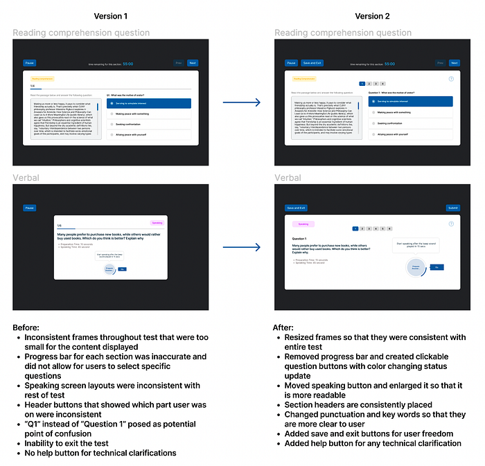
I decided to maintain the formatting of the reading comprehension questions since that was something that tested users found successful. However, there were a lot of inconsistencies in the test components that needed to be addressed in order to make this a more seamless experience for the user.
- Maintaining consistency in design throughout the entire flow is essential for users to navigate through the product with ease, so I made that the focal point while rearranging. I changed the format of the speaking section for this same reason — since users were already familiar with the “answer” area being on the right hand side, this should remain the same in every question.
- I wanted to ensure that there was a level of user freedom present without disturbing the genuine nature of the TOEFL exam that my stakeholders needed to uphold. The question buttons give the user the ease of clicking to a specific question without having to press “previous” until they reach it, and the ability to exit and pause was also in light of that reasoning.
- Lastly, users should have access to help if they need it — especially when it comes to the functional nature of answering a question. If users are confused with the format of a question, they could click the help question mark which would provide an example and further explain the expectations of their answer.
Below are the rest of the screens in the Figma file that we altered. The TOEFL portion of this assignment was what we were required to focus on more, but we also made improvements to Lang’s IELTS test along with their test report screens.
Recap
This was my first time working with a company to iterate on a real world project — and while it was thrilling, it certainly posed its challenges! Here are my key insights from my experience:
- Time is of the essence. Even though 4 weeks seems like a good amount of time, it goes without saying that time flies. Ideally, I wish we had enough time to sketch out new wireframes to deliver to Lang, but there was so much that would have still needed to happen in the design process in order for it to be successful — and unfortunately, time just wasn’t allowing for that. However, I’m proud of what we were able to deliver in light of that.
- Communication is a vital part of creating a product that aligns with the company’s goals. As a designer, it’s very easy to impress your own standards and expectations on a product. But even if you design what you think to be the most impressive piece of UX work in history, without communication, it may not align with the goals of the company and make for an unsuccessful product. There were a lot of things that I personally would have done differently here — but I needed to align myself with the standards I was provided.
