UX principles for AR: an overview
How spatial interfaces will evolve.

One of the early examples of AR technology was the “Virtual Fixtures” project, developed in the early 1990s by Thomas Caudell at the United States Air Force’s Armstrong Laboratory. This project utilized AR to enhance piloting skills and training for military pilots.
Over the years, a significant number of VR and AR technology devices have emerged. Apple gave a new boost to AR technology by releasing its own model of augmented reality glasses, further propelling the advancement and accessibility of AR experiences to wider audiences.
I, Ksenia Toloknova, have decided to research this topic. Sonya Papenova will assist me. We will rely on the materials we’ve found and our knowledge of basic artistic principles.
In this article, we will:
- Dive into the fundamental principles of visual perception
- Refer to recommendations from Apple, as seen in their WWDC23 videos
- Explore the concepts already proposed by developers and designers
Why will these interfaces change the world of design?
When new technologies emerge, their ergonomics and principles often simulate familiar interaction patterns. This happens because:
- New principles have not been established yet,
- People find it easier to adapt to changes in a familiar form.
This was the case with the predecessor of the modern automobile, The Benz Patent-Motorwagen, a steam carriage that had the characteristics of a car but ergonomically imitated familiar technologies.

Currently, patterns of working with augmented reality technologies are still evolving and often draw on our previous experiences. However, we believe that this will evolve. Technologies such as AR and VR are blurring the boundaries between digital and physical, offering a canvas where digital elements feel almost real.
Let’s turn to science.
Perception of the world
People have numerous sensory systems through which we perceive the world (and the brain does not distinguish between real and virtual). In the context of AR technology, the following systems are involved:
- visual,
- tactile,
- auditory,
- proprioception (sense of body position).

Among these sensory systems, we’ll delve further into one — proprioception. While vision, hearing, and touch have been engaged for a considerable time and are crucial in designing any interface, proprioception is relatively novel.
Sense of one’s own body in space, scientifically known as proprioception. Proprioception allows us to perceive the relative positions of our body parts and understand how they are moving without needing to look at them. This sense is facilitated by proprioceptors, specialized sensory receptors located in muscles, tendons, and joints.
In the context of technology, incorporating proprioceptive feedback can enhance user experiences by providing a more intuitive interface. AR systems can simulate proprioceptive sensations to make interactions feel more natural and immersive. Wearable devices equipped with sensors can monitor body movements and provide feedback to users.
If you want more details, here is an interesting scientific article on this topic.
Today, we will focus more on the basics of visual perception because the control system for these interfaces is primarily based on eye movement. Let’s dive in!
Fundamentals of visual perception
For most of us, our eyes are the basis of perceiving the world. We receive the majority of information about the surrounding world through them.
As mentioned earlier, our eyes scan objects and transmit information to the brain. The brain processes this information and interprets it based on parameters such as:
- Color
- Size
- Shape
- Blur
- Motion
This generalization is quite rough, but it will help us understand how to work with these parameters.
Understanding these parameters is crucial for designing any interface, not just AR. If the designer uses them correctly, he can create a user-friendly experience for any interface: website, mobile application, VR and AR interface, and so on.
Color
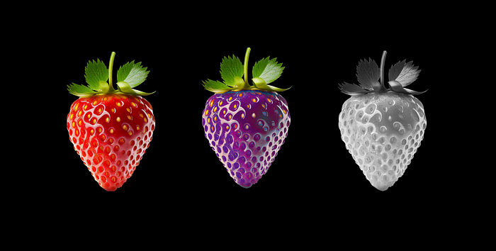
For sure, the science of color is extremely important for designers and artists. The color of an object helps a person make certain conclusions about it. For example, looking at a strawberry, we can assess whether it is ripe, and if the berry is purple, we can conclude that it is likely artificial.
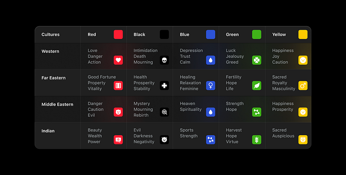
Perception of color can vary significantly from person to person and depends on culture. For example, the color white may symbolize celebration in some cultures, while in others, it represents mourning.
How does this reflect in interfaces?
Bright colors attract our attention, while muted ones calm us down. Proper use of color helps designers who plan interfaces to choose color combinations meaningfully, skillfully managing user attention.
Size
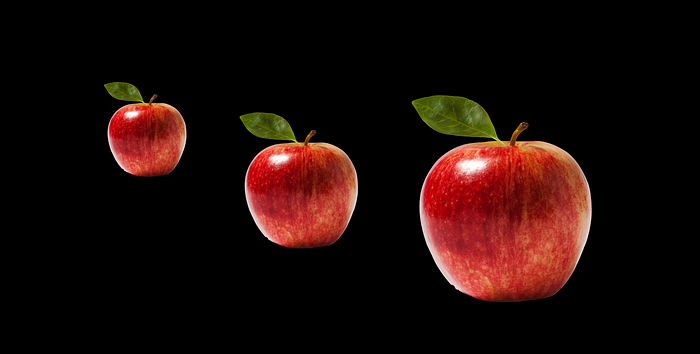
Size is the second important parameter of perception. Take an apple in your hand and try moving it around in space — bring it closer and farther away. The closer the object is, the larger it appears to the eye, and vice versa. The brain assesses the size and relates it to meaning.
How does this reflect in interfaces?
Large elements are more noticeable and inherently seem more important to us. By adjusting the sizes of interface elements, we can control the movement of our users’ eyes.
Shape
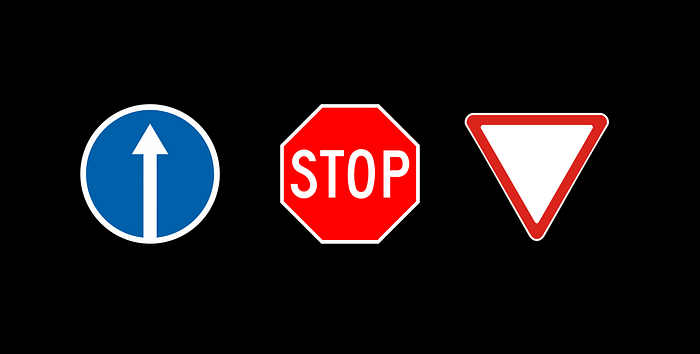
The shape of an object elicits an emotional response. Our eyes favor circles, as round shapes are associated with comfort and tranquility. A triangle is perceived as aggressive and dangerous, and an inverted triangle looks unstable. This knowledge has been found to be applicable to road signs.
How does this reflect in interfaces?
Choosing shapes helps us, as designers, evoke the desired emotion in users. Rounded shapes are perceived as more pleasant and comfortable, so Apple recommends using them in their guidelines. However, if you need to evoke a different emotion, such as precision and severity, it’s better to choose more stable shapes, such as squares and rectangles.
Blur
Blur is an excellent parameter that photographers and videographers love to use. Assuming our eyes are healthy, we see objects sharply when they are close and become increasingly blurry as they move away.
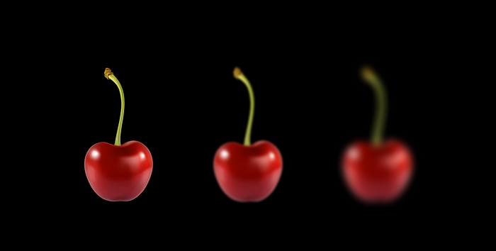
How does this reflect in interfaces?
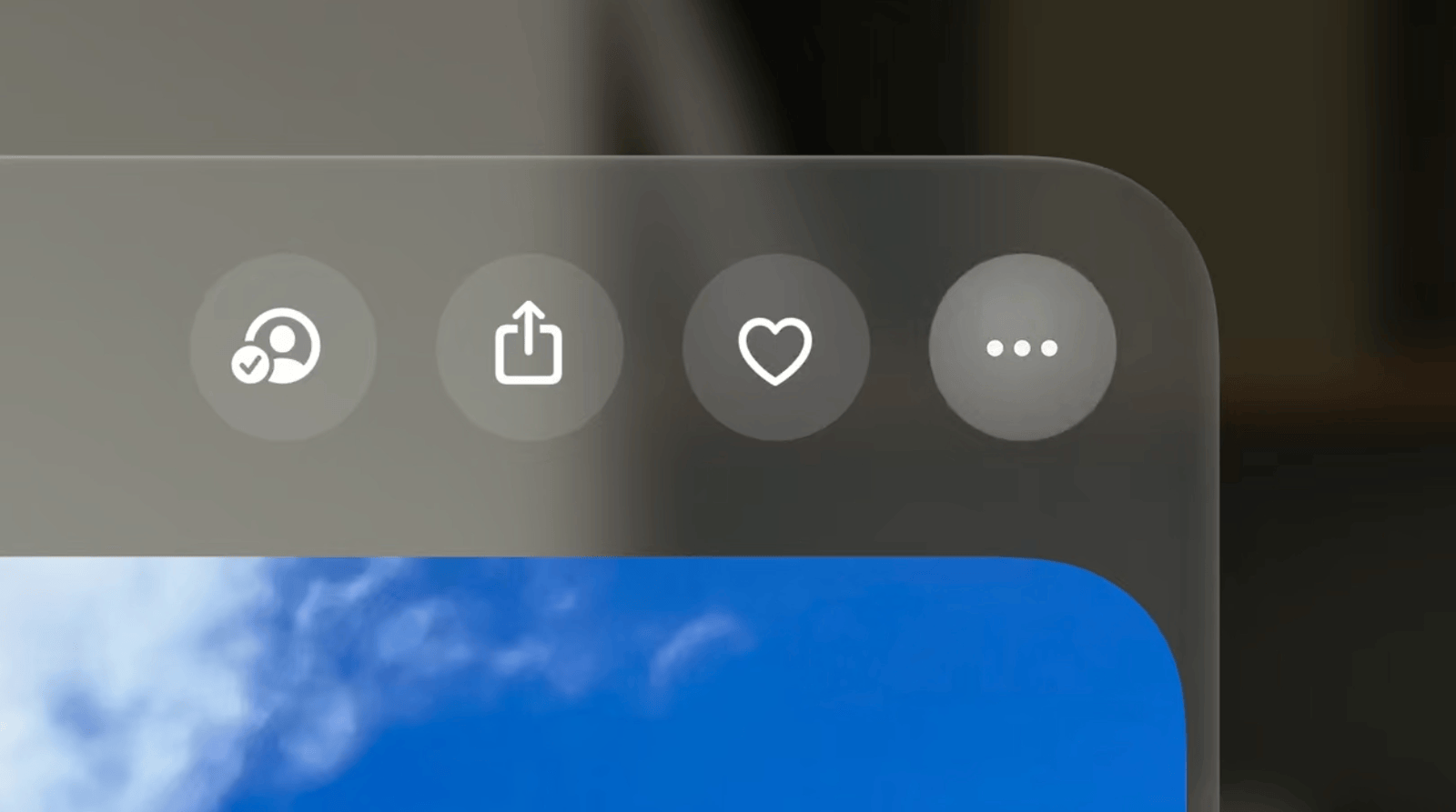
Blur is another tool for managing attention. All elements in the Apple Vision Pro interface are placed on a digital material called “glass.” This glass blurs the background, allowing the eyes to focus on the interface elements.
Motion
Motion invariably attracts attention. Even if users don’t want to, they won’t be able to ignore it. This is due to our basic safety instincts — what if there’s a snake or a lion in front of us?
How does this reflect in interfaces?
If you want the user to pay attention to your object, animate it. Even as you read this text, you’re likely paying attention to the gif above because it’s moving. Designers use animation to evoke the desired emotion. Sharp movements are associated with high speed, while slow movements convey calmness and confidence.
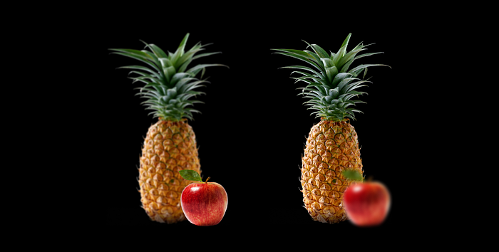
All these parameters work together rather than exist separately. Conflicting parameters cause discomfort. For example, in the image below, the eye perceives the clear apple closer to us than the pineapple. If suddenly the apple becomes blurred, a conflict arises because it contradicts the brain’s expectations. As a result, the eyes and brain tire faster while trying to process the information.
You can find more detailed information about how these principles work in a video by the Apple team.
Pleasing Our Eyes, Head, and Brain
It’s essential to consider many factors to ensure provide comfort and clarity for our eyes. In another video, Apple elaborates on how to achieve this. We’ve also added a few points of our own.
Layout of Content
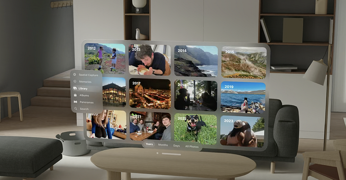
- Place content within the user’s field of view, minimizing neck and body movements.
- Position primary content in the center, slightly below the horizon line. Avoid placing content too high or too low for the eyes. Utilize side areas for content that is not needed constantly, such as secondary actions.
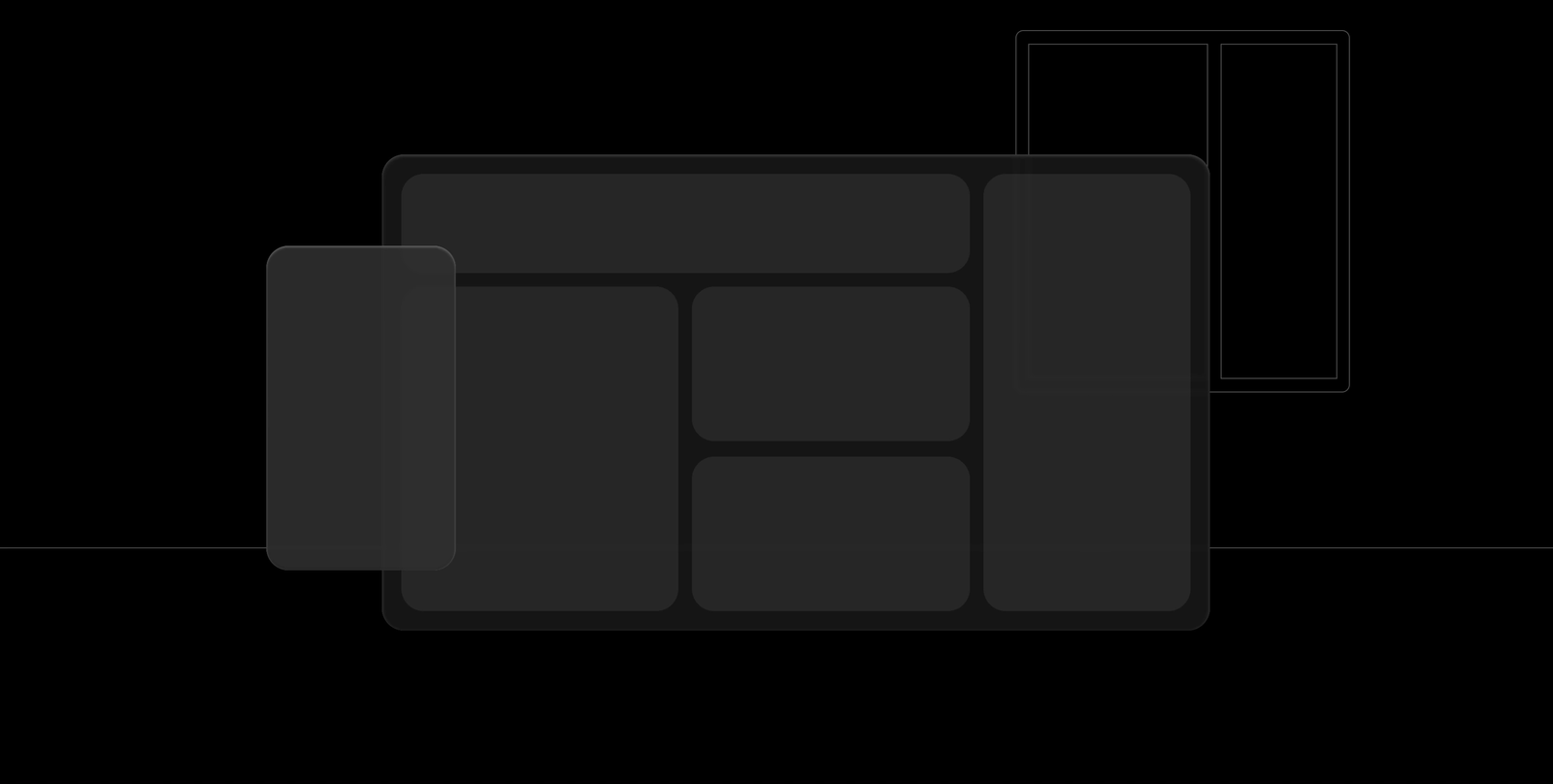
- Adhere to the Gestalt principles to ensure users don’t exert additional effort to understand the structure of your interface.
Ergonomics
- Use rounded shapes, such as circles and rounded rectangles. Our eyes naturally focus on shapes that direct our attention to the center of an object.
- Leave sufficient space between elements. This helps the eyes aim quickly and accurately at interface elements. Maintain a clickable area of at least 60 points.
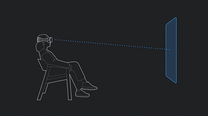
Depth
- Maintain consistent depth perception to avoid eye strain and discomfort. Content perception should resemble how users perceive space in the real world.
- Place content intended for prolonged concentration at arm’s length, while content for quick actions should be slightly closer to the user.
- Remember the physical world and its rules more often! Use blur for background elements to help the user focus. Calculate the optimal size of the interface relative to the environment. Also, don’t forget about the interface shadow, as the eyes will perceive it as a “physical object” and therefore should have a shadow.
Space
- Whenever possible, fix content in space. In the physical world, objects do not follow us (unfortunately or fortunately). Therefore, static placement of content is the most comfortable.
- The operating system allows adjusting this parameter — content can be static and fixed relative to the user. That is, it will follow the user wherever they go.
- Avoid completely blocking the view unless it’s for watching a movie or a presentation. Users need to control what happens beyond the interface’s boundaries for comfort and safety.
Contrast
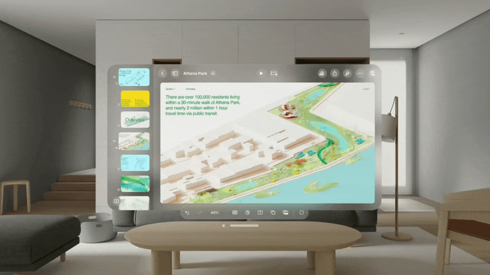
- Utilize higher contrast for text readability and lower contrast, transparency, or blurring to redirect visual attention elsewhere. The system font has become bolder, both in headings and regular text. Additionally, luminance helps to make the font more readable.
- Consider the environment. If the user is in a dimly lit room, allow their eyes to adapt to a brighter interface.
Feedback
In the physical world, we constantly receive feedback on our actions.
- Provide clear and intuitive feedback for user interactions. Visual, auditory, and tactile feedback can enhance the user experience.
- Highlight elements where the gaze is fixed, but do so delicately. Hover effects play a crucial role, especially when eye tracking is involved.
- Track the user’s gaze. When a person looks at something for an extended period, you can show more information about that object. For example, buttons can have pop-up tooltips. Tab panels can expand when focused on, showing details.
Gesture recognition
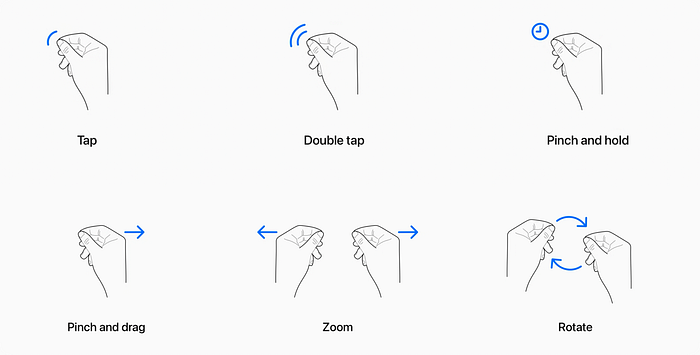
Using hands to interact with virtual content is something entirely new for most people. That’s why it’s crucial to guide them, provide clear feedback, and rely on familiar interaction patterns whenever possible. Here’s what Apple recommends:
- Support intuitive and natural gestures for interaction. It’s better to use pre-existing gestures from the platform developers, but you can also create your own.
- Check the ergonomics of gesture interactions. Interaction that requires holding hands raised for even a short time can become tiresome.
- Strive to use one-handed gestures and a comfortable finger layout. Avoid excessive repetition of similar movements as it strains muscles and joints.
- Don’t design gestures for a specific hand. This increases cognitive load and makes the interface inaccessible to some people.
Motion
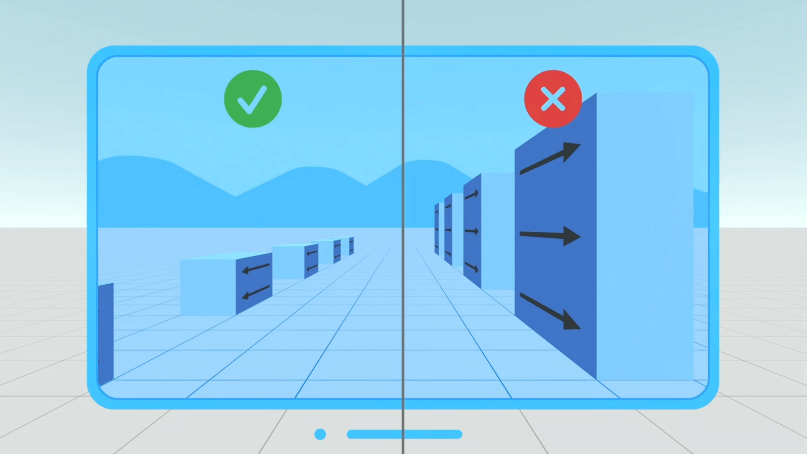
- Stabilize the interface position in space. When objects move within the application, it is advisable to avoid creating a sense of motion for the user.
- Avoid rapid turns, rotational movements, and large objects flying close by.
- Minimize oscillations. For comfortable use, it is better to minimize oscillations. If it is unavoidable to display oscillatory movements, consider keeping the amplitude of the movement low and making the content semi-transparent to reduce its visibility to the eyes.
Accessibility
Make spatial interactions inclusive and accessible to users with different needs. Provide alternative methods of interaction and consider diverse user requirements.
For example, the Dwell Control feature allows you to select content simply by using your eyes. Briefly focusing on a button will display the user interface, and the button will be selected without the need for a hand touch gesture. For more details, watch this video.
What Lies Ahead?
The creators of Apple Vision Pro state: “When people wear Apple Vision Pro, they enter an infinite 3D space where they can interact with your app or game while staying connected to their surroundings.”
The interface becomes integrated into our more natural physical world, interacting with the real world. Therefore, the logical continuation involves interfaces that blend reality with technology.
There is vast potential for ideas in various fields: education, medicine, entertainment, and many others.
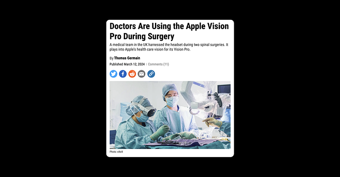
Medicine
In medicine, there are projects that are already improving lives. For example, doctors can now use augmented reality during surgeries. It’s truly inspiring!
More materials on the application of technology in medicine can be found here.
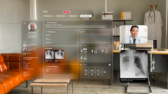
You can also read the article about the experience of doctors Mr. Fady Sedra and Mr. Syed Aftab regarding the use of glasses during surgery.
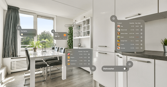
Home Assistance
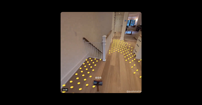
The possibilities of Apple Vision PRO in everyday life are no less captivating. An interface related to physical objects, like a refrigerator or a window, appears next to them. We discovered the concept of such an interface on Behance.
I really like the example with the vacuum cleaner. Firstly, it shows all the areas I haven’t touched yet, and secondly, it’s just fascinating! Daniel Boshan from Canada, who works as an AR/VR systems engineer at Shopify, created a vacuum cleaner with an augmented reality system. It displays areas of the surface that haven’t been cleaned yet.
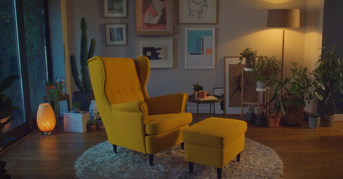
Interior Design
A vast realm unfolds for interior designers. Not only will they be able to create visualizations on their computers, but also, by donning glasses, they can see the future interior almost as if it were real! IKEA has developed an app to “try on” their furniture in an interior, for now using a phone, but in the future, AR technologies will undoubtedly integrate well here.
Entertainment
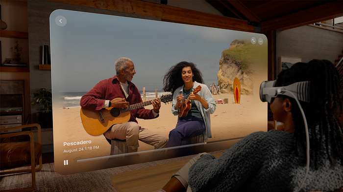
Of course, there is great potential in the entertainment industry. There is already a lot to find on this topic in presentations from Apple and in concepts from designers around the world, for example, a movie player:
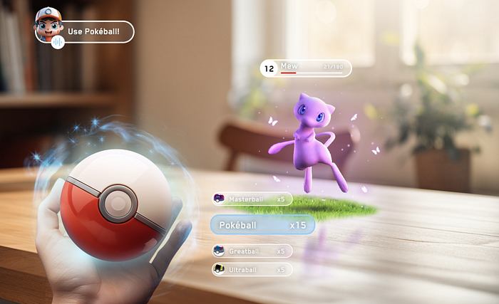
And here are my lovely Pokemons (VR):
Social Media
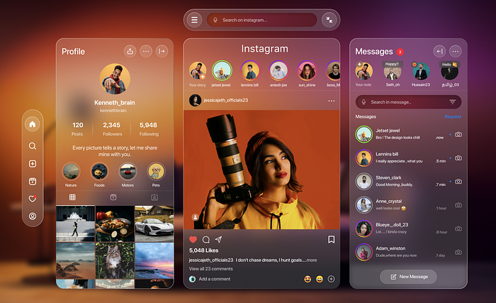
There are already concepts of well-known social networks, which have been adapted to the “glass” background. However, it seems that a complete rethinking is possible here. We’ll keep an eye on how things develop.
Summing Up
Designing for AR technologies challenges us and motivates us to grow and evolve, but also to return to fundamental knowledge of artistic principles.
In the near future, we can expect a new evolutionary leap in interfaces, the main thing is that technology continues to evolve and improve. For now, AR glasses are quite expensive and not very convenient, but I personally believe that this is just the beginning.
