UI Exploration | Product Discovery
UX laws implementation in improving restaurant discovery experience
Exploring a different approach for discovery process based on visual preference.

The First-World Problem
Visiting a restaurant is a great way to catch up with a loved one over some great food, but have you ever feeling confused when you have to decide where should you eat? No worries, we’ve all been there.
A survey of 2,000 people in committed relationships shows 37 percent of couples regularly have a hard time agreeing on where to eat. According to another study, they even spent more than 10 days per year only just to think about what to eat.
Choosing about what to eat is already difficult, let alone the place.

Why do we have difficulty in choosing a place to eat? How do other people usually find a place to eat? How might we even solve this problem?
In this case study, I’m going to walk you through my process of digging the problem deep on the people’s behavior first, and how do i propose a better discovery experience.
Albert Einstein said, “If I only had one hour to solve a problem, I’d spend 55 minutes defining the problem, and the remaining 5 solving it.”
Understanding comes first
This is one of the most common problems, there must have been plenty of references discussing this behavior. I think secondary research will be enough to save our time, and then I’ll validate the findings with the primary research.
Why is it so hard to decide where to eat?
Based on this article, most people find it difficult to choose where to eat because of the phenomenon of ✨Paradox of Choice✨
Similar to one of the cognitive biases in UX, Hick’s Law, the Paradox of Choice is a condition where more choices do not make people feel relieved because they are more free to choose, but instead overwhelm our brain because there are many considerations to maximize the value of their choices, for example difference of preferences.
Besides, in economics, there is a theory called Gossen’s Law, a condition where there is a certain point of same food you can keep eating before you get sick of it and the mere thought of having anymore actually lessens your hunger.
This will then cause you to seek a new option.

So, how do people today decide where to dine-in then?
Many people nowadays prefer to look for places to eat from social media. A previous study found that customers are tempted to go to the restaurant and taste the food just by looking at the photos on social media. How can that be?
- Social media is considered to have easy access, especially now that there are many curators who specialize their accounts to provide recommendations for places to eat.
- More convincing than googling. Google does not provide complete info. Social media is considered more up to date and offers many choices.
- Visual aspect seems to be one of the most important values for users when looking for dining recommendations on social media. One of the main goals in choosing to look for recommendations on social media is to see the atmosphere of the place to be visited.

Challenging The Paradox
Confusion in choosing a place to eat is related to the user’s lack of ability to discover new places.
On the other hand, we can take advantage of the behavior of social media users. And also improve the experience by patching the weaknesses of social media, the inability to search for specific multi-preferences.
Based on this article, the answer to solve the paradox is by taking the cognitive load off your users, either by making product filter keys, being customer’s personal shopper, or using social influence to suggest products.
Meet Vasco — Instagram tags with more detailed info and sorting feature for restaurant discovery only.
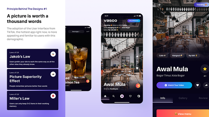
A picture is worth a thousand words
The adoption of the User Interface from TikTok, the hottest app right now, is more appealing and familiar to users with this demographic. Besides, restaurant interiors are considered as high detailed image, so simplification needs to be done for the other components.
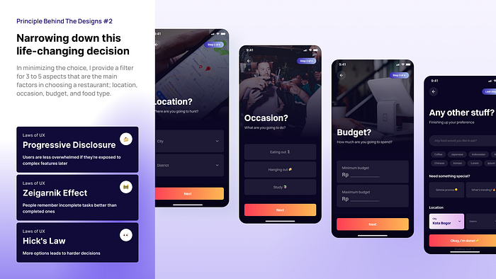
Narrowing down this life-changing decision
In minimizing the choice, I provide a filter for 3 to 5 aspects that are the main factors in choosing a restaurant; location, occasion, budget, and food type. For the first time setting, I simplified the process with an onboarding experience and added a progress indicator to keep users informed.
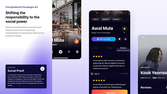
Shifting the responsibility to the social power
Besides its purpose in suggesting user and increasing trust, features made based on social proof theory have a role in replacing responsibility of restaurant selection to another’s hands.
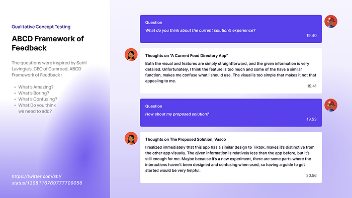
What does people say
For the testing process, I use a qualitative approach by comparing the current solution with my proposed solutions in the 3 main touchpoints of the discovery process; homepage, preference settings, and results (restaurant profile). Measured from an aesthetic and usability aspect.

Learning to love the process
- Trying to focus on the solution. While the problem is still king, paying the solution a little attention makes it predictable. Problem is fixed variable, while solution is more flexible. The more you explore solutions, the more unique solutions you’ll provide.
- Trying to challenge the predefined structures. We must be tired of looking at case studies with that same template. I try to give a unique — yet personal touch using visual storytelling in presenting solution and research finding.
- Trying to design for myself. Steve Jobs has done it. Building something you would want to use is the best motivator, and has been a well-known approach ever since. Designing for yourself can provide you with a creative breathing space in the design process— and it felt rewarding. Just make sure to keep being critical, yet constructive.

