UX Designer: Think Like a Developer (But Not Literally)
How to work more effectively cross-functionally with Software Engineers and Create a Smooth Handoff Experience.

The age-old narrative: UX designers craft beautiful interfaces in Figma, developers bring them to life (sometimes with a grimace), and the user… well, that outcome varies. But what if there was a better way? A way where UX and developers collaborated seamlessly, creating not just user-friendly experiences, but also developer-friendly ones?
Beyond the Handoff
Let’s face it, tossing a Figma prototype over the fence isn’t true collaboration. It’s time for UX designers to ditch the “handoff” mentality and embrace a deeper understanding of the developer’s world. This doesn’t mean coding bootcamps for designers (although, hey, go for it if that’s your jam!).
Here’s what I propose:
- Understanding Technical Constraints: Equip yourself with basic knowledge of development realities. Learn about common limitations like performance considerations, browser compatibility, and API restrictions. This awareness helps you design solutions that are not just beautiful but also feasible.
- Speak the Dev Language: Familiarize yourself with basic development terminology. Understanding concepts like backend vs. frontend and user flows vs. code structure fosters better communication and avoids misunderstandings.
- System Thinking: Think in terms of the entire system, not just the user interface. Consider how your design interacts with existing functionalities and data structures. This holistic approach streamlines the development process.
- Early Collaboration: Involve developers early in the design process. Discuss potential challenges, brainstorm workarounds, and explore alternative solutions together. This fosters a sense of shared ownership and leads to a more cohesive final product.
Creating a Smooth Handoff Experience
Closed-Loop Prototypes
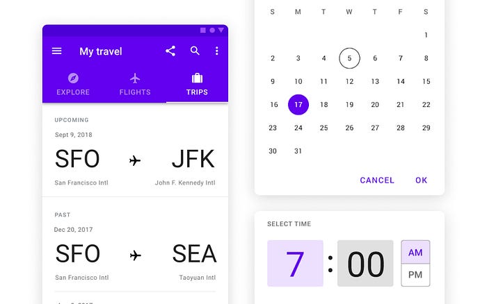
Don’t leave developers guessing about user journeys! Build prototypes with a clear “closed loop,” defining the starting point, ending point, and every step in between. This transparency allows developers to grasp the user flow seamlessly. This clarity not only streamlines development but also empowers them to get creative and find innovative ways to bring your prototype to life.

Don’t Forget the In-Between:
Empty states, confirmation screens, loading icons — these “alt states” might seem like minor details, but they play a crucial role in user experience. These moments bridge the gaps in user interactions, and clear, well-designed alt states can leave a positive and lasting impression. By investing time in crafting informative and engaging alt states, you ensure a smooth and consistent user journey, even when things aren’t quite happening on screen.
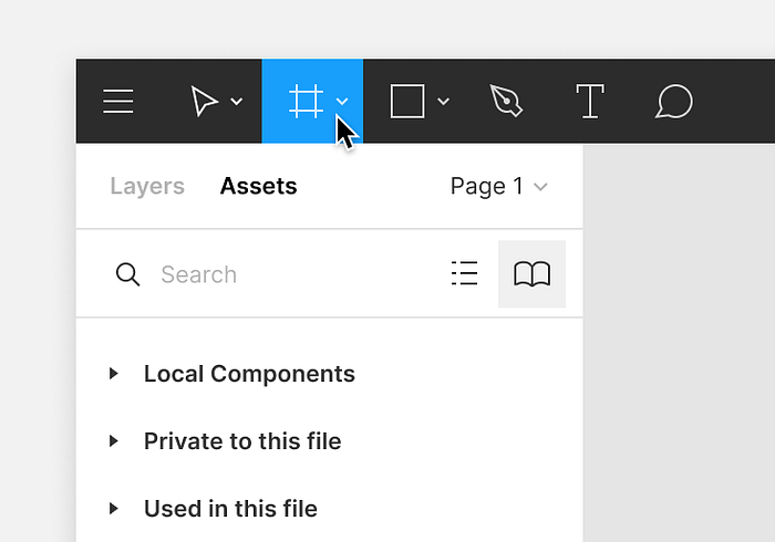
Frame It Up
Using frames in Figma might seem like a basic principle, but it’s a game-changer for seamless handoffs. Here’s why:
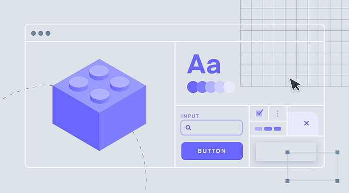
Frame Every Element: Treat frames as building blocks. By framing every element, from icons to complex components, you establish a clear hierarchy and organization for developers. This consistency makes it easier for them to understand the layout and translate your design into code.
Embrace Auto Layout: Combine frames with Figma’s powerful Auto Layout feature. This allows for dynamic resizing and spacing, ensuring your design adapts seamlessly across different screen sizes. Developers will appreciate the clear structure and predictable behavior of your well-framed and auto-layered design.
Here’s a great article on why you should use frames in Figma:
Applying Layout
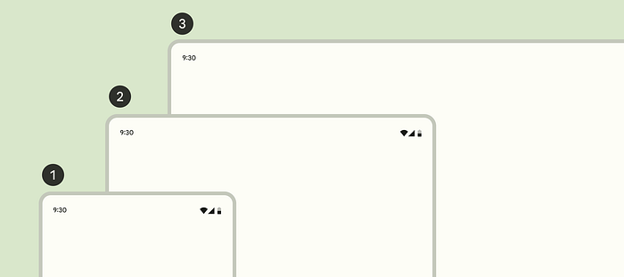
Responsive design and a mobile-first approach are fundamental, but let’s take it a step further. Modern responsive design isn’t just about three screen sizes. Today’s users navigate a vast landscape of desktop, tablet, and mobile devices, each with varying screen sizes and capabilities.
Bridging the Gap with Developers: Collaboration is key. While you don’t need to code yourself, actively participate in the development process by sharing your UX expertise and providing guidance. One way to achieve this is by proposing window size classes. These represent specific breakpoints where the layout should adapt based on available space, device conventions, and user ergonomics. Discussing and refining these breakpoints with developers fosters a unified design and development approach.
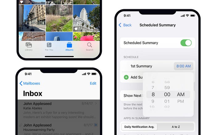
Embrace Native Design
Native design isn’t just about aesthetics; it’s about leveraging the power of familiarity and established user expectations. Here’s how mastering design guidelines unlocks a smoother mobile experience:
- The Power of Familiarity: Design guidelines like Google’s Material Design for Android and Apple’s Human Interface Guidelines for iOS provide a comprehensive set of best practices. By following these guidelines, your app inherits the look and feel of the user’s entire mobile ecosystem. Imagine your app seamlessly blending in with other apps on their phone, creating a sense of comfort and ease of use.
- Intuitive Interactions: These guidelines also detail device-specific gestures and functionalities. Integrating them ensures your app aligns with how users naturally interact with their phones. Think smooth swiping transitions, familiar button placements, and intuitive menus — all thanks to mastering design guidelines.
Using real data
Imagine presenting stunning dashboards, tables, and information visualizations — only to have them fall flat during development. Here’s the secret: ditch the generic Lorem Ipsum and embrace real user data throughout the design process.
Using actual data demonstrates a deeper understanding of user behavior and builds trust with stakeholders. They see how the design interacts with real-world information, giving them confidence in its functionality.
Speaking the Dev’s Language: Understanding Web Component Libraries
When collaborating with developers on web projects, understanding the web component library they’re using can be incredibly beneficial for designers.
Here’s why:
- Demystifying the Toolkit: Web component libraries offer a collection of pre-built UI components and styling options. Knowing the specific library allows you to:
- Identify Available Components: You can readily incorporate existing components into your designs, saving development time and ensuring consistency.
- Style with Confidence: Understanding the library’s styling capabilities empowers you to create designs that seamlessly integrate with the established visual language.
- Navigate Constraints: Awareness of any limitations or constraints associated with the library helps you design within realistic parameters.
- Collaboration Through Knowledge: By familiarizing yourself with the chosen web component library, you can collaborate with developers more effectively. You can discuss design options that leverage existing components and explore creative solutions within the library’s framework. This shared understanding fosters a smoother design and development process.
The Takeaway
A successful UX designer isn’t just a master of aesthetics; they’re a bridge between users and developers. By thinking like a developer (but not literally!), we can create a collaborative environment that fosters innovation and produces user experiences that are not just delightful, but also efficient and maintainable. So, let’s ditch the silos, embrace empathy, and start building awesome products together!
In conclusion, by thinking like developers and understanding their perspective, UX designers can foster better collaboration and ultimately create more successful digital products. By providing detailed design specifications, collaborating throughout the development process, and thinking in systems, we can ensure that our designs not only meet user needs but are also feasible to implement. Let’s work together to create better products for our users and make life easier for our fellow developers.


