UX Case study: Coffee Bean and Tea Leaf — addressing changing times

The adoption of e-commerce has grown exponentially over the years and it is still growing at an astounding rate. Consumers are becoming accustomed to buying from either a website or an app to complement their busy lifestyles. They are seeking more convenient ways to fulfil their needs. This trend can be observed from a few online web trackers, reporting that mobile phones are generating more than half of the internet traffic today.
The pandemic has elevated the importance of e-commerce as a sales channel for businesses to serve their customers and has also propelled the urgency for businesses without an e-commerce setup to implement one.

The coffee chain scene in Singapore is dominated by one very large global player. Coffee Bean and Tea Leaf (CBTL) comes in next in line as the second largest. Followed by many contending thirds entering the space with tech-enabled solutions.

Currently, CBTL has a website with limited e-commerce offerings and no app. CBTL needs to rediscover their customers in these changing times to create value and new meaningful experiences to stay competitive.
The Problem
Since CBTL has no e-commerce setup, their customers have to be physically present at the store to make their purchases which takes time away from the activities they may want to or have to participate in. This brings about inconvenience to the customers.
Hypothesis
- With an app, CBTL users can buy and consume their food and beverages anytime, anywhere.
- With an app, CBTL users can make their purchases as quickly as possible and stay safe by minimising contact with others in the crowd.
Target Market
Given the nature of CBTL’s products and services, they serve a very broad base of customers. From preliminary research, the total labour force in Singapore, also known as the economically active population is circa 2.4 million (stats.mom.gov.sg). The Millennial Generation would be between ages 25–40 today and would make up about 80% of the total labour force. With the data gathered above, I segmented the business users into two categories— business users: on-the-move and business users: desk bound, to take the formal research forward.
“The Millennial Generation is in the 23–38 age group today… According to Singstat, … is approximately 0.9m. Based on our observation, the eating preferences… tend to evolve around healthy eating, freshness, convenience, and nutrition; with value, environment, lifestyle and aesthetics occasionally playing a part.” DBS Bank (20 Oct 2019)
Design Thinking
The Design Thinking approach was applied across the study, over 4 months, to arrive at the solution.

Research Methodology
I started the research process by evaluating the research methods that could direct me to the answers to my research questions. A mix of qualitative & quantitative research methods were deployed in the study. All except the user interviews were unmoderated. The choice of methods used were made based on their suitability to address specific research goals.
Desk Research
I began the study with desk research. I wanted to draw on existing sources and literature to understand the current trends, preferences and shifts of the target market. I also used widely accepted research findings, together with current data to establish consistency in the user survey findings.
Another trend that stood out amid pandemic measures was the rise in takeaway and food delivery. As at Nov 25, the percentage of seated diners in restaurants has declined by just over 51 per cent globally from pre-pandemic levels, with takeaway and food delivery emerging as an alternative. This service model is quick, convenient and keeps us safe, and is expected to grow exponentially in the region…” Business Times (22 Jan 2021)
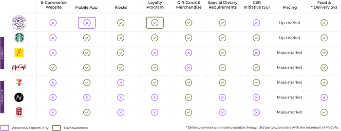
SWOT & Competitive Analysis
Next, I did a thorough study of CBTL’s internal gaps and competitive landscape in Singapore to uncover their strengths, weaknesses, opportunities and threats. Specific data from direct and indirect competitors such as target market, value proposition, sales channels, reward programs etc. were collected and analysed.
User Interviews
In order to gain in-depth understanding of coffee chain users’ behaviours, habits, preferences and lifestyle — during pre-pandemic times and in in-transition to endemic phase, I conducted four interviews with users aged between 32–55. I gathered insights into their views, attitudes and motivations behind their visits to CBTL, and also uncovered their preferences on the use of apps and pain points while consuming CBTL’s services.
It is crowded everywhere during peak hours and it’s always a big rush for me. The queue is often the reason why I am late for work.” Female, 32. Marketing Manager
I usually order via app while seated and just collect when ready so that I can talk to my clients while waiting.” Male, 40. Insurance Agent
I didn’t know they have a reward program. I have not heard of it. Apps are best for tracking rewards, I can check anytime” Female, 45–50. Teacher
I’ll definitely consider safety, crowd, price and convenience.” Male, 50. Businessman
User Survey
User survey was the fourth and final research method used. Questions were carefully crafted, with best practices applied, to gather responses from a targeted group of users. I posted two qualifying questions at the beginning of the survey to filter away participants who did not meet the criteria.
I wanted to gather quantitive data using the survey and understand the change in users’ behaviours, habits and preferences — in pre-pandemic times and in in-transition to endemic phase and uncover users’ preferred mode of coffee purchase and the motivations behind using an app to make purchases.
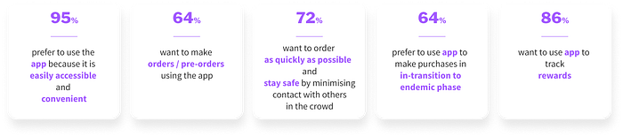
A Summary of Key Findings
- Users are seeking convenient ways to make their purchases from coffee chains, with mobile apps being the preferred mode.
- Users prefer mobile apps because it is convenient and easily accessible. They can make their purchases anytime, anywhere
- Users want to use an app to order and to pre-order
- Moving into the endemic phase, more users will use apps to make purchases
- Users do not like queues, they want to get their orders as quickly as possible and they place safety & minimising contact with others in the crowd as priority when deciding on the stores they patronise
- Users prefer to use apps to track their rewards
Problem Statements
Three “How might we?” problem statements were framed after performing the Affinity Diagram exercise, and were taken forward in the Ideation phase to generate ideas. These questions have helped me stay grounded on the problems and at the same time, explore new ideas. The favourite and notification features in the final design were generated through this process.
Lifestyle — How might we help desk-bound users enjoy their food and beverage with minimal time away from their desks?
Speed & Crowd — How might we help on-the-move users stay with their clients throughout the meeting and also minimise contact with others in the crowd?
Rewards — How might we give users the flexibility to stay informed of their reward status at their convenience?
Personas & Customer Journey Map
Jane and Dave were born — the Personas crafted from the research for CBTL. Jane and Dave represent CBTL’s business customer profile and the entire development of the solution was tailored based on their needs and expectations.
Jane is a typical desk-bound business user who rushes to the office from the gym in the morning. In her user story, she experiences three pain points while making a purchase at the store, I addressed the pain points with the proposal of an app with pre-order capabilities and “Favourite” function that allows for Jane to personalise and save her favourite items. The app will also come with notification capabilities to keep her updated on the status of her order and keep her away from the crowd.


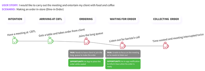
As an Insurance Agent, Dave cares a lot for the time spent with his clients. Dave encounters 2 pain points during his visit. With an app, Dave would be able to place his order at his seat and leave his client only once, momentarily, to collect his order. The in-app notification would also enable Dave to stay focused on his conversation. Since the entire order process takes place at the seat, Dave can also stay well away from the crowd.

Value Proposition
With the proposed solution in place, a value proposition was created to position and communicate the value of the solution — convenience, speed and simplicity.

Information Architecture & Heuristics
Due to the absence of an app and a full-fledged e-commerce website, the heuristics and IA studies were conducted against a competitor app, taking the “learn from others” approach. With Jane and Dave’s goals in mind, I moved on to identify the content gaps with reference to their goals, and develop the relevant content to help Jane and Dave achieve their goals with the CBTL app. In my evaluation process, I learnt that these two factors have a big part to play in creating a good or great user experience. A lack in these two areas can frustrate a user, cause drop-outs or even never to return customers.
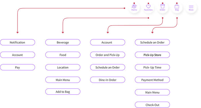
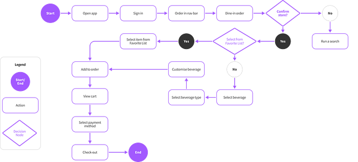
Task Flows & User Flows
Jane and Dave are both users who are ready to make their purchases and hence the app is built for “ready-to-buy” users and not targeted (as yet) at consumers who only want to browse.
On top of Jane and Dave’s user flows, the CBTL’s app v1.0 will focus on transactional task flows (eg. Account Sign-up, Top-up card value, Add credit card etc.)—to ensure that users are able to make purchases.
In the user flow below, Jane wants to place her order ahead and selects all her items including her desired location using the favourite function. She has saved all her customised items in a list which eliminates the need to repeat the same steps every time she wants to buy the same item.

Dave on the other hand, is dining-in with a client and does not use the favourite list. His location is automatically detected and he orders from the main menu. It is assumed in both user flows that they they are buying one drink and have activated their face detection login feature prior.
Wireframes vs Mock-ups
Initial mid-fi wireframes were drawn-up according to the planned IA and UX elements. Iterations were made to the layout, UX elements and UI design in the process to better the user experience. My final design came out very different from the initial wireframes. I took inspiration from several apps at the beginning to include the latest layouts and UI trends which later I realised did not fit into my concept and the product I was designing for. Most importantly, the initial wireframes could not present the information concisely to the users.
Design Considerations
Before diving into the final phase, UI design, I summarised and added on several other elements that I wanted to be included in the app. These considerations also shaped the final design.
- v1.0 - An app built with user problems in mind — App v1.0 i is focused on solving user problems. It has been developed using the MPV approach. Learning and iterations will follow after launch
- Users are busy professionals — App is built for users who are ready to buy and to complete specific transactional tasks. It allows the users buy anytime, anywhere.
- CBTL’s corporate branding & identity — CBTL’s current branding styles have been incorporated in the design for overall consistency, globally.
- Personalisation & accessibility — Allow users to tailor their own experiences, and build a relationship with CBTL. Care has been taken in the design to ensure inclusivity
- Micro-interactions & simple animated images — To provide feedback to the users, encourage engagement, provide error prevention, brand communication, evoke emotions and to keep the app fun
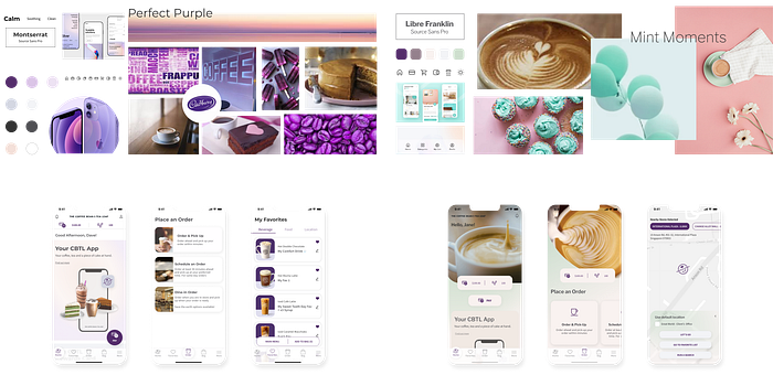
Moodboard & Mock-Ups
Two versions of the app were put together and mock-ups for several screens were also done up for comparison. “Perfect Purple” came out to be more corporate and formal while “Mint Moments” gave a lighter and refreshing feel. I went ahead to refine the “Mint Moments” experience as it aligns with the UI concept I had in mind.
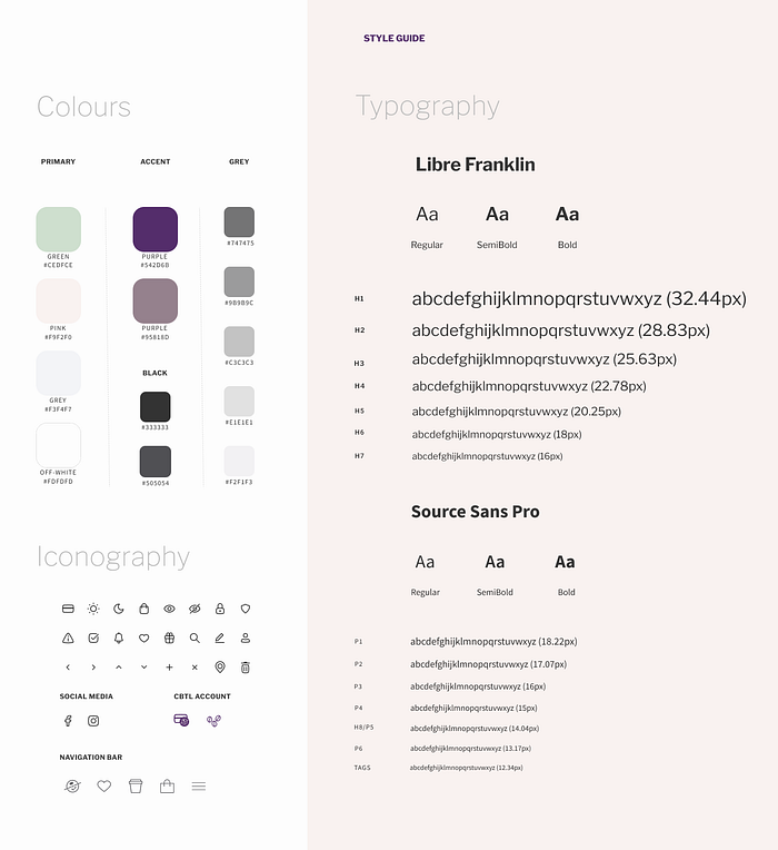
Style Guide
A style guide for the app was created as I moved along with designing the different screens. It has helped me remain consistent across the app. I documented the UI elements used — typography, colour palette, iconography, buttons, navigation bars etc., and reused them where applicable. Developing a style guide can take time but, in my opinion, it is time worth investing in. A consistent UI brings about better user experience.
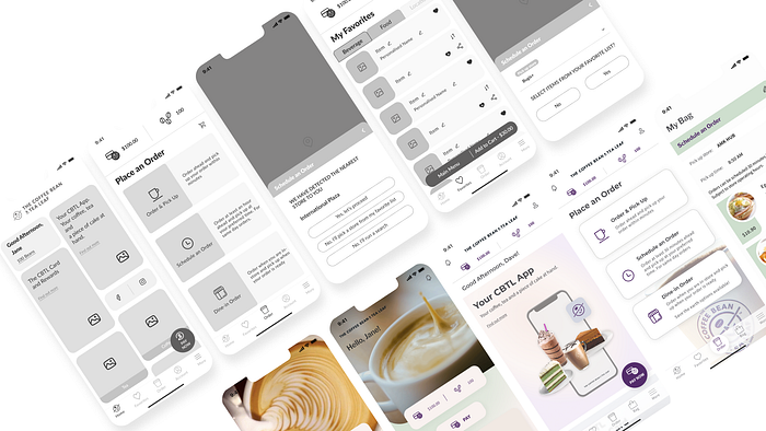
Design Solution
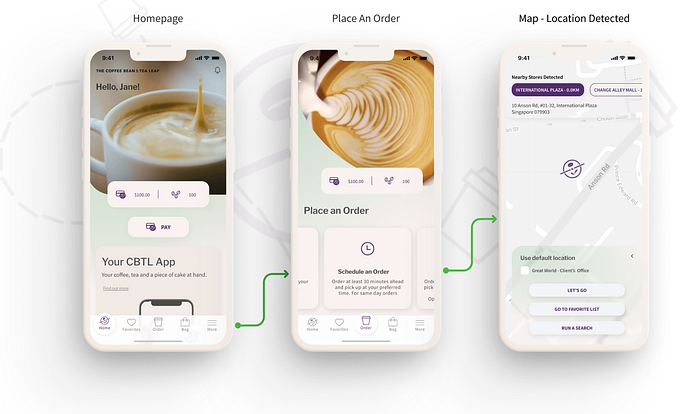
In my final solution, the user makes an order, in advance, from their current location using their device. The user goes directly into the Homepage and clicks on “Order”. The options provided in the “Place an Order” page is based on the user’s intention which is known to them at the time of purchase. In the user flow (Jane’s scenario), the user taps on “Schedule an Order” and it automatically detects the user’s location, saving the user the need to select. However, there is a chance that the user may be at a different location since there is a 30 minute window or more for “Schedule an Order”. The solution caters for the user to select other preferred locations as needed; anticipating the user’s needs.
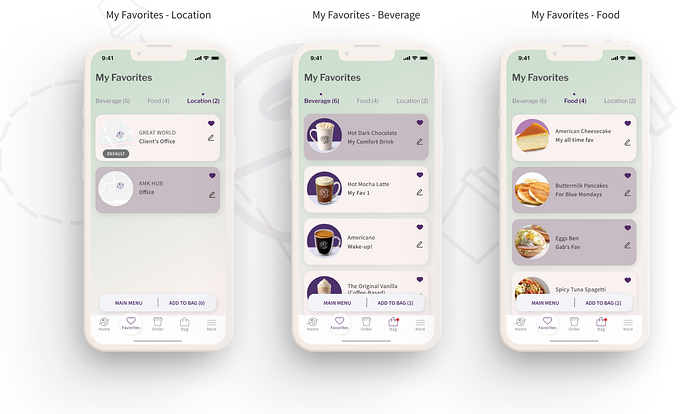
The user then moves on to the “Favorite List” where all three categories under “Favorites” are presented. The user can quickly and easily access everything they have saved. “Favorites” is everything about the user—from favourite drinks, food, location to item customisation and naming. Multiple selections from each “favorite” category can be selected and added to the “Bag” together. This saves the user time and the effort of having to add them one at a time.
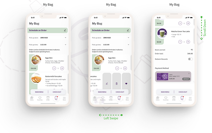
Finally, the user moves to “Bag” where they will see a summary of the items they have added, the rewards they will be awarded from this order and the total price. A view of all their CBTL cards are also presented on this screen for payment purposes. The CBTL Cards are presented in the following order: user setting (default card), value and frequency of use. They also have the option to access and top up the cards individually. I have kept the all selections the user has made in the earlier steps editable to this point. This is to make it as convenient as possible for the user should there be any need for changes. On the “Thank you” screen, the user is informed of the status and reminded that the notification setting needs to be “ON” to receive updates. The user proceeds to exit the “Thank you” screen and back to the Homepage where they will see alerts on the notification icon and “More” where purchase history resides.
Watch the Interactive Prototype
There is an advanced user flow within. Can you find it?
*Hint: Everything about the user
Next Steps
It has been an exhilarating journey designing the CBTL v1.0 app. There are plentiful more that can be improved on and done beyond this.
- As the next immediate step, I would like to first jump into usability testing to gather insights on user problems for refinement before releasing the MVP. An unmoderated user test will be needed to measure time-on-task and identify specific points of struggles. I would also like to conduct user interviews to get deeper insights on their views and opinions. On-going iterations and improvements will be made to the next version release.
- Moving on, I would like to work on improving the personalisation feature — tailoring experiences to a T. While customisation is available in the MVP version, I have identified gaps where a user saves two same items and may not be able to differentiate them through the current UI. This can be addressed by improving the front-end IA through a card sorting exercise (which generalisation will still exist) or with an AI/ML (Artificial Intelligence/ Machine Learning) engine running at the back. Further readings and understanding on personalisation will be required.
- I would also like to explore the possibility of social media integration which translates into a broader target audience. Another round-trip through the design thinking process will be needed for this to happen.
- On a personal front, I would like to push for some sustainability efforts to be included in every project that I work on. I included an option for dine-in users to play their part in one of the screens.
Conclusion
It is worth mentioning that a comparison study was conducted right at the beginning of this study between coffee chain apps (own brand app), delivery apps and super apps. The key differentiators, at the very surface, between these apps lie in the rewards offered by the app operators, the price tag (own brand apps are typically lower), the level of customisation possible, the users’ location, if delivery services are required etc.. The charges imposed by delivery and super apps are known to be on the high side which erodes profitability. While it does seem to make perfect sense for businesses to own their e-commerce channel, can they keep their customers coming back? How can we exceed users’ expectations continuously? This will be top of mind in my next UX design project.

See my portfolio: https://www.behance.net/ceepp

