UX Case: Bank Mobile App Redesign

HEY BANCO REDESIGN
As a young adult trying to make the most out of my money I discovered Hey Banco, I decided to create an account and open a bank account, I also applied for a credit card, everything from the Hey Banco App. Now I use the Hey Banco App to manage my account, my cards and my money but I do not find the navigation and the structure the best. After observing that other people also experienced issues with the app, I pursued this redesign as an opportunity to improve the experience in any way I could.
Through usability testing, I discovered that many users struggled with navigation within the app due to the load of information given. Based on my research findings, I designed some solutions and validated them further with additional usability tests.
Role: UX Designer (Research, Wireframing, Interface Design, Prototyping and Testing)
Tools used: Figma, Illustrator and Photoshop
Timeline: One week (design sprint)
Sector: Financial Services
Context
Hey Banco is an online bank, they do not have any physical branches. They provide the main interaction through the Hey Banco App and their clients can also access their digital banking on the web. For customer services they can call or message via Twitter. It is a brand from Banregio targeted for young adults.
From the Hey Banco App users can do a lot of things from creating an account and applying to open a bank account and credit card to pay services, invest money and buy stocks.
Hey Banco is part of the boom of online banking/credit cards along RappiCard, Nu Bank, Nano Pay and Stori but with a big difference there is an actual bank that backs up this brand unlike the previously mentioned. Hey Banco is not only a credit card, it is an online bank.
Since Hey Banco does not have any physical branches their clients have to interact a lot with the app, which sometimes can be overwhelming due to the amount of actions they can take and how the information is organized.
Problem
Hey Banco clients get overwhelmed using the Hey Banco App which can result in less use not only of the app but also of the card(s). I decided to redesign the Hey Banco App, this would allow users to navigate in an easier way and would eliminate the overwhelming feeling while navigating the app.
Project Goals
Create a better user experience for Hey Banco App by improving its user interface, navigation and the information architecture. The challenge is to keep all the features in a way that is not overwhelming for the user providing a more pleasing and seamless experience.
The Process

MAP — RESEARCH AND DEFINE
Research Objectives
- Learn about Hey Banco and its customers.
- Understand why people decide to open a bank account in Hey Banco.
- Explore how users navigate the Hey Banco App.
- Identify pain points and unmet needs that users face while using the app.
- Learn about the experience offered by other banks regarding their digital solutions and their reception.
User Interviews
I conducted user interviews with 10 participants who are current clients of Hey Banco, most of them use another bank besides Hey Banco. I wanted to further understand their motivation and behavior within the app. Additionally, to those who have been clients of Hey Banco for a while now I asked about what they think about the iterations the app has experienced. Lastly, I learned about how they interact with other bank apps and what they enjoy and dislike about them.
Usability Testing
To test the app’s user experience, I contacted various Hey Banco clients (new and old) from all over Mexico and asked them to perform a few predefined tasks in the Hey Banco App while recording themselves so I could analyze their actions and take notes.
Competitor Analysis
I dedicated some time to exploring other banks apps in order to get a better understanding of the products the competitors offer. I inspected the most common and famous banks apps and took notes about the user interface, the design, the navigation, the features offered and the reviews and feedback they have received.
Identifying Design Problems
After all the research, the following four issues stood out the most:
- Security and the amount of steps when logging in: the Hey Banco App request in one step your username and in another the password, which appears to be to many steps compared to other banking apps that remember this information and the only thing needed to logging in is facial recognition, this not only speeds up the process but also is perceived safer to avoid frauds.
- Visual pollution when logging in: the amount of advertising in the log in screens is annoying, distracting and not considered useful.
- Too many actions from the home screen: there exist many actions one can take from the home screen, which can be overwhelming and hard to understand.
- Repeated notifications: most of the notifications keep being active even after being seen which causes confusion and irritation in most of the users.
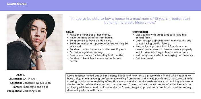
User Persona
I created a user persona to put a face on Hey Banco’s target user and visualize various aspects of their behaviors and motivations. This persona was roughly based on the users interviewed and the users from the usability testing.
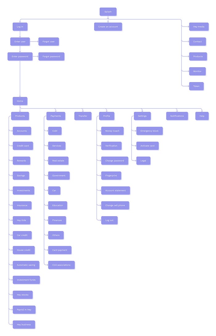
Current Sitemap
Most users were having trouble navigating through the current app and getting overwhelmed by the amount of actions one can take. Therefore, in order to redesign the app, I built the information architecture to understand its structure.
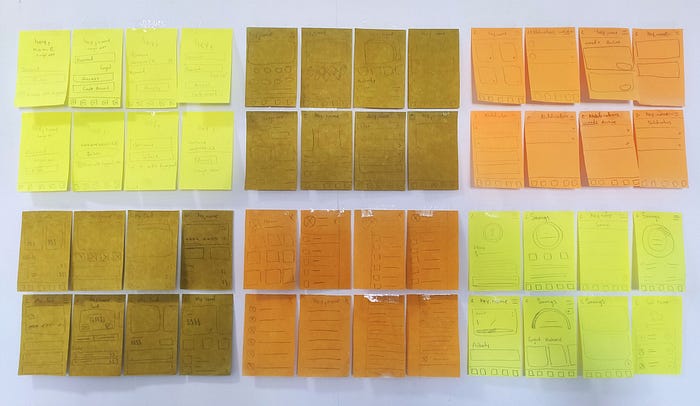
SKETCH — GETTING CREATIVE AND GENERATING IDEAS
Step by Step
For the sketch phase, I began with gathering the key info from the research, interviews and tests I have done, second I started with doodling rough solutions from the notes I had retrieved, third I did the crazy 8s exercise (a fast-paced exercise where you rapidly sketch eighth variations of each screen (1 minute per sketch — overall 8 mins)) to try and mix different elements in each screen, lastly is to figure out the details.
DECIDE — PICKING THE BEST SOLUTION
It is time to decide which idea(s) to elaborate and move on to the prototype phase. I made the decision based on the project goals and the problems I determined, always taking into account how well the chosen solutions align with them, so I can choose the best solutions for this project.
Log in
For the log in screen I got rid of the advertising/news on the screen since they are accessible from the navigation bar. For the interaction of logging in I decided that the app will remember the username and will only ask for the password, with option to enable biometric login to add an extra security layer, this allows the user to login in only one step instead of two which makes the experience more pleasant and engaging due to the speed of the process
Home
The home screen got decluttered and organized, I kept to a minimum the actions available from this screen with the purpose of reducing the overwhelming feeling and the user not getting so distracted when entering the app. The actions got organized into a submenus that are accessible from the home.
Notifications
For the notifications I only modified the interaction, now when a user enters this screen the badge that indicates that there is a new notification gets cleared and the notifications stay there in an active or inactive status depending on if they were seen or not.
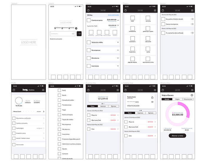
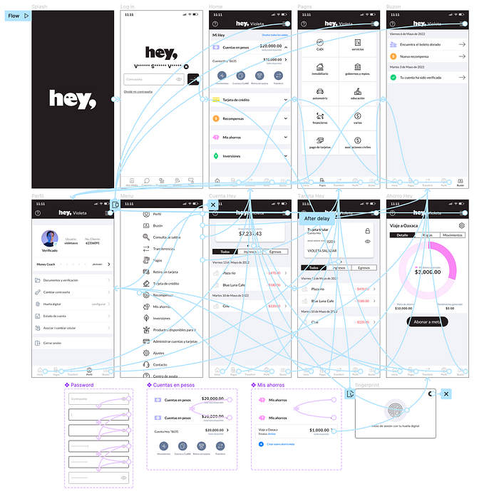
Wireframes
After deciding the designs I created digital mid fidelity wireframes to illustrate the ideas I chose.
PROTOTYPE — CONNECTING THE SCREENS
In this stage of the process I prototyped the ideas and solutions chosen in the previous stage, this way I created a real, tactile representation of the ideas and solutions. In addition I also worked on the transitions of the screens and the navigation of the whole app so the user can comprehend the basic functionalities that solve the problem.
TEST — GETTING FEEDBACK FROM THE USER
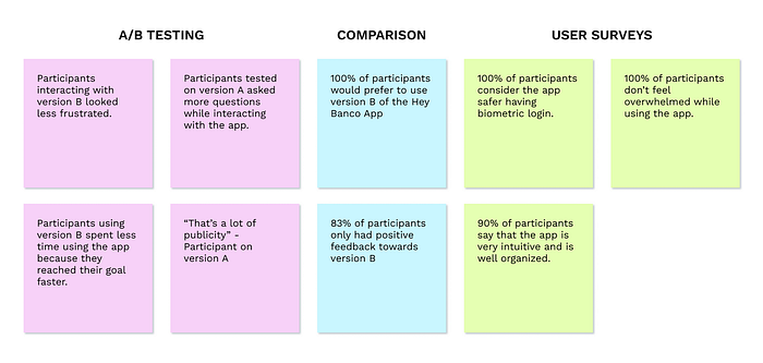
A/B Testing
The first kind of testing I conducted was an A/B testing, where 4 people were tested on the version A (Hey Banco App’s current version) and 4 people were tested on version B (my redesign). I measured their behavior to see if they acted differently when they got version B.
Comparison
To make a comparison between version A and version B I recruited 6 participants and made them use both versions, give their feedback, what they liked and what they didn’t like about each version, and at the end tell me which version they would prefer to use.
User Surveys
To validate the changes I made, I surveyed 10 users of the Hey Banco App with my prototype. I asked the same questions from my initial tests and recorded their behavior and feedback.
Findings
FINAL PRODUCT
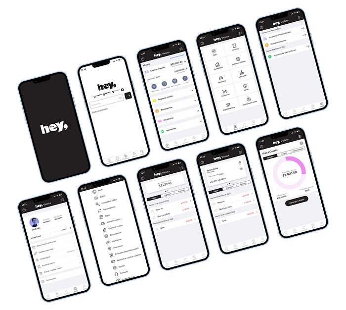
Hey Banco App Redesign
Here is the high fidelity prototype of my redesign, this new version aligns with the project goals and gives solutions to all the design problems. I would like to mention that I kept the visual identity from Hey Banco App’s original design. The redesign is focused only on the experience, including user interface, navigation and information architecture.
TAKEAWAYS
Next Steps
Now that the experience redesign is completed it can be implemented. After that it would be good to conduct usability testing to keep iterating on the product and building a better experience. Another thing that can be improved is the visual identity, this way the brand can be strengthened, improving the visual identity would impact directly on the elements of the UI kit causing the modification of the user interface in the app, which (if based on user research) could improve the experience.
What I learned from this project
REDESIGN
From this project I learned how to approach a redesign project, and how it differentiates from starting a project from scratch. I learned about the challenges, how you need to understand not only the existing users but also meet the business goals and how they can be seamlessly integrated into the redesigned user experience.
DESIGN SPRINT
For this project I followed the design sprint process for the first time. I learned about the different stages and what involves each one. Even though it was hard to keep up I enjoyed the process and how fast it is possible to ideate new and innovative solutions.
INTERACTION MATTERS
The redesign of the Hey Banco App made me gain a deeper knowledge on why the interaction matters. I learned that interaction gets the UI more detailed and that details can make the experience more functional.

