
Grids are one of the most important tools in a designer’s arsenal. Grids not only help create a sense of balance and structure in a design, but they also improve the overall user experience by making it easier for users to understand and navigate a website or application.
Think of it like a sheet of graph paper. Just like a graph paper which has horizontal and vertical lines that divide the sheet into smaller sections, a grid in UI design consists of a series of horizontal and vertical lines that divide the layout into smaller sections.
As you can use the squares on a sheet of graph paper to plot out a graph or a design, a grid in UI design can be used to place elements like text, images, and icons in a way that creates a sense of balance and structure.

Just as the squares on a sheet of graph paper are uniform in size and shape, a well-designed grid in UI design will have consistent spacing and proportions to create a cohesive and visually appealing design.

In UI design, a grid is a system of horizontal and vertical lines that are used to divide a layout into manageable sections. These sections can then be used to place elements like text, images, and icons in a way that creates a sense of order and hierarchy. When used correctly, grids can help to create a clean and consistent design that is easy to understand and navigate.
Grids also help to create a sense of hierarchy in a design. By using larger sections for more important elements and smaller sections for less important elements, a designer can help users to quickly understand which elements are the most important.
This can help to guide users through the interface and ensure that they are able to find what they are looking for quickly and easily.
There are several types of grids that can be used in UI design. Each type of grid has its own strengths and weaknesses, and the choice of grid will depend on the specific needs of the project.
Below are some of the most common types of grids used in UI design:

Column grid
A column grid is one of the most common types of grids used in UI design. It is a grid system where the layout is divided into columns. This type of grid is easy to use and can create a clear hierarchy in a design.

Modular grid
A modular grid is a grid system where the layout is divided into modules. This type of grid is more flexible than a column grid and can be used to create more complex designs.
Modular grids are often used in web design where the layout needs to be responsive.
Hierarchical grid
A hierarchical grid is a grid system where the layout is divided into different levels of importance.
This type of grid is often used in designs where there are several levels of information that need to be communicated to the user.
Breaking down the Grid
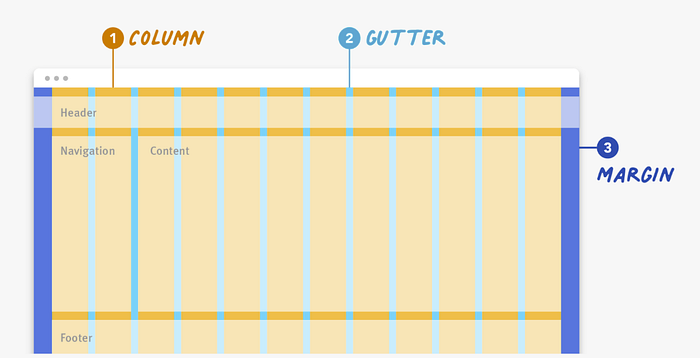
Column
A column is a vertical division of a layout. In a UI design, columns are often used to group related content together or to create a sense of structure and hierarchy. For example, a three-column layout might have one column for navigation, one column for content, and one column for ads.
Gutter
A gutter is the space between two columns. The gutter helps to create separation and visual breathing room between the columns. The size of the gutter can affect the overall look and feel of the layout. A larger gutter might create a more spacious and open feel, while a smaller gutter might create a more compact and dense feel.
Margin
A margin is the space between the content and the edge of the layout. Margins help to create visual balance and breathing room around the content. The size of the margin can affect the overall look and feel of the layout. A larger margin might create a more spacious and open feel, while a smaller margin might create a more compact and dense feel.
Choosing and Setting Up Your Grid
Consider your content:
Before choosing a grid system, think about the type of content you will be designing for. Will your design feature text, images, or both? Will it have a lot of content or just a little? The type and amount of content can influence the size and spacing of your grid.
Choose a grid system:
Once you have a sense of the type of content you will be working with, you can choose a grid system that fits your needs. There are many types of grid systems to choose from, such as column grids, modular grids, and hierarchical grids.
Each system has its own benefits and drawbacks, so consider which one will work best for your project.
For example, hierarchical grids are great for online news platforms. If the content you need to display is highly variable, consider using a basic column or modular grid, as these provide lots of flexibility when designing.
For example, elements and content can span across multiple columns or modules or just one to fit design needs.
Determine the number of columns:
Once you have chosen a grid system, you will need to determine the number of columns you will use. The number of columns can affect the overall look and feel of your design, as well as how flexible it is.For example, a three-column layout might be more rigid than a six-column layout.
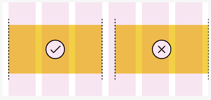
The gutters should remain empty as you place elements on the grid in order to clearly separate and align content and elements.
Conclusion
There are many types of grids that can be used in UI design, each with its own advantages and disadvantages. As a designer, it is important to understand the strengths and weaknesses of each type of grid and to choose the one that is best suited to the specific needs of the project.
If you have got any idea? Let’s get in touch.
I am a Product designer you can reach out to me on these other platforms:

