Using gestalt principles of perception to upgrade your visual story telling

How can you upgrade your visual story telling to captivate your audience, increase your conversion rate, and drive online sales?
Look no further than the Gestalt Principles of Perception. Gestalt is a German word that translates directly to “form” or “shape”.
These principles were first introduced in 1912 by German psychologists and they delve into our ideas regarding how we group together visual elements in order to perceive them as a unified whole.
Upgrade your visual story telling with the “similarity” gestalt principle
The gestalt principle of similarity is based on the idea that people tend to organize things in their minds based on how they look similar, rather than how they are different.
For example, if you’re presenting a slide deck and you want people to remember your company’s main competitors, but you don’t want them to get confused by the names of those competitors, you could use a visual that uses similarity to help people remember which competitor is which.
If you were using a bar graph or pie chart, for example, you’d want each competitor to be represented by a different shape (say, a circle for one competitor and an oval for another).
You could also use color or size as another way of organizing them.
This principle helps designers enhance their visual story telling by grouping similar elements into one cohesive unit, which creates a stronger impact.
When you use this principle to create your visuals, think about how your audience will perceive the information.
If it’s important to organize all of the data on one screen, then use this principle to group related pieces of data together.
In addition to helping you organize your data into groups, the gestalt principle of similarity can also be used to add visual interest and create an exciting palette for your designs.
How proximity will enhance your visuals
Proximity refers to how things relate to each other, and it’s a powerful tool in the hands of designers.
When you use proximity well, it can bring your audience closer to your message.
This principle states that objects near each other will be perceived as a group or cluster, and thus perceived as more closely related than they actually are.
This can be used to create visual clusters in order to make your meaning clear.
For example, let’s say you want to convey the idea that “you aren’t alone.”
You could use proximity by placing words like “alone” and “together” close together without indicating any relationship between them.
The viewer’s brain will naturally interpret these words as being related because they’re close together, even though they really aren’t.
This helps communicate the meaning of your message in a much more powerful way than if you had just written out “You aren’t alone.”
The Law of Closure
When you’re working on upgrading your visual story telling, you want to make sure that your design is as strong as possible.
One of the most powerful ways you can do this is by using the law of closure.
The human brain is hard-wired to look at incomplete images and try to fill in the gaps.
If you want to create a powerful design for your audience, use this principle by leaving out a particular element in an image so that your audience will figure it out for themselves and feel gratified in doing so.
The gestalt principle of closure is a principle in psychology that states that the brain will fill in gaps and complete figures, even if they are incomplete.
For example, if you look at the picture below, your eyes automatically fill the gaps in the image, even though there is nothing there.
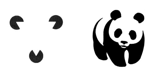
This principle is useful for creating powerful visual content because it can give your audience a sense of completion or fulfillment.
You can use this principle in your marketing materials by using white space to create a sense of completion.
How the principle of symmetry improves design
Symmetry is a gestalt principle that allows us to make sense of the world.
When we see a symmetrical shape, we can immediately recognize it as such, without having to think about it.
This makes symmetry an incredibly powerful tool for creating visuals that are instantly recognizable and easy to consume.
As a designer, you can use symmetry to create visual cues that guide your audience through your content and keep them engaged with what they’re reading or watching.
The human brain tends to perceive patterns as either symmetrical or asymmetric and will tend to organize elements in that way.
This effect can be used to create powerful visuals: by using symmetry (or asymmetry) in your design, you can help viewers to make sense of what they’re seeing, and feel like they understand the message more clearly.
To use symmetry effectively, look for ways to balance out your design with both positive and negative space.
“Figure and ground” in visual stories
Figure and ground are all about how your brain perceives an image.
It’s the idea that some parts of a picture are more important than others, and your brain will assign the most important parts to “figure” and the less important parts to “ground.”
This can be applied to many different types of visuals, including graphs, illustrations, infographics, and photos.
It's all about the way we see the world, and how our brains process it.
This law guides us on an unconscious level, but by understanding it, we can use it to create powerful visuals that grab people’s attention.
The idea is simple: everything in an image has two parts — a figure, and a ground.
The figure is what stands out; the ground is what’s being contrasted with that figure.
Let’s look at this example of a common visual: a person standing in front of a wall.

The person is obviously the figure, but what about the wall? Is it just background?
Not really — it’s part of what makes us understand where we are in relation to this person.
It helps us understand the context of their actions by providing another point of reference for our brains to latch on to.
Continuation deconstructed
Continuation describes how people perceive a series of elements as a single unit.
It’s used to create powerful visuals that draw the eye and compel the viewer to continue scrolling.
When you use continuation, you take advantage of our tendency to see an object or shape as a single entity, rather than a collection of smaller parts.
You can use this principle to create a visual flow that draws the eye along a path (like an arrow) or around an image (like a circle).
Continuation is used in many different types of design — from logos to cartoons, from book covers to advertisements.
Continuation is a gestalt principle that refers to the tendency for humans to perceive objects as whole units, rather than as a collection of smaller parts.
This means that when you see a shape or object in your mind’s eye, your brain will fill in the rest of the picture with what it thinks should be there.
This can be used very powerfully in design.
Your brain will then assume that they are connected even though there’s no actual line connecting them.
This works especially well when creating data visualizations because it helps people understand and retain information more easily.
Takeaway
As you can see, gestalt principles of perception can lead you to new ways of making your visuals more impactful, more engaging for your viewers.
By understanding how humans perceive shapes and letters, you can create effective designs that draw in the viewer and make your point quickly.
Gestalt principles are versatile and can be applied to a variety of forms of design — not just logos and posters, but also websites, PPT decks, and even advertisements.
In sum, it’s important to remember that when creating your visuals, consider the different elements and how they interact and affect one another when deciding how you want your visuals to be presented.
When you’re ready, here are two ways I can help you…
1. Subscribe to my Newsletter, follow me on Twitter, connect with me on LinkedIn, and read my articles on Medium.
2. Work with me 1–1 to grow your online presence here.

