How to make your landing page look more professional
Does it really take a lot to make a landing page look professional?

We know what “professional” looks like. So why is it so hard to make our pages look right?
When designing, we realize the thousands of micro-decisions needed to create a page.
Decisions like:
- Where should we put the images?
- Is this enough spacing? Is this too much spacing?
- Is everything aligned with everything else? Should this one element break that rule because of this reason?
- How much padding should we give each section? What about this illustration here? There’s something that just doesn’t look right.
And these thousands of questions don’t help us really pinpoint what our pages need to go from “amateur looking” to “beautifully designed”.
So the question is, is there an easier way?
Let’s explore 3 simple techniques to make more professional looking pages.
- Above the fold design patterns
- Use UX open secrets
- Make it easy to scan
The first 5 seconds matter
I’m currently taking a landing page course that puts a lot of emphasis on UX.
So much in fact, they ended up introducing the concept of the “5 second test”.
Basically, it’s a quick UX method that’s used to make sure the message your page is conveying is clear to your users.
The 5 second test in action:
- Find a friend (or a friendly stranger) with some extra time on their hands to help with your page.
- You show them your page for 5 seconds.
- And then ask them follow up questions.
Pretty simple right?
But the importance is, of course, in the questions.
The most important questions to ask, according to the course, were:
- What is the page selling or offering?
- What are the benefits you’d get from the offer?
- What’s the name of the company who is giving you that offer?
As you’d notice, they’re based on what was immediately memorable from your page. And the best part - you don’t necessarily need target audience members for it.
You’re testing clarity, not demand.
And clarity ends up being a huge factor when talking about making a page look professional.
But to understand why, we first need to talk about first impressions.
Why first impressions matter for professional pages.
Remember when we said that you can just “tell” when a page looks professional or not?
Well, a part of that has to do with first impressions.
In just a short amount of time, your lead forms an opinion about your page, how trustworthy it looks and what it makes them feel.
And when I say short amount of time, I mean it.
According to studies, first impressions are formed in 500ms.
And it’s based on this first impression that users make their first decision on your page.
Decisions leads can take when visiting your page:
- Click on your main CTA (if they’re immediately interested).
- Scroll down to learn more about your offer (either because they’re curious or because they had some questions they needed answered before clicking).
- They bounce (either because their intent for clicking on your page’s link didn’t match their expectations, they just aren’t interested (not part of your target audience) or they just got a “bad vibe” from your page.
So taking this idea of the importance of first impressions and how little time we have to make them…
Now we circle back to the topic of clarity.
Clarity is important because we don’t get a lot of time with our leads.
Most headline advice for landing pages always tell us to be clear, make our offer obvious and if possible, state the biggest benefit they’ll get from it.
And the reasoning is simple.
If you make clients have to think for something “clever”, it messes with first impressions. It’s not clever, it’s clutter.
And that’s why above the fold design patterns exist.
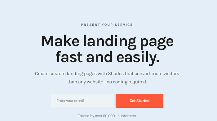
Above the fold design patterns look like this

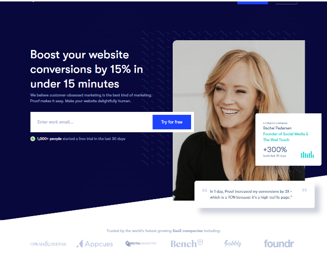

And these patterns are a combination of 3 elements.
Headline + CTA + Video or Image
It’s a “3-way-combo” that works for a few reasons:
- It follows the design principle of “rule of 3”, which helps break up content, increases visual appeal and makes it more memorable.
- You’re not showing just text and a button (which can make a page look “basic”). The use of good images or video can amplify emotions and help clarify your message faster than words can. (e.g An image of a book on a landing page is stronger than just saying “Free e-book!”).
- It follows a visual hierarchy, which lowers complexity. This gives it an inherent un-announced order to when you should read content. Headline, then image or video, then button or form.
If you really want to see more of these patterns in action, just search “landing page” on Behance. You’ll see this above the fold format everywhere, and for good reason.
That’s why having a good above the fold goes a long way.
And if you want to know where to get great images for your page, Kickofflabs made a great article on the topic with a good list with both paid and free sources.
Sources that, for your convenience…
I will bluntly rip off from.
List of free image sources for your landing pages:
- Pexels
- Little Visuals
- Unsplash
- Death to the Stock Photo
- New Old Stock
- Superfamous
- Picjumbo
- The Pattern Library
- Gratisography
- Getrefe
- IMCreator
But what if you don’t want to use a design pattern like mentioned above?
You don’t need to, as long as you find a way to include an image, video or visual styling in some way (like in the background).
Because there’s something about not having just one plain color that exponentially adds to a page.
An image is that important.
And since I want to compare and drive the point home, here’s one landing page without a background (which is from a template)
And here’s one with an image (which, ironically, is actually a background video. But the still image is too good so I’m keeping it in):

The one with a good image will always look more professionally done. (Fight me in the comments if you think I’m wrong)
Tip: If you go the background route, overlay, blur or darken the image to make the text in front stand out more.
And now that we figured out the best way to organize above the fold, let’s explore what other rules we should implement for the rest of the page…
2) Use UX open secrets
So, UX (which stands for user experience) is a weird thing to study.
Basically it’s because the more you look into best practices, the more you realize how obvious it is.
And then you end up kicking yourself because your pages end up breaking every single obvious rule of the web.
That’s why they’re called UX open secrets — They’re so obvious and yet we break those rules all the time.
UX Open Secrets include:
- Only underline text that is a link. Don’t use it to emphasize text. That’s because we already associate underlined text with links on other sites. If we underline normal text, we’re just sending mixed signals.
- Be as consistent as possible. If you create spacing that’s 24px apart, make all similar spacing on the page 24px apart. Make all your h1s the same size. h2s same size. All of this helps your page from looking “off”.
- Use things like H1s, H2s, H3s and beyond (and use the right tags in your html). People who use screen readers (programs that read text out loud) use them to better present your page to users. You never know if somebody you’re targeting is using them. Also helps with SEO.
- Group things together to reduce visual complexity. And okay, this isn’t exactly an “obvious” rule, but it’s a good design principle.
Elements that are closer together tend to be grouped together visually (and psychologically). You can use color to do the same thing. - 16px. T̶h̶e̶ ̶m̶i̶n̶i̶m̶u̶m̶ ̶s̶i̶z̶e̶ ̶o̶f̶ ̶t̶e̶x̶t̶ ̶y̶o̶u̶ ̶s̶h̶o̶u̶l̶d̶ ̶h̶a̶v̶e̶ ̶o̶̶̶n̶̶̶ ̶̶̶a̶̶̶n̶̶̶y̶̶̶ ̶̶̶s̶̶̶i̶̶̶t̶̶̶e̶̶̶ ̶i̶s̶ ̶1̶6̶p̶x̶. [Okay! So after releasing this article, I learned this isn’t technically right. There’s this ongoing saying that “16px should be the minimum or at least ‘a good place to start’ for accessibility reasons.” Not true.
The problem is, I heard this phrase so many times I assumed it was. There’s no actual official font size standard, but since 16px is the default size for browsers, that’s why it seems that number gets thrown around so much.
The real best case scenario is to use a font unit sizes like percentages or em (nothing lower than 1em) that scales depending on screen size and zoom level. Leaving these two links here if you’d like to look up more.
https://www.w3.org/QA/Tips/font-size
https://w3-lab.com/website-font-size-guidelines/ ] - Make your buttons look like buttons. Make them circular, give them a bit of shadow and, when the mouse hovers over it, make it go darker in color.
You’d be surprised how little things like this add up over time. Look at your favorite pages and you’ll notice they all follow these UX rules (and more too)
But there’s one last principle we haven’t talked about.
3) Make it easy to scan
Let’s be honest, odds are you didn’t read every word in this article. You skimmed a bit because, you know, you have a life.
Which is fine!
But realize that your leads will do the same
Users will tend to skim to the relevant info they’re looking for and ignore everything else, according to studies.
That’s why I’ve been separating this article into “segments”. The idea is you should try and do the same.
Here’s how to improve scan-ability in your pages:
- Use bullet points (like the one you’re reading right now. They help be concise and punchy with your benefits)
- Highlight keywords (Bolding or using colors are an option)
- Use meaningful sub-headings (Ask yourself “what do leads need to know”, and make that your subheading)
- Keep your line length short, between 60–80 characters so it’s easier to read. You don’t want leads to lose their place because your line is so long that they lose their place when they go to the next line)
- Keep to one idea per paragraph (And keep your paragraphs less than 3 sentences. If you need more, either break it up or be more concise)
- Include the most important information your lead higher in the page. Less important and supporting info lower on the page.
- See if you can half the word count after finishing your page. Less words means less clutter.
And don’t get me wrong! Making something easy to scan doesn’t make any word less important on the page.
What it does is make your page more digestible, easier to navigate and more importantly — Your leads don’t have to think about finding info…
They just do.
An awesome memorable example I’ve seen of this in action is comparing this website with this other, better website (WARNING: Very heavy hilarious cursing)
So hopefully, this helps you create better looking and easier to digest pages. 💪
Most of the landing page examples in this article were from my landing page swipe file
My free landing page swipe file includes annotated examples and studies from real landing pages on the web.
You get it as a bonus for signing up to In One Snap: a weekly newsletter that delivers insights for marketers, designers and devs who want to increase conversions on their landing pages. You can check it out here.

