Understanding typography: Type arrangements

Welcome to the third instalment of the “Understanding Typography” series. In this blog, we delve into 4 primary alignments or arrangements of type blocks and explore a few other key concepts.
Let’s get started!👇
1. Left-aligned/Ragged right
It is the most used arrangement of Latin text that we encounter in our daily readings. When text lines are aligned along the left edge of a block, causing an uneven right edge, this arrangement is termed as left-aligned text.
The uneven end of the text block is called a rag.
In the left-aligned arrangement, the rag formation is on the right, hence the term “Ragged Right.”
The left-aligned text keeps a steady left margin while sporting an irregular right margin. The consistent left margin facilitates effortless line-to-line navigation and provides readers with a uniform starting point, enhancing their reading experience.
For reference, refer to the image below.
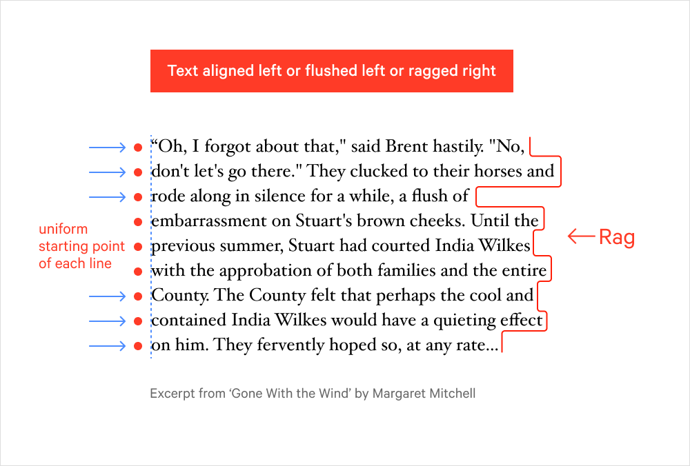
Left align, Flush left, and Rag right are the terms used interchangeably for this type of text arrangement.
When aligning a text block to the left, it’s crucial to ensure that the ragged right edge remains visually balanced. An uneven rag can disrupt the flow of the text and negatively impact its readability and aesthetic appeal.
A poorly structured rag often creates distracting gaps or irregular white spaces in the margins, making the text block look untidy or unprofessional.
To address this, we can manually adjust line breaks, use hyphenation, or even revise the copy itself.
Small adjustments in the text can make a big difference in achieving a clean, well-balanced layout, enhancing both legibility and overall design harmony.

The left-aligned text maintains consistent word spacing, effectively eliminating the risk of river formation and ensuring a uniform texture in the type.
|| Rivers?? 🧐 We’ll discuss this below in the Justified text arrangement.
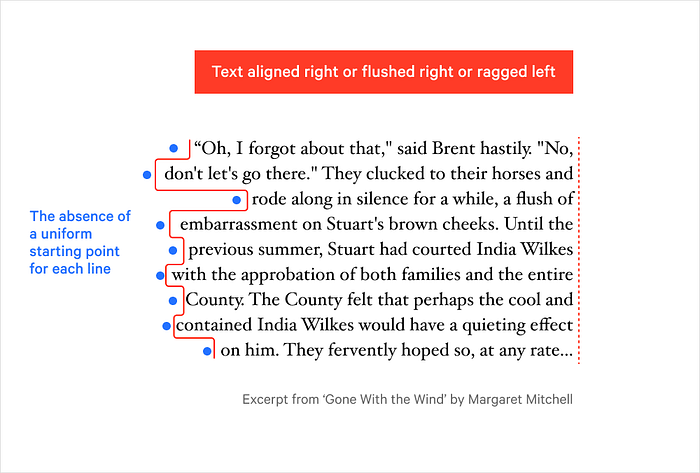
2. Right-aligned/Ragged left
In the context of typography, when text lines are aligned to the right edge of the block, resulting in an uneven left edge, this arrangement is referred to as right-aligned or flushed right or ragged left text.
Flush right alignment is a rather rare type of arrangement, typically reserved for shorter pieces of text, as illustrated in the example below.

But why for a shorter text block? Let's understand.
Well, consider this: We are accustomed to reading Latin scripts from left to right, and when the text is flush right with a ragged left side, it can momentarily disrupt the flow as we search for the starting point of the next line. This is because, unlike the more common flush left alignment, there’s no consistent starting reference point for each line.
3. Justified text
In this particular text arrangement, both the left and right edges of the text block align evenly, resulting in uniform line lengths (please note that equal line length doesn’t necessarily imply an equal number of words).
Justifying text in this manner creates a neat and compact appearance on the page. It’s a formatting technique commonly employed in extensive textual content, such as newspapers and magazines.
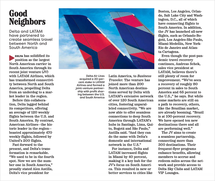
Here is an example of the justified text arrangement employed by The Guardian in their magazine:

Nowadays, most magazines and newspapers use left-aligned text instead of justified text because, I believe, they do not want their designers to spend time fixing the rivers and uneven word spacing of justified text.
In certain magazines, one can observe a blend of both justified, right-aligned, and left-aligned text. This combination of various text arrangements serves to maintain visual intrigue and diversity in typography, which can be a compelling aspect of design.
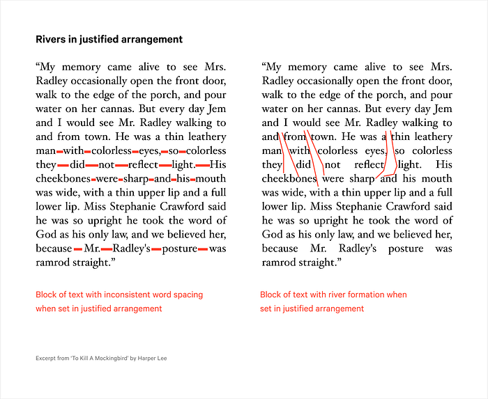
The pitfall of justified text: Rivers in the column
One downside of justifed arrangement is that sometimes it results in inconsistent gaps between words resulting in the formation of rivers running down the column of the text.
- Rivers in typeset text can sometimes pose a distraction for readers. While they may not always be problematic, many publishers and designers opt to steer clear of them to maintain a smoother reading experience.
- From a visual perspective, rivers can be quite unattractive. They interrupt the uniformity of the text and can give a messy, unprofessional appearance to your document, whether it’s a book, a magazine, or a website.
Addressing the challenge of rivers
- Hyphenation: It can help distribute spaces more evenly, reducing the chances of rivers forming. Use this approach more judiciously to avoid excessive hyphenation.
- Adjusting the text block manually: This can be achieved by adjusting line length, use of positive and negative tracking, manually adjusting the word spacing to reduce the visibility of rivers, and changing the font size.
Dive deeper into the concept of tracking in typography? Learn more right here on our blog.
4. Centre-aligned
When the block of text is aligned along its central axis, then the type of arrangement is called centre-aligned.
Centre-aligned text creates rags on both sides of the text block making it difficult to read. Therefore, it’s advisable to employ this alignment sparingly, especially for shorter text elements such as headings, decorative elements, quotes, or anywhere you want to draw attention to.

🌟 In summary, center-aligning text in typography is a valuable tool for creating visually appealing designs and emphasizing specific content. Just remember to balance it with other alignment styles to maintain readability and aesthetics in your typography projects.
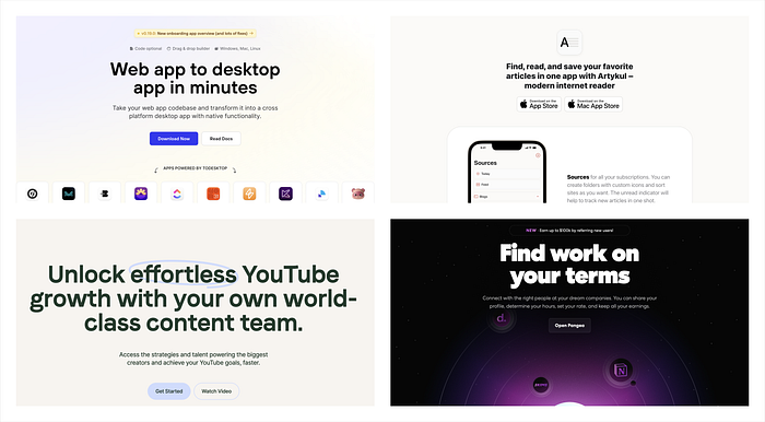
👉 In contemporary web design, the practice of center-aligning headings to capture the viewer’s attention has become increasingly prevalent. Below are a few instances of different websites embracing this approach to effectively draw users’ focus and create a compelling visual impact.
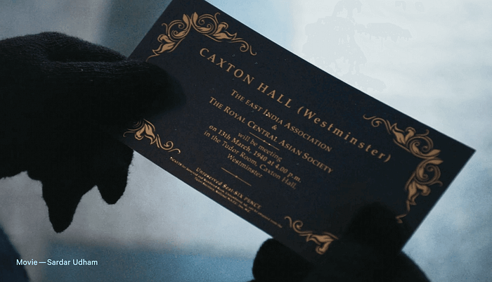
👉 The centre-aligned text adds a touch of formality and elegance to your content, which is precisely why it’s the go-to choice for most formal invitations.
Visual showcase: The four typography arrangements in a GIF

To sum it up, typography arrangements are like the brushstrokes of design that bring words to life on a page or screen. Whether you’re centre-aligning for a touch of elegance, left-aligning for clarity, or justifying for structure, these choices can make a world of difference in how your message is received. So, don’t be afraid to experiment with these arrangements, infuse your creativity, and let your typography be the storyteller that captivates your audience. Happy designing! 🤓

