
Overview
As an international college student who lives overseas, I use WhatsApp religiously to talk to my professors and colleagues in the US. International calls and text messages being free, with tools functioning just like any other mobile chatting app got me wondering why some people around me prefer other chatting apps over WhatsApp.
However, despite WhatsApp’s promise to ensure user privacy and security, the app lacks front-end solutions that prove its confidentiality. In addition, WhatsApp generally seems user-unfriendly and I as a user felt frustrated.
In November 2020, I set out to conduct a case study on WhatsApp and identify how it could be improved. My initial hypothesis was: If WhatsApp created more front-end solutions on privacy, it would help more users feel secure when using the app.
Problem — Technology has Low Credibility
WhatsApp is originally known for being strict with privacy through an end-to-end encryption set up into its system, which means that the texts can only be seen by the user and the other party. But this system is only engraved in the system, while lacking external privacy features that are visible to users. If content leaking is the concern the app wants to focus on, it lacks those additional features that accentuate the reputation, leaving users to worry.
Solution — Let Users Trust WhatsApp
Today, society is undergoing dilemmas on how technology invades our privacy. Therefore allowing the users to manage their privacy and personal space to a certain extent could reassure them that their experience on WhatsApp is safe. Add front-end approaches covering privacy, visible on screen. The features to implement will be measured later in the case study.
User Research
Over a span of 5 days, I released a survey link on my Instagram page to investigate the real world opinions on WhatsApp’s image. Survey questions were a mixture of multiple choice questions and free response questions. This is what I collected.
Participants: 55 people

- Users care about eyes from the outer world (external privacy)
“I don’t want to worry about people taking my phone, easily accessing my chats.”
2. Users want to feel emotionally secure with app (internal privacy)
“I still prefer emailing my professors even though it seems old school. Honestly, WhatsApp doesn’t give me a formal, official, or private impression. What if I get hacked or something.”
3. Users prefer quick and easy interactions
iMessage does not require additional steps to login, but WhatsApp just has a lot of steps which should be eliminated.”
4. Users seek for extra features and tools
“I chose to use KakaoTalk since theres more features/options: sending gifts, turning off notifications, etc. I guess KakaoTalk is more convenient in general.”
5. Users are unhappy with WhatsApp’s UI
“Don’t like how it looks visually. Makes me not want to use unorganized apps.”
User Personas

Exploring What Type of Feature to Implement

Discussing the opportunity areas, I came up with solution spaces and voted on what type of feature would best suit the problem. I decided on:
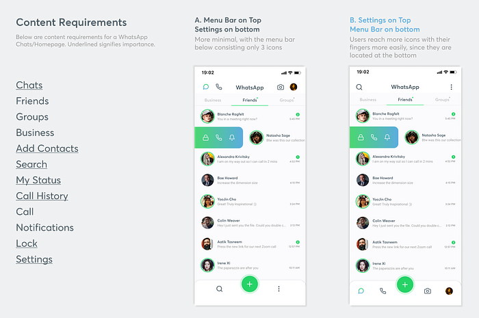
- Creating a lock for selected chats
- Reducing the number of pages through a clean homepage
Since my initial goal was to increase a sense of privacy through a front-end approach, I thought locking chats would be the key feature that represents the initial goal. I also thought that by doing so, a clearer image of WhatsApp could be originated, that could possibly bring in new types of users.
The idea of building the process of setting up passcodes may be an exhausting cognitive load, which is why it is important to make the steps as simple as possible. Cutting down the number of slides is a solution to blend in with the locked chat feature.
Wire-framing
Market Research
I looked into the two most common chatting apps people around me use: KakaoTalk and Facebook Messenger. In my opinion, if these two apps were aimed towards casual socializing, WhatsApp is a different category for being a slightly more professional, private, but casual mobile chatting app.
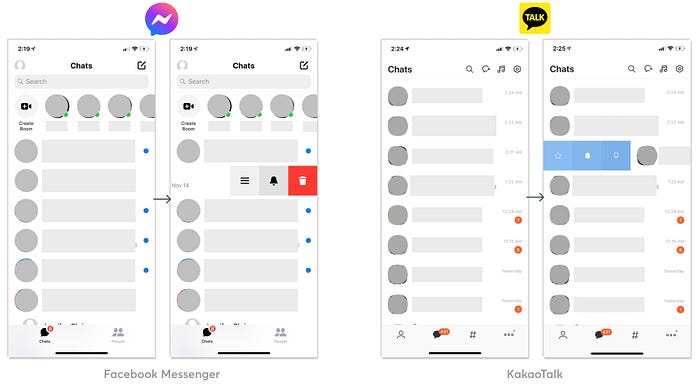
Swiping someone on the chat list supplies additional features that could be customized on a certain user. Messenger offers settings, notifications, and delete. Kakaotalk offers favorites, pin to top, and notifications.
The notifications option is functional and is also closely tied to privacy, since users could manipulate what messages to show and not show up on their screens. This option is definitely something WhatsApp could adopt.

Apps with Passcodes
Banking Apps were what first appeared on my mind when I pictured a passcode. I studied the slide sequences and instructions for CitiBank and Bank of America. I also studied the regular Iphone passcodes.
A key difference I spotted was how the Iphone passcode page had one less step than the other apps. When the page to fill in a code or a digit appears, user is told to press on the first empty space until the keyboard of numbers and letters pop up. Basically, users need to take one more action to enter the code. But since the Iphone already implemented a large keyboard on with the empty digits, users could navigate through the process more quickly.
Final Design
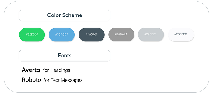
I followed this UI Kit to make sure that my high fidelity prototype is as accurate as possible.

The current UI of WhatsApp is unbelievably inconsistent with Messenger or Instagram even though they are under the same Facebook umbrella. Designs are dull and old-fashioned, and most importantly, lacking features.

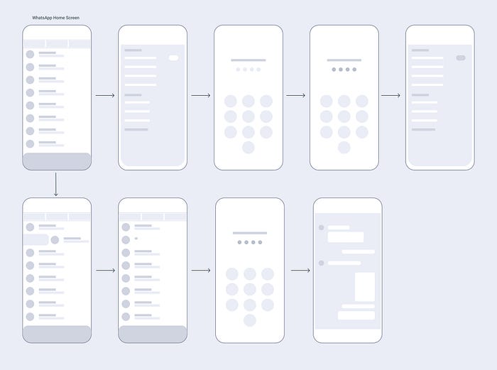
Final User Flow

Prototyping
Design Iterations
To construct the WhatsApp homepage/Chats, I had to list down what elements I would need to execute the app’s features.
Visual Design
How might we use visual design to help the “setting password” process seem less complicated for users?

Option B and D were from the earlier drafts of my designs. I eliminated B and D right away because they are both under a system of targeting a certain user to lock, as it turns away from the user flow of setting a password through settings.
Option A and C are both very convenient in terms of saving time and simplifying the process, but ultimately I chose option A. The buttons of the keypad are large and tidy, producing comfort for the users when tapping the screen with their fingers. The scale of option A, especially after putting all these options next to each other and comparing them, allows a straightforward navigation.

I explored where the “locked” icon could be located after locking a certain chat. I thought Option A would be the best fit, since the human eye subconsciously stares at names first, and the icon is right next to the name.

I explored how I could organize the different chat categories. I discovered that Option B fit WhatsApp’s visual language the best. Minimal but easy to comprehend and distinguish.
What I Learned- Seek for Advice
As a design student, I am very used to experiencing critique sessions whether in class or at work, and I am positive about designs improving more rapidly when opinions are tossed around.
But since this was my ever first case study, I felt shy about presenting my work at first. Because I was eager to improve my designs, I knew I had to search for feedback. I found hearing words from the user’s perspective being very effective when editing my work. I learned that instead of taking advices personally, asking for advice could become my new daily design habit.
Thank you for taking your time to read through! Reach me at amandajh@usc.edu

