Case study: A design of an online food ordering app
Introduction
A few days ago, I came to a ‘Nasi Padang’ restaurant (a common Indonesian restaurant that serves traditional dishes) to buy my favorite food, the “Ayam Rendang”. When I arrived at the restaurant, I was almost frustrated when I saw the queue. It’s God damn cramped with hundreds of online drivers waiting for their order, my God!
Understanding the challenge
Queuing at the food court or restaurant is a common thing. So what happens if the line is too long? Of course, you will be tired of standing. Not to mention if the place to eat is so small and cramped. So exhausting for being in that place, but this stomach is already getting hungry and the food is also delicious.
This is a personal experience that I often encounter when queuing at a restaurant where the foodservice system has to be ordered at the cashier first, whether dine-in or takeout. So why not just use online food? It’s easier. You can, but it’s not suitable if you want to save more. The price difference can be up to IDR 8000 ($0.6) even more for the same portion of food. Not to mention if you have to scroll through promotions, which if you realize mostly it’s not even worth and waste of time. Sometimes when it’s rush hour, we can wait for more than an hour for a single portion of food, even though the food stall or the restaurant is only a few blocks from my house.
From that problem, I want to create an app that can be used to order food via smartphone without having to queue in front of the cashier.
Initial research
Survey
I prepared a survey with Google Forms and distributed it among multiple groups. 24 voluntary respondents help me fill out the form. Here we can see some results of the survey:
1. How often do you eat at the restaurant/food court/food stall?

2. How often do you take away food from the restaurant/food court/food stall?

3. Have you ever had a long and tiring queue?

4. How often do you queue with online drivers?

5. If there is no promo/voucher, what do you think about the current rates/costs for online food?

6. What are your complaints when ordering food online?

7. If there was an application that made it easier for you to order food for dining in or for takeaway, would you use it?

8. Respondents’ complaints about long queues at restaurants
I don’t like waiting, let alone more than 3 people in front of me.
If the queue is too long, it’s better to just stop queueing and back home or search for another stall.
In some stalls, the service is not optimal because there are few employees, mostly customers who dine in are prioritized, so customers who take out have to wait longer.
From these data, we can conclude that most respondents need a system that can solve their queue problems. There are some online apps that they can use for online ordering for taking away the food with a help of drivers, but some said that that way is too expensive, inefficient and mostly depend on promo.
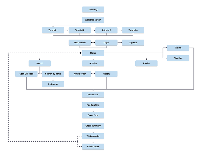
Flow chart
The concept is that visitors (users) come to the restaurant, then scans the official barcode attached to the restaurant or make a manual selection on a smartphone. Furthermore, users can immediately sit at an empty dining table and select the menu from their phone to be ordered and fill in the required data. Then, users make a payment using cash, a transfer, or an online wallet. Finally, there will be 3 ways for food to be accepted, namely: User 1 waits for the order to arrive according to the data entered, The user gets a queue number and picks it up at the cashier, user 1 will be called through the application to pick up his food according to the queue.
Sketching the frame
Before I start designing my wireframes, I drew my sketch first on my paper. This is my first guide for wireframing. But sometimes, I skipped this process to Wireframing.
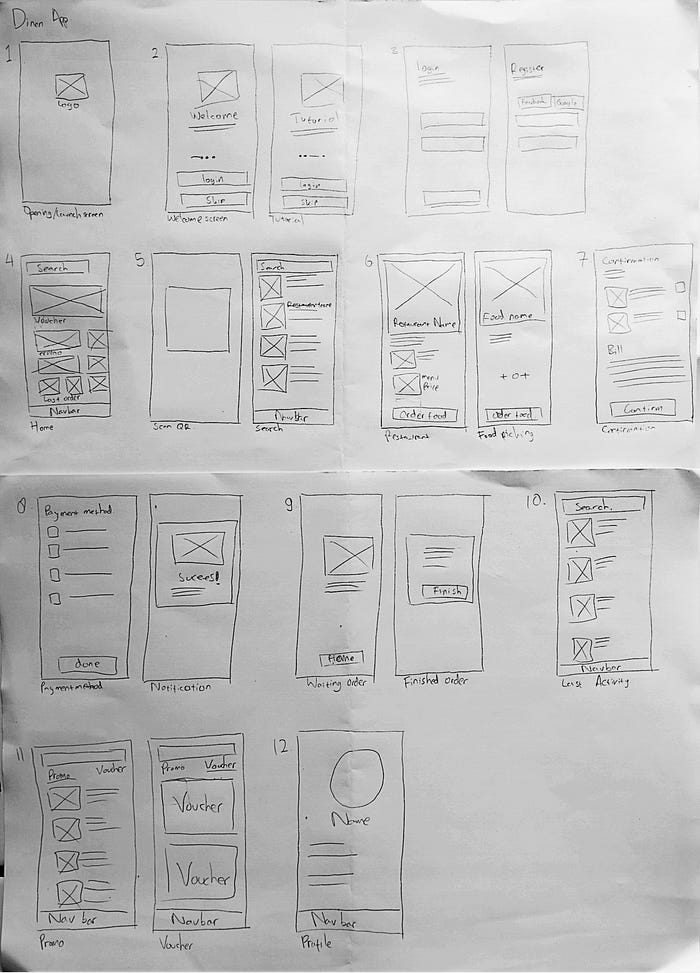
Wireframes
After finishing my sketch, I drew my low fidelity design on Figma to build the wireframes. At the first, it was simple, colorless, even without a real image. Before I built my design app with high fidelity elements, this was my basic design.

Visual Research
Inspiration
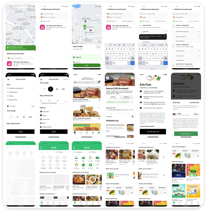
Before I start designing the apps, I need to research other apps for my design reference. Mostly I observe some similar apps like online food apps (Grab App, GoJek App, and Uber App) and some fast-food restaurants (KFC, McDonald's, Starbucks)
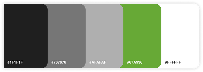
Color Palette
I divide 2 groups of coloration for my design. First, I use it for the theme color and second I use it for texts purposes. Here is the palette.

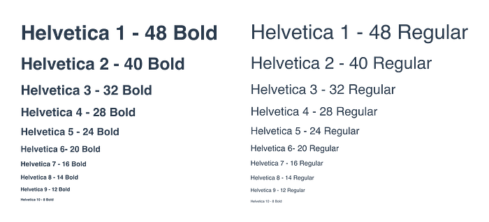
Typography
I use Helvetica font in my design because this font is a Sans type, it’s easy to read text using this font.
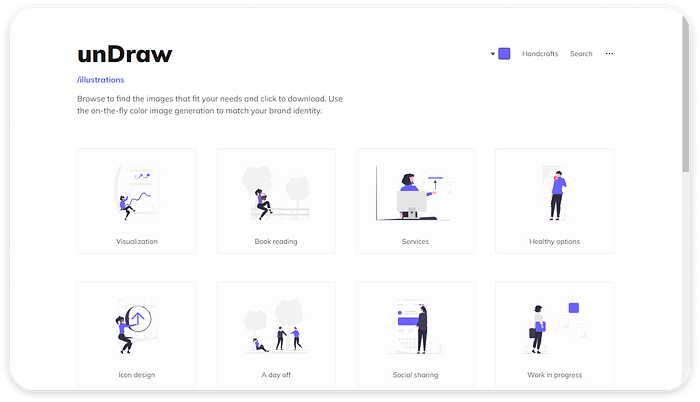
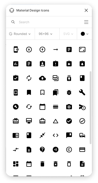
Icon & Illustration
I’m not illustrating on my hand. Surely, I’m not mastering illustration design, so I use some illustrations from Undraw which I can use for free.
I’m quite mastered creating designing icons. But I decided to use the Rounded Google icons from Material Design Icons plugin from Figma than create those by myself. Creating the icons takes a lot of time. I want to spend my time more thinking about design than creating icons. Also, the Google icons are quite appropriate to my design.
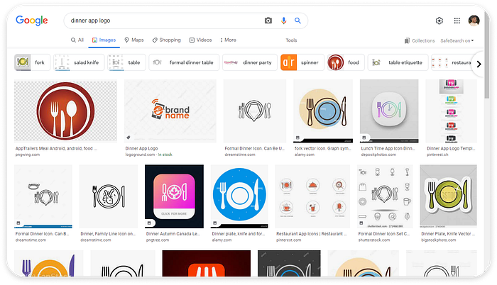
Naming & Logo
For me, the hardest part of all of this process is deciding the name of the product. I need a lot of inspiration for the name, and also the logo design. I seek the information by searching the word ‘dinner logo’ on Google image search.
At the end of the day, I found the name for my project apps. I name it ‘Dinen’. The name is simple, represents the product, and is easy to remember. And here is the logo:

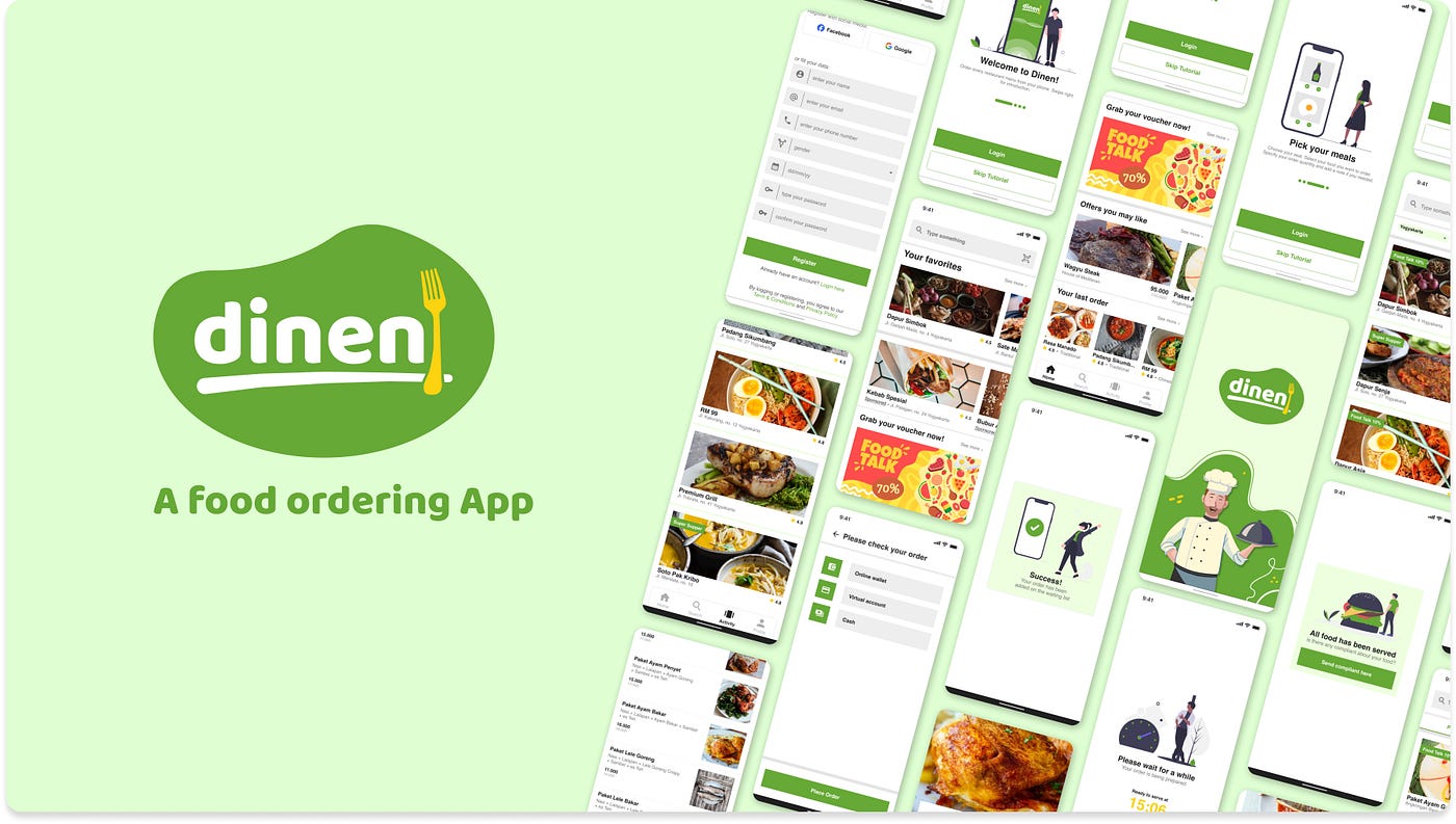
Final Design

Here are the designs of Dinen. The project I have started on March 20, 2022, and finished on April 1, 2022. It’s taken about 2 weeks to complete the design.
Launch screen, welcome screen, tutorial, & login
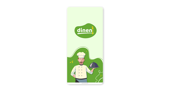
The first screen of my design is the launch screen. On this screen, I use a logo in the middle of the screen and an illustration picture on the bottom. All I use is green dominant with some spots of white and yellow.
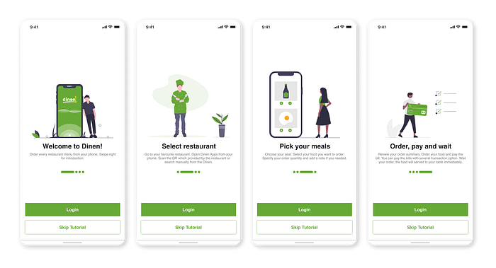
On the next screen are the welcome screen and tutorial. The first screen that users will encounter after opening the screen is the welcome screen. On this screen, users can continue to 3 options, i.e. a short tutorial, login, or skip directly to the home screen.
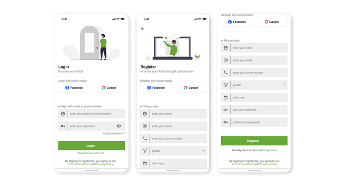
After completing a short tutorial, users login if they already have an account or register first if they don’t have an account. In the process, users can register using Facebook or Gmail as an alternative.
Home screen
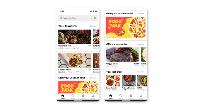
After passing through the opening and login stages, the user will be shown the home screen display. On this screen, users can find many features starting from the top, they can see favorite menus, advertisements, vouchers, restaurant promos, and last orders.
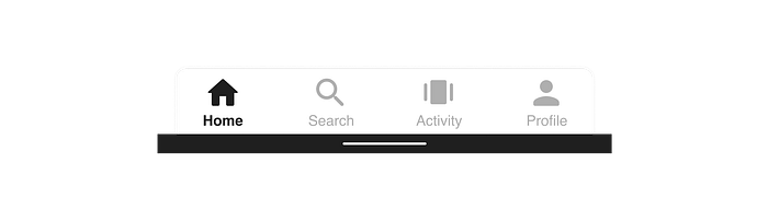
In addition, users will also find a navigation bar containing home, search, activity, and profile. The navigation bar will appear on other screens, including the search, activity, and profile screen.
Finding restaurant & food ordering

To find a restaurant, users must first search or scan the barcode available at the restaurant.
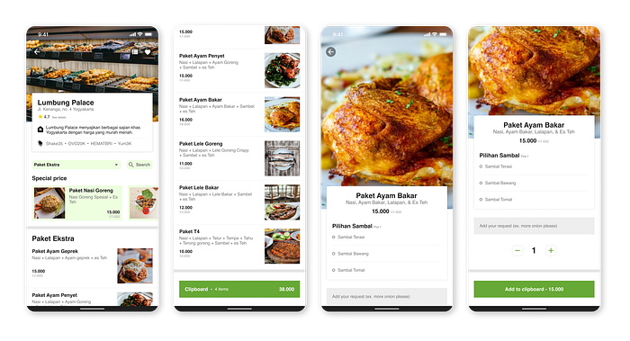
After finding the restaurant they are looking for, the user will be shown a restaurant screen. On this screen, users can view all available menus and place orders by entering simple data as desired.
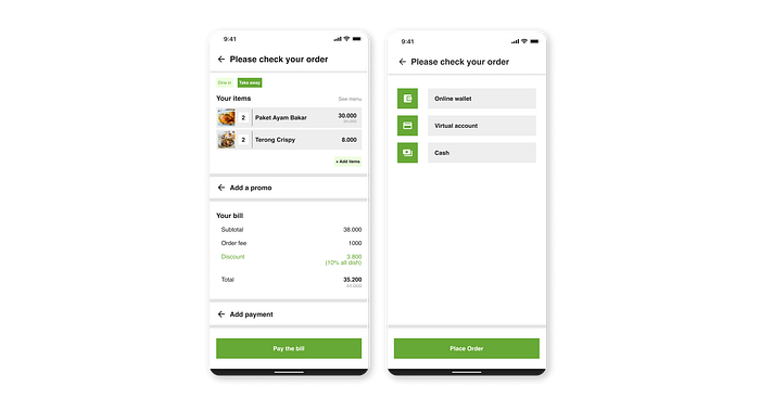
The user will be shown a summary of the food choices, the amount to be paid, the discount, and the choice of payment method. The method used can be an online wallet, virtual account transfer, or cash payment.
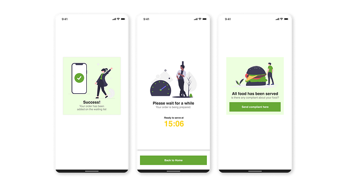
After paying off the bill, the user will get a queue number and wait according to the estimated time listed on the screen. User can send their compliant for the food condition or the service.
Activity, promotion, and voucher
Apart from ordering food, there are several other features available, namely activities, promos, and vouchers.
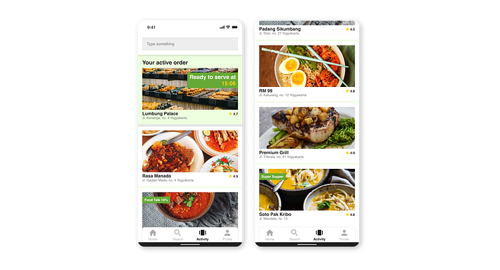
On the activity screen, the user can view the currently active orders and their order history.
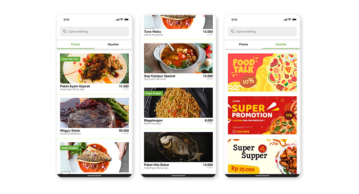
Furthermore, on the promo screen, users can see all the promos provided by the restaurant. In addition, there is also a voucher screen where users can claim to get special offers when ordering food.
Profile
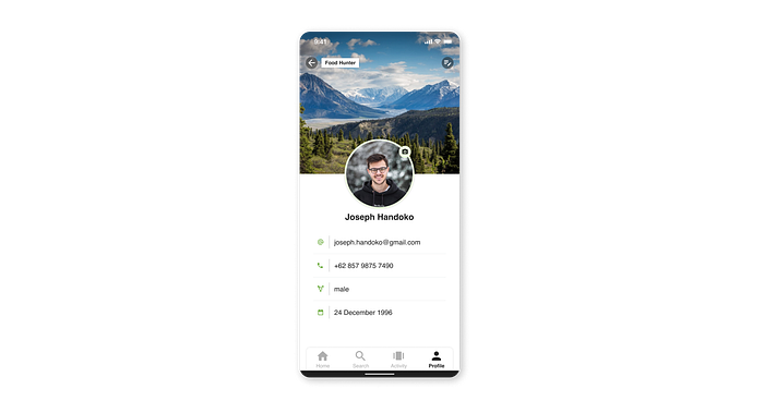
The last screen on this preview is the profile screen. On this screen, users can preview their profile data also edit their current data or log out from the app.
Conclusions
What did I learn?
Designing an application requires a very high level of focus and consistency. I learn many things from my design process. Several challenges arise in conducting surveys, making wire flows, or making interface designs.
Conducting a survey may seem easy. But in reality, not many people are willing to voluntarily express their concerns through the questions asked. In addition, not everyone who fills out the survey is a potential user. In this case, it can be circumvented by distributing survey questionnaires widely, through community groups, social media, and even fanbase accounts on Twitter.
In making wire flows, we often encounter difficulties in determining the right flow and placement of buttons or features on certain screens. In the process, a designer must be able to position himself from a user point of view who will use the application to be able to design a maximum user experience. Besides that, it can also be overcome by conducting in-depth research on other similar applications to get lots of inspiration and points of view.
And the last challenge is to design the interface. In addition to designing so that it is easy for users to use the application, I also have to design so that it is visually comfortable for users to see and use for a long time. The process is very easy if we already have a standard guide of the application, but it will be a challenge if the application is designed from zero. To overcome this challenge, we have to do a lot of research for virtual inspiration. In addition, we can also look for colors, shapes, and positions that are suitable for our products as well as comfortable for customers to use.
What are the next steps?
- Usability test of the prototype with potential users
- Research and improve user flow
- Realization of ideas into business concepts
- In-depth research on related features
Final Conclusions
The FnB industry flow in Indonesia is very high, especially in big cities which are bustling with students, employees, and tourists. Some restaurants and the food court are overcrowded at certain hours, so they need precise service management. With the Dinen app, it is hoped that it will be able to help restaurants perform services more precisely, quickly, and accurately.
From the user’s point of view, this is very advantageous because there is no need to queue in long and endless lines. At the restaurant, users just order food from their table. It saves a lot of time and effort.
Then, from the restaurant side, it will also greatly benefit from the existence of this application. With a reduced queue, it will reduce the impression of being overcrowded in the restaurant. A more accurate service because it uses an automated system also provides added value for service to customers. Also if the queue is not crowded, employees have more time to do other technical things. Furthermore, with the Dinen App, restaurants do not need to add employees to serve every table or to break the queues.
I hope the Dinen Application can help many people, especially the FnB industry in Indonesia and the customer who needs to save time and energy.