UI is just micro UX

If you’re in the product design world you might often get asked these questions:
- Are you a UI designer OR a UX designer?
- Do you have UI skills or UX skills?
- Is this ticket for UI work or UX work?
For those who don’t know, UI stands for User Interface (Design) and UX stands for User Experience (Design).
We know what someone means when they ask these questions, because we’ve been taught to draw a line between UI and UX. We’re told UI is the skin and UX is the bones. Form (UI) verses function (UX). We’re told that all a product needs is UX design and that UI design comes second, or third, or wherever.
I accepted this early on in my career but I’ve had trouble with it in recent years. The logic came out of trying to simplify and distinguish these areas as separate design specialties or disciplines, to make it easy to teach and explain to someone. While there are some differences, it’s not UI versus UX.
It’s all UX design. UI is just micro UX. Every part of the design affects the user’s experience.
Example 1: Cars
If all we cared about were the bones of a car (UX), then all we need is:
- The frame
- The motor & transmission
- Wheels
- Steering controls
- Acceleration and brake controls
- A seat

Would you buy this car? It could take you from A to B. It serves it main function, but it would be wildly uncomfortable, unsafe, and terrible to look at. And with no labels on any of the controls, it may be dangerous or impossible to operate.
Yes, having an adverse reaction to the way something looks and feels is critical to the UX. The feeling a product gives you when you see, touch, or use it is part of your user experience.
Let see how the user experience improves when we add some skin (UI):
- Soft cushions on the seats
- Leather seat covers
- Doors
- Windows
- AC to keep cool
- Heat to keep warm
- Labels explaining buttons, levers, and guages
- Your favorite paint color
- Airbags & seatbelts
- Side and rearview mirrors
- Cupholders for your favorite drink
- A great stereo to play your favorite songs
If you take all the skin off of your favorite car, is it still your favorite car?
Example 2: Clothing
You hate the cold, so you go shopping for some warm clothes. You buy the first items you see: some green snow pants, a large yellow turtleneck, knit polka dot pink mittens, and white rain boots.

- Are you warm?
- Are the clothes comfortable?
- Do you like how you feel when you wear them?
- Do you like how you look in them?
Yes, the clothes accomplished the function of keeping you warm, but what about the other goals you had for the clothes? Do they match your style, do they make you feel happy when you wear them? Would you prefer the turtleneck be made from a different material that doesn’t itch your neck?
In addition to keeping us warm or cool, we typically want clothes that we like the look of, are comfortable, and make us feel good when we wear them.
Example 3: Red Button Colors
Most people look at the color red as a destructive color. We often see it on a mobile app asking is if we want to delete something. Of the 2 options below, which is less confusing?
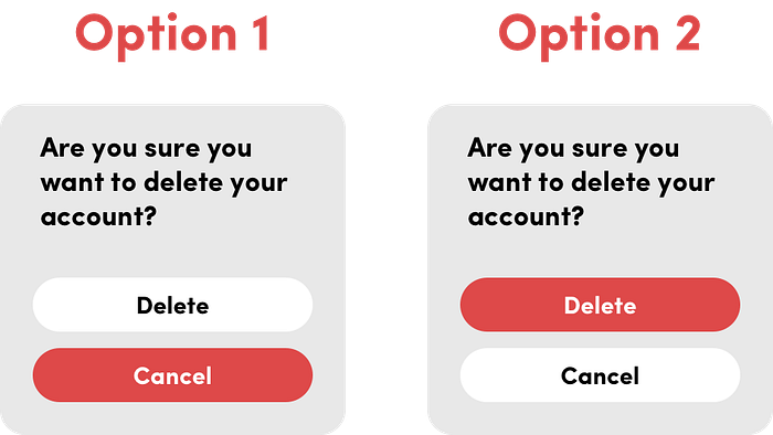
Option 1 encourages the eyes to look at the red button, misleading the user to press “Cancel” when they may really want to press “Delete”. We see this all the time, especially from products that want to prevent us from deleting an account with them.
Option 2 is the ideal way this should be displayed, so users know that red = destructive, stop, remove.
Example 4: Font & Color Choices
Something as small as font and color choice affect the experience of the user, and also the the perception of their brand.
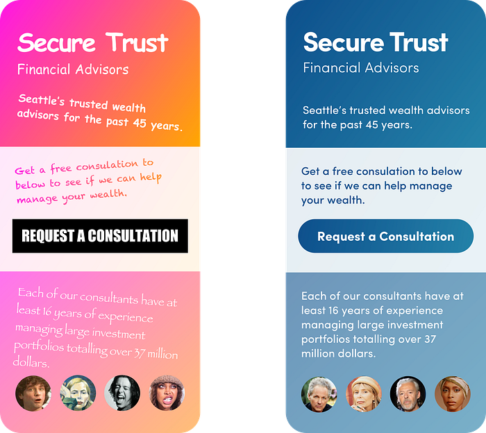
Same company name, copy, layout, offer, experience, and consultants (just different headshots). One relies on bright gradient colors and the infamous Comic Sans and Papyrus font families. If you’re like me, I would much rather entrust my money with the company on the right.
The way you present the product (all of the visual design) matters. People want to invest their money with serious people, who take their jobs and clients seriously.
Option 1, while not outright a terrible design, would be better suited for social media platforms for teenagers and young adults.
Conclusion
UI is just micro UX. Everything you see in the design is part of the user experience. The best “UX” work can be ruined by terrible UI, resulting in a broken experience. UX and UI are just the same. One is high-level, and one is granular. Learn to value both as a complete UX experience.

