Type scale Unleashed: Harnessing the Raw Power of Harmonious Letterforms in Design Systems
And lo, in the realm of web design, there emerged Typekit, the savior who delivered the digital world from the dreary clutches of web-safe fonts. It was the fabled year of 2009 when a glimmer of light pierced through the abyss. Then, as time marched on, other noble services such as Google Fonts answered our call, coming to our aid. Truly, it was an epic era, worthy of bardic tales and quests!
Possible quote from a web designer (or aspiring web designer) active before 2010.

Alright, perhaps it wasn’t necessary to start from such a distant point, but I was feeling inspired. Now let’s get down to business!
Some quick basic notions — The Design System
When it comes to the development of digital products, whether complex or not, the creation, maintenance, and enhancement of a Design System have proven to offer numerous advantages. Here are a few examples:
- Consistency across all visual and functional aspects of a product or a series of products
- Improved brand consistency
- Enhanced focus on the user experience by the designated team or teams
- Cost savings (you can find an interesting in-depth analysis here)
Ah, in essence, it’s not like anyone does whatever they want. Products miraculously become these stunning epitome of beauty, all while being consistent and even managing to save a few coins. Quite impressive, isn’t it?
I could go on indefinitely and cite a hundred more articles that delve deeply into this topic, but let’s focus on some fundamental parts, namely those commonly referred to as the foundations.

But what primarily interests us is the part related to typography, where we are usually presented with the following points:
- Used typefaces
- Styles
- Tokens
- Various and other useful resources
And in the end, the type scale.
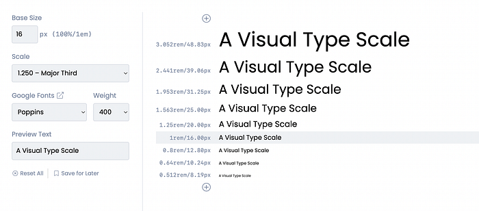
What is a type scale?
A type scale is a selection of font styles that can be used across an app*, ensuring a flexible, yet consistent, style that accommodates a range of purposes.
Material Design 3
In other words we are talking about a structured arrangement of character sizes interconnected by a shared ratio, crucial for achieving consistency, harmony, and contrast in typographic design.
In his book ‘The Elements of Typographic Style’, Robert Bringhurst says: “Don’t compose without a scale”, let’s find out the reason.

Design software, such as Adobe InDesign, commonly incorporates a typographic scale which is 6, 7, 8, 9, 10, 11, 12, 14, 16, 18, 21, 24, 36, 48, 60, 72, and so forth. For over four centuries, the typographic scale, with its historical significance, has persevered unaltered since its adoption by typographers during the early Renaissance period.
The adoption of this scale was driven by practical factors during the era of metal type cutting. Typographers intentionally chose a narrower range of sizes, focusing on accommodating a greater diversity of smaller fonts. This led to a comparatively smaller ratio difference between the smaller font sizes in contrast to the larger ones.
If we consider scaling in a more modern context, it originates from an equation that, without delving into overly complex calculations and reasoning, generates a sequence similar to what we saw earlier. If you prefer to delve deeper into the topic, here is a very useful article (link).
The Modern Scaling
Now that we have uncovered some background information, let’s first examine the reasons behind these gradual changes and why they occurred.
The answer, truth be told, is simple: context and needs.
Consider the clarity and contrast that text on a single blog article page should have, or how quickly textual information should be accessible when we open our Spotify app.
- What type of product are we dealing with?
- How much can we increase the size of the headings?
- How many different sizes will I need?
- Etc…
And we haven’t even chosen a font yet.
How Scaling is Done
There is no single way to technically calculate type scaling, and as I mentioned earlier, context and needs should guide this choice.
Two main things are primarily required to get started:
- A base size: the initial reference value from which the scale will start
- A ratio: the multiplier and/or divisor that will generate the values preceding and succeeding the base size
Consequently, what we will have is a progressive sequence determined by a certain level of contrast.
Clearly, we will have different types of scales depending on our needs, these are the most common ones:
- Minor Second — 1.067
- Major Second — 1.125
- Minor Third — 1.200
- Major Third — 1.250
- Perfect Fourth — 1.333
- Augmented Fourth — 1.414
- Perfect Fifth — 1.500
- Golden Ratio — 1.618
You can test them easily using tools such as:
- Type Scale by Jeremy Church
- Modular Scale by Tim Brown
- Type Scale by Spencer Mortensen
Another Approach
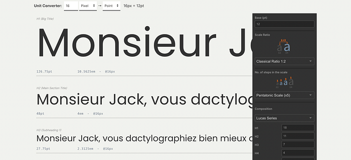
With the LGC Typographic Scale Calculator, designers can explore recreating musical scales.
For instance, assigning the value 8 from a chromatic scale to a title would reflect a dominant fifth (+7 semitones) in a musical scale. Similarly, inputting 13 would be equivalent to a perfect octave (+12 semitones), and 25 would signify a double octave (+24 semitones). You can discover this at www.layoutgridcalculator.com.
Action!
Once you have ensured that the scaling accommodates all necessary requirements, it’s time to apply the selected fonts with their respective weights.
One suggested division is to organise the groups with the following naming convention:

Once done, only enable the styles that are needed. For example, if you require a font display with a weight of 700 for readability purposes, considering the type of font and size, exclude very small numerations.
Set all the remaining settings, such as line height and letter spacing, and here is what you will achieve.
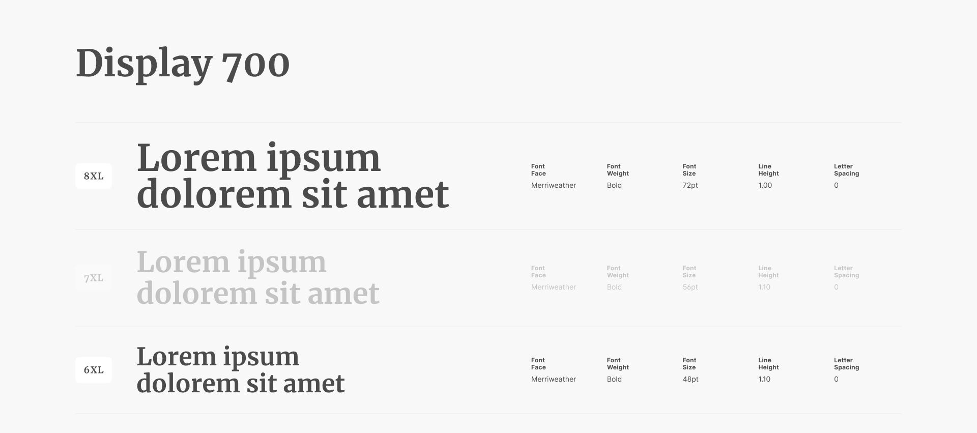
After organising in this manner, save your styles in the library by organising them into “folders” following a similar logical structure:
Display 700/D 700 8XL
Where “Display 700” is the group that gathers all the styles of that typology and weight, while the style name itself is the abbreviated version of the group (D 700), followed by the size. In this case, I preferred to indicate it like this, but feel free to indicate it in the way you prefer.
The important thing is that the naming is easily understandable. It’s better to avoid things like “really really small text, wtf text, teensy-weensy text”.
The Importance of the Product
Referring back to the concepts of context and needs, the product type also matters greatly in choosing the appropriate scaling. Let’s take a product like the Spotify app.

Besides delighting you with the music I usually listen to, given the type of product (in this case, a desktop app), let’s highlight a few points:
- There isn’t a real need for large headings due to the abundance of information present. It’s better not to exaggerate.
- We can observe the low contrast between texts. Considering the different needs and elements present even in a single viewport, it’s easy to understand the reason behind this choice.

What about responsiveness?
If we are talking about a product that needs to be adapted to different devices (e.g. a simple website), it is important to have appropriate scaling for this purpose.
Regarding the ratio to use, feel free to choose the one you prefer. It can be the same one used initially. The important thing is to ensure that the product has excellent readability, especially on mobile devices.
A piece of advice I would like to give is to start with a scaling that offers many sizes and minimal contrast, making it as easy as possible for you.
Last thing, the type scale is something that extends to an indefinite number of products, while responsive scaling is specific to a single product.
The important thing is that the naming is easily understandable. It’s better to avoid things like “small text, very small text, super tiny text”.
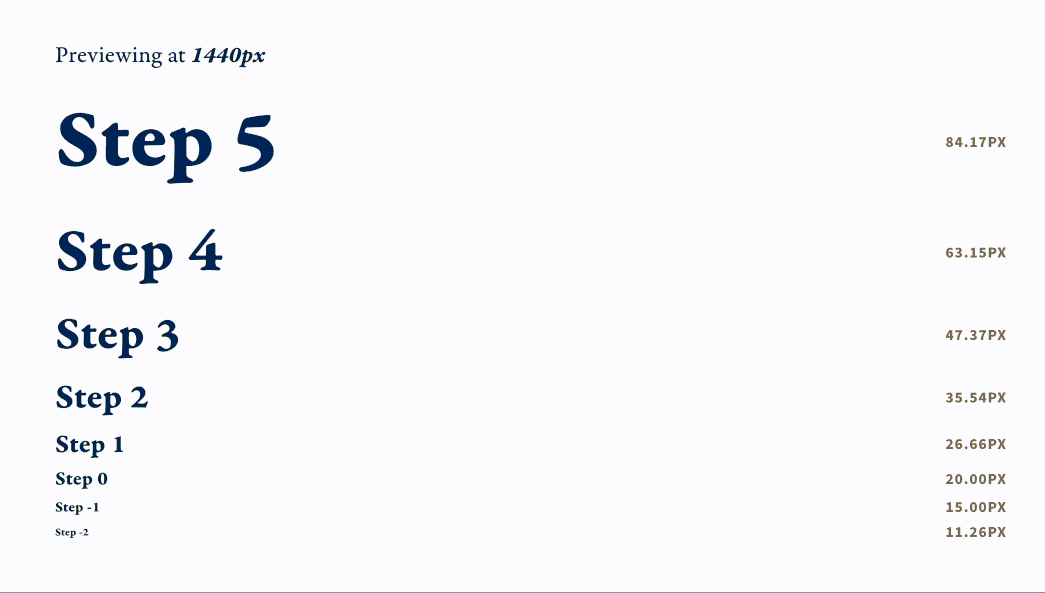
Another cool alternative — fluid type
While in responsive scaling the transition from one breakpoint to another appears “static,” with fluid type, each font scales proportionally and, as the name suggests, in a fluid manner. But how does it work?
Let’s say our largest heading is 84px on desktop and 44px on mobile. By setting a maximum value (desktop) and a minimum value (mobile), we magically achieve a similar result.
There are tools that automate and export the dedicated CSS, such as Utopia.fyi
Conclusions and Additional Tips:
- Always keep the context and needs in mind.
- Clearly, the product should not be overlooked.
- The broader the scaling, the easier it will be to enable styles in the future.
- Be precise with naming and categorisations; your team will thank you!
- In the type scale, set aside nomenclatures like H1, H2, H3, etc. These are SEO-related logic that can create confusion at this stage. For example, very large text may not necessarily be the H1 of a page, and vice versa.
Thanks for reading!

