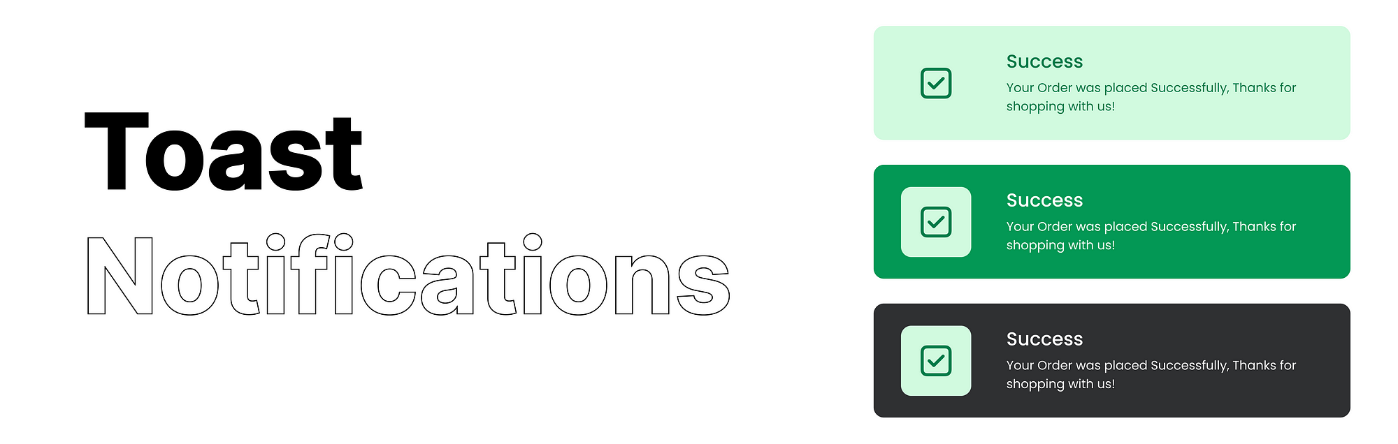
Toast notifications — how to make it efficient
The success of any software application is significantly influenced by the user experience, and there is a common misconception that user experience is how cool your application looks and feels. In reality, the concept of a “user experience” is centred on enhancing the application’s usability and user-friendliness. This involves a lot of aspects and elements — And one of them is Toaster notification.
Have you been to this screen?
Looking at it for just a few minutes can feel like an eternity, as there is no tangible unit of time to measure it. The loading process can range from mere seconds to what seems like endless hours but a loading screen featuring a progress bar along with an indication of the time remaining tends to make the wait feel shorter in comparison. This is exactly why providing users with updates at every stage not only keeps them engaged with the application but is also recognized as the optimal UX approach, and toaster notifications play a key role in achieving this.
What are Toaster Notification/Toasts?
Toasts serve as a notification mechanism with a low attention requirement, primarily intended for conveying various forms of user information,

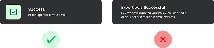
showing status like Error or Success,

or in some cases prompting to perform an action

Incorporating color coding or the placement of a suitable icon can provide significant assistance.
When to show it?
For low-attention messages, it’s suitable for conveying singular status updates that don’t demand further follow-up. However, it’s important to note that this mechanism should not serve as the primary notification method, as it typically is time-bound.
Placement
The placement of this totally depends on your use case and the type of information you are showing, for example, windows and Mac both have different approaches.

They follow the Law of Proximity where it is placed in proximity to their status bar which helps the user understand the relationship between the status bar and the toaster notification as both of them are showing some kind of information or action for the system. Whereas Figma uses a different approach by showing it in the bottom center as showing it on any corner of the page may block the user from seeing the important properties

Accessibility
It’s best to give 500 milliseconds per word to the user. For a short toast, up to 10 words can be processed by the user in 4000 milliseconds + 1000 millisecond buffer(Since not all users may have English as their native language). If the text is above 140 characters(20–35 words English words) best choice would be not to time out the toaster notification. Make sure your placement doesn’t block users from accessing an important part of the application. To further optimize you can use UX writing and color coding to enhance the information
Based on the hierarchy of information you can decide which toaster to time out and which ones should not, like how Mac OS times out your Slack notifications but it doesn’t times out the Low-battery notification. It is also not advisable to time out the toaster if the toaster has an action.
To elevate your UX even further, consider fine-tuning your animation timing
400ms — Inward Animation: That is how much time it takes to shift human focus. (in a scenario when the user is looking at the screen)
1800ms — Outward Animation: This provides users with ample time to observe the toast as it exits the screen.
Adding a Hover-Stay: If the user hovers over the toaster notification it stays on the screen(Subjective to the information)
Sizing
Toast notifications maintain a constant width while their height adjusts according to the length of the notification message. As outlined in the content guidelines, it’s advised to restrict toast notifications to a maximum of two lines of text.
Thankyou for taking the time to read ❤
I’m a Product Designer, also interested in Cosmos, productivity tools, technology, and Automotives. Follow me on Medium to hear more from me.
You can follow me professionally on www.jaykumar.life

